Viewing entries in
Delivery

My presentation training in 1996

My presentation training in 1996

In the middle of the house and office declutter exercise, I found my credit card-sized reminder of things I should work on which I wrote after a communication training at McKinsey, back in 1996 when I just returned from INSEAD:

presentation-training-tips.jpg
  1. Avoid the "Napoleon hand", I seemed to have difficulty finding a natural position for my right hand
  2. Finish a point completely before jumping into the next slide / topic
  3. Introduce a slide before putting it up (McKinsey data slides can be overwhelming)
  4. Maintain eye contact with the audience
  5. Use a loud (maybe confident?) voice

I think I had a few strengths as well, but did not bother to write them down (I hope :-) ).

That little card might survive the declutter tornado.


Cover image by Margarida CSilva on Unsplash

SlideMagic: a platform for magical presentations. Free student plan available. LEARN MORE
Pitching your voice lower?

Pitching your voice lower?

In a recent blog post, Nick Morgan advises to pitch your voice lower when presenting. When we are nervous, we tighten our vocal chords, which results in a high "shrieky" voice that radiates lack of confidence.

I see many people do this even in smaller meetings, and especially some women are dropping their voice pitch dramatically to come across stronger in a male/testosterone-loaded world. In many cases this sounds very artificial.

 Part of the exercise of lowering your voice is probably not related to your voice at all, it gives you something to focus on that simply calms you down. When you are in your mental low voice mode, you feel more confident.

I would treat lowering your pitch as a last resort, and hopefully other stress reduction techniques (including having tremendous confidence in your story) enable you to keep your own natural voice.


Image via WikiPedia

SlideMagic: a platform for magical presentations. Free student plan available. LEARN MORE
How to practice?

How to practice?

If you have a few hours left to prepare for your presentation, they are better spent rehearsing than fine tuning the design of your slides. 

How to practice? I prefer to run through a presentation as if it were the real thing. No stopping, no stepping back, no rephrasing. Present it once start to finish, think what went well and what went wrong, and do it all over again.

In this way, you get used to the feeling of being on the spot, and that extra mental challenge will help you prepare better for your presentation. 

SlideMagic: a platform for magical presentations. Free student plan available. LEARN MORE
The stumble chart

The stumble chart

I am in the business of designing presentations that I hardly ever need to deliver myself. Now and then I come up with this brilliant visualization/analogy that simply does not stick with the client.

First she asks what it means. I explain. "OK".  In the next call: "remind how that chart works again?". I follow up with a passionate explanation. During rehearsals: "So, here we have an [um] great example", and the energy in the pitch grinds to a halt.

Time to take the chart out.

SlideMagic: a platform for magical presentations. Free student plan available. LEARN MORE
Getting stuck on page 1

Getting stuck on page 1

Often, presenters get stuck on page 1. The long list of bullet points which are supposed to summarize the story becomes speaker notes to deliver the entire presentation verbally without the visuals.

Well, that is great right? A captivating story standing on its own with out the need for slides. Things are usually not that perfect. Instead of a captivating story, the presenters reads out the summary bullets, adds some "uhms", hints a bit at the key points but stays at a generic level, saying that the real story will follow. After 15 minutes, the actual presentation starts, which the audience has already heard, more or less. And then, when the presenter reaches the final summary slide, the whole things gets repeated again in 10 minutes.

When presenting live, it is best to consider your first slide a teaser slide, not a summary slide. Hint at what is about to come, but resist the temptation to spend too much time on it. Instead, run the presentation using the visuals.

For presentation documents that are meant for reading a summery page is appropriate (not a teaser page), and in that case I would actually add more text in a smaller font for someone to get the full essence of a story in 1 page, just in case she does not click through to the end.

SlideMagic: a platform for magical presentations. Free student plan available. LEARN MORE
Behind the projection screen

Behind the projection screen

I watched an opera a few days ago in Tel Aviv, where the singers were performing behind a perforated projection screen, and in front of another regulator projection screen, which created a very interesting stage backdrop. Here is an idea for a presentation set up: put the presenter literally inside the slide.

In the image below, you can see the 2 screens. The battlefield background is a regular projection, the barrels in front are semi transparent. I googled for another demonstration of this stage setup:

SlideMagic: a platform for magical presentations. Free student plan available. LEARN MORE
Paul Ryan's PowerPoint

Paul Ryan's PowerPoint

This is unusual, a politician doing a PowerPoint in front of the press. You can see his full presentation here.

Here are a few observations:

  • The slide design is actually OK: consistent, good use of color, balanced, not a spectacular TED talk, but still a lot better than your average corporate bullet point deck
  • The screen is too small
  • He is a pretty good and confident presenter
  • Het gets the start wrong. A super technical summary slide with what they are going to do, without having presented the logic of why they want to do it. I think most people switch of in the first minute (See some reactions here). 
  • Later on, things get better. But it is almost as if the slides are holding him back. First he presents a statistic or a quote, turning towards the slide, then he steps away from the screen and explains what it actually means. And it is here where he does a pretty good job.

I watched about 10 minutes of the presentation. The key change I would have made, is to change the framing of the presentation. Leaving my own political views aside, if I were trying to make the case for a script, it would: "Hey, from the outside Obamacare looks pretty good, because of 1, 2, 3. BUT, people are missing a few problems 1, 2, 3,. Our plan offers the best alternative. And here is all the technical, legal stuff we are going to do to make it happen. 

SlideMagic: a platform for magical presentations. Free student plan available. LEARN MORE
Too informal

Too informal

From multiple VCs I have heard this scenario:

Highly confident entrepreneur walks in the conference room, sits casually next to the VC rather opposite the table, leans back relaxed in the chair, rocking back and forth, savoring his coffee, suggests to do a different style of pitch, life is too short for boring pitch decks, let's just have a more intimate and informal chat about the tech world at large and the entrepreneur's specific venture in particular, the entrepreneur-investor relationship is all about dialogue, conversation, and exchange of ideas...

"Multiple VCs", means 2 VCs, and both of them were women. (No, it was not the same entrepreneur).

This approach might be a bit too informal to work. Have your traditional pitch deck ready, and make things less formal if you sense the right dynamic in the meeting. 


SlideMagic: a platform for magical presentations. Free student plan available. LEARN MORE
Slides = training script

Slides = training script

This quote applies to telephone sales people, but it is relevant to presentations as well.

When a presentation is still fresh, the presenter clings on to her slides which contains the flow of her presentation. Good presenters get away from stage 0 (reading the slides aloud) and can fake spontaneity by really knowing them by heart. The next level up though is feeling so free and immersed in them that you can almost leave them out al together.

A bit like a guitarist, play the song, memorize the scale and improvise, and in the end, just flow with the music. 

SlideMagic: a platform for magical presentations. Free student plan available. LEARN MORE
Executive Summary?

Executive Summary?

Back in the 1990s, "Executive Summary" pages were summaries that you put in front of a strategy consulting document. They were meant for senior management / decision makers. There was almost something offensive about them, reminding you of your junior position in the hierarchy. Senior managers can skip the detail that you have been sweating on for months and get straight to the point.

The good thing about these summaries was that you actually had to think what it is you wanted the senior management to do, and you had to frame your argument in the best possible way. Writing these summaries often caused major shifts in the recommendations of the project.

Clients ask me frequently about an Executive Summary of a presentation. This time, it is about a summary document that they can email to someone ahead of a presentation, or in most cases, a document that should convince the recipient to agree to a presentation.

I think the classic Executive Summary memo is not the most engaging way to get people excited about your project. There are a number of differences between your need for a summary, and the Executive Summary of the strategy review that is addressed to the CEO of your company.

The CEO is probably very interested in the recommendations (what price should I pay for the acquisition target), and is fully aware of the broad context of the project. She just needs the underlying logic to complete her own understanding of the situation. And, she probably knows you, and can pick up the phone quickly to clarify something that is not clear.

The investor or potential customer might not be very keen to double click a Microsoft Word file and start reading about your investment or sales pitch. Worse even, she he has probably no clear understanding of what it is you are actually doing, and finally, she has no idea who you are, and when she does not understand things, will delete the email instead of calling you.

My advice: forget about the Executive Summary memo, and instead create a short visual presentation that will have many more pages, but will take the exact same time to go through as reading a boring text memo. The object of the summary is not to be complete, it is to get the recipient to want to hear more. Therefore, leave out details that are not yet essential for this stage of the process, you only want to create interest. Most importantly, make sure that it is actually very clear what you are doing / what you want, surprisingly that is not always the case in these summary presentations.


Image via WikiPedia

SlideMagic: a platform for magical presentations. Free student plan available. LEARN MORE

Slides in a foreign language?

Slides in a foreign language?

Should slides and your talk be in the same language? Ideally, yes. Visuals and the audio track are in perfect sync.

But I think for most audiences in Western economies, "business English" slides that support a talk delivered in a local language work perfectly OK. "Business English" is what I call the English that is spoken by most non-native English speakers. A very narrow vocabulary of English that enables you to express most common business concepts.

For some audiences having your slides might give you that added international appeal (a startup raising money across Europe for example, or here in Israel, where high tech slides designed in Hebrew would look really weird).

Slides in English raise the challenge for the presenter though. If you were planning on reading bullet points of the slides, it sounds boring in English, it sounds really awkward when you are live translating from English into your native language. Either things go really slow, or the translation sounds really funny, or - most likely - both.

As always, there are exceptions. Some highly conservative financial institutions have complicated investment approval processes where decks get forwarded/discussed without you being there. If your deck is primary for reading, then consider translating the whole thing.

Be aware that languages can create technical challenges as well if people do not have the right fonts installed on their computers, and mobile devices create additional problems. Always send PDFs.

I have done many of these types of projects for presentations aimed at local Israeli institutional investors. I would start with an English design (but laid out right-centered, graphs flow from right to left), the client would translate (challenge 1: Hebrew, challenge 2: business/science-specific jargon in Hebrew), and would clean up afterwards with a 50% understanding of what's inside the text boxes. 

SlideMagic: a platform for magical presentations. Free student plan available. LEARN MORE
Most decks are for pre-reading

Most decks are for pre-reading

I browsed through my recent client work and saw that the objective of most decks I design is to get interest as an email attachment. This is a significant change from a couple of years ago.

Remember, 90% of my client work is in the field of investor presentations (startups, VC funds who need to raise money themselves, and big corporates reporting to the analyst community).

The big hurdle for many in fund raising is getting through that initial noise and reach the stage of a quick phone call, or even a 30 minute one on one meeting. If this goes well, most clients are less concerned about the big stand up presentation in front of an investment committee.  (Well, after they have gone through my design process they are covered for that stage as well of course).

These send-ahead deck pretty much replace the dense 1-pagers that people used to email. What makes a good introduction presentation that you cannot explain in person?

  • A professional look and feel. Comic sans, standard PowerPoint colors, and a list of bullet points with buzzwords on page one signals "oops, these guys are not ready yet"
  • Clear explanation what you are actually doing, in what field, market do you operate (most people are surprisingly vague about this
  • Some sense of stage of the company, traction (napkin, seed, series A, etc.)
  • Then a condensed pitch of why what you are doing is a big deal.

Leave out super sensitive intellectual property information, confidential financials, partner discussions and/or some of the more "boring" slides with factual information about the company and its strategy. This deck is all about getting people excited about your company, it will not land you the investment.

Sequence the whole story as a "rodeo ride". Assume that you might lose your audience ("click") at any moment, create a slide deck that invites the next click. And no, stunning pictures in itself will not guarantee a click by an investor who is too busy to look at beautiful images. There is a difference between a VC catching up on email and people sitting down relaxed for a day of TED talks.


Painting: Young Girl Reading by Jean-Honoré Fragonard.

SlideMagic: a platform for magical presentations. Free student plan available. LEARN MORE

Exhibition floor signs

Exhibition floor signs

People roaming an exhibition floor spend 2 seconds looking at your small early-stage startup booth. Conference organizers usually create space for a huge logo and a tag line that is not very visible. It would be better to rebalance that.

People don't yet know your brand or logo, so it won't help to attract attention ("ooh, let's check out the guys from [BRAND]"). Your objective is to turn the 2 seconds attention span into 10 seconds, which then hopefully is followed by a visit to the booth.

Below an example in a random Tweet I found. Not the fault of this startup, they just followed the format set by the conference. 


Image via WikiPedia

SlideMagic: a platform for magical presentations. Free student plan available. LEARN MORE
Presentation culture

Presentation culture

CEOs are banning PowerPoint presentations from meetings to improve company culture:


From: Bezos, Jeff

Sent: Wednesday, June 09, 20014 6:02PM

To: [REDACTED]

Subject: Re: No powerpoint presentations from now on at steam
A little more to help with the question “why.”
Well structured, narrative text is what we’re after rather than just text. If someone builds a list of bullet points in word, that would be just as bad as powerpoint.
The reason writing a good 4 page memo is harder than “writing” a 20 page powerpoint is because the narrative structure of a good memo forces better thought and better understanding of what’s more important than what, and how things are related.
Powerpoint-styel presentations somehow give permission to gloss over ideas, flatten out any sense of relative importance, and ignore the interconnectedness of ideas.

Jeff
— Jeff Bezos, CEO at Amazon https://www.hirevue.com/blog/coach-blog/what-i-learned-from-jeff-bezos-about-sales-management

During his first two months as Diageo’s North American chief marketing and innovation officer, James Thompson counted every single presentation slide he was exposed to in meetings. The final tally was 12,000, which to him was way too many.
”It stops conversation. It makes people feel secure they’ve communicated what they wanted to. But, in fact, it doesn’t move anything on,” he said. So he has instituted a PowerPoint ban in some meetings. “Just talk to me, please” is his plea. His goal is to ensure his marketing team is “not totally buttoned-up all the time,” he said. “We just want people to be at their best, and that is usually when they are able to think and respond and build rather than sell.”
— James Thompson, North American CMO at Diageo http://adage.com/article/cmo-strategy/powerpoint-ban-diageo-changed-culture/306739/

Bad presentations are bad for company culture. And boring the audience is just one aspect of this. People forget the other ones:

  • People waste incredible amounts of time editing footnotes in slides, time that could have been spent much better
  • Presentations are used to keep subordinates busy and under pressure by requesting zillions of updates to the slide deck by 9AM
  • Company management is now mainly suggested slide edits ("cut it to 5 slides') in emails that go up and down the corporate hierarchy

Presentation documents have become the language that corporate management uses to agree on ideas, and it is a pretty inefficient one. It is time for a change. I don't think completely banning visuals in meetings will solve the issue. A better alternative is to ask employees to use a super simple presentation tool to back up their pitch to colleagues and I am working on that.

SlideMagic: a platform for magical presentations. Free student plan available. LEARN MORE
TED parody

TED parody

This video of a TED talk parody was uploaded a couple of months ago and I missed somehow. Yes, it is a parody, but in the between the lines (the content is non-existent) it actually shows how body language, pausing and pacing can give you a better stage presence.

SlideMagic: a platform for magical presentations. Free student plan available. LEARN MORE
Panels = entertainment

Panels = entertainment

Another good video by VC Mark Suster about how to speak when invited on a panel:

  • Entertain
  • Be energetic
  • Be short and to the point (people don't remember who long you spoke, but what you said)
  • Say something different than the person before you
  • If the moderator asks the wrong question, answer a different one

I would also add that pitch competitions are a form of entertainment. A pitch for such an event is completely different from a pitch to the partner group of a VC.

And most of the time, pitch competitions are far more entertaining than panels. In a pitch competition, the presenter is on the line, sharp. People in panels usually do not prepare and can hide behind the others on stage, making them a lot less interesting to watch.

SlideMagic: a platform for magical presentations. Free student plan available. LEARN MORE
Sounding convincing, versus actually convincing

Sounding convincing, versus actually convincing

Some people naturally sound convincing. They have charisma, they find it easy to tell their story, they are confident, they can wing the presentation, they say that they consider themselves good presenters. They sound convincing, but do they convince?

Many of the people who fall in this category are not very good at reading body language. Maybe the buyer or investor on the other side of the table is (slightly) introvert and does not push back that much. Maybe if the same type of question comes back for the third time (after 2x the same sort of answer), the answer was not very clear. Maybe there is a difference between a great meeting with great energy, and a decision to buy/invest.

As a presentation designer, I have built up another type of self confidence: not being ashamed to ask again if something is not clear, even if it is the fifth time. If I don't get it, the presentation I am going to design will also not get there. Investors and buyers won't be as patient as presentation designers


Image from WikiPedia

SlideMagic: a platform for magical presentations. Free student plan available. LEARN MORE
A personal speech

A personal speech

We recently celebrated my daughter's Bat Mitzvah and here is the process I went through to produce my short speech:

  • I did not make too big a deal out of the speech, it is not the State of the Union, I wanted to express my feelings to my daughter, and focus the attention of the entire crowd for a few minutes on her.
  • I created a digital notebook accessible from all my devices weeks in advance. Here I jotted down ideas: stories, memories, jokes, anecdotes, as they came along. It is hard to come up with ideas 24 hours before
  • About a week before the event, I wrote down a whole version, and put it away
  • A few days later during a bike ride a crafted an entire new story in my head, shorter, simpler, and less dry. Immediately after dismounting from the bike I wrote that one down.
  • I rehearsed a couple of time and created a short bullet point lay out of my talk that I could print in small font and hold in my hand. Important points are the key element of a paragraph (you can summarize those in 4 words if you have to), and lists ("what was that 3rd character trait again?")
  • During the speech i made sure that I was really "into the story" feeling the meaning of the words while saying them (i.e, not pressing play from memory and just recite text without processing what it means).
  • Instead of uttering "uhm", I tried to keep the composure and pause to form the next key idea in my mind before speaking it out.
  • And yes, I did not use slides!

SlideMagic: a platform for magical presentations. Free student plan available. LEARN MORE
Facial expressions in the presidential debate

Facial expressions in the presidential debate

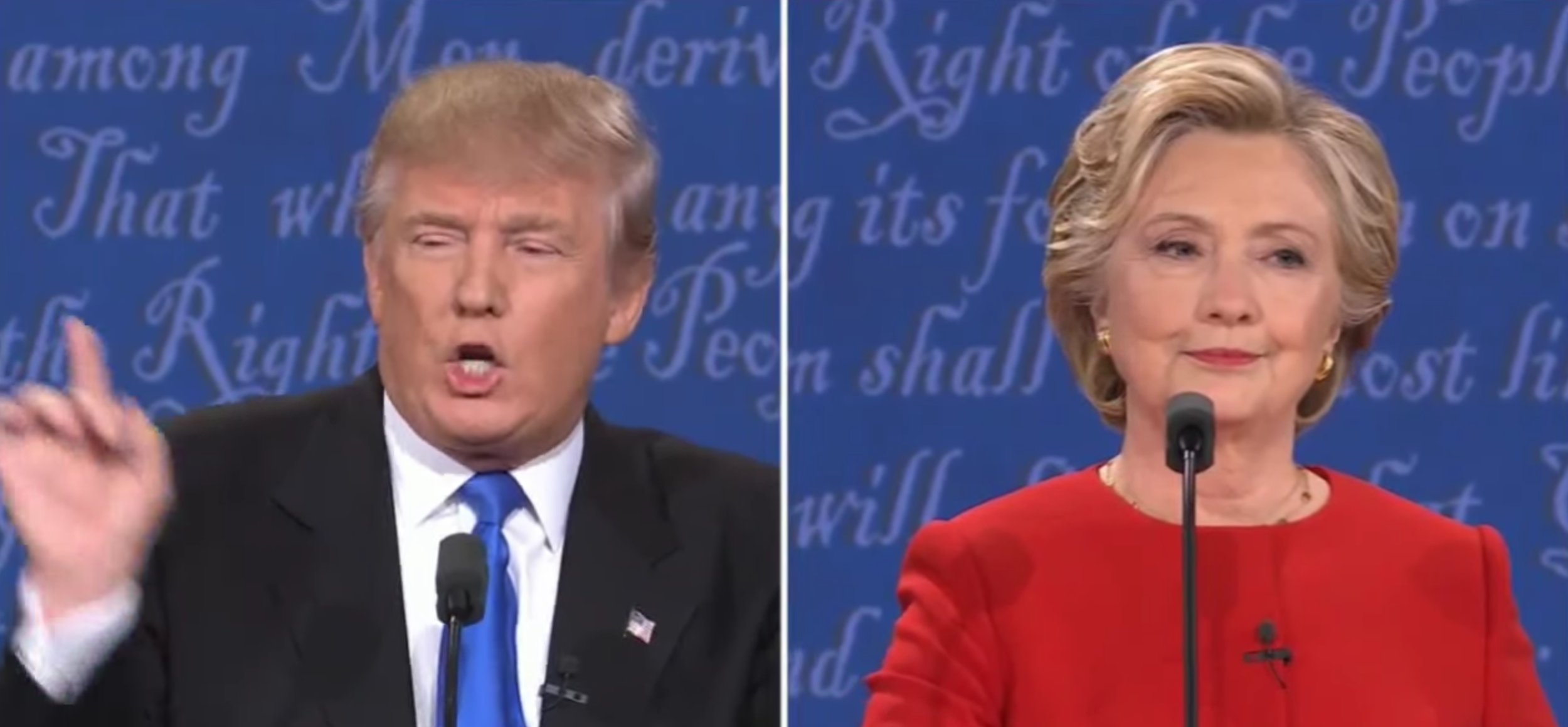
It is interesting to to see the side-by-side video shots of the presidential debate of last night.

Here is what you can learn from Hillary when confronted with an unpredictable debater:

  • Keep your posture
  • Maintain that "look" in your eyes at all time showing that you just stand above it all
  • Prepare: Donald is looking up pondering how to respond, Hillary is reading a prepared note with a response to an attack that she expected to come
  • Maintain the dominant audio track even when interrupted mid-sentence multiple time
  • Practice a whole stretch, be prepared to keep everything up for 90 minutes

The second debate will probably be more interesting as both candidates will have had the opportunity to analyze the first debate. You can watch the full version of the debate in this video.

SlideMagic: a platform for magical presentations. Free student plan available. LEARN MORE
The annual school performance

The annual school performance

It is that time of the year. Here are some things kids do, and you will recognise them in grown-up presentations as well:

  • "Press play", rattle down the lines to show that you can memorise things. You speak slower, softer when your memory needs to work harder. Eyes up to locate that next phrase.
  • Blank stare. You can't see the audience because of the stage lights, so you are not really looking at them.
  • No connection to the substance. You simply say the words without feeling their meaning.
  • "Bye". The moment you spoke the last word, you turn around and walk off stage

Art: The Country School, Winslow Homer, 1871 

SlideMagic: a platform for magical presentations. Free student plan available. LEARN MORE