Viewing entries in
Delivery

Everyone or no one

Everyone or no one

If everyone is on a Zoom connection, the meeting works, we have gotten used how to deal with the new setup. If a few people are present in person, and a some others are “Zooming in”, the meetings dynamics are broken.

When planning meetings for next year, think about the time, money, and the environment wasted in travel, and prioritize which meetings really have to be in person, and which ones can be done remote. If you go for in-person, everyone has to show up though. Another reason to think twice about that option

Photo by Marvin Meyer on Unsplash

SlideMagic: a platform for magical presentations. Free student plan available. LEARN MORE
Aide memoire

Aide memoire

The highschool teacher of my daughter handed out small cards to the class. Every student was allowed to fill it with whatever they feel like and take it to the upcoming test, or… sell it to the teacher for 3 points extra. The teacher’s sneaky strategy: making that card is actually 80% of the work of mastering the material for the test.

This is a bit like holding a small piece of paper in your hand during the wedding speech, or peaking at the speaker notes when doing a stand up presentation. In the world of Zoom, it can even be more blunt: lots of cheat sheets around your screen that nobody can see.

There are 2 ways to approach these cheat sheets:

  1. Write down the actual content that you want to remember, literally.

  2. Fill it with little hints that make you remember things.

The second strategy is more effective, it is easier to remember things, it takes less space (or time to look at your cheat monitor) and you will present things in a more natural way (reading out bullets from your speaker notes is even worse practice than reading them from your slide).

Maybe write “P.O.P.” or “pop” when the three words you need to remember start with a P, an O, and another P. This is similar to the strategy that memory champions use: put things you need to remember in an imaginary 3D space. (Number 42 sits under the pink elephant, next to the grand piano).

The result of this is that the cheat sheet is only relevant for you, other people don’t know the context. As a result, it is not a good strategy to simply copy the piece of paper of the best student in class and think you do not have to put in the hard work to pass the test.

Photo by Kelly Sikkema on Unsplash

SlideMagic: a platform for magical presentations. Free student plan available. LEARN MORE
Apple event - "auditorium camera position"

Apple event - "auditorium camera position"

Apple is known for setting the standard when it comes to product presentations. It is interesting to see what they produced in yesterday’s event within the constraints of COVID. A pre-recorded, pre-produced long-format “television commercial” without a live audience.

As we know from Zoom calls, webinars-style presentation of slides with a presenter voice over can be pretty boring. Adding a small picture-in-picture video of the presenter makes things a little bit more interesting, but it still does not capture the energy of a live presentation.

Apple used an auditorium-style camera position in some of the presentations:

Screen Shot 2021-04-21 at 10.24.52.png
Screen Shot 2021-04-21 at 10.26.44.png

This enables the speaker to walk around, to create a much more interesting presentation. Big budget, multiple camera editing completed the effort.

This is something you could copy, if your business has a large neutral wall, record yourself event without slides in the background, peeking at a small presenter laptop, and later on edit the slides in the background. Or if you have an amphitheater around (if you are a university student), you are lucky and can use that.

I guess this could also be a good idea for some future startup, that maybe can record you in a much smaller setting, and add the digitally created auditorium in a later stage. I see Prezi moving in the direction of video now, but it tries to make the slides more dynamic and exciting. I think this opposite approach is more effective: very calm slides with an energetic presenter.

SlideMagic: a platform for magical presentations. Free student plan available. LEARN MORE
Live demo in presentations, should you?

Live demo in presentations, should you?

It is tempting to show a live demo of your product in your pitch presentation: look, we have a real product, this is not just “slideware”.

There are downsides too though. Murphy’s law, if a technical issue could happen, it will happen, especially in important pitch presentations. Demoing a product involves all kind of time consuming steps that are not really adding to your pitch: log-in screens, clicking through various settings pages, loading dummy data. If you have only 20 minutes, each and every minute is very valuable. Fifteen minutes of demo might be too much.

So, what to do?

  • Include a series of relevant screen shots in your pitch deck that show the key features of the product. The objective is not proof of technology, just educating the audience what it is that you actually try to build. Choose the screens wisely and put them in the right sequence. Add arrows and markups to make things clear if needed. (App screens are not presentation slides).

  • If possible, have a live demo of your product running on your machine, and in that first 20 minute pitch, simply click through a few screens. The objective is not to use it to explain what you are trying to build, but proof that there is actual technology. “Look, here it is!”

  • If the audience is interested, schedule a second meeting that is entirely dedicated to demoing your product, leaving sufficient time for solving technical glitches.

Photo by Rhett Noonan on Unsplash

SlideMagic: a platform for magical presentations. Free student plan available. LEARN MORE
A better way to edit speaker notes

A better way to edit speaker notes

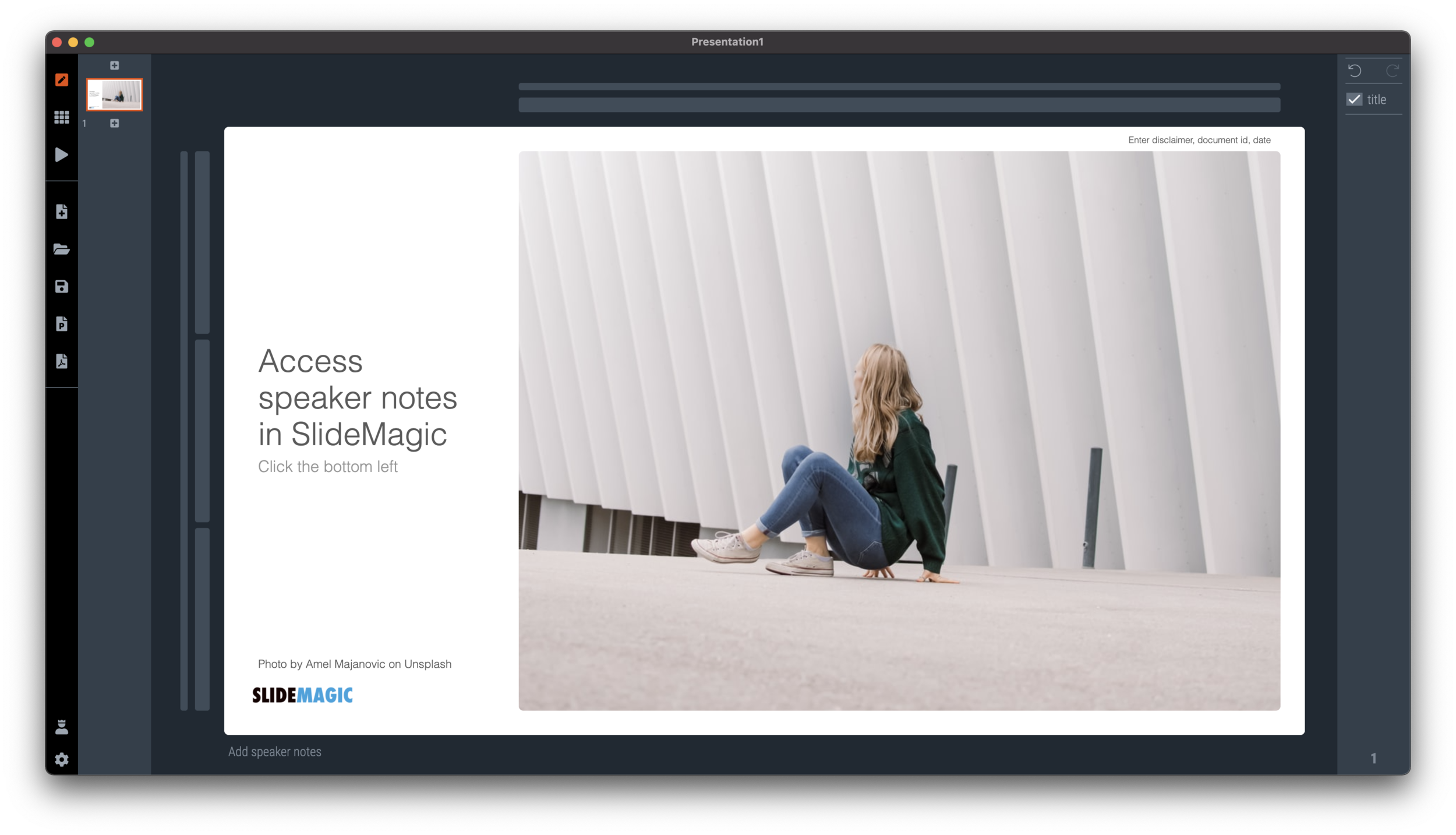
I made the user interface for speaker notes a bit clearer in version 2.6.12 of SlideMagic. The mysterious bullet point icon at the bottom of the slide has been replaced with a simple text link. Click and you will see a big and bold overlay over the slide where you can add your notes.

Screen Shot 2021-01-27 at 6.07.07.png
Screen Shot 2021-01-27 at 6.20.17.png

Speaker notes will show up in the presenter view window when you present the slides and are only visible to you the presenter, not to the audience. On a Zoom call, share the audience window to the video call participants, while you keep an eye on your private presenter view with important reminders of the points you want to make when presenting the slide.

Screen Shot 2021-01-27 at 6.10.39.png

In SlideMagic, you can edit your speaker notes also in this presenter view window. This is not only great for last minute fixes of your story, but also gives you a platform to edit the flow of your story slide by slide. Increase the size of your presenter view window, and click through your presentation. You see a small thumb of your slide, an even smaller one of the next slide up, and a big text box to write down your points.

Screen Shot 2021-01-27 at 6.25.13.png

When you return to the normal view of the slide, you will see that the speaker note edit link has changed colour, to remind you that there are speaker notes in this slide. This is important when you share .magic files with other users, because they will be able to read those speaker notes as well. (This prevents you from sending “Better not share our 50% churn with investors in the first presentation with investors if they do not ask for it….” to well, an investor attending your first presentation)

Screen Shot 2021-01-27 at 6.31.38.png

When convert a SlideMagic .magic file to PowerPoint .pptx (a ‘pro’ feature), the speaker notes will be transferred as well. (Of course, a PDF conversion will have no speaker notes.)

Screen Shot 2021-01-27 at 6.30.09.png

SlideMagic: a platform for magical presentations. Free student plan available. LEARN MORE
Making SlideMagic more Zoom-friendly

Making SlideMagic more Zoom-friendly

Up until now, playing a SlideMagic presentation would trigger a full screen view of your slide, plus second full screen window on the presenter machine (if available). Switching back and forth to full screen, swapping monitors can be a bit disorienting, and in the area of Zoom, it does not work well when you want to share your audience window, but not your presenter view.

Screen Shot 2021-01-06 at 10.10.07.png

As of version 2.6.3, entering a presentation will now always trigger 2 windows (not in full screen): the slide and a smaller presenter view with timer, counter, and a thumb of the next slide coming up. You can re-rearrange them to monitors as you see fit, and go to full screen manually if needed.

This also ‘solves’ the issue of deciding which screen is the audience screen, and which one the presenter’s when many on screen projectors (not replaced very frequently) have lower screen resolutions than most computers.

SlideMagic: a platform for magical presentations. Free student plan available. LEARN MORE
Appearance

Appearance

Wearing a mask in times of the virus (probably) protects you somewhat from catching the virus, (probably) protects others from you. Individually, the change in odds are probably not that big, but as a society as a whole (the perspective of the government), a small change in infection rate can have an incredibly positive impact (exponential mathematics).

But there is something else, a mask has a social function

  • A mask signals that it is not rude when you don’t shake my hand

  • A mask signals that you are probably a careful person in general and therefore OK to be with (from 1.5 meters distance)

  • A mask makes others think (feel guilty) whether to do the same

The mask signals who you are.

This ‘appearance’ also applies to your presentation. You can have the perfect story line, slides with little text, clear and crisp headlines. But the look and feel of your slides says a lot about the culture of you and your company, irrespective of their content.

With SlideMagic, the look and feel is sorted.

Photo by Fran Boloni on Unsplash

SlideMagic: a platform for magical presentations. Free student plan available. LEARN MORE
Why does Merkel's explanation work?

Why does Merkel's explanation work?

Why does Merkel’s explanation of the virus “R0” (basic reproduction number) work so well?

She makes abstract mathematical concepts very tangible. Instead of talking about R0 being 1.0 or 1.2 and the resulting number of patients, she explains:

  • If that ratio is 1, it means that every patient infects one other, hospitals are full in October

  • If that ratio is 1.2, it means that out of 5 patients, 4 infect another one each, and one infects another 2, we are out of beds in July

No graphs needed.

SlideMagic: a platform for magical presentations. Free student plan available. LEARN MORE
Now is the time to experiment

Now is the time to experiment

Everything gets thrown around at the moment. Everything is all of a sudden allowed. Laundry, pets, and kids in the background of video calls., no problem. Why not take the opportunity to change the way you present as well?

Sorry, I did not have a lot of time to prepare that 100-pager, but these 10 pages capture exactly what we should discuss today

And while you are at it, why not use SlideMagic as an alternative to PowerPoint now that everything is risk free? Hey, maybe some of the new habits will stick.

SlideMagic: a platform for magical presentations. Free student plan available. LEARN MORE
Getting to the point

Getting to the point

Everyone is working remotely The meeting is on an improvised video call. Less time to prepare the slide deck. People watching slides on small screens. There is less room for “escape behaviour”, request another sensitivity analysis, rephrase slide 25 to get back to it later.

The current situation might be a turning point in corporate communication. PowerPoint still holds the fact packs and the result of our analysis, built up over months, updated with the latest information. Then, there is the (virtual) meeting tomorrow where you have 5 minutes to make a point. “OK, what it all boils down to is this…”

And that’s where SlideMagic comes in: fast and simple.

Photo by Tommy Lisbin on Unsplash

SlideMagic: a platform for magical presentations. Free student plan available. LEARN MORE
When you got your story really memorised

When you got your story really memorised

Some more learning from last week’s music performance. When you think you have something memorised, you actually still have a long way to go.

Here is the process I went through with a pretty simple song, still it took time:

  1. Hit the right chords when reading the chord letters on a piece of paper

  2. Hit the right chords when starting the song from scratch, without paper

  3. Consistently getting the chords inversions and finger positioning right (rather than making them up each time you remember to place a chord)

  4. Being able to do the above with random interruptions, without starting from the start: a mistake (by you or a band member), a quick start-stop to rehearse a certain piece

  5. Not thinking at all about chords anymore, just hitting the right thing based on the lyrics, music you hear around you.

When you wing a story on the fly, prompted by a slide that you see on the projector, you are at stage 1 when it comes to presentation preparation, and have 4 more steps to go.

Photo by Wes Hicks on Unsplash

SlideMagic: a platform for magical presentations. Free student plan available. LEARN MORE
Getting your focus before a presentation

Getting your focus before a presentation

This weekend and family and me joined a professional group of musicians to give a performance on stage. It was interesting to watch how the band leader made sure all of us delivered the best of our abilities, all which apply to the world of delivering presentations as well:

  • The confidence boost to the singer who wakes up with a sore throat the day of the performance: reminding her (based on decades of experience) that when the body has to perform, it will (and it did.

  • Spotting and eliminating small logistics hick ups that do not matter in a rehearsal but can kill the flow of a live performance. Have water available to clear dry throats, making sure nobody trips over cables, and pulls out cables of instruments, where do people stand and move, where do people go when they are not part of a song, how do transitions between songs happen.

  • And finally, a small rerun of the set lists in a quiet room. Just focusing on the list of songs (which you already know) for a second is like rerunning a 30 minute rehearsal in your head, the mind gets the right focus.

Image credit: @yulesh

SlideMagic: a platform for magical presentations. Free student plan available. LEARN MORE
Stress-testing monitors

Stress-testing monitors

A critical feature of any presentation app is the management of screens when presenting for a live audience. The presentation needs to show up on the big screen, and if possible, the presenter windows with the slide count, next slide preview, and timer needs to pop up on the secondary monitor.

Messing with monitors under the stressful time pressure of standing in front of a waiting audience requires serious stress testing. I am now doing this for SlideMagic 2.0. Pulling out monitor cords mid-presentation, sticking them back in, closing windows. I removed many bugs, but there are still a few left (the dual operating system set up is causing some additional challenges).

Soon, I will have ironed them out all. But as a precaution, I might not go as far as PowerPoint or Keynote where the user does not see the presenter and audience windows explicitly. I will leave them visible as non-maximised windows so the user can find them and move them around if Murphy’s Law strikes.

To be continued.

SlideMagic: a platform for magical presentations. Free student plan available. LEARN MORE
Yes, I know...

Yes, I know...

The first few seconds of any presentation, the audience is not really paying attention to what you say, but rather checks out who the speaker in front of them is. Wow, that is a bright pink shirt, is she senior, he seems nervous…

A major distractor is vocal accents: where is she from? Often, accents can be so heavy that they start reminding us of characters in movies and/or other stereotypes. Yes, this is not politically correct, but you cannot help the brain making that connection.

I often “apologise” for that Dutch accent in a short opening intro explaining where I am from. If you are a French engineer, with a heave French accent, maybe you should acknowledge it with a smile and move on.

Photo by Titouan on Unsplash

SlideMagic: a platform for magical presentations. Free student plan available. LEARN MORE
Live audience questions

Live audience questions

In a huge keynote, audience questions are almost impossible. The practicalities of picking who can ask a question, getting a microphone to the person. The lottery of whether the question will actually be interesting or relevant, and/or whether the person is actually good at asking to the point questions. And what if no one actually responds to the famous speaker inviting questions?

Dedicated smartphone apps (or even Twitter) seem to solve part of these problems. Users have to be brief, don’t interrupt the live presentation, people can upvote things, and you can pre-populate question to get people started.

I have seen them in action. Often the questions are projected on a huge screen behind the speaker. But, that constantly changing huge screen is actually distracting, there is even a possibility of “background vandalism” for controversial speakers, and most of the times, the questions are actually ignored.

A solution? Use the system, but don’t put the questions on the main screen. Answer at least one question. But most importantly, use the questions that pop up to make other conference presentations more relevant. Questions are live feedback about what the audience actually wants to hear. If it cannot be used now, maybe it can help the next session.

Photo by Camylla Battani on Unsplash

SlideMagic: a platform for magical presentations. Free student plan available. LEARN MORE
Buzzwords from poor language?

Buzzwords from poor language?

Any business gathering, in any language is filled with hollow - English - buzzwords. Part of this is to blame on executives who want to show of by using "fancy" words. But a big part I think is simply people learning the new universal language in business: "Business English".

Business English is spoken by non-native English speakers, unlike proper English, it has a very small vocabulary and people are in need of finding words/verbs/concepts to express common things. You hear others speak Business English, you read documents online in Business English, you see YouTube videos in Business English. And hey you learn, this is how you communicate.

Business language and culture are also deeply linked I think. Overhearing a conference room discussion as an outsider might soon completely ridiculous in terms of buzzword use, but to everyone on the inside, these are just verbal shortcuts that sound perfectly normal, and everyone knows exactly what everyone means.

The challenge is to be aware of this when you start talking to people outside of this inner circle.


Cover image by Jakob Owens on Unsplash

SlideMagic: a platform for magical presentations. Free student plan available. LEARN MORE
The smartphone snap

The smartphone snap

People re-use slides for different audiences. And 10 years ago, you would still be able to skip a few slides quickly when they contain confidential information if - by accident - you forgot to delete the product roadmap that you used in last week's Board meeting. (Or you forgot to mark them as "hidden").

The smart phone with super high resolution cameras means that nothing is safe anymore. There is the accidental smartphone snap, but also the professional "slide harvesters" diligently recording every slide in your deck. An HD video just needs a millisecond to capture the slide that is being skipped.

Here are some other confidentiality pitfalls to watch out for:

  • Data that still sits in the underlying Excel sheets, even when you take the data labels of your chart
  • Hidden slides in presentation mode that are there for everyone to see when you send a PowerPoint file
  • Speaker notes
  • Collaborator comments
  • File names or URL names that can still persist in a document even after its is PDF-ed
  • Tiny footnotes that give away important information

Cover image by Ben White on Unsplash

SlideMagic: a platform for magical presentations. Free student plan available. LEARN MORE
Presentation = agenda

Presentation = agenda

In some cases, a stand up presentation is an emotional story telling performance that moves your audience to do something they did not know they wanted to do 60 minutes before.

However, not every presentation is like this. The majority of slides are presented in small conference rooms, the "trenches" of the economy, where middle management tries to get a decision agreed in the middle of opposing viewpoints, office politics, and interpersonal meeting dynamics.

In these meetings your deck is actually the agenda for that meeting. Make sure things get discussed, make sure people have the facts, make sure the right trade offs are presented, and make sure a decision is made in the end.

Think about this when putting your deck together. Which facts are obvious, which facts are disputed, what info is counter intuitive, what is likely to spark a big debate, what not, etc. etc.

The presenter is telling a story, but also orchestrating a number of humans.


Cover image by Vincent van Zalinge on Unsplash

SlideMagic: a platform for magical presentations. Free student plan available. LEARN MORE
Take the junior analyst to the CEO meeting?

Take the junior analyst to the CEO meeting?

Yesterday's meeting blog post made me think of an other topic: junior analysts (lots of them among my readers) and whether they should go to the meeting with the CEO or not.

During the early years of my McKinsey career, there were many, many occasions, where I did not get to go to meetings where my work would be presented, and it was explained to me that too many people in the room would harm the meeting dynamics. A valid point: sitting in a huge conference room full of consultants does not create the atmosphere for a candid discussion about strategy.

But there were other concerns my seniors might have had:

  • The junior analyst might not be able to present the slides, not having the right "CEO language", going of on a tangent, explaining how he did the analysis, without the so what
  • And even if we did not let the junior analyst present, he might come in with odd remarks that throws the discussion in the wrong direction, vent his uncomfortable feeling with the broad assumptions that were made in the analysis (that were actually justified), thereby undermining the credibility of the whole deck.

If you are just starting out as a consultant, it is worth your while thinking about the above. 

But there are advantages of taking a junior member to these meetings now and then (feel free to use the following with your seniors):

  • Taking turns makes sure that the entire 15 people team does not sit in the room at once
  • Analysts can actually learn a ton from these meetings that will make the whole team perform better:
    • You see how these analyses are actually used
    • You get to learn that CEO presentation skill that you can put to work even when presenting to more junior clients
    • You might come in handy when a very detailed question about the data comes up
    • You get credibility with your client team members
    • You will get a motivation boost
    • You will need less time briefing to follow up on next steps
    • (Junior analysts are always good at serving coffee, making copies when needed)

Good luck!


Cover image by Valeria Zoncoll on Unsplash

SlideMagic: a platform for magical presentations. Free student plan available. LEARN MORE