The cover page of a presentation is an important page. It sits on the projector as the audience walks in the room. It is featured in the thumbnail of an email attachment. It sets the look and feel of your presentation.
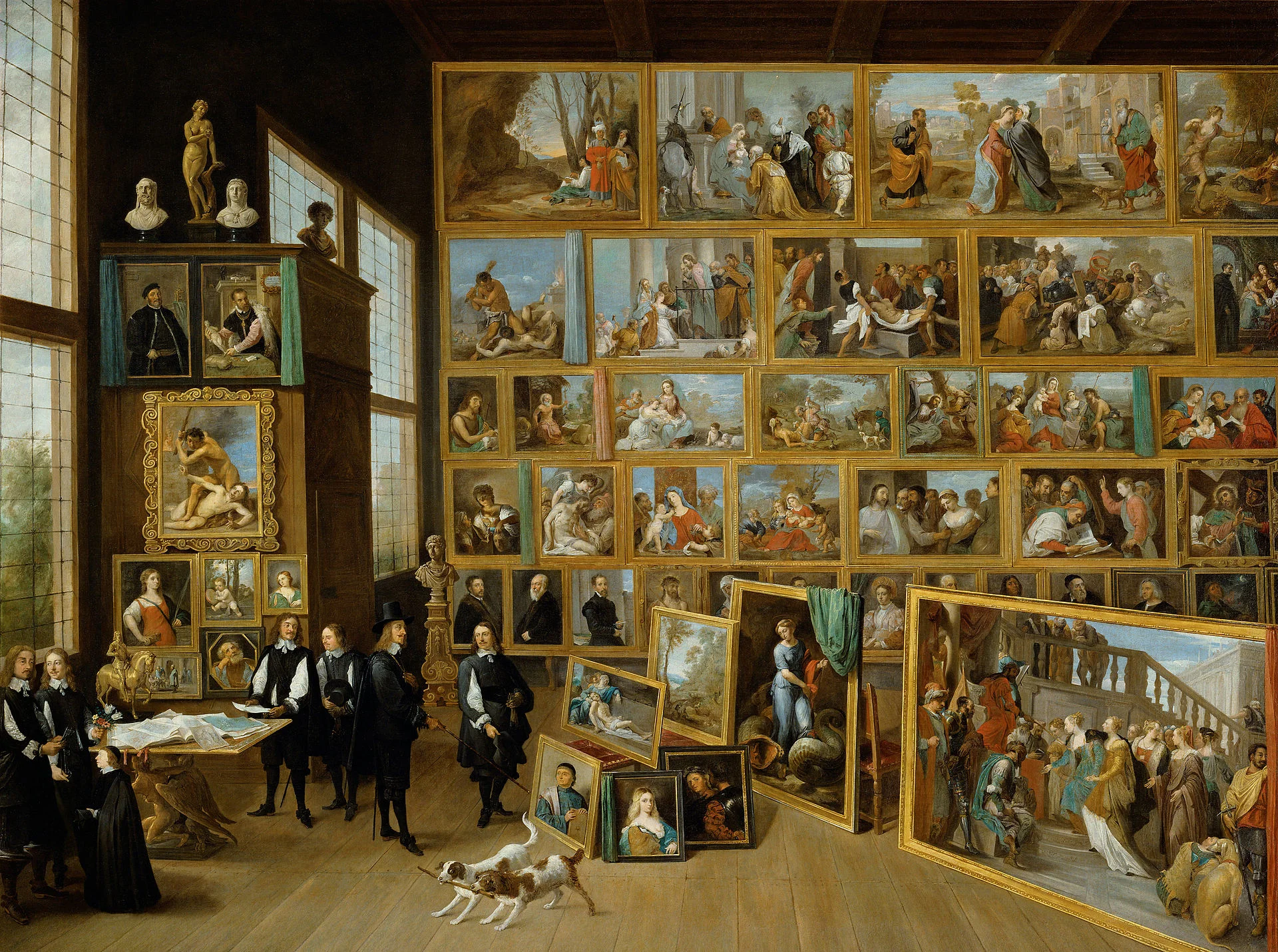
Many clients want to have a cover page that says it all. A perfect image that reflects the entire story. In the absence of this image (99% of the cases), they want to do the next best thing: make a collage of smaller images that together tell the story.
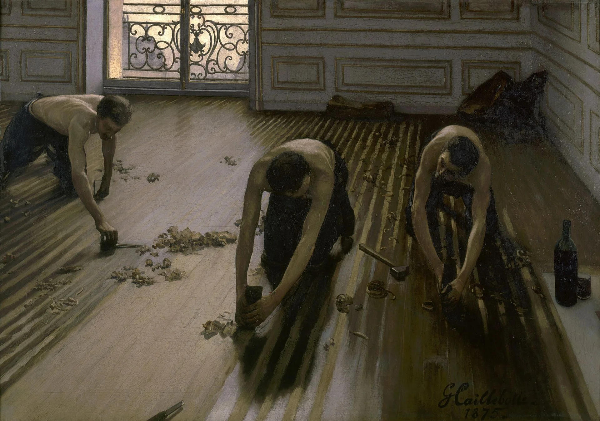
I think it is better to pick just one, imperfect, image as a cover page. A collage of tiny images without explanation does not mean anything to the audience, and looks very cluttered. If people could get your message by just looking at a picture collage for 15 seconds, there would be no need for your presentation?
Art: David Teniers, The art collection of Leopold, 1651


