Viewing entries in
Images

New image search habits

New image search habits

There are a number of problems with stock images:

  • Most of them are staged, cheesy, unrealistic images
  • Stock image search algorithms no push up results for photos that include some design elements (some words for example), stuff that is better being taken care of by the presentation designer
  • Many people are over doing the images, trying to use a photograph to visualise a concept that does not really need visualising. The result: an endless string of "stunning" images that distracts the audience rather than support your story
  • Stock images are so over-used that a presentation who uses them now almost look as bad as one that consist of list of bullets. It is an instant recognition: you see the first page of a bullet point presentation, you see the first page of a stock image presentation and you think "uh oh, the next 30 minutes it is going to be one like these"

Here are the steps I go through when trying to find an appropriate visual concept for a slide:

  1. Do I need an image at all? Or can a simple box composition with some text do the job?
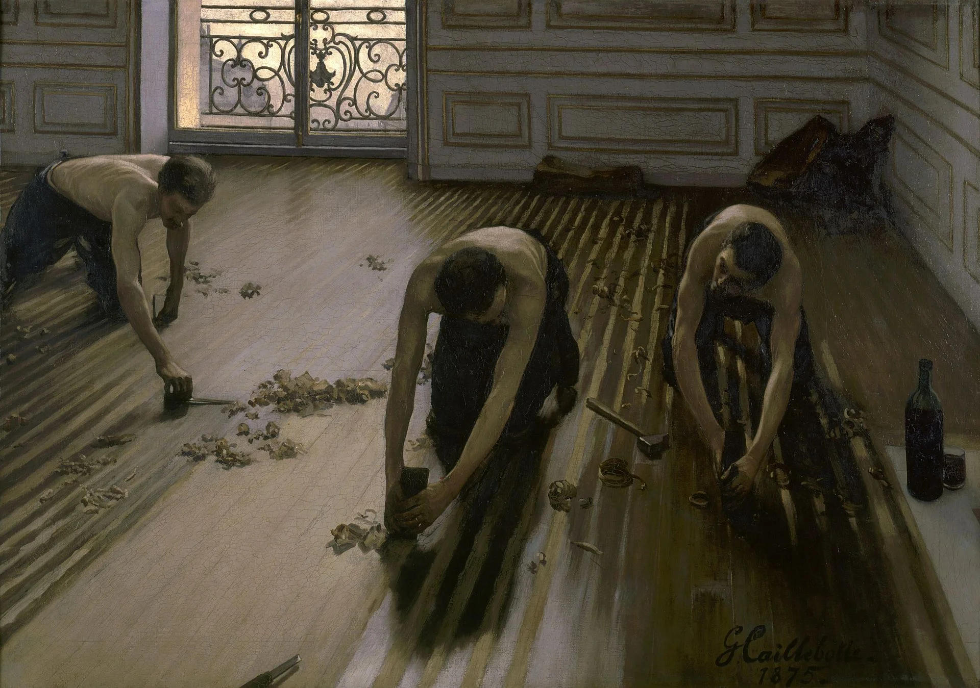
  2. If I need images, is there some consistent set of photographs I can use throughout the presentation? Art? People using mobile phones? Retro? Paris?
  3. Do a quick Google Image search with search tools set to "labeled for re-use" to see whether there are any good free/real images out there (always check the actual image for re-use rights, Google might have it wrong)
  4. Try some other free image sources (see my list of free image sources here).
  5. Dive into stock image sites

The free images that are available become better and better by the day. For icons and basic vector diagrams there is now almost a 100% hit rate.


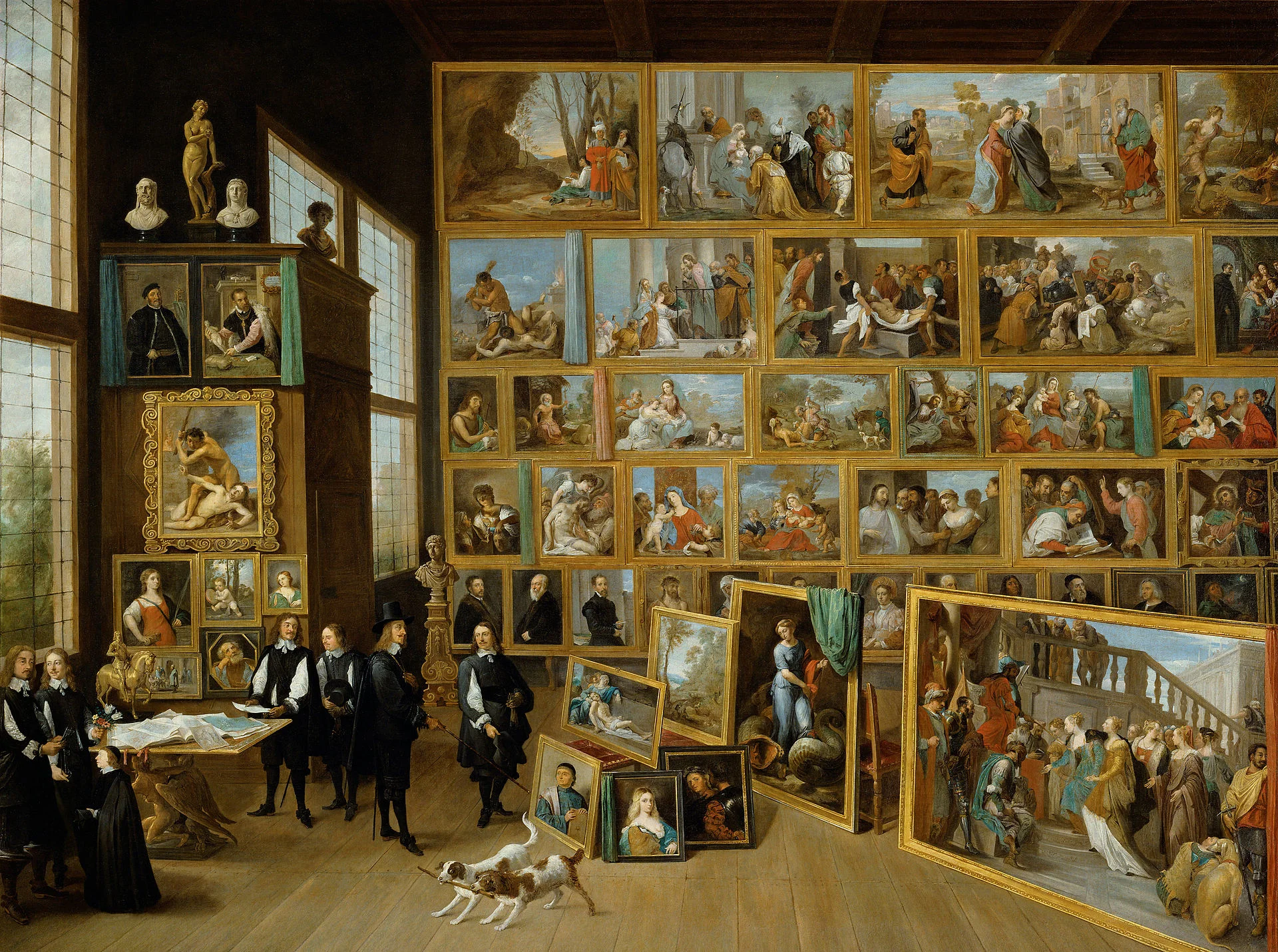
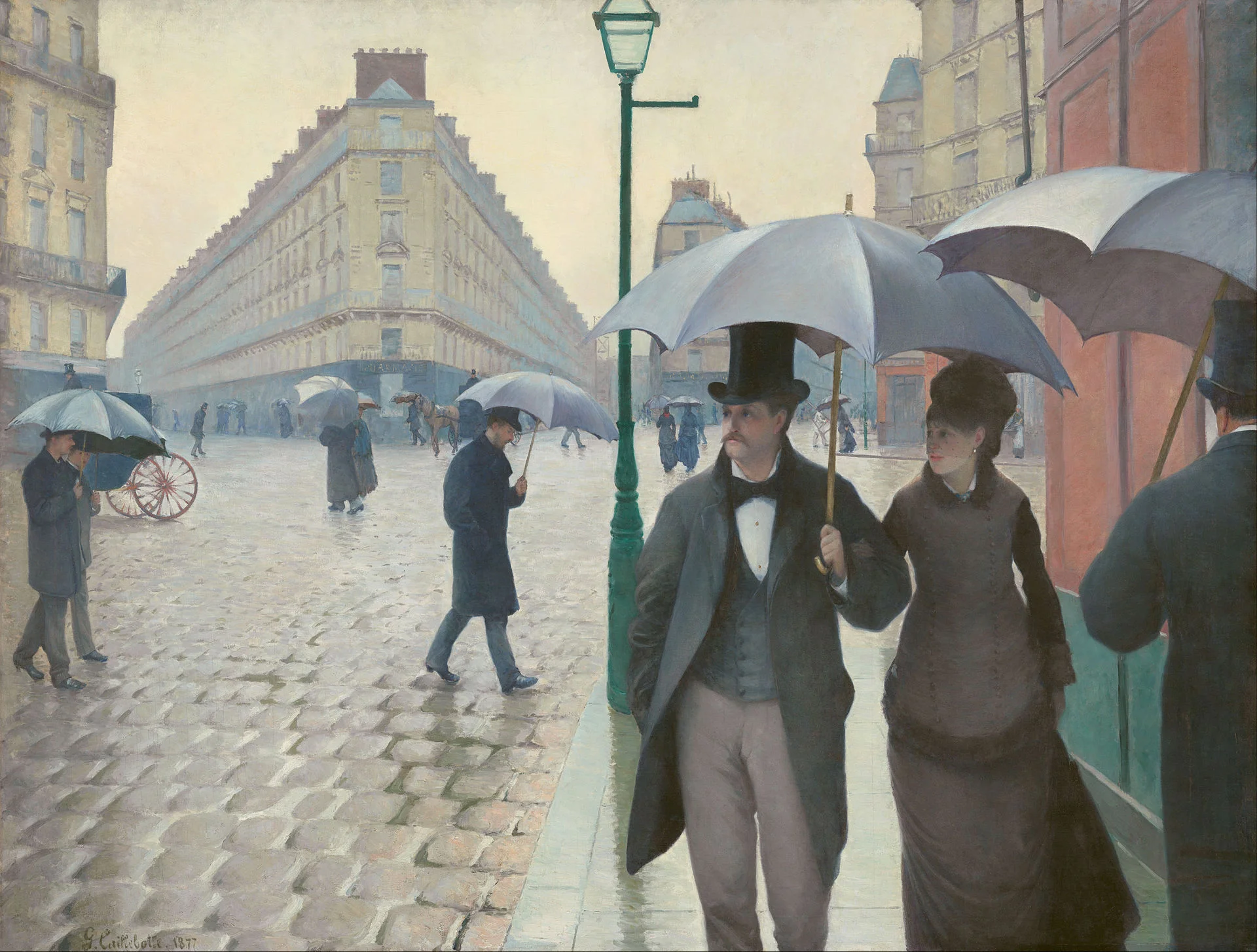
Art: Paris On a Rainy Day, Gustave Caillebotte . Sign up for SlideMagic, subscribe to this blog, follow on Twitter

SlideMagic: a platform for magical presentations. Free student plan available. LEARN MORE
Not every presentation slide needs an image

Not every presentation slide needs an image

Yes, visual slides with stunning images are more powerful than boring lists of long bullet points. But that does not mean that designing good presentations is the equivalent of finding a stunning image for every page (sorry).

  • A powerful quote can look beautiful on its own, in naked typography. The image of the person might distract the audience, especially if it is a relatively unknown author of an airport book best seller.
  • A simple information slide (here are the 3 priorities for next year), but just be best visualised with a simple list of 3 priorities. 
  • Section breaks can be done in 2 ways: a dramatic visual to show the transition, or an almost blank page that brings the attention of the audience back to you
  • It is very hard to find dozens of images that are more or less similar in style or look and feel. As a result, presentations with lots of images look inconsistent.

It does require though that you find a way to make a typography-only slide look good. A nice full colour plain background, and some elegant stealing from the Swiss graphics design masters in the 1960s is a good way to start.


SlideMagic: a platform for magical presentations. Free student plan available. LEARN MORE
Another free stock image site

Another free stock image site

I only now discovered startupstockphotos.com, a site with creative commons images of workplaces with a startup feel to it (aero chairs, lofts, Apple laptops, wooden tables). They look great! I added this source to my list of sources of free stock images.

Art: Degas, The Cotton Exchange, 1873

Click here to subscribe to this blog


SlideMagic: a platform for magical presentations. Free student plan available. LEARN MORE
The cover image that needs to say it all

The cover image that needs to say it all

The cover page of a presentation is an important page. It sits on the projector as the audience walks in the room. It is featured in the thumbnail of an email attachment. It sets the look and feel of your presentation.

Many clients want to have a cover page that says it all. A perfect image that reflects the entire story. In the absence of this image (99% of the cases), they want to do the next best thing: make a collage of smaller images that together tell the story.

I think it is better to pick just one, imperfect, image as a cover page. A collage of tiny images without explanation does not mean anything to the audience, and looks very cluttered. If people could get your message by just looking at a picture collage for 15 seconds, there would be no need for your presentation? 


Art: David Teniers, The art collection of Leopold, 1651

Click here to subscribe to the blog

SlideMagic: a platform for magical presentations. Free student plan available. LEARN MORE
Useful presentation design tools and resources

Useful presentation design tools and resources

As most of my clients outside Israel are enjoying the X-mas break, I have some time to clean up my web site further (no holiday here in Tel Aviv). I added a bunch of presentation design resources on the site.

  • Presentation design books. The flurry of new presentation design book releases seems to have faded a bit over the past years. Has all that needs to be said, been said, or did I miss anything?
  • Presentation design tools. A few neat software tools that can make the life of a presentation designer easier.
  • Sources of presentation images. There are more and more sites out there that offer free stock images under a creative commons license. These images are free, look real, BUT the library sizes are still small, and search is limited.
  • The blog search archive. Now that I moved away from Blogger, it is harder to add sidebars with search boxes, archive links, and tag clouds to the blog. Hence, the dedicated search page for access to 6.5 years of posts (more than 1700 in December 2014).

I hope you find it useful, and let me know suggestions to add more resources.


SlideMagic: a platform for magical presentations. Free student plan available. LEARN MORE