Viewing entries in
Layout

Counting the boxes

Counting the boxes

The first thing I do for almost any slide is "counting the boxes": how many points does each argument have, how many people are there on the team, how many layers to the technology, how many steps in the process.

This drives the layout of the slide: 2 columns with options and 3 arguments each, a 5-step value chain, a 6 x 4 grid of logos, 5 management bios next to each other, 10 columns of sales data, etc. This layout will make sure that your slide looks evenly spaced out. You are also see that in most cases, the (bullet point) list grid structure is actually not the one you need.

PowerPoint and Keynote do not have very strong grid capabilities. Spacing out equally sized boxes across a slide is a pain, and table editing is not much better. And that is why I made the grid structure the central feature of my own presentation app SlideMagic, try it out!


Art: Perspective boxPieter Janssens Elinga, 1623

SlideMagic: a platform for magical presentations. Free student plan available. LEARN MORE
"We need to add this bullet"

"We need to add this bullet"

Group editing of a slide deck is difficult, especially if it involves a lot of people, and especially if some of the people editing dial in from a remote location. If you do not have the full view of the presentation (either because you are far away, or you have not been involved in the process that much), you should resist the urge to ask the junior analyst to add "an extra bullet to the slide that say [fill in message]". There is a good chance that that point is already made on another slide.


Art: Dogs Playing Poker by C. M. Coolidge

SlideMagic: a platform for magical presentations. Free student plan available. LEARN MORE
Flatten those bullet point hierarchies

Flatten those bullet point hierarchies

They appear often in business presentations: hierarchies of bullet points:

  • A summary point that partly repeats what is said below
    • A sub summary point that partly repeats what is said below
      • A sub sub summary point that partly repeats what is said below

The worst of all bullet point sins: the lone bullet point that jut hangs there without a brother or sister.

Breaking up a problem/story in its components is great for solving problems: you can get a hypothesis quickly and carve up your team to work on each of the individual bits. They might even work as the skeleton of a presentation story flow.

On actual slides though, it is a different matter. These hierarchies are hard to read and process. You read the summary, read the supporting points, then combine the supporting points to internalise the summary again. Too much.

For a presentation, you need to flatten the bullet points. 

  • Kill bullet point hierarchies as much as possible, creating a linear flow
  • Then, spreading out each bullet point on a separate chart (as much as possible).

Ever wondered why my presentation app SlideMagic does not even feature the option of a bullet point?


SlideMagic: a platform for magical presentations. Free student plan available. LEARN MORE
What is wrong with your presentation summary page

What is wrong with your presentation summary page

In every client project, I try to get rid of the dreaded summary page in front of the presentation. Instead, I give a very clear description of what we are actually talking about, and a teaser of what the presentation is going to show.

Here is a check list of things I regularly see on first pages.

  • It is written in font size 8, in looooong sentences that stretch over the screen (especially on 16:9 wide screens)
  • It is an invitation to tell the entire story (too detailed for a summary, but not detailed enough to cover the content correctly)
  • It is written in chronological order, then we did this, then we did that, then we did this, rather than an order that makes sense to the audience
  • The same point / bit of information is repeated multiple times
  • It is loaded with quantitative data, but because of the text format, this data is impossible to understand / relate to each other
  • It contains dry information, and no encouragement what so ever to be excited about the content that is going to follow
  • It is full of values, mission statements, generic trends, buzzwords and other vague concepts that are context, rather than the core of your idea
  • It is full of details (number of employees, founding year, etc.) that are not a crucial part of the "summary" of your story
  • It has sub bullets, and worse bullets that have just 1 sub bullet hanging below it. It uses different font sizes for the main bullets, and the sub bullets. Bullets are not properly intended, (space space space space)

Art: detail of a painting by Gavin Rain

SlideMagic: a platform for magical presentations. Free student plan available. LEARN MORE
I like to frame images

I like to frame images

Big, confident images look better on a presentation slide. The maximum size of your image is achieved when you let it "bleed" of the page (the term comes from the age of print, where the ink would drip of the corner).

These full size images look great if your presentation is just images. In most cases, my client work is not. Hence, I prefer to frame my images within a box of white (or black). Some people say it is bad practice, I disagree:

  • You do not have to worry about legibility of slide titles
  • Photo slides look consistent with other slides in the presentation
  • I think, it actually looks very distinguised

My presentation app SlideMagic caters for both formats, so don't worry if you disagree with me. You can clone the slides below (and all other slides I have used on the blog) into your own SlideMagic presentation via this link.


The image was found on unsplash, free images under a do-whatever-you-want license

SlideMagic: a platform for magical presentations. Free student plan available. LEARN MORE
Lining up logos with tag lines

Lining up logos with tag lines

Often, graphics design is about details. It is difficult to pin down why something just does not look right. The answer: small little things. See the bottom of a magazine ad below. The logos on the left and right have tag lines/sub brands: above on the left, and below on the right. The graphics designer simply centred the image files, but our eyes wants to centre not the entire image, but the main text of the logo. It looks like the logo on the right is positioned too high.

If you cannot get excited by this you should not become a graphics designer...


Illustration: Gemini constellation

SlideMagic: a platform for magical presentations. Free student plan available. LEARN MORE
3 steps to a good slide

3 steps to a good slide

Here are the basic 3 steps to come to a good presentation slide. And for 2, you do not have to be a stellar designer to get them right. For step 3, you can use my presentation design app SlideMagic)

  1. Decide on one message, one message only. Here is where most people go wrong: they try to put more than one idea on a slide. Too many things to grasp at once, too much content/clutter on the slide. Only if your message is: "There are 15 reasons why you should stop smoking") might you consider a list of 15 small bullet points.
  2. Decide on a basic slide structure. The only structure most people use is the list. But there are other (simple) ones that you should consider. A contrast (box on the left, box on the right), a ranking (bar chart), an overlap (Venn diagram), pros and cons (table), cause effect. They are not that hard to put on a slide.
  3. Get the design right. Now, here it might be trickier for the layman. Fixing alignment, proportions, grids, colours, white space, etc. etc. SlideMagic users won't have to worry much about this, for everyone else, here are some of the guidelines I have implemented in SlideMagic:
    1. Everything lines up 
    2. Everything lines up according to a grid
    3. Calm colours: one accent, lots of shades of grey
    4. Safe (sans serif) font
    5. Slides look similar in one presentation (positioning of titles, margins, etc.)

There is no reason to get 1. or 2. wrong, and you can learn 3. over time.


Art: Silver Landscape, Photocollage by Gordon Rice

SlideMagic: a platform for magical presentations. Free student plan available. LEARN MORE
Image captions

Image captions

What do people read in text? Big headlines (if there are not too many of them), and tiny captions under a photo. So watch out what you put right under the image, people might read before the other beautiful things you have written down.

A screen shot from an article on TechCrunch

A screen shot from an article on TechCrunch


Art: In 1928-1929, Belgian artist René Magritte painted this piece called The Treachery of Images. Below the image of the pipe he painted the French words for "This is not a pipe." Photo by Daryl Mitchell on Flicker

SlideMagic: a platform for magical presentations. Free student plan available. LEARN MORE
The web page has become the style guide

The web page has become the style guide

A decade ago, a company's look & feel could be tightly controlled by the corporate communications department, with tight brand guidelines and consistently executed print advertising.

Today that design capability is fragmenting: PowerPoint presentations, product PDFs, web pages, mobile apps. Design is everywhere. Especially in large corporates that span multiple countries/continents it becomes hard to find what the corporate language actually is.

When in doubt, I revert to the corporate web page to get inspiration for a PowerPoint design.


Art: Gerard van Honthorst, The Concert, 1623

SlideMagic: a platform for magical presentations. Free student plan available. LEARN MORE
Designing presentations for print

Designing presentations for print

In some industry sectors, especially financial services, people still insist on printing the presentation slides and handing out booklets at the start of the meeting. You can have groups of 10-20 people sitting around a conference table flicking through pages.

It is great for taking notes, analysing detailed financials, but it is not that great for a close connection between speaker and audience, and that last minute typo in the name of the CEO cannot be corrected once on paper.

Sometimes you have to pick your battles and if print is the way to go, think about these issues when starting the design of your slides. The bottom line, get a slide to look good on paper on day 1 of the design project, not at 3AM the night before the meeting.

  • Colours appear different on screen than on paper, especially on cheaper, older, or almost-out-of-toner printers. Bright blue can turn into faded grey, lively orange can become girly pink, subtle grey shadings turn into bright white, just to name a few potential problems.
  • Hole punchers for binding machines require extra space at the top of your page, test it.
  • Dark back grounds empty toner cartridges and make make the fingers of your audience black.
  • You can get away with low res images on a 15 year old VGA overhead projector, on paper though, you will get caught. Use high resolution images.
  • A monitor frame, or the light rectangle on a projection screen provide an implicit frame for your slide. Paper should do the same in theory, but A4/letter/4:3 and other issues makes it highly unpredictable how your slides are scaled on paper. In the worst case you might have draw a tiny grey line around your slides to anchor things (yes really).

Professional print designers will laugh at all this, this is design 101, and these issues have long been solved with Adobe InDesign, and printer driver software. A whole industry has been built around this, you are unlikely to see page scaling issues in your print newspaper. The problem is, these designs are hard to maintain/change in a corporate environment.

The one good thing about print though is that it shows that your slides are as fresh as the croissants in the bakery down stairs if the pages are still warm from the printer. A compliment I got many times in my previous life as a management consultant.


Art: Vincent van Gogh, The Bakery in Noordstraat

SlideMagic: a platform for magical presentations. Free student plan available. LEARN MORE
Team introduction pages are not CVs

Team introduction pages are not CVs

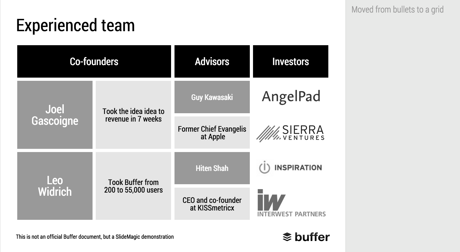
The team introduction page in a presentation is always a tricky one. Some much information (text) that can be shown, so many logos, so many pictures. How to make it all fit?

First of all, it is important to realise that team introduction slides do not equal CVs. They are not meant to provide the full background of someone's career, rather you want to present specific strong points of your team.

Things you can cut: personal interests, not every bio needs to cover every year of someone's career (unlike HR people that are always on the look out for holes), academic degrees if they are no longer that relevant (i.e., the person is older than 35). Job descriptions usually have very long titles (that makes them look more important). In your team slide, you need to do the opposite cut them down to save space.

Before you design your team introduction page, think about what it needs to say, and plan your design accordingly:

  • We worked at big blue chip companies before: put the logos of the big blue chip companies on the page (and leave other logos out)
  • We worked at the same companies: put the logos of these same companies multiple times on the slide (next to each team member's name), this repetition will drive the message home
  • We did something really amazing at a company no one has ever heard of: leave the logos out, go for a more elaborate text description
  • We have lots of experience with lots of companies: fill the page with logos, even if they are not that well-known
  • We worked at an amazing company that no one outside country [x] knows: forget about the logo, add explanation about that company

Photos can liven up a team introduction slide a lot. The best picture is a group shot that is stretched across the entire page. On top of this image you can add selective bio information for each person in the picture. Next best option: head shots. Make sure they are consistent in style and cropping. 

Whereas in a live pitch, or in a cold email deck, people will not dig through a dense CV, later on, they might want to do so. It is always a good idea to add dense bio page(s) in the appendix of your presentation, preferably with hot links to your LinkedIn profile if possible.

PS. Team slides are often the most tricky slides in a deck to design from a technical perspective: it is pain to get all the head shots of people in exactly the same size, and exactly aligned. There is one group of people who does not have that problem: SlideMagic beta testers. SlideMagic forces you (sorry) to work in a strict grid, images are always perfectly aligned and cropped. Sign up as a SlideMagic beta tester now.


Image: women's ice hockey team from 1921

SlideMagic: a platform for magical presentations. Free student plan available. LEARN MORE
Columns versus rows and other table design issues

Columns versus rows and other table design issues

When making a table, what to put in columns, what to put in rows? There is no absolute rule here, but this is what I consider when deciding (some of these can contradict each other).

  • It easier to fit lots of rows then lots of columns.
  • Long labels go in rows
  • Year on year trend: years go in columns
  • Feature/competitor comparison: features in the rows

The most important things is that you never should assume that the layout in which the source data was presented to you is the best way to put that table on a slide. Next to swapping rows and columns consider:

  • Shortening column labels
  • Re-sorting rows and columns so that check marks / similar table content is grouped together
  • Group together multiple rows, or multiple columns if their content is the same as the neighbour
  • Cut text as much as you can in table cells. Side comments and sentences can go in the footnote
  • Design a table at 2 levels: Level 1 (using colouring of cells) to communicate the pattern/conclusion, level 2 (using text) the explanation of the colouring for when people read the slides after the presentation
  • Harmonise column widths and row heights to get a grid pattern that is as calm as possible
  • Avoid boxes/outline lines, rather work with light grey boxes

Users of my presentation design app SlideMagic do not have to worry about a lot of these things, the app will do it form them. 


Art: Mondrian dresses by Yves Saint Laurent shown with a Mondrian painting in 1966.

SlideMagic: a platform for magical presentations. Free student plan available. LEARN MORE
Putting text on images

Putting text on images

This image that I saw on Twitter has composition problems that you often see in presentation slides:

  • The text in the box does not have enough breathing space,
  • The quotation marks disturb the balance and alignment of the text box
  • The line breaks are not placed carefully enough, breaking apart words that belong together.

I tried to come up with an alternative design in SlideMagic (which does not support the giant quotation marks [yet]). You clone these two slides to your own SlideMagic account here and use them in your presentations if you want. Image taken from WikiPedia.


Art: detail of the Mona Lisa

SlideMagic: a platform for magical presentations. Free student plan available. LEARN MORE
Adding structure to text

Adding structure to text

Sentences or titles never have the same length, so putting them on a page without some form of framing makes the whole slide look unbalanced. My solution: a light grey background  creates a box that gives structure to the text. You can also use images to reinforce the slide's grid layout. Many people use an outline, a frame around text for the same purpose. I think a light box fill looks a lot better.  

The light grey box is one of the key structuring elements in my presentation design app SlideMagic. Traditional presentation design software is not very well set up to changing grids of text boxes and images. Try doing it in PowerPoint, then try to do the same thing in SlideMagic.


Art: Piet Mondriaan, Broadway Boogie Woogie, 1942

SlideMagic: a platform for magical presentations. Free student plan available. LEARN MORE
Makeover of the Buffer pitch deck that landed them $500k

Makeover of the Buffer pitch deck that landed them $500k

When Googling for examples of VC pitch decks, the on that Buffer used to raise $500k in 2013 ranks high. I decided to give it the SlideMagic treatment: how would the deck have looked when the slides would have been created in SlideMagic.

  • I changed the slide design to fit SlideMagic
  • I did not change the slide content
  • I did not change the story flow

I have a few comments on the slides that I have put in the SlideMagic explanation boxes.

Here is the original:

Here is the same deck in SlideMagic. You can clone this presentation to your own SlideMagic account by clicking this link and use some of the slide concepts in your own presentations. I have also added this presentation as a template in SlideMagic's template library.


Art: Johann Zoffany paints a group of Englishmen in Rome for the Grand Tour, united only by their wealth and love of art; unlike most conversation pieces, this was not a commissioned work


SlideMagic: a platform for magical presentations. Free student plan available. LEARN MORE
"All presentations will look the same"

"All presentations will look the same"

I get this feedback from early SlideMagic beta testers. SlideMagic supports one accent colour, one font, and encourages you to work in a strict slide layout grid. For certain presentations, this feedback is valid. I think we will not see any Apple product launch presentations designed in SlideMagic (yet).

For 99% of presentations though, it is actually precisely what I tried to achieve:

  • When the software tool you use for presentations is incredibly simple, you spend most of your time worrying about the content rather than searching support web sites how to align the second line of a bullet point paragraph. I want 90% of SlideMagic users to master 100% of its features.
  • If all presentations use more or less the same visual concepts to show trade offs, contrasts, sales over time, etc. then people will be able to read and understand them quicker

Today, I would argue that PowerPoint presentations look more similar to each other than the SlideMagic decks: lists of bullet points on a white background using the standard Microsoft Office (olive, blue, red, green) colour scheme.

Below are examples how the same SlideMagic chart would look when used in different companies. You see the impact of consistent use of colours. All SlideMagic charts will be updated instantly after a colour and logo change.

Screenshot 2015-04-30 11.25.00.png

If you want to try SlideMagic for yourself, you can sign up here as a beta user.


Art: Salomon de Bray, The Twins Clara and Aelbert de Bray, 1646

SlideMagic: a platform for magical presentations. Free student plan available. LEARN MORE
Slide icons

Slide icons

Repeating the whole story of your presentation on the last slide is boring. You want to end with a "boom" and quickly remind people of the most important message in the presentation. I usually do that with repeating a key visual (just one). Using (the cliche) that a picture says more than a 1,000 words, the repeated image brings back the full richness of the discussion you had in one millisecond. Much more efficient than writing a bullet point.

If you have to repeat multiple messages, here is another trick: use small screen shots of slides. At the end, the audience does not need to be able to read the entire slide anymore. The thumbnail is a quick visual reminder of the content. Below an example that I created in SlideMagic.

I have added this slide design to the template file of all slides I created for the blog. You can open it in the SlideMagic app here and use it for your own designs. Just change the images.


Art: The Flute Concert of Sanssouci by Adolph Menzel, 1852, depicts Frederick playing the flute in his music room at SanssouciC. P. E. Bach accompanies him on the harpsichord.

SlideMagic: a platform for magical presentations. Free student plan available. LEARN MORE
Fancy management theory

Fancy management theory

Your Group CEO has asked you to present her your strategy for the next 3 years. While you have a pretty good idea what you want to do, you are not sure how to present it on slides. You call in the Internet to the rescue and Google delivers an endless stream of Harvard, McKinsey, and other management gurus' perspectives of what a strategy should contain.

The problem is when you put it on a slide, your strategy sounds like a page out of a management theory book. All is in there: visions, missions, governance, change management, stakeholder involvement. In the middle of all the buzzwords it is hard to find your own story.

The other way to present it? Do not use the frameworks to tell the big idea behind your strategy. Tell it in your own way. Once you have done that, use the fancy frameworks as a check list to compare your full strategic plan against. Have you thought about everything?

Frameworks are great for work planning, not for making convincing presentations.


Art: Nicolas de Largillierre, (Details of artist on Google Art Project), Portrait of a Boy in Fancy Dress, 1710. Sign up for SlideMagic, subscribe to this blog, follow on Twitter.

SlideMagic: a platform for magical presentations. Free student plan available. LEARN MORE
2x2 matrix clarity in presentations

2x2 matrix clarity in presentations

The 2x2 matrix is a favourite layout for differentiating yourself from others. 'We, the good guys, are in the top right corner".

But people sometime force the framework somewhat. If you are having trouble filling the bottom left box, consider using a Venn diagram (a "best of both worlds concept").

If it is going to be a 2x2 matrix and your axis choice is a bit tricky, write things out in full. Rather than "ease of deployment, low, high" consider ignoring the axis name and write the 2 categories: "Big system integration project", "Up and running in 5 minutes". You can also write explicitly in the 4 boxes what they are about (BCG did that with their brand matrix: "dogs, cows, stars, question marks")

Framework in pitch presentation are different from those in a micro economics Phd thesis.


UPDATE January 2018: we have now added 2x2 presentation templates to the SlideMagic template store.


Art: Peterka Vlada, Sunset at Liberty Square, Oil on canvas, 40x28 inches ( 100x70 cm ), 2012
Subscribe to this blog, follow me on Twitter

SlideMagic: a platform for magical presentations. Free student plan available. LEARN MORE
The final clean up

The final clean up

Some things to check once you think you have finished your presentation:

  • Are the fonts consistent throughout the presentation? Are have default Arials/Calibris managed to sneak in? 
  • Are font sizes in comparable boxes the same?
  • Are the headlines all in the same place on every slide?
  • Are objects in each slide aligned, and properly distributed?
  • Are the proper colours used on every slide, including data charts, or do you still see standard PowerPoint colours anywhere?
  • Are all images in the proper aspect ratio, without distortion?
  • Did you include an attribution to creative common images?
  • In case you will be displaying the presentation on another computer, have you checked Windows/Mac rendering issues? Sometimes fonts are rendered in slightly different sizes, causing words to drop to the second line.
  • Is data properly rounded up?

Now you see why SlideMagic has 1 font, 1 accent colour, and a strict grid that makes it impossible to misalign objects or put titles in the wrong places.


Art: Berthe Morisot, Hanging the Laundry out to Dry, 1875
Subscribe to this blog, follow me on Twitter

SlideMagic: a platform for magical presentations. Free student plan available. LEARN MORE