Viewing entries in
Software

New PowerPoint 2016 for Mac can beat Keynote

New PowerPoint 2016 for Mac can beat Keynote

The preview of the new Microsoft Office 2016 is out (finally) and I have installed it on my production machine letting it do all my presentation design work for clients. (You can download the Office 2016 preview here)

  • It looks beautiful. PowerPoint 2016 for Mac looks exactly the same as PowerPoint 2013 for Windows. A calm flat user interface. Working in a beautiful software environment always encourages you to create beautiful presentations.
  • The whole interface feels faster, snappier, and smoother, somehow. This is especially true for Excel. The current version of Excel for Mac has a highly annoying latency when entering data in cells. 
  • Subtle changes to the default colours and fonts. Gone are the boring olive greens of the old PowerPoint colour scheme. Calibri light looks great on Retina displays. Gone are the default gradients and drop shadows. Gone are the tick marks in data charts.
  • The commenting infrastructure is nice for collaboration with other people
  • Full integration with OneDrive cloud storage (if Microsoft has guts they should add Dropbox as well, and maybe even Google Drive).
  • Now PowerPoint gives suggested snap lines to place objects, automatically distributing and aligning things on your screen. 
  • The grid behaves more normal with a centimeter ruler. If you accidentally move a grid line (yes, this still happens) it is easy to move it back to the right position. 
  • Now text and shape backgrounds have the exact same colour rendering, an annoying bug in PowerPoint 2011, where despite selecting the same RGB value, colours on text and shapes would render differently.

There are a few important things that are missing:

  • The ability to customise the toolbar at the top (here is where I put my align and distribute buttons for example) (this was possible in PowerPoint 2011)
  • It is still not possible to embed fonts with a presentation saved in PowerPoint for Mac (it works on the Windows version)

I think PowerPoint 2016 is so good that it has gained the edge over Apple Keynote. Recent user interface changes in Keynote have made the workflow a bit slower. You need to navigate around too many menus to do basic things such as colour changes. Keynote looks nice and clean, but this organised UI comes at the expense of usability.

But before PowerPoint can take the trophy, some bugs that are still in the preview need to be ironed out. I am confident that Microsoft will be able to do this over the next few months until the official release. Here wo go:

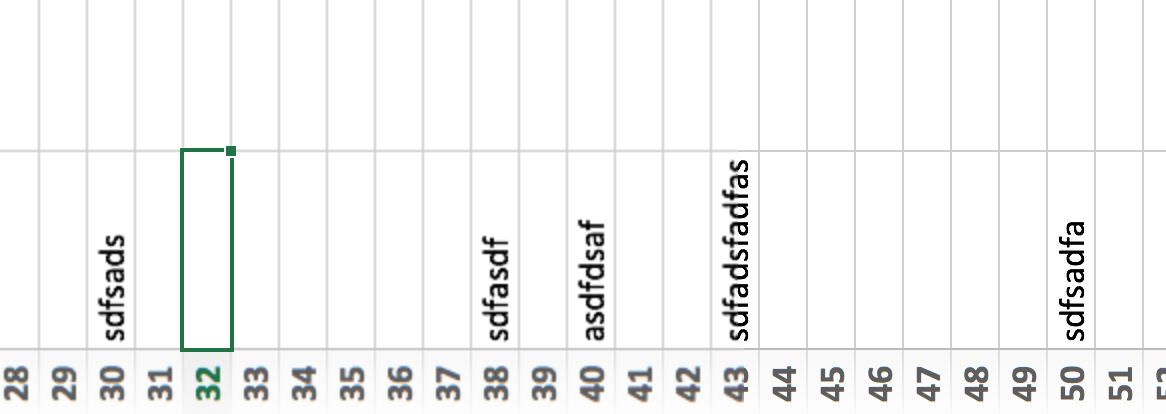
  • Font rendering: The software UI looks clean and crisp, but the presentation fonts look a bit fuzzy. In Excel, there is an inconsistency of fonts across the spreadsheet. It looks fine towards the top and bottom of the screen, but not in the middle. 
 
Fuzzy fonts on the slide (not in the software user interface)
 
Screenshot 2015-03-12 09.59.56.png
  • The colour picking is not completely fool proof, especially when you want to use it define new theme colours for your presentation
  • There are frequent crashes, save your work
  • Font variations to not come through as in PowerPoint 2011. For the Apple Helvetica font, the bold condensed variant does not pop up for example

But hey, you are developing a PowerPoint killer?

Correct (and therefore my review is biased), I think that PowerPoint and Keynote have too many features, and leave too much design freedom to a layman designer. The result: boring bullet point presentations. My presentation app SlideMagic is trying to address these issues. But that is a separate discussion.

UPDATE: This post was corrected, shape booleans are still present in PowerPoint 2016


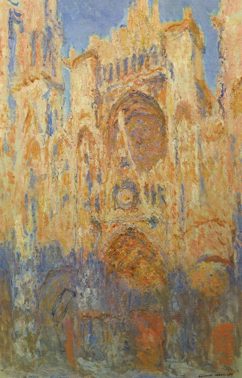
Art: Claude Monet, Rouen Cathedral, Facade (sunset), harmonie in gold and blue 1892-1894 Musée Marmottan Monet Paris, France. Sign up for SlideMagic, subscribe to this blog, follow me on Twitter

SlideMagic: a platform for magical presentations. Free student plan available. LEARN MORE
Rediscovering Evernote

Rediscovering Evernote

I was an early user of Evernote on a PC (a couple of years ago) and used it to organise bookmarks for reading later. Then I stopped using it for some reason until recently. Not as a bookmarking service, but to organise life across multiple devices. It has specific advantages over bookmarking sites, Dropbox/Box/iCloud/Google Drive, online presentation apps

  • My demo presentations. It is easy to maintain and access a folder with all my demo decks ready and up to date on all my devices. This is the folder that I set to sync/download to my devices so it is available without internet connectivity. I have run pitches on my iPhone to potential clients.
  • On the go note taking. Away from the office it is hard to capture stuff and not lose it. I use the Penultimate hand writing app for iPad that gets synced into Evernote. Evernote itself has notes screen where you can jot down quick thoughts (an idea for a blog post for example). The Evernote scan app (Scannable) is perfect for capturing receipts, doodles, and white boards. It is actually faster to search through hand written notes than typed ones.
  • Screenshots have become a big part of my design workflow. I just can't be bothered to convert between different image file formats. Skitch, the Evernote screen shot app has a very used cross hair few that the standard Mac function is missing.

I did not get paid a single $ for writing this (unfortunately).


Art: The Elephant Celebes by Max Ernst. Oil on canvas. 125.4 x 107.9 cm. Tate Gallery, London
Subscribe to this blog, follow me on Twitter

SlideMagic: a platform for magical presentations. Free student plan available. LEARN MORE
Your requests for SlideMagic templates

Your requests for SlideMagic templates

I am keen to make the templates in presentation software SlideMagic as useful as possible. Let me know if you have specific requests for templates and/or story flows that I should include. Two conditions for this free presentation design help:

  • You do not get angry with me when I could not find the time to work on your request and prioritised another template 
  • The result of your request will be publicly available for everyone to use, so strip it of any specific/confidential information

Send your requests to jan at slidemagic dot com, start with TEMPLATE PLEASE in the subject line.


Art: Henri Matisse, The Open Window, 1905
Subscribe to this blog, follow me on Twitter
SlideMagic: a platform for magical presentations. Free student plan available. LEARN MORE
The future of the PC

The future of the PC

Technology analyst Ben Evans was pondering the next possible revolution in computing platforms: the PC, the smartphone. This triggered me to give my thoughts about the future of the desktop or laptop computer (I will call them PC). I posted a quick comment, but will elaborate here a bit more.

It is important to separate device from the usage setting. There will always be a need for a creative, focussed work environment to capture your ideas. I do not think that we will ever witness the moment where we can do serious design work on the go on a small device. Creative means, focus, concentration, and an organised clutter free spacious environment.

No, smartphones and tables (current screen sizes) are not going to be the dominant platform for design work (that is why I am launching SlideMagic for bigger screens first).

Having said that, the PC as we know it could totally change. Design work requires some form of big visual interface, and some form of human-machine interaction. What is in between can be completely different from the form factor that we know today.

Technology might advance to such a level that all PC-type processing power, storage requirements, and power supply can easily fit in a smart phone-sized device. And I think that is the future. Everyone carries one piece of hardware with them that contains these functions, but also serves as a wrapper for our security credentials.

Screens could evolve drastically (remember that touch screens were the big driver behind the smartphone revolution). We could see very large tablet style devices for design work. But maybe e-ink technology will enable the creating of super thin, super light, paper-like foldable screens The same is true for keyboards and mouse controllers. Maybe that same screen can spread out in front of you and creates a combined input device and visual screen for your work?

Screen innovation should go along software user interface innovation. Many of today's productivity tools are still based on old working practices. Mouse-based drawing, type writer-style keyboards. 

SlideMagic is already working to innovate the user interface. Now the screens need to follow suit.


Art: Georges de la Tour, The Cheat, 1630

Click here to subscribe to this blog

SlideMagic: a platform for magical presentations. Free student plan available. LEARN MORE
SlideMagic is not Software

SlideMagic is not Software

I tend to look at it as a new business communication design language. When you give people simple building blocks they end up doing great things with it. Look at Lego. Look at Twitter. Constraints actually drive creativity.

I can see the confirmation that it works in the behaviour beta users. Advanced designers who are looking for the most advanced features miss certain functionality (but hey, check out that automatic light to dark background conversion). Some people are confused by the user interface which is radically different (read much more simple) than PowerPoint. But the user who makes a first effort to go through the dip and actually makes a presentation for real is hooked.

I could have written a book, created a training program, but I thought I would never get the reach that a web based tool could give. Hence the presentation design app SlideMagic.

So the ambition is not to remove PowerPoint from corporate desktops, it is bigger than that. The ambition is to change the way people talk to each other in business.


Art: Rene Magritte, La trahison des images, 1928–29, Image credit: Nad Renrel on Flickr.

Click here to subscribe to the blog

SlideMagic: a platform for magical presentations. Free student plan available. LEARN MORE
Designing presentations for retina displays

Designing presentations for retina displays

Typographers had big debates when Apple launched the first iPads and iPhones with retina displays ("Retina" is the marketing name for a screen with such a high pixel density that your eyes cannot see individual pixels anymore). Retina displays are obviously different from low resolution screens, but - as the typographers discovered - are also different from paper/print.

I now see similar issues with large retina monitors. A traditional PowerPoint presentation with an Arial or Calibri font looks somehow off. You need lighter, thinner, crisper fonts. Macs have Helvetica light installed, but Windows machines not. Drop shadows look "dirty". Outlines around boxes look too heavy.

My guess is that Microsoft will fix the font issue in upcoming releases of Windows and Office products. But, if we fix the issue for computer screens, we are still left with this huge install base of crappy VGA overhead projectors in corporate conference rooms that never get replaced...

If you are working on a really important, one off, presentation find out about the screen you are going to present on and test your design. 


SlideMagic: a platform for magical presentations. Free student plan available. LEARN MORE
No, online collaboration has not been solved yet

No, online collaboration has not been solved yet

SlideMagic is moving into the polishing phase, after which we can take off the invite-only beta sign up form the app. So far I have mainly focused on the slide design engine. Sloppy design is one big problem of modern business communication.

The other one is collaboration, version management, and sharing, which I am starting to think about more and more now. Email attachments are big. You are always looking for slides in old presentations. You can never keep track on how has access to your files in Dropbox. You are never sure that when you delete a file because of space constraints somewhere, it will also be deleted somewhere else. "Did I just share that file with the entire internet?" Where is that file in iCloud? Who remembers shared Lotus Notes databases from the 1990s? Mass multi-editor collaboration creates to the too-many-captains-on-ship problem.  Companies find it impossible to maintain clean slide templates, or up to date versions of slides. Full project management environments feel like corporate prisons where every action/edit has to go through an application.

There must be a smarter, much simpler, way to do this.


Art: Henri Matisse, Dance, 1910

Click here to subscribe to the blog

SlideMagic: a platform for magical presentations. Free student plan available. LEARN MORE
Speaker versus explanation notes on SlideMagic

Speaker versus explanation notes on SlideMagic

SlideMagic now has 2 types of notes for each slide:

  • Explanation notes can be added to the right of the slide (optionally) and are meant for explaining the content of the visual is nice fluid full sentences. In case the presenter cannot be there to explain things in person. They are nicely formatted.
  • Speaker notes are messy, huge bullets that serve as a reminder for the speaker during a live presentation. The bullets are visible to the speaker on the presenter window (not to the audience).


Art: George Jakobides, Two children playing peekaboo, 1895

Click here to subscribe to the blog

SlideMagic: a platform for magical presentations. Free student plan available. LEARN MORE
Useful presentation design tools and resources

Useful presentation design tools and resources

As most of my clients outside Israel are enjoying the X-mas break, I have some time to clean up my web site further (no holiday here in Tel Aviv). I added a bunch of presentation design resources on the site.

  • Presentation design books. The flurry of new presentation design book releases seems to have faded a bit over the past years. Has all that needs to be said, been said, or did I miss anything?
  • Presentation design tools. A few neat software tools that can make the life of a presentation designer easier.
  • Sources of presentation images. There are more and more sites out there that offer free stock images under a creative commons license. These images are free, look real, BUT the library sizes are still small, and search is limited.
  • The blog search archive. Now that I moved away from Blogger, it is harder to add sidebars with search boxes, archive links, and tag clouds to the blog. Hence, the dedicated search page for access to 6.5 years of posts (more than 1700 in December 2014).

I hope you find it useful, and let me know suggestions to add more resources.


SlideMagic: a platform for magical presentations. Free student plan available. LEARN MORE
Lawyers, politicians, doctors, priests, and corporate executives...

Lawyers, politicians, doctors, priests, and corporate executives...

...They all have their own traditional language. Complicated contracts, evasive and woolly statements, illegible prescriptions, religious books only written in Latin, and bullet point-filled PowerPoint presentations full of jargon and buzzwords. These languages were formed by tradition, and some may argue are here to protect a profession (who needs a lawyer when you can seal agreements with a simple paragraph?). 

And yes, I put business presentations in the same category. Change is already happening. Formal letters are replaced by short, informal emails. The woolly Microsoft Word long hand memo was replaced by PowerPoint bullets. And for very important presentations (1% of the total?), businesses start investing in visual, custom designed, presentations (the work I do under the Idea Transplant name)

But change can go further.  The other 99% of business presentations can be different as well. These documents do not have to be graphically stunning, loaded with the latest animation and zooming effects, or full of exciting video clips. They need to look good, and they need to have a clear, crisp, direct, visual language.

It requires a change in the corporate language that corporate executives are using. And making that change is hard. Requiring a new complicated piece of software for it would kill the change before it even starts. The idea behind my presentation design app SlideMagic is to stop comparing business language to that used by lawyers, politicians, doctors, and priests...

Art: Benjamin Ferrers, The Court of Chancery during the reign of George I, circa 1725

Click here to subscribe to the blog

SlideMagic: a platform for magical presentations. Free student plan available. LEARN MORE

Let's eradicate PowerPoint 2003

PowerPoint 2003 still uses the old MS Graph chart engine, and while PowerPoint 2003 probably does not run on any computer anymore, the slides created with it continue to live on. In many corporates, the same slides keep on getting updated with new numbers, sometimes for more than 10 years in a row.

So, in today's PPTX files we still see leftovers of MS Graph charts, almost like virus infections. Depending on the computer and software you are running, some of the following can happen:

  • Random resizing of charts
  • Random re-coloring of charts
  • But worst: a total crash of PowerPoint and loss of data

Here is the instinct I developed and I encourage you to do the same upon noticing an MS Graph chart:

  1. Hit save in PowerPoint
  2. Copy the slide with the virus
  3. (Shivrrrrr), right click and open the MS Graph in the duplicate
  4. Go to the data tab and copy the data in a blank excel sheet
  5. Hit save in PowerPoint
  6. (Pfffew) recreate the chart from scratch
  7. Hit save in PowerPoint
  8. Delete the MS Graph slides
  9. Hit save in PowerPoint

With a bit of help from all of you, PPT 2003/MS Graph charts should be eradicated in 5 years or so.

SlideMagic: a platform for magical presentations. Free student plan available. LEARN MORE