Viewing entries in
Story

Kawasaki: the only 10 slides you need in a pitch

Kawasaki: the only 10 slides you need in a pitch

Guy Kawasaki (the person behind the 10/20/30 rule) listed these 10 slides as the only ones you need in a startup pitch to investors. I agree and disagree with him.

I agree that these are more or less the 10 points you need to hit. But in order to hit these points, you might need more (visual) slides. Especially number 2: the problem/opportunity. A one slide explanation might not make the point emotionally. Or number 4: the magic, might take more than one slide.

The biggest problem is not which slides you need, the challenge is how to design them. Design is easy for the straightforward slides: title, business model, go-to-market, management team, projections. The other ones are a bit more tricky.


Art: Rothko number 10, sign up for SlideMagic, subscribe to this blog, follow on Twitter

SlideMagic: a platform for magical presentations. Free student plan available. LEARN MORE
"Let's start with the slide headlines"

"Let's start with the slide headlines"

This is often how a manager starts a presentation design exercise. For her, it feels very comfortable: the 20 slides are in production, just fill them out, everything is under control. In the next meeting we can check against the agreed headlines and point out empty spots that still need to be completed.

Here is why I usually skip this stage of a project:

  • The slide headlines you can come up with at the start of a project are usually, hollow and descriptive: the market, the competitive advantage, the financials, the team. They do not contain any content
  • Even if you were to push them one level further (3 meetings later), you focus the attention of your manager on editing headlines and shuffling slides. There is the hard to resist urge to word smith the language for endless flow iterations. Still without the actual meat of the presentation.
  • "Empty" slide headlines are great to carve up a piece of work. Team member A gets this data, team member B focuses on that. But, creating the logical fact pack that solves the problem is different from creating the emotional presentation that will convince people to act upon the audience.

So, I actually dive straight in. Create the key slide that hammers home the key point of the presentation. I add backups that support this point (for example a new way to look at the competitive positioning in detail). I add place holders for less important stuff: the work plan going forward, the financials. These can be filled out later.

Meetings that discuss substance are so much more interesting and useful than meetings that discuss process, empty headlines and story flows of empty slides. 


Art: Gray and Gold, John Rogers Cox, 1942. Sign up for SlideMagic, subscribe to this blog, follow me on Twitter.

SlideMagic: a platform for magical presentations. Free student plan available. LEARN MORE
"We can skip the problem"

"We can skip the problem"

Often, this is what a confident sales rep says when discussing the brief for a sales presentation. For industry insiders, it is true that you do not have to elaborate much about issues they already know. But I think plunging straight into features, benefits, and solutions is the wrong approach.

It is much easier to sell a problem than to sell a solution. Almost all my sales and investor presentations elaborate on the problem.

  • For sales presentations, it is a good opportunity to discuss individual issues the client has. The best sales presentations talk about the client, and not about the seller. Even if it is old news for the audience, it is good to start your story on common ground. And most importantly, I often present the solution using a slide layout that I already introduced during the problem part of the presentation. "Here is that same slide we discussed before but now with that big messy part ripped out".
  • For investor presentations, you actually need to educate the audience about the issue that your innovation is solving. So here the problem section is actually very important.

So, next time push back when they tell you to skip the problem.


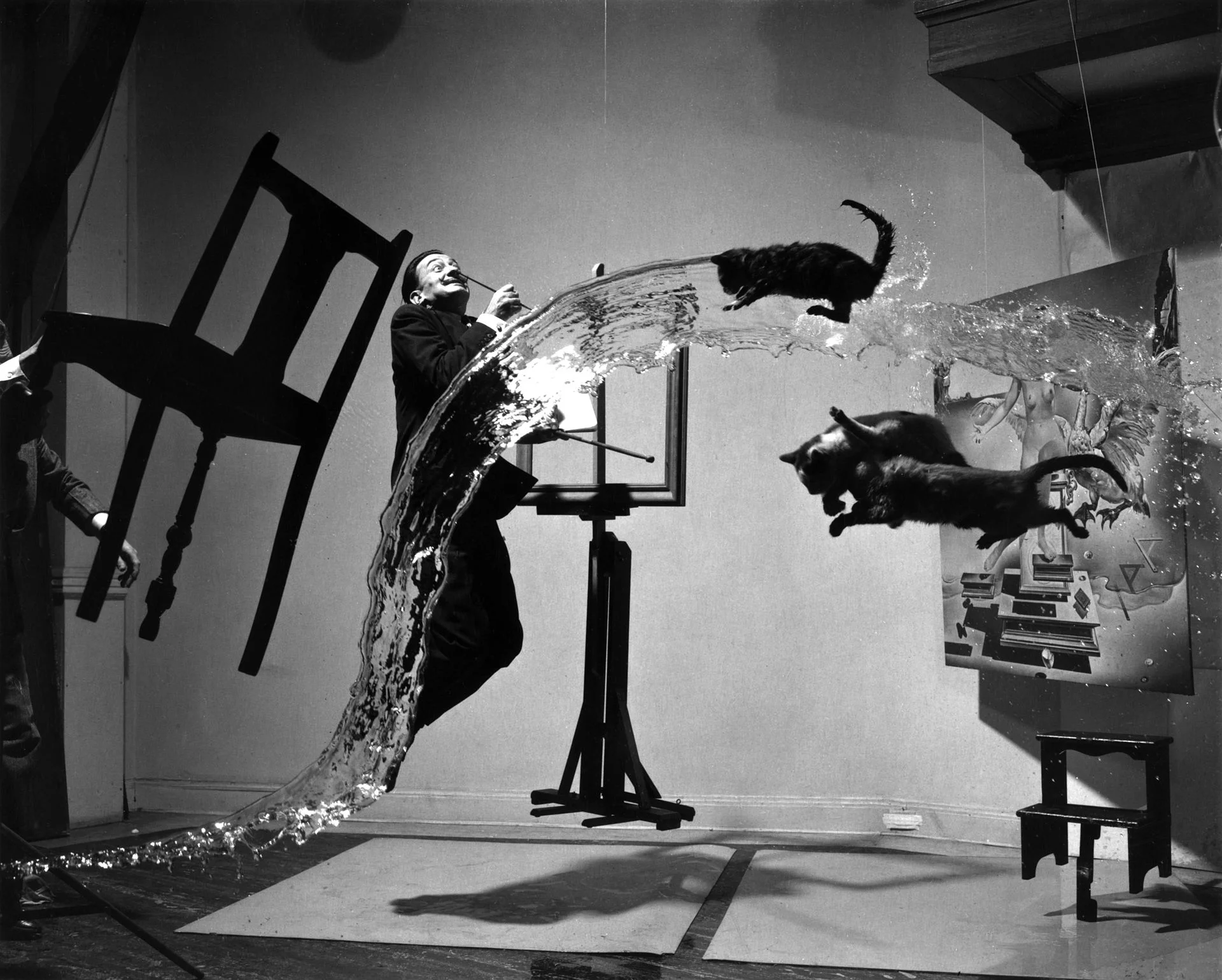
Art: Dalí Atomicus (1948) by Halsman in an un-retouched version
Subscribe to this blog, follow me on Twitter

SlideMagic: a platform for magical presentations. Free student plan available. LEARN MORE
You cannot force creativity

You cannot force creativity

I tend to work on presentation design projects in bursts: dive in, get stuck, put it away, work on another project, get back to it, put it away again.

Even when you stop working on something consciously, your subconscious mind continues to chew on things. This article discusses recent research that proves that the subconscious brain can solve real problems.

There is another benefit of this delayed approach. When you get back into things some details of the story have faded to the background a bit. It is this "numb" state of mind that is useful to piece together the story that really matters, you have to explain it to yourself again and it might come out clearer without the distraction of these details. In addition, other details might come to the forefront which you thoughts were not important.

All of this explains why presentations that are created at 3AM at night before the 9AM meeting are not very creative (most management consulting projects). It also explains why an outsider or senior executive/partner can walk into a room and articulate a story much better in 3 minutes than an entire team who has been working on it 24/7 for the past 3 months. It not all experience, it is also being able to take some distance from the subject.

What to do? Start thinking early about the presentation of your results. The problem of how to communicate your project, is a different one from the problem that your project solved (read that sentence again). While you still might end up finishing your presentation at 3AM, if you started early enough to think about it, your presentation will be much more effective. 


Art: The Inspiration of Saint Matthew by Caravaggio, 1602
Subscribe to this blog, follow me on Twitter

SlideMagic: a platform for magical presentations. Free student plan available. LEARN MORE
Benefits versus features: the cart before the horse?

Benefits versus features: the cart before the horse?

Benefits of enterprise high tech products are usually pretty similar: you save cost, time, increase productivity, security, scalability, flexibility. Starting your presentation with these benefits will not really make them stick. Everyone is saying exactly the same thing on their page 1 of the their presentation.

You have to reveal a bit of what it is you do before plunging into the benefits. "We automate all manual processes in order picking". Right, now I can see where all these benefits come from and tell me how big they are.

In business and marketing seminars we are always told to talk benefits, not features. Talking product gets you boxed in as too detailed, too middle management, too engineering, too much missing the big picture.

I disagree, people who have a story with real substance have an edge here. There is too much hollow marketing speak out there.


Art: Edgar Degas, Aux courses en province (At the Races in the Country) c. 1872; Museum of Fine Arts, Boston 
Subscribe to this blog, follow me on Twitter

SlideMagic: a platform for magical presentations. Free student plan available. LEARN MORE
Convincing the center

Convincing the center

Here in Israel the election campaign is in full swing with mud slinging and charged advertising campaigns everywhere. The surprising thing is that very little effort is targeted at convincing the voter at the political centrum, because she will decide the election.

Targeting your existing supporters with messages they already have bought in to will get you lots of likes and support, but will make little impact on new potential voters. Think about those voters that sit on the edge, how can you tip the balance in your favour?

The same is true for almost any presentation. Your followers are already on your side. The haters will never agree. You need to target the ones that have not decided yet. 


Art:  Annibale Carracci, The Choice Of Hercules, 1596
Subscribe to this blog, follow me on Twitter

SlideMagic: a platform for magical presentations. Free student plan available. LEARN MORE
Do they care how you are organised?

Do they care how you are organised?

Many corporate presentations include organisation charts, what are the main business units, and who are the people running them, and who reports to whom.

For some presentations, this relevant. If you are trying to sell a company or a business unit, it is important to see the people assets that an acquirer is getting. If you are presenting to a financial analyst it is important that she knows what financial data belongs to what business unit.

If you are trying to explain what your company does however, the organisation chart might not be the best way to do that. Most of the times, there is not a 1-1 match between business units and products. There are far more exciting ways to present what your company does than organisation chart boxes.

To you, the structure of your organisation is really important. The audience is likely to have another view.


Art: "Puppet Show", a painting by Chinese artist Liu Songnian (1174-1224 AD)

Click here to subscribe to this blog

SlideMagic: a platform for magical presentations. Free student plan available. LEARN MORE
One case study throughout

One case study throughout

Case studies or examples are a great way to explain your idea or technology. And by case study I mean something different than the empty, generic, meaningless quotes you find in many technology white papers. We need real stories.

Wherever possible, I try to stick to one big case study throughout the presentation, avoiding many smaller case studies. I can use this one case study to highlight different aspects of the technology.

  • It saves time, I do not have to introduce a new story setting all the time
  • It saves time, because I can re-use visual concepts. (For example, the red stars are the dangerous computer viruses)
  • I can afford to take a really detailed deep dive if needed
  • In case of complex science (healthcare technology for example) I can afford to take the time to introduce a few advanced scientific concepts and use them throughout my presentation
  • Images and visuals will look consistent throughout the presentation

The key challenge in these type of presentations is not so much the visual design, it is finding that case study that says it all. And once you are thinking about that, you are actually trying to find your story,


SlideMagic: a platform for magical presentations. Free student plan available. LEARN MORE
When to use tracker icons on presentation slides

When to use tracker icons on presentation slides

Consulting presentations often use a little icon on the top right corner that is a miniaturised version of some framework. As you click through different sections of the presentations, another part of the icons gets highlighted. The "tracker".

When to use, and when not to use a tracker?

  • Your short 20 minute pitch should be such an exciting naturally flowing story, that trackers should not be necessary, at least not on every page. If you feel that you need to remind the audience of where they are in the story, use full-page repeats of the framework, with different sections highlighted
  • In very long presentations, and especially presentations that are intended for reading, a tracker can be useful. The tracker has more of a reference function. Keep your finger on page down and stop when the right part of the icon gets highlighted. In these cases, keep the tracker really, really, small to minimise the damage to screen real estate.

Often you might find that early on in the design process you feel a need to use trackers (because you do not understand the story structure very well yourself), and as you progress, your confidence to take the trackers of increases.


Art: Léon Cogniet, oil sketch for details of Scenes of July 1830

Click here to subscribe to this blog

SlideMagic: a platform for magical presentations. Free student plan available. LEARN MORE
"Here is where I always stop..."

"Here is where I always stop..."

If you find yourself interrupting your story flow repeatedly at a certain point in your presentation, it is probably time to review the story line. Why not create visuals that support that important breaking point in the presentation?

Most story flows start with a logical sequence/structure, but sometimes we find out in the dialogue with the audience that they are missing an important piece of data or background early on in the story. After 10 runs of the presentation, and 10 questions, we pre-empt the question the 11th time.

Break the logic to build the story.


SlideMagic: a platform for magical presentations. Free student plan available. LEARN MORE
The excitement sapper on the last page

The excitement sapper on the last page

A good pitch should be a crescendo of energy and excitement. Ideally it goes up all the way through the story. But it is hard to avoid even for the best story tellers that in the middle of the presentation the audience attention drops a bit. Make sure to bring everyone back to the tip of their chairs at the end tough.

A sure energy sapper is a last presentation slide full of bullet points that recap the entire presentation. "Oh no, he is going to read out the entire thing!" When the presenter is at bullet 2, the audience has finished reading the entire page full of things they already heard over the past 20 minutes.

A better approach is to repeat one crucial visual, diagram, image on the last page that reflects a key point in your presentation. It will be visual memory anchor point for your entire presentation. 


Art: Paul Klee, The Red Balloon, 1922

Click here to subscribe to the blog

SlideMagic: a platform for magical presentations. Free student plan available. LEARN MORE
Lawyers, politicians, doctors, priests, and corporate executives...

Lawyers, politicians, doctors, priests, and corporate executives...

...They all have their own traditional language. Complicated contracts, evasive and woolly statements, illegible prescriptions, religious books only written in Latin, and bullet point-filled PowerPoint presentations full of jargon and buzzwords. These languages were formed by tradition, and some may argue are here to protect a profession (who needs a lawyer when you can seal agreements with a simple paragraph?). 

And yes, I put business presentations in the same category. Change is already happening. Formal letters are replaced by short, informal emails. The woolly Microsoft Word long hand memo was replaced by PowerPoint bullets. And for very important presentations (1% of the total?), businesses start investing in visual, custom designed, presentations (the work I do under the Idea Transplant name)

But change can go further.  The other 99% of business presentations can be different as well. These documents do not have to be graphically stunning, loaded with the latest animation and zooming effects, or full of exciting video clips. They need to look good, and they need to have a clear, crisp, direct, visual language.

It requires a change in the corporate language that corporate executives are using. And making that change is hard. Requiring a new complicated piece of software for it would kill the change before it even starts. The idea behind my presentation design app SlideMagic is to stop comparing business language to that used by lawyers, politicians, doctors, and priests...

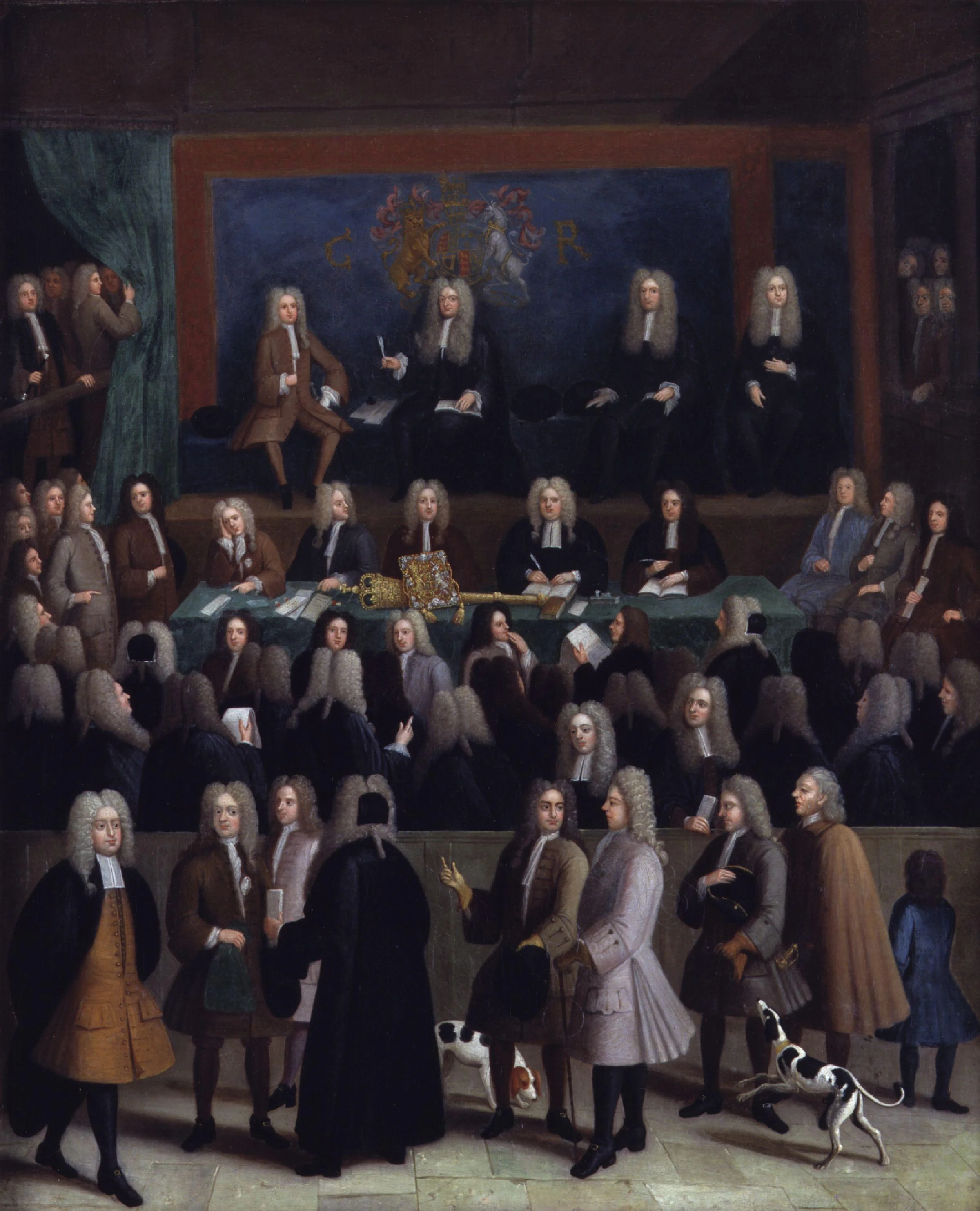
Art: Benjamin Ferrers, The Court of Chancery during the reign of George I, circa 1725

Click here to subscribe to the blog

SlideMagic: a platform for magical presentations. Free student plan available. LEARN MORE