Viewing entries in
Story

Management vocabulary

Management vocabulary

This picture by Anouk Zwager has an interesting list of common management vocabulary in the Netherlands. Part of these words sound perfectly fine to an English speaking audience, but in a Dutch context, with many words in the Dutch language available it just does not feel right.

I will try to translate, some of them might not work:

  • To roll out
  • To make an areal approach
  • To hook up
  • To smack on something
  • To sound board (verb)
  • To hit a marker stick in the ground
  • "Bila" short for bilateral discussion
  • To benchmark
  • To level
  • To secure (like you do with a ship wreck)
  • Low hanging fruit
  • Quick wins
  • To scale up
  • To wrestle
  • To harmonize
  • To shoot at something
  • Commitment
  • To press ahead
  • To shoot on goal
  • To tick the box
  • To hit the gas
  • Hands on
  • To "further develop"
  • To crystallise
  • To adjust downwards
  • Out of the box
  • To "communicate further"
  • Pro-active

SlideMagic: a platform for magical presentations. Free student plan available. LEARN MORE
Spending time on the problem

Spending time on the problem

In a pitch there is always pressure to keep things as short as possible. It is therefore tempting to compress the problem you are solving is as few words as possible: "[x] is not very flexible", because hey, people know this, right?

I tend to drag out the problem section of the pitch a bit:

  • Remind people of the problem in an emotional way, that they "feel" it, usually with a picture or a statistic
  • Point out what is the cause of this problem, it is often soften very trivial that people did not realise. ("Did you know the reason is that there are no batteries light enough to do this?")
  • Point out why it is so hard to solve the cause (not the problem itself). ("The law of physics that you cannot have this, and this at the same time)

Now you have set up the audience to show why your solution is so clever.


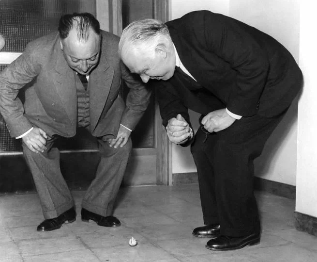
Image: Wolfgang Pauli and Niels Bohr demonstrating 'tippe top' toy at the inauguration of the new Institute of Physics at Lund; Sweden

SlideMagic: a platform for magical presentations. Free student plan available. LEARN MORE
Problem and solution go hand in hand

Problem and solution go hand in hand

I usually spend 80% of the production section of a pitch on the problem, and 20% of the solution. That might seem an uneven balance. But in fact, these two sections are one and the same thing, they go hand in hand. The way you frame the problem, sets up the way you introduce the solution.


Image: Wikipedia

SlideMagic: a platform for magical presentations. Free student plan available. LEARN MORE
Corporate language simplification is next

Corporate language simplification is next

A lot of the progress of humanity boils down to improving and simplifying communication. There were huge wins when we figured out how to speak and coordinate hunting strategies, learned how to read/write/print books, speak long distance instead of taking the ocean liner, video, etc. etc.

More subtle improvements happened as well. Clear, simple language impacts the premium/position that bosses, priests, doctors, lawyers, politicians, can command. Long-winded corporate memos and formal letters made way for informal emails and now messaging to get to the point, quickly.

What we lose in style, we gain in efficiency and clarity. Gone are the beautifully hand-written letters without grammatical errors. Now we have the universal "business English" with a tiny vocabulary, full of mistakes, and pronunciation can be whatever you see fit. The English might not be perfect, or sophisticated, its meaning is crystal clear.

The same happens to corporate language. Management consultants took a first stab at making memoranda logical and structured. The exhibits in these documents slowly become more important than the written words themselves. And now presentation software/slides has become the main language in which we do business.

We need a crisp, simple, visual language to get a business concept across. Everyone can understand it, everyone can use it. That's what I am trying to do in the presentation app SlideMagic.


Art: Pieter Breugel the Elder, The Tower of Bable, 1563

SlideMagic: a platform for magical presentations. Free student plan available. LEARN MORE
The impatient audience

The impatient audience

When I am reading I switch in different modes:

  • Losing yourself in a novel and forgetting the time
  • Digging through an article to find the acquisition price that was paid for a company
  • After having failed to resist the click bait title, looking for the answer to the question it raised
  • Absorbing every background aspect of the making of a certain music album

"Newspaper" journalists often get this wrong. They think they are writing for a person sipping a glass of wine and sitting in front of a burning wood fire, while most often they are not.

Hardly any business presentation is digested in the lounge chair. The audience:

  • Has no time
  • Is constantly distracted by calls, emails, messages
  • Thinks that they know it all already and tries to put your idea in a box that is familiar
  • Is clicking down and clicking down and wondering when they get to the point already

The captive TED Talk audience is in the lounge chair sipping wine. The venture capitalist is scrolling down your slides on her mobile while wondering whether the elevator button "1" or "0" will get you to the lobby.

BTW: Happy 2016 to everyone!


Art: Edouard Manet, Young Woman Reclining in Spanish Costume, 1862-1863

SlideMagic: a platform for magical presentations. Free student plan available. LEARN MORE
Your audience has heard it before

Your audience has heard it before

You are only aware of your own sales or investor pitch. Your audience (investors, clients) sit through dozens of them. After 10 sales or investor pitches in a certain industry, they probably understood the key industry trends, and in their heads they are wondering how you are different from the others.

Have the "101" slides ready, but the body language of your audience should tell you whether you are the first presentation they are watching, or number 12.


Image by Malcolm Carlow

SlideMagic: a platform for magical presentations. Free student plan available. LEARN MORE
"We need to add this bullet"

"We need to add this bullet"

Group editing of a slide deck is difficult, especially if it involves a lot of people, and especially if some of the people editing dial in from a remote location. If you do not have the full view of the presentation (either because you are far away, or you have not been involved in the process that much), you should resist the urge to ask the junior analyst to add "an extra bullet to the slide that say [fill in message]". There is a good chance that that point is already made on another slide.


Art: Dogs Playing Poker by C. M. Coolidge

SlideMagic: a platform for magical presentations. Free student plan available. LEARN MORE
Sales presentation versus strategy presentation

Sales presentation versus strategy presentation

They are different.

  • Strategy presentation. In most cases, the audience of a strategy project recommendation presentation understands the context. A large part of them probably participated in the project (steering committee meetings, interviews, doing analysis). Therefore, the presentation can be highly in your face, conclusions upfront, in a strict logical order. Pretty much like the classic consulting presentation.
  • Sales presentation. Your audience will be less familiar with the background, you need to drag them in a bit slower, show that you understand their problem, etc. And, logic only is unlikely to lead to a sale.


SlideMagic: a platform for magical presentations. Free student plan available. LEARN MORE
Confusing things on purpose

Confusing things on purpose

Some clients don't want to be compared to, seen as, a certain competitor or market alternative. These type of companies might have a very low reputation in the market, typically charge very low prices, or there could be regulatory issues involved where lawyers recommend to change the tone of the pitch slightly.

What you put in, is what you get out. If you confuse, obscure, make it less clear who you are, your presentation will be less powerful. This is especially true for the cold audience who will first try to compare you to a company or concept they are familiar with. If you leave your pitch confused, they will be confused. "Hmm, they are sort of a company A competitor".

The above is especially dangerous when it is not you who has to present the story, but a third party salesforce, if you confuse things, the salesforce will be confused, let alone the potential customers or investors down the chain.

It might be better to take things head on, and almost follow the thought line of the audience: "yes, this sounds a lot like company A", but let me explain why this in fact is totally different". But that takes courage.


Art: Composition VII—according to Kandinsky, the most complex piece he ever painted (1913)

SlideMagic: a platform for magical presentations. Free student plan available. LEARN MORE
Flatten those bullet point hierarchies

Flatten those bullet point hierarchies

They appear often in business presentations: hierarchies of bullet points:

  • A summary point that partly repeats what is said below
    • A sub summary point that partly repeats what is said below
      • A sub sub summary point that partly repeats what is said below

The worst of all bullet point sins: the lone bullet point that jut hangs there without a brother or sister.

Breaking up a problem/story in its components is great for solving problems: you can get a hypothesis quickly and carve up your team to work on each of the individual bits. They might even work as the skeleton of a presentation story flow.

On actual slides though, it is a different matter. These hierarchies are hard to read and process. You read the summary, read the supporting points, then combine the supporting points to internalise the summary again. Too much.

For a presentation, you need to flatten the bullet points. 

  • Kill bullet point hierarchies as much as possible, creating a linear flow
  • Then, spreading out each bullet point on a separate chart (as much as possible).

Ever wondered why my presentation app SlideMagic does not even feature the option of a bullet point?


SlideMagic: a platform for magical presentations. Free student plan available. LEARN MORE
How to write a good cover email pitch

How to write a good cover email pitch

Cover emails that introduce a presentation are very important. It is the first thing the recipients sees. And given that more and more emails are read on smartphones that are not very good at handling attachments (still), they have become more important.

Here  are 2 poor cover emails:

  • One that says too little: "Please see the attached business plan"
  • One that says too much: the whole pitch cramped into the body of the email with out the visual support of your slides

The enemies we are fighting: getting ignored (the email is not opened), or getting deleted/archived before the whole message has had a chance to come across.

What can you do better?

  1. A good subject line. If it is a cold email, use the full space you have, almost like a Tweet. Good subject lines intrigue, they don't have to  tell the whole story. Good subject lines tell more or less what you want.
  2. Write who you are, how you got to the recipient, what you do (no intriguing here, super factual and super short, let the recipient put you in a box) and say what you want. 
  3. The body of the email is all about intriguing. Unlike when you are in the room where you can stand in front of the door to prevent people from leaving, here, it is you versus the mouse click:
  • Think very hard about what the intriguing aspects of your story are. Every pitch has usually only one, or two. (A completely counter intuitive approach to solve an issue, a truly unique team, etc.)
  • Forget about the classical business plan story line, you need to get these intriguing aspects across as soon as possible, BUT think of a story flow that allows you to do that. In most cases you need to educate the recipient a bit before you can deliver the key surprise. 
  • As you add more content, think hard: does this line increase my chance of a response (pick up the phone, click the attachment, write a reply)? Sometimes the best is to keep things short. Cut buzzwords, cliches, any baggage.
  • Look at the typography, line breaks, paragraph lengths. Do the right things pop out?

In short, cover letters:

  • Say who you are, what you do, and what you want
  • Intrigue, even if that means to leaving out a lot of content, and/or mixing up the story flow.

SlideMagic: a platform for magical presentations. Free student plan available. LEARN MORE
Catch those fresh impressions before they are gone

Catch those fresh impressions before they are gone

When someone briefs me on a new presentation design project, I usually do not scribble in a note book during the conversation. One, it prevents a direct dialogue. The client is not passing on his food orders to a waiter who looks down at a piece of paper all the time. And, when you write down, it is hard to inject questions. But there is a second reason.

Writing down your impressions after a discussion 10 minutes after the meeting is over is a wonderful way to let your brain do the first sorting of what is important, and what is not. I don't write down the entire conversation sequentially, rather, I write down the big ideas that struck me. They are not in the right order, they are not at the same level in the story hierarchy, they overlap. Still they are all thoughts that "need to go in somewhere'.

Ten to fifteen minutes is the optimal delay, after that your memory starts fading and you will lose that thought.


Art: Jean Siméon Chardin, Soap Bubbles, 1733

SlideMagic: a platform for magical presentations. Free student plan available. LEARN MORE
A typical startup pitch story line

A typical startup pitch story line

I noticed that many of the pitches I have been designing recently follow this kind of narrative:

  • [Something] has been going on for ages
  • It is hard to understand that with all technological progress we still have to do [this], [this] way
  • Well, there is a good reason for, because until now it was not possible to get [this] right
  • Enter [company] that for the first time can offer [this] and [that] at the same time
  • This is not as easy as it sounds: for example look how hard it is to do [this]
  • It is not hard to see why in a couple of years, everyone who used [this] will now be using [that]

After this, the more standard "about" section follows with information about the company, the product economics, financials, team, etc. etc.


Art: Vincenzo Campi, The Fruit Seller, 1580

SlideMagic: a platform for magical presentations. Free student plan available. LEARN MORE
You are wasting time on PowerPoint

You are wasting time on PowerPoint

The majority of business presentations are not TED Talks, are not major product launches, are not State of the Unions. Corporations automate and simplify many processes: accounting, HR, planning. These non-critical "presentations" are the glue/oil on which corporate middle management runs. Decision making and deal making is done around endless iterations of confusing and boring PowerPoint decks because we do not have time (see the irony) or are not in the same place to communicate directly and clearly and sort things out on the spot. Asking for another version of a PowerPoint deck and a meeting next week is the most convenient form of procrastination.

My presentation app SlideMagic (sign up to try it) has been created to kill this inefficiency and give everyone a simple tool to create good enough, decently designed business documents that can be created in an instant, freeing up time to do more interesting and important things.

Here are 2 types of internal corporate documents and reasons why you spend too much time creating them, and the audience is spending too much time decoding them.

  • Big decision trade offs. The audience wants to understand what the options are and a clear set of pros and cons (preferably quantified and comparable) to make a decision. And, yes, they want to know which option you prefer. You write endless pages with market context, general trends, project team history, description of the work, without getting to the point.
  • M&A deals. Consultants produce endless amount of pages with company backgrounds, company history, description of assets. While the buy side is out to make a DCF valuation model. It needs to understand what the basic business units are, how the economics of the business work, and how to think about forecasting things in the future. Maybe you should not write down a generic business description, but instead create a document that spoon feeds assumptions for a valuation model.

SlideMagic: a platform for magical presentations. Free student plan available. LEARN MORE
What is wrong with your presentation summary page

What is wrong with your presentation summary page

In every client project, I try to get rid of the dreaded summary page in front of the presentation. Instead, I give a very clear description of what we are actually talking about, and a teaser of what the presentation is going to show.

Here is a check list of things I regularly see on first pages.

  • It is written in font size 8, in looooong sentences that stretch over the screen (especially on 16:9 wide screens)
  • It is an invitation to tell the entire story (too detailed for a summary, but not detailed enough to cover the content correctly)
  • It is written in chronological order, then we did this, then we did that, then we did this, rather than an order that makes sense to the audience
  • The same point / bit of information is repeated multiple times
  • It is loaded with quantitative data, but because of the text format, this data is impossible to understand / relate to each other
  • It contains dry information, and no encouragement what so ever to be excited about the content that is going to follow
  • It is full of values, mission statements, generic trends, buzzwords and other vague concepts that are context, rather than the core of your idea
  • It is full of details (number of employees, founding year, etc.) that are not a crucial part of the "summary" of your story
  • It has sub bullets, and worse bullets that have just 1 sub bullet hanging below it. It uses different font sizes for the main bullets, and the sub bullets. Bullets are not properly intended, (space space space space)

Art: detail of a painting by Gavin Rain

SlideMagic: a platform for magical presentations. Free student plan available. LEARN MORE
Over emphasizing

Over emphasizing

We are not trying to be a social network, it only looks that way. We are not trying to be a social network, it only looks that way. We are not trying to be a social network, it only looks that way. We are not trying to be a social network, it only looks that way. We are not trying to be a social network, it only looks that way. We are not trying to be a social network, it only looks that way. 

If you have to repeat it that often, people might just think you are.


SlideMagic: a platform for magical presentations. Free student plan available. LEARN MORE
Two reasons the story does not come out well

Two reasons the story does not come out well

  1. The curse of knowledge, you are so deep in the material that you:
    • Cannot see anymore what points of your story are obvious to an audience, and which points are not (and vice versa, which points are difficult to understand while you think they are very clear
    • Cannot see anymore which details are important / add flavour to the story, and which details are tangents that lead to nowhere
       
  2. You probably hang on to a story structure that you designed for your first presentation a long time ago. Your company and your story has moved on, but your slide deck has not.

Art: Franz MarcDie großen blauen Pferde (The Large Blue Horses), (1911)

SlideMagic: a platform for magical presentations. Free student plan available. LEARN MORE
Two related product stories

Two related product stories

Sometimes, your company has 2 products with similar, but different stories. Pitch the products in full detail sequentially duplicates some of the common parts of the story (and bores the audience) A generic pitch followed by example 1 and example 2 makes the product pitches too weak.

A possible solution that I recently applied to a medical technology startup:

  • Layout the basic idea behind the innovation that is shared between the products, not necessarily as a pitch, but more to educate the audience
  • Set up the company as a combination of 2 parts
  • Do a full pitch for product 1 (without repeating the basic concept that was explained in the introduction)
  • Do a slightly shorter pitch for product 2, just highlighting the differences in the technology for product 2 compared to product 1.

Art: John Everett Millais: Twins, Kate Hoare and Grace Hoare, 1876

SlideMagic: a platform for magical presentations. Free student plan available. LEARN MORE
"This is my usual introduction"

"This is my usual introduction"

"When I put up the first [incredibly busy bullet point] I start of with this introduction before I take people through the slide"

Usually, these introductions are great. They come out naturally, in a conversational style. Next time:

  1. Use that introduction as the opening of your presentation, add a visual slide here and there to support the story. And don't stop there, finish the entire presentation in that style
  2. Second best option. Put in a black slide before your busy opening slide and tell that introduction without encouraging people to start reading your bullet points.

SlideMagic: a platform for magical presentations. Free student plan available. LEARN MORE
Where to put the team page?

Where to put the team page?

This is the dilemma in many investor presentations, in the front, in the back? Usually, I put the team slide in the second half of the presentation, after you tackled the pitch of the problem/solution. The slide sits in the "about" section, alongside financials, organisation, milestones, etc.

There are exceptions, here are some reasons to put your team slide in the front:

  • The team is actually the key story of the pitch: if your company consists of unusual people (the former this, the former that), than better start with it right
  • The majority of your team is sitting in the room, physically. A team slide upfront is a great background for the introduction of your people
  • Your company is all about combining different disciplines, which have never been combined before. A time slide (specifically designed to show the cross-functional expertise) might help support this point.

I usually design 2 versions of the team slide:

  • A summary slide that highlights the main message about team that you want to emphasise (we worked together for 5 years before, we worked for very important companies before, each of us has 5 patents, etc.)
  • In the appendix of the document a more elaborate, traditional CV description of the backgrounds, you can use font size 8 here.

Art: Scotland Forever! by Elizabeth Thompson, 1881

SlideMagic: a platform for magical presentations. Free student plan available. LEARN MORE