Viewing entries in
Typography

Why does it look like PowerPoint?

Why does it look like PowerPoint?

It is often quick and easy to use PowerPoint to draw a diagram. No need to install and learn new specialized software. A few boxes, lines, a screenshot, and you are done. But why the result totally obvious a PowerPoint slide, even if you are not using the program to present your visual?

Over the past years (decades for some) we have become so used to seeing PowerPoint slides with the built-in fonts, standard color palettes, that most people will recognize it instantly. But when your end product is a screenshot, you don’t have to worry about things like font compatibility and presentation templates.

  • Change colors and fonts to match the document you are working in

  • Let go of the restrictions of the aspect ratios for a slide (4:3, 16:9) and pick something that is appropriate for your diagram.

SlideMagic: a platform for magical presentations. Free student plan available. LEARN MORE
ALL CAPS

ALL CAPS

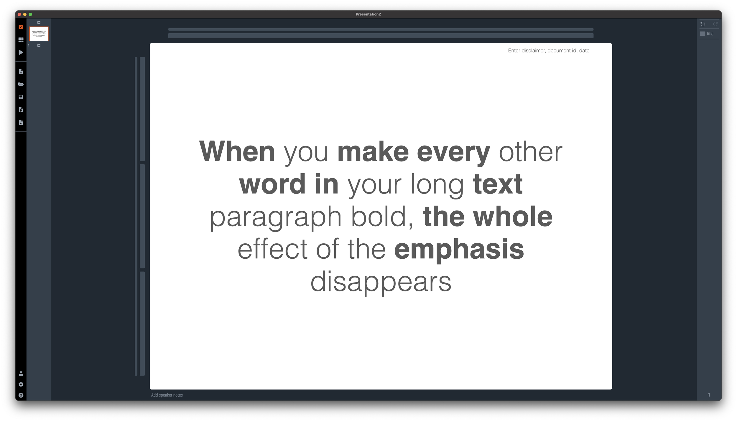
Some people use ALL CAPS TO MAKE A TEXT STAND OUT. That’s not a good use of all caps. It looks busy/messy, especially when used frequently on the same page. A subtle use of bold is better, and if you find yourself bolding every other word, maybe it is a signal to reconsider the design of the slide.

I like using all caps for labels or tags, especially if the text in these tags has similar length. The consistent height of the characters creates nice and stable elements on the page.

Consider reducing the font size of your all caps tags though, from the font your are using for the rest of the page. All caps look bigger (by design).

SlideMagic: a platform for magical presentations. Free student plan available. LEARN MORE
Being too bold

Being too bold

Smart use of bold text can help make a slide clearer. Overdoing it takes out the whole effect.

Why do people fall for this? If you start at your own chart for hours, rereading it, changing the line breaks, bolding and un-bolding text, you become convinced that the text is super clear. It is, for someone who has studied it for a long time. Not for someone who looks up from her phone and sees it for the first time.

P.S. Use ctrl-B (Windows) or cmd-B on selected text in SlideMagic to make things bold.

SlideMagic: a platform for magical presentations. Free student plan available. LEARN MORE
Should the fonts of your logo and presentation match?

Should the fonts of your logo and presentation match?

No.

Now that mobile devices are becoming the dominant screen on which we look at brands, more and more logos become text-based. The font is the key design aspect of the logo. To set your whole presentation in a funky font would not make sense.

Having said that, the fonts of your presentation and the logo are very close, but just a bit different, a design nerd might find it bothersome. (Arial - Helvetica for example). This would only be an issue for big, bold headlines. Though.

Some brands do force the match between logo font and text font. Think of the ads produced by the Absolut Vodka brand. Slogans and headlines are in Extra Bold Futura Condensed all caps and it matches the brand exactly.

SlideMagic: a platform for magical presentations. Free student plan available. LEARN MORE
Typography tutorial

Typography tutorial

Why does certain typography look great and others not? When a designer ‘get its right’, she is intuitively adjusting a great number of parameters. And the most important ones are not the obvious ‘in your face’ ones (such as the font type). Paragraph width, line height, lots of subtle adjustments that can make a big difference to your layout.

This online typography tool lets you experiment with some of these parameters and get feedback on the result

SlideMagic: a platform for magical presentations. Free student plan available. LEARN MORE
Typography is everywhere

Typography is everywhere

The building manager finally installed a house number on our building, to reduce the amount of desperate calls I get from couriers. Still, I wished he had asked me for a suggested position where to put it. “Bleeding off the page” is not the right concept here…

SlideMagic: a platform for magical presentations. Free student plan available. LEARN MORE
Sorting text by length

Sorting text by length

In slide design, every detail counts. Pay attention to the length of text blocks when putting them on a page. Sorting them by length can give an interesting visual effect. Or the other extreme, picks words on purpose so that the length of each text box is more or less the same.

PS. How did I get the picture? Search for “diagonal" in the SlideMagic app and you get lots of suggestions

SlideMagic: a platform for magical presentations. Free student plan available. LEARN MORE
Different types of language errors

Different types of language errors

Most business presentations in the world are written in English, most people who write them are not native English speakers. Different type of errors pop up:

  1. Typos and grammatical errors that can be caught by a spell checker / other software

  2. Typos and grammatical errors that are hard to spot by software

  3. Mistakes in word choices, a literal translation from another language into English produces a result with a totally different meaning, or double meaning in slang

Number 1 can be avoided, no excuse here.

Number 2 are also made by native English speaker, they look sloppy but are not a deal breaker. To catch all of them, you might need to help of a professional editor.

Number 3 can be a big problem and really damage the credibility of your presentation. Having your presentation read by anyone who is an English speaker will catch these, also no excuses here.

SlideMagic: a platform for magical presentations. Free student plan available. LEARN MORE
How to punctuate bullet points

How to punctuate bullet points

Dr Clare Lynch is “chief business writing expert” at Doris and Bertie Ltd and a University of Cambridge writing instructor, she has an excellent YouTube channel that deserves more viewers.

In a recent video, she explains the official rules for punctuating bullet points, full stops or not, capitals, etc.

She gives 3 options and a warning:

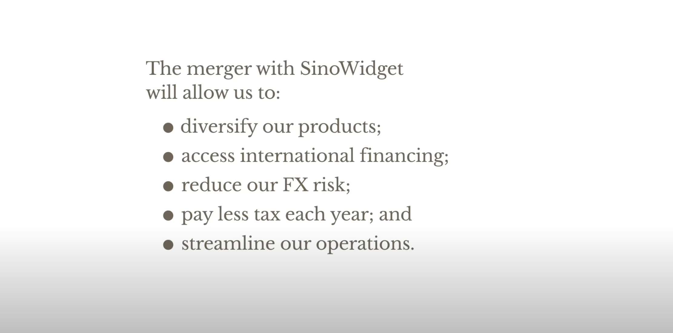
Colon: no capitals, no full stops

Colon: no capitals, no full stops

The long hand version with capitals, and full stops

The long hand version with capitals, and full stops

For writing: semi colons

For writing: semi colons

Don’t mix sentence styles

Don’t mix sentence styles

Back at McKinsey in the 1990s, we were taught to write paragraphs in bullet point form but starting with what we called a “clunk”, with a heavy paragraph sign as the bullet point anchor (a pilcrow), and leave the full stop out after the last sentence (but use them for other sentences in the bullet point paragraph).

In presentations? First rule avoid bullet points if you can. If you to include some sort of list to make your point on a slide:

  • I try to keep the text super short (even shorter than Clare in the above examples)

  • Try using some repetition: Higher sales, higher market share, lower costs (“business poetry”)

  • And pay close attention to the length of the text I am writing, I want all text boxes to be roughly the same in terms of length. Yes, I admit that I sometimes “stuff” a super short bullet point with a non-essential word to make it look prettier…

SlideMagic: a platform for magical presentations. Free student plan available. LEARN MORE
Making a sentence a bit longer than needed

Making a sentence a bit longer than needed

I just caught myself adding a few words to a sentence that added no meaning whatsoever to the slide, but the layout of the whole page just looked so much better… Usually, it’s the other way around.

Photo by Sharon McCutcheon on Unsplash

SlideMagic: a platform for magical presentations. Free student plan available. LEARN MORE
PowerPoint conversions back to Arial

PowerPoint conversions back to Arial

I changed the font that SlideMagic uses for PowerPoint conversions from Calibri to Arial as of version 2.6.22.

The thought behind Calibri was that when converting slides to PowerPoint, I wanted to stick as close as possible to the box-standard Microsoft format as possible, and Calibri is the standard font for Microsoft Office applications. SlideMagic users “complained” that the PowerPoint conversions did not look very similar to the beautiful originals. So I made the change.

Helvetica (especially thin variants) looks more elegant but gives compatibility issues on Windows machines. Hence Arial it is….

Obviously when you convert your SlideMagic .magic files to PDF, you get the exact same look & feel as in the SlideMagic app. This is the workflow we should aim for. SlideMagic .magic files are the source code of your documents, PDF is how you share the result with external audiences.

Photo by Natalia Y on Unsplash

SlideMagic: a platform for magical presentations. Free student plan available. LEARN MORE
Font or typeface?

Font or typeface?

Seth Godin in hist latest blog post:

And yes, there’s a mustard analogy in everything you do. In how you shake hands, in the typeface you use in your presentation (and whether you call it a ‘font’), in the volume you choose for your voice when in conversation.

Yes, there is a difference between “typeface” and “font”. Typeface refers to the style of a character, (Helvetica), font is the specific instance of that typeface (Helvetica 12 bold italic), which corresponds to a specific drawer with letters printers once used.

As someone who presents himself as a professional designer, I should be a purist, but don’t tell anyone, but I use the word “font” all the time. It sounds better is shorter, and an issue that is relevant for me recently: “font” is easier to fit in a dropdown menu of an application than “typeface”.

Photo by Mr Cup / Fabien Barral on Unsplash

SlideMagic: a platform for magical presentations. Free student plan available. LEARN MORE
Font sizing

Font sizing

When people submit their SlideMagic documents for conversion to PowerPoint, I still have to peek inside for a second for a quick manual operation. Here is the most common design mistake I see: different font sizes in boxes that are part of the same list or grouping.*

Screenshot 2018-11-26 07.03.55.png

Yes, bigger fonts are better, but in case of lists, it is the lowest common denominator that determines their size. Slide design is like formatting headlines in a print newspaper: you need to edit text to make the message clear, but also to fit things in the typographical constraints.

* Users in te app are warned beforehand about this.

Cover image by Andre Benz on Unsplash

SlideMagic: a platform for magical presentations. Free student plan available. LEARN MORE
2 types of typos

2 types of typos

And they say different things about you:

Type 1. You could not be bothered to invest the extra time to weed out obvious mistakes (and I am sometimes actually guilty of this on this blog, when jot down a quick idea).

  • Small typos with a red underlining from the spell checker
  • Obvious grammar mistakes resulting from incorrectly rewriting a sentence.

Type 2. Mistakes which you did not catch because you did not detect them yourself. 

  • Picking the wrong word in the wrong context (words that sound the same but mean something different)
  • Less obvious errors in grammar.

When an investor reads your investor deck, she will probably forgive you, depending on the context. Sloppy "type 1" errors are OK in small informal notes, but leaves her wondering whether you would have the drive to weed out any source possible reason to lose a pitch in high-stake, all or nothing, efforts. I see many type 2 errors in documents by entrepreneurs who are non-native English speakers, and here it might trigger the "ultimately we need to get a US CEO" knee jerk reaction, as she is worried that you are not "presentable" enough to represent the company to potential big clients and/or future investors.

Better have that "all or nothing" deck checked by a native speaker. 


Cover image by Ben Hershey on Unsplash

SlideMagic: a platform for magical presentations. Free student plan available. LEARN MORE
Small differences in font sizes (don't)

Small differences in font sizes (don't)

Small differences in font size. Visual emphasis is important in graphics design: it creates a sense of hierarchy, what should be viewed first, and what are less important details.

SlideMagic: a platform for magical presentations. Free student plan available. LEARN MORE
Text balance

Text balance

Shapes, their sizes, and the layout grid set the balance of a slide. But text as well and is often overlooked. Watch out for these:

  • One word that drops to the second line
  • A very long word that makes a sentence break halfway the page
  • 3 boxes in a row, 2 with little text, one crammed with characters
  • Long descriptors in column headings that break line after line after line

The solution in these cases is not reducing the font size, reducing the margins, it is redesigning your slide layout and content:

  • Take out filler words
  • Replace long words (management, manufacturing) with shorter ones
  • Splitting a point in 2 points that are more balanced
  • Making a sentence actually longer to restore balance
  • Flipping the rows and columns of a table
  • Using a different shape (circles and long text do not go together for example)

SlideMagic: a platform for magical presentations. Free student plan available. LEARN MORE
Letter spacing in PowerPoint

Letter spacing in PowerPoint

"Kerning" is tweaking the spacing between characters in a word. Not to be confused with line spacing, tweaking the vertical space between lines.

Line spacing is important in presentation design. When you use very large font sizes, PowerPoint adds too much wide in between lines, you need to trim it.

As an amateur designer of PowerPoint slides for a business presentation, you probably never need to worry about kerning. The one exception is cleaning up the mess that other users and/or templates have created. On the Mac, select all the text on a slide, click the little-used icon shown below, and set things back to "normal"


Cover image from WikiPedia

SlideMagic: a platform for magical presentations. Free student plan available. LEARN MORE
The largest amount of text

The largest amount of text

The eye wants boxes on a slide to be equal in size. That is why I am always battling with the box with the largest amount of text, it determines the shape size and/or font size of all the boxes on the chart. Here you need to be a newspaper front page layout designer/editor and cut down the text of that box carefully without diluting its meaning. It will improve the look of your entire slide.

I really don't like the word "management" for example. You need it a lot in business presentations and has all these wide letters, which makes it hard to fit.


Image from WikiPedia

SlideMagic: a platform for magical presentations. Free student plan available. LEARN MORE
Quotation marks in presentations

Quotation marks in presentations

Quotation marks never come out right when you use large, bold, typography. Below is a nice idea by the designer of Gary Vaynerchuck. One huge, big, quotation market centred across the text. Note that the quotation mark is in a far bigger font size than the rest of the text.

SlideMagic: a platform for magical presentations. Free student plan available. LEARN MORE
Lining up text, lining up text boxes

Lining up text, lining up text boxes

A post for the purists today. In PowerPoint, a text box and a rectangular coloured shape with text line up the same way: you hover them across the slides and "snap" lines appear that encourage you to line things up with items above or below. To do it correctly though, you need to make a small adjustment.

A text box with a transparent background: line up the edges of the text (without padding) to the object below

A text box with a transparent background: line up the edges of the text (without padding) to the object below

A text box with a coloured background: line up the edge of the box with the item below

A text box with a coloured background: line up the edge of the box with the item below

With my presentation app SlideMagic, you don't have to worry about this. I remember "arguing" with my developer why this was an important feature :-) 

SlideMagic: a platform for magical presentations. Free student plan available. LEARN MORE