Viewing entries in
Typography

Calibri light

Calibri light

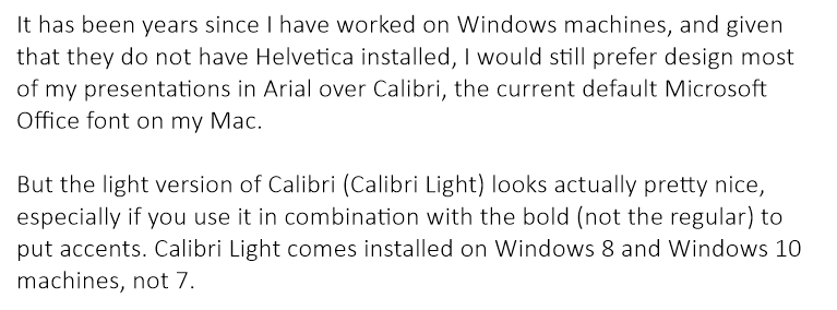
It has been years since I have worked on Windows machines, and given that they do not have Helvetica installed, I would still prefer design most of my presentations in Arial over Calibri, the current default Microsoft Office font on my Mac.

But the light version of Calibri (Calibri Light) looks actually pretty nice, especially if you use it in combination with the bold (not the regular) to put accents. Calibri Light comes installed on Windows 8 and Windows 10 machines, not 7.

Goodbye Arial.


SlideMagic: a platform for magical presentations. Free student plan available. LEARN MORE
Lining up logos with tag lines

Lining up logos with tag lines

Often, graphics design is about details. It is difficult to pin down why something just does not look right. The answer: small little things. See the bottom of a magazine ad below. The logos on the left and right have tag lines/sub brands: above on the left, and below on the right. The graphics designer simply centred the image files, but our eyes wants to centre not the entire image, but the main text of the logo. It looks like the logo on the right is positioned too high.

If you cannot get excited by this you should not become a graphics designer...


Illustration: Gemini constellation

SlideMagic: a platform for magical presentations. Free student plan available. LEARN MORE
Line breaks deserve your attention

Line breaks deserve your attention

When you write a block of text, the editor will insert line breaks without you noticing. Fonts are relatively small and the resulting text blocks look always good.

Designing presentation slides is different though. The position of every word and every line break counts. You face similar problems as the headline writer of a newspaper, or the designer of a poster.

  • Make sure important words that need to be seen together, stay together: "blue [break] ocean strategy" breaks the connection between critical words
  • Make sure the text is balanced across the page, without weird right paragraph endings. If required, change the font size to make words just fit, or drop to the next line. Add line breaks manually if you have to
  • And if it still does look weird, rewrite that headline into one that does look good

Yes, contradicting myself: my blog engine sometimes makes a mess of blog titles on certain screen sizes. I cannot control line breaks here...


Art: The Cliff Walk at Pourville, an 1882 painting by Claude Monet.

SlideMagic: a platform for magical presentations. Free student plan available. LEARN MORE
Design DNA

Design DNA

Design DNA is engrained in a company. It shows in presentations, in the web site, in the way the office is laid out. When a visitor/user/viewer gets in touch with a company, she makes up her mind in the first millisecond about the design DNA of the company, by comparing it to all other presentations, web sites, and offices she has seen. We have all seen these stereotypes:

  • The bare bullet point presentation in the standard Microsoft Office 2007 format
  • The over-designed PowerPoint template with gradients, images with faded edges and huge logos at the top of the page
  • The social media expert website full of call to actions to buy her $5 ebook on being a social media expert
  • The traditional, hierarchal office with too many big leather board seats crammed around a too small board table in a board room that doubles as a storage room for exhibition displays
  • The hipster I-don't-really-say-anything web site
  • The girly office full of plants and cute natural-material furniture
  • The macho office with an impressive collection of booz in the lunch room
  • The 1990s tech company web site: takes 40% of your screen and has detailed product hierarchies that get to pages that don't really say much about that specific product
  • The startup web site where "tour", "about us", "benefits", and "product" tabs pretty much say the same thing

At every point you come in contact with a client, user, investor, make sure you look the way you want to look. Even if your investor presentation looks right, that impression can be undone in one second when someone opens your web site.

One strategy is to change and align everything to make sure it is consistent. Another one is to recognise who you are, and change the 1920s cute art deco look of your presentation if you are in the business of selling 4x4 car suspension systems.


Art: Henri Rousseau, The Dream

SlideMagic: a platform for magical presentations. Free student plan available. LEARN MORE
Learning from Swiss graphic designers

Learning from Swiss graphic designers

Most presentation design software today is the result of someone in the 1980s thinking: "hey, this mouse is cool, you can use it to draw things!". We can move, drag, stretch, place things freely across our drawing canvas.

Presentation software SlideMagic aims to close this tangent and go back 20 years earlier to the 1960s when graphics designers in Switzerland developed a clean and crisp style of communication and design that does in many cases the exact opposite of the freedom the mouse offers: tight grids, limited font choices, limited colours. simple shapes.

Eyeball the posters on this Pinterest board by Misswyss and see what you can learn form them for your own designs. Which one do you like? Which one does a better job at communicating than others? Why is it that some of these very simple designs look very pretty?

Examples of posters designed in the Swiss style

Examples of posters designed in the Swiss style

Some of the features they have in common:

  • Limited number of colours
  • Sans serif font (only one)
  • A strict grid alignment throughout the page
  • Relatively small headlines
  • De-emphasising (making things grey) rather than emphasising (making things bold) text
  • Flat shapes, no gradients, drop shadows, textures
  • Big silhouettes, simple shapes

Why not steal some of these ideas in your slide designs?


Art: Albert Anker, The walk to school, 1872, 90 x 150 cm
Subscribe to this blog, follow me on Twitter

SlideMagic: a platform for magical presentations. Free student plan available. LEARN MORE
Not every presentation slide needs an image

Not every presentation slide needs an image

Yes, visual slides with stunning images are more powerful than boring lists of long bullet points. But that does not mean that designing good presentations is the equivalent of finding a stunning image for every page (sorry).

  • A powerful quote can look beautiful on its own, in naked typography. The image of the person might distract the audience, especially if it is a relatively unknown author of an airport book best seller.
  • A simple information slide (here are the 3 priorities for next year), but just be best visualised with a simple list of 3 priorities. 
  • Section breaks can be done in 2 ways: a dramatic visual to show the transition, or an almost blank page that brings the attention of the audience back to you
  • It is very hard to find dozens of images that are more or less similar in style or look and feel. As a result, presentations with lots of images look inconsistent.

It does require though that you find a way to make a typography-only slide look good. A nice full colour plain background, and some elegant stealing from the Swiss graphics design masters in the 1960s is a good way to start.


SlideMagic: a platform for magical presentations. Free student plan available. LEARN MORE
Designing presentations for retina displays

Designing presentations for retina displays

Typographers had big debates when Apple launched the first iPads and iPhones with retina displays ("Retina" is the marketing name for a screen with such a high pixel density that your eyes cannot see individual pixels anymore). Retina displays are obviously different from low resolution screens, but - as the typographers discovered - are also different from paper/print.

I now see similar issues with large retina monitors. A traditional PowerPoint presentation with an Arial or Calibri font looks somehow off. You need lighter, thinner, crisper fonts. Macs have Helvetica light installed, but Windows machines not. Drop shadows look "dirty". Outlines around boxes look too heavy.

My guess is that Microsoft will fix the font issue in upcoming releases of Windows and Office products. But, if we fix the issue for computer screens, we are still left with this huge install base of crappy VGA overhead projectors in corporate conference rooms that never get replaced...

If you are working on a really important, one off, presentation find out about the screen you are going to present on and test your design. 


SlideMagic: a platform for magical presentations. Free student plan available. LEARN MORE