Viewing entries in
Video

Different types of video

Different types of video

There are 3 roles that video can play in a presentation

  1. Recording. This video does not add anything to the presentation, it is simply a narrative of what you want to say. Especially useful when you are not there to present slides. Example: a TED talk video.

  2. Decoration. Spectacular visual and sound effects (try to) enhance something that can also be expressed using “regular” slides. Example: an expensive introduction commercial of a new iPhone.

  3. Explanation. The video does a better job at explaining something than a regular slide. Example: an animation of how a vaccine impacts a virus.

Think about these when the question “do we need a video” comes up.

SlideMagic: a platform for magical presentations. Free student plan available. LEARN MORE
This could have been a better video

This could have been a better video

Israel caught Iran stealing IAE documents and using them to conceal dubious nuclear activities. Israel put Iran’s plan in a Google Drive folder for everyone to read.

The video to explain all this to the world is not very strong though:

  • The graphics are really basic and childish (no, not the same as South Park)

  • The story in the video does not tell very much

  • These dark Holywood trailer style voice over is not really working either.

There is a better way to do it I think. First of all, the audience does not consist of Israelis and other people who already are on Israel’s slide. The target segment are the ones who are sitting on the fence in the middle. The message ‘look at these dark and evil people’ will not stick. What might work though is a message of ‘these people who seem so friendly in your negotiation meetings do something completely different behind your back when you are not looking’.

To create this effect:

  • A lighter, friendlier and factual voice (I would use a female one)

  • ‘Documentary style’ movie

  • Add a bit about the story on how you got the documents (news media love spy stories)

  • Use a much more factual approach with screenshots from the documents and satellite images of desert landscapes (Ken Burns zoom) to show what happened.

SlideMagic: a platform for magical presentations. Free student plan available. LEARN MORE
John Mayer's marketing video

John Mayer's marketing video

Guitarist John Mayer starred in the launch video for a more affordable version of his signature guitar for PRS Guitars. Some interesting presentation lessons in here.

  • It worked, the video gets even linked to on a presentation blog

  • A naked and vulnerable pitch. A bare bone background, just him and the instrument, putting his entire reputation at stake by recommending this guitar. “Skin in the game”. Different from celebrities wearing a watch, driving a car, or holding an espresso cup.

  • A very nice use of the “best of both worlds” storyline. Up until now you had to choose between A or B, but as of today, you can have both.

  • Very clever addressing of target audiences. Hard core guitar players that admire John for his skill, and die hard fans that admire John for his songs are included implicitly. But parents buying guitars for their kids (and maybe secretly for themselves) are addressed directly with a clear excuse to go and get one.

A great sales pitch

SlideMagic: a platform for magical presentations. Free student plan available. LEARN MORE
Virtual backgrounds in video conferencing

Virtual backgrounds in video conferencing

Camera technology is finally good enough to solve the video conference background problem: no more bed rooms, bad lighting, plumbers, kids and/or other unpredictable events behind your back. In the settings tab of zoom, go to virtual backgrounds and set it to the mood you want.

Almost perfect, my hair and sweater pattern did get adjusted as well…

Almost perfect, my hair and sweater pattern did get adjusted as well…

SlideMagic: a platform for magical presentations. Free student plan available. LEARN MORE
Recycling the presentation

Recycling the presentation

Cities are recycling their presentations to lure Amazon to put a new HQ there to pitches other candidates. 

I see this many times, a company that needs to pull out all the stops to present at a major conference or pitch competition. Ideas and energy of that pitch are re-used numerous times in other presentations. It is often that wake up call to get your act together, take more creative risk to present your idea with "nothing to lose".

There is a cost element to it as well. How can you get more return on that expensive video work? You need to try to find the balance between a personal and relevant pitch (rule #1 of sales presentations), and re-usable content. For videos, I usually request to have a clean version of the file without specific text banners or voice overs that cannot be separated. In that way you can re-use the assets for other projects.

Btw, these city pitches are very interesting. Here are 3 very different pitches. I think Detroit is the most inspiring. What do you think?

Cover image by Steve Harvey on Unsplash

SlideMagic: a platform for magical presentations. Free student plan available. LEARN MORE
Corporate videos

Corporate videos

As a presentation designer, I get to sift through a lot of corporate introduction videos, most of the time, I am looking for some decent still images that I can use as a background for an introduction slide about a customer or strategic partners.

A lot of money is going into these videos. Sophisticated motion graphics, upbeat music, soothing voice overs.

Most of these are hosted on YouTube, so you get a sense of how many people actually watched them. In most cases: a few thousand at best, but many have far, far fewer views. The majority of which is probably the creative team and the people reviewing drafts at the client.

Why? I do not have scientific evidence, but here are some possible causes:

  • There is actually not that much information in these videos, except for the usual buzzwords about helping improve the environment and making the world a better place. An analyst who wants to know what the group is all about, can spend the 3 minutes it takes to watch the video better in other places on the web site.
  • (Related) These videos are full of stock video cliches: pretty board rooms against a view over the park, happy families running in that park, a drone going up the corporate sky scraper.
  • In the case of conglomerates, a large part of the video is spent on justifying the existence of the group, what ties them together? This is a hugely important issue for the conglomerate management, but for the student, investor, journalist, customer, potential employee, it does not merit 50% of the 3 minutes.

In short, these videos are actually produced for an audience which is the management of the company, to reconfirm their perception of the image of the place they work, and less so for an external audience.


SlideMagic: a platform for magical presentations. Free student plan available. LEARN MORE
"Flattening" a video

"Flattening" a video

Most of the corporate promotion videos I see are enhanced presentations: text movements with animations, still images with slow zoom added, piano background music and maybe some custom made illustrations. They look good, but have 2 problems when it comes to pitches to busy people:

  • They make files very heavy (email attachment bounce and/or consuming 500MB of mobile download data)
  • They take too much time: like a bullet point chart, you will have read that one sentence 10x by the time the pianist is finished with the 8 bar melody and ready to move on to the next shot.

That is the reason why I often "flatten" these videos, take the 5 best screen shots and paste them as images in a regular presentation deck. Looks great, quick to read, easy to download.

Anticipating this issue, when you brief a video production company ask them for 2 versions of the video, one with all the graphical elements, and one with less text, so you can use it as source material for still images over which you can place your own text in a presentation. Also handy when your messages change over time.

There are many other situations where you might actually need to keep the video in its full size: demonstrations of products, interviews of people, etc. If it is just about adding drama to a still visual, why not go with a well designed still visual though.


SlideMagic: a platform for magical presentations. Free student plan available. LEARN MORE
Video briefing

Video briefing

You know how to give that perfect sales presentation, but do you sales reps in the field as well? Probably not. One way to get them to say the right things is write the messages down in bullet points that can be read of the screen. But that does not create the most engaging presentation for your potential customers.

A better approach might be to record yourself delivering the presentation on video and share that with people in the field.

SlideMagic: a platform for magical presentations. Free student plan available. LEARN MORE
Hillary's stock campaign video

Hillary's stock campaign video

The video in which Hillary Clinton announced her intention to run for President is too well executed. The messages are incredibly clear, you can almost reverse engineer the PowerPoint slide that contained the briefing bullet points for the script. 

But the execution is also staged and lacking raw emotion that it is unlikely to resonate with voters. I don't think it will leave a negative impression, just a neutral one. It sounds and looks like almost all advertising we see around us. This review on the Huffington Post captures it correctly.

In a similar way, Apple product videos, once admired, now almost look funny after the many parodies

A better way to do this? Interview "real people" on camera. It is a lot harder to do though.

It is a warning sign for those who think that big budget productions (videos, presentations) automatically translate into audience impact. The more people have been disappointed by slick presentations, photoshopped ads, spectacular videos, the harder it is to convince them that in your case they should believe you.

P.S. What do I think about the campaign logo? I don't think it is very pretty, but it will be very recognisable as an avatar on social media sites. Functional.


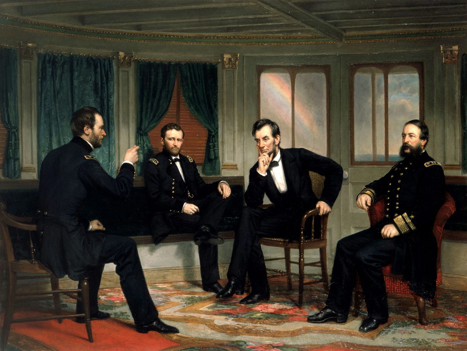
Art: The Peacemakers (1868) painting by George P.A. Healy

SlideMagic: a platform for magical presentations. Free student plan available. LEARN MORE