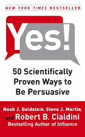
The new London 2012 Olympic pictograms

The pictograms for the 2012 Olympic games were launched yesterday, designed by Yasmine. Glancing back over the pictograms of the past decades (a new set is designed for every tournament), I actually still like those of the 1972 Munich games best (designed by Otl Aicher). Simple, recognizable, and full of movement and energy.
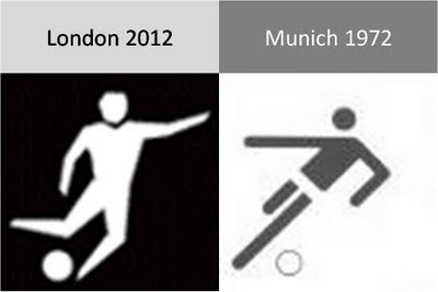
Somewhat related, designs for Olympic posters that were not adopted in an earlier post. Again simple and full of motion.

SlideMagic: a platform for magical presentations. Free student plan available. LEARN MORE

Calming down your presentation images (sequence)

The audience might feel a little bit like they just stepped out of a roller coaster after you showed them your 30 images in 10 minutes presentation. Some suggestions to calm things down:
  • Not every concept needs a supporting image. "We're running out of time" [click - image of a time bomb ticking away]. "We're under pressure" [click - Atlas lifting the globe on his shoulders]. "It's either" [click - A pot of gold] or "the end" [click - image of the Grand Canyon]. A data chart showing a rapid decline in sales over the past month will do if you want to create a sense of urgency...
  • Consider taking the color out of your images. Black and white images, or images with a monochrome overlay look more in harmony with a presentation's color scheme.

SlideMagic: a platform for magical presentations. Free student plan available. LEARN MORE

The cinematic presentation opening

Film directors can use powerful tools to throw us in the middle of a story right in the first seconds of a movie. Steven Spielberg's opening of Saving Private Ryan is a gruesome but good example. Everyone in the audience thinks "Wow, I should be grateful to these guys that drew the short straw and had to come out of the boat first..."
Presenters can use similar techniques. Try to find big images with a perspective as if they were taken from someone in the middle of the issue you are talking about. These images trigger an emotional response from the audience, especially (and maybe only) if they are "real". Think of photographs that make it on the front page of a newspaper.
The following 2 images could lead into a presentation about the issue of maternal deaths due to poor living and health conditions in the slums of India:
Less powerful examples of images with a patient or victim perspective here and here. Many of my investor pitch presentations use different styles of charts throughout the presentation:
  1. Emotional opening (images) to connect the audience to the problem
  2. Conceptual diagrams (arrows, boxes) to explain why my solution solves it
  3. Data charts to show why this is a big deal
  4. "Standard", almost slideument, charts to give more background on the company
P.S. Read more about the great work that the Acumen Fund is doing to combat the issue of maternal deaths here.

SlideMagic: a platform for magical presentations. Free student plan available. LEARN MORE

Chart concept - can't see the forest through the trees

Sometimes you can't see the forest through the trees. How to visualize this? The ad below uses a technique that can be copied easily in PowerPoint: a huge word/sentence in a bold font covered by a set of fat, spaced out stripes in the same color as the text. Via Ads of the World.

SlideMagic: a platform for magical presentations. Free student plan available. LEARN MORE

The color goes in last

Garr Reynolds wrote a beautiful post on what Zen arts can teach us about minimal use of color. Let's take things down to the very practical level: how to use these concepts when sitting behind your slideware edit screen.
  • Make sure your template has a decent color scheme that works well with your corporate colors. See one of my earlier post how to set one up.
  • Design your charts in black and white. Really, switch off the colors, and give it your best shot using only shades of grey. This is especially useful when working on busy data charts or complex IT architecture diagrams.
  • Now start adding additional background colors from the template to group items together that belong to each other. A cluster of servers, all pieces of a pie chart that relate to manufacturing businesses, etc. Within each background color, again use shadings as if you were working in black and white. A very light orange database server, with a slightly darker orange data pipe coming in, and label it "data base server" with an almost brown orange font.
  • Finally add very bright accent colors to highlight aspects of the chart. The server with breached security that is letting all kind of viruses into the network definitely deserves a dash of red.
The key lesson: the color goes in last (if at all).

SlideMagic: a platform for magical presentations. Free student plan available. LEARN MORE

Chart concept - easier to get in than out

Some places are easy to get in, and hard to get out. (That one-off discount which becomes permanent for example). How to visualize this?
Things that come to mind (the one-way revolving door, permanent temporary structures such as the Eiffel Tower or the London Eye) are not obvious when you use them in a slide. "You see, your discount scheme is a bit like the Eiffel tower". Blank stare.
Images of someone stuck in a well and looking up into the light do work. The idea was triggered when I found myself inside the double helix staircase in the Château de Chambord in France, and looking up. Stock image sites also have lots of "inside a well" images.
There is a bigger point in this: presentation designers should look at cinema direction to move audiences inside a scene or a situation and make them "feel" what your message means. A future blog post on this is in the pipeline

SlideMagic: a platform for magical presentations. Free student plan available. LEARN MORE

How to scale an image to full-size in PowerPoint

Most people have now caught on to the idea of using large images in presentations. But with a few graphics design tricks you can make things look even better:
  • Make sure that they are not stretched or squeezed: the proportions between height and width are the same as in the original
  • If the image is big, go all the way and have it cover your entire slide.
Here is how to do it:
  1. Right-click the image, select format picture and click "reset picture" to restore the original aspect ratio (between height and width)
  2. Re-size by dragging a corner until both the height or the width are at least equal to the full screen
  3. Reposition the image and crop the bits of the image that are sticking outside the canvas
  4. Select the image, press format and compress pictures to reduce the file size of your presentation

SlideMagic: a platform for magical presentations. Free student plan available. LEARN MORE

Cool - make your own picture mosaic

Many new technologies in enterpriseA software help you see the bigger picture that is hiding in various bits of information and data scattered across the organization. One option to visualize this in a presentation is through impressionism (painters such as Monet).
Another one is through a photo mosaic. This ancient post on Engadget still holds. You can download the software AndreaMosaic here. It's freeware, as you as you give it credit when you use it. Hereby. Installation and use instructions can be found on the site.

SlideMagic: a platform for magical presentations. Free student plan available. LEARN MORE

Kindergarten teacher crowd control techniques

I watched in amazement the other day when I saw my child's kindergarten teacher calming down a rioting group of 5 year olds in a matter of seconds. Maybe there are some presentation lessons here:
  • Start telling a story, build anticipation
  • Lower (and not raise!) your voice
  • Ask people to imagine/see/hear something
  • Maintain direct personal eye contact with everyone in the room
  • Ask people questions, encourage them to contribute, have audience members listen to each other, even put them on the spot (in the center of the circle of kids)
These 5 year olds are most certainly a more difficult crowd than a grown-up presentation audience...

SlideMagic: a platform for magical presentations. Free student plan available. LEARN MORE

Calling all professional presentation designers: do a pro-bono project

I have been working on a probono project recently: designing a presentation for free for an organization pursuing a great cause. I can recommend this to any professional presentation designer.
  • A much larger leverage than simply donating money. Fund raising presentation case example: you use a unique skill you have, giving your pro-bono client the ability to raise a large amount of money, which in turn can be deployed for the good cause.
  • These companies are a dream to work for as a presentation designer. The stories that they need to tell are so strong that your presentation is almost guaranteed to be a great success. Moreover, you will find that these pro-bono clients are more willing to push the boundaries of presentation design and try new techniques than your regular corporate clients.
Some guidelines for selecting your project:
  • Pick a cause that you are really passionate about and believe in
  • The best pro-bono clients will actually interview and test your skills as if this was a paid-for project. Don't be offended, it brings me to my next point:
  • Treat the relationship with a pro-bono client as you would do with any other client: agree deliverables and deadlines, and meet them. Once you promise a presentation, these people need to rely on you. There is no room for "sorry, a paying client called me, you'll have to wait 2 weeks"
  • Don't even think about pay back, putting a logo, a reference, etc. The cause should be your motivation. Chances are that if you did a great job, the word will spread and benefit you somehow in the medium term. But if it doesn't, that is fine too. If you feel the need to make a return-on-investment calculation, the pro-bono project is not the right thing for you

SlideMagic: a platform for magical presentations. Free student plan available. LEARN MORE

Pitch MY problem - not YOUR solution

I am catching up on Dave McClure's blog. Here is another good post (strong language alert): when pitching to venture capitalists (VCs)::
  1. When people emotionally connect to the problem
  2. You earn the permission to introduce your solution
Many startup pitch presentations are designed the other way around:
  1. Take some technical architecture slides from the product roadmap deck
  2. Add some stuff upfront to show that the world needs this ("that $1bn IDC number sounds good", "hey, let's plop in this Gartner quote and leave the date February 2007 out")
OK, there is more to an investor pitch than just talking about the problem. The relative importance of the problem pitch on the development stage of the market you are operating in.
  • If you would be pitching Twitter 5 years ago, you will have had to spend 99% of your presentation on why there is something missing in the way people communicate on the Internet. "Yeah right, people are interested to follow SMS-es from 1,500 strangers all day?". Pitch the problem.
  • If you claim to be able to beat the Google search engine, you better spend 99% of your presentation showing that your technology works. "OK, let's see what comes up when I type [VC PARTNER NAME]". Pitch the solution.

SlideMagic: a platform for magical presentations. Free student plan available. LEARN MORE

A great presentation ignoring EVERYTHING suggested on this blog

Presenters should pick their own slide design style. The safe option is to read this blog, read Presentation Zen, read Slide:ology, and other resources and apply the principles as best as you can to your deck. But hey, the world would be pretty boring if all of us did this.
Why not do the exact opposite what the presentation design establishment is trying to teach you - on purpose?
Dave McClure is an investor in startups that does exactly that. Random colors, bullet points galore, "love that clip art", arbitrarily placed images, and some pretty rough language. Kicking the presentation etiquette. Building businesses is all about getting your hands dirty, passion & energy, and ignoring slick packaging. It's the substance that matters.
Here is a recent presentation (some strong language):
The resulting presentation is actually pretty good. I am sure the "show" on the London stage was great. And through reading the slides I get the main point about feature focus. If you have Dave's substance and confidence, there is nothing holding you back to deliver a presentation like this. Another example of a presentation by Dave: how to pitch to a VC (strong language)

SlideMagic: a platform for magical presentations. Free student plan available. LEARN MORE
Chart concept - the chain reaction

Chart concept - the chain reaction

Sometimes a stable situation can easily be knocked out of balance, triggering an irreversible chain reaction of events. How to visualize this? A nuclear mushroom might be slightly too explosive. An image of a series of falling domino stones might be too cliche. Here is another idea based on a toy:


UPDATE: if you would like those domino stones, there is not a template with dominoes ready for download.

SlideMagic: a platform for magical presentations. Free student plan available. LEARN MORE

Experimenting with "real" textures

While I am getting a bit tired of stock images (first only the cliche ones, and now actually almost every image that is not real), I find new inspiration in textures of real-world materials (there are lots of these on stock image sites). See the ad below for the folding bike (via Ads of the World).
Do not forget to compress your images before saving. High-resolution textures can consume a lot of disk space on your computer and as an email attachment.

SlideMagic: a platform for magical presentations. Free student plan available. LEARN MORE

"Healthcare Napkins" wins SlideShare 2009 Best Presentation Contest

Dan Roam has won SlideShare's 2009 Best Presentation Contest with a napkin-style presentation about the U.S. healthcare reform plans. A good choice I think. The bar is rising. The idea of how to make beautiful presentations using large and stunning images has spread. Next challenge: how to use visual communication to get incredibly complex subject matters across. Congratulations Dan. A related post: my review of Dan Roam's book: The Back of the Napkin.

SlideMagic: a platform for magical presentations. Free student plan available. LEARN MORE

Book review - Yes! 50 scientifically proven ways to be persuasive

The book Yes!: 50 Scientifically Proven Ways to Be Persuasive is the "sequel" to Influence (earlier review here). Building on the approach of Influence, the book discusses 50 techniques to influence people's behavior. A psychological science experiment is the basis for each technique: the results are discussed and general lessons are drawn out.
As both books are similar, so is my review. The research case examples are great, the generic lessons are sometimes a bit dry. It could have been left up to the reader how to use the findings. There is a lot of overlap with techniques presented in the first book, if you do not have tim to read both, I would recommend reading Influence, since it takes you through the process of thinking about psychology in a more fundamental way when trying to persuade others.
Reading this book once again confirms the potential for visual communication. A lot of these psychological experiments involve people allocated in groups (test group, control group) and various changes in the experiment. Putting the outcomes in simple tables or graphs would have made it much easier to understand the outcome. Now, the reader is left to plough through the text and construct the visual picture in his/her head. Some of the 50 techniques in the book are more powerful than others, some are more relevant to the field of presentations than others. A few here:
  • Create a bond with a group. "The majority of people who stay in this hotel room re-use their towels"
  • Create scarcity: "If operators are busy, try calling again"
  • Very relevant for presentations: watch out for data that can backfire. "22 million single women did not vote". "Hmmm, that's a lot, maybe I shouldn't either?"
  • Create 2 extreme options around the desired outcome: people usually buy the middle-priced wine bottles in a restaurant. (Useful when presenting strategic options to your Board)
  • Big threats don't work, people block them out. "Smoking kills". You need to complement the threat and provide an easy, step-by-step action plan to solve the problem.
  • Hand-written post-it notes as a message really work. Thing about adding that personal touch to your presentation slides (by using selective hand-writing fonts for example)
  • Get people to write down a goal at the beginning or the end of the presentation, it dramatically increases the probability that they will act
  • Ask people whether they would be willing to do something later on. If they respond, they are actually more likely to do it themselves in the future.
Just a few teasers to get a sense of the sort of things discussed. If you are interested in psychological techniques to influence people, but Influence and Yes! are recommended books.
The author Robert Cialdini has a site with some more information.
Disclosure: links to Amazon in this review are affiliate links and I earn a small commission on purchases made through them.

SlideMagic: a platform for magical presentations. Free student plan available. LEARN MORE

If you need arrows to point at what's really important...

...on your slide, you might as well re-design the entire slide just around that message.
This image of kites with red arrows highlighting random elements of a city landscape reminded me of dense bullet point slides with last-minute arrows added to make sure that the audience does not forget to get the point...
Details on this art installation here on the Core 77 design blog. See one of my earlier posts on a similar subject.

SlideMagic: a platform for magical presentations. Free student plan available. LEARN MORE

Leonard Cohen building up audience participation

Songwriter / poet Leonard Cohen gave a concert in Tel Aviv a few days ago. In "Tower of Song" he kept the audience craving for The Answer (to all mysteries of life) for almost 2 minutes. The audience got really excited, the backing vocals had to work hard... Listen to the entire song, or skip through to 6:00. No, no spoiler here. The video below is not the Tel Aviv concert, but a different performance in the same tour.
The presentation lesson. Many communication philosophies such as Barbera Minto's Pyramid Principle (used by McKinsey) advocate to present your conclusion first, then provide backup and logic. Very efficient, at every single point in time, the audience knows the key message of the presentation. Sometimes humor, suspense, drama and good story telling might actually do a better job in getting a message across though. Highly structured presentations are not always the most memorable ones.

SlideMagic: a platform for magical presentations. Free student plan available. LEARN MORE

Filling charaters with an image (redux)

This ad (via Ads of the World) reminded me of an earlier post showing that you can also achieve this effect in PowerPoint (2007). It only works with huge, huge characters. The ones I used in my original post are actually not big enough.

SlideMagic: a platform for magical presentations. Free student plan available. LEARN MORE

Screen bean nostalgia...

A number of good things have happened in presentation design over the past few years. Yesterday, I came across one of these screen beans that used to feature prominently in many corporate presentations in the 1990s. I am very glad people are not using them anymore. (But I must admit that deep in my heart there is a bit of screen bean nostalgia...).
There is a modern reincarnation of the screen bean character though. A small cartoon with a text balloon placed on the border of a slide. He/she often makes a side comment that adds to the overall message. Garr Reynolds uses them very successfully, Google explains the technology behind the Chrome browser using comic characters, just to name a few.
Farewell my friend Mr. Screen Bean...

SlideMagic: a platform for magical presentations. Free student plan available. LEARN MORE