Video of my SalesCrunch webinar is up

Here is the video of the webinar on presentation design I hosted together with SalesCrunch last week. The focus was specifically on sales presentations.


SlideMagic: a platform for magical presentations. Free student plan available. LEARN MORE

Why your presentation could have been better

All the reasons can be prevented:
  1. You let PowerPoint take over the story. Rather than using the story flow that would come naturally to you in a 1-on-1 informal conversation, you go in writing mode, think of structures (market inefficiencies, demand drivers, core competences, strategic sustainable advantages), and fill the standard Microsoft bullet point template with them. You are not bold enough in designing the visuals that you actually need to support your story.
  2. You make small, lazy mistakes that make your slide designs look amateurish: a childish font, screaming colors, images in low resolution and in distorted aspect ratios, and slide elements that are not aligned.
  3. You walk around the elephant in the room. You pad the story with fluff, talk about issues that your audience is already convinced about, and avoid taking on the real questions that the audience has about your pitch. 
Here you have it.

SlideMagic: a platform for magical presentations. Free student plan available. LEARN MORE

A reason why competent graphics designers design ugly templates?

Most corporate PowerPoint templates are ugly and take up too much screen real estate. Most corporate PowerPoint templates are designed by professional graphics designers. This does not make sense? I just realized, here is probably why: graphics designers design the template on an empty screen (or Microsoft's bullet point opening screen). Uh oh, need to fill up that white space with something interesting.

The solution: next time your PowerPoint template is up for renewal, hand the graphics designer a real slide deck and tell her: put this presentation in a new template. My guess is you would get far better results.

SlideMagic: a platform for magical presentations. Free student plan available. LEARN MORE

But you cannot see the building features!?

Recently, I designed an investor presentation for a real estate developer. Most PowerPoint presentations designed by people in this sector look like a real estate catalogue: page after page of small images of buildings with square meter indicators.

I did something different. One property per page, one page-filling photo of a close-up of the building, with a short story about the property in a subtitle at the bottom. You get the feel of the quality of the building without seeing the entire structure. Similar to a fashion catalogue where it is actually hard to see a full photo of a suit.

Remember your audience. This presentation was for institutional investors, not for architects or property buyers.

SlideMagic: a platform for magical presentations. Free student plan available. LEARN MORE

We need a replicator in PowerPoint

I am making a second attempt to master the art of motion graphics, this time through Apple software. It is much easier to use than Adobe's. The more I think of it I come to realize that the ability to replicate objects infinitely and from different 3 dimensional angles could be as useful as flying and bouncing text in presentations (regular readers know what I think of over used animation features). With a good replicator, PowerPoint could produce slides like this:


Via Ads of the World.

SlideMagic: a platform for magical presentations. Free student plan available. LEARN MORE

New free fonts from Google

Google is going through a design metamorphosis and launching a lot of new products and features. Designers should take note of a new series of 180 free fonts. Many of the free fonts available are the kind you would use to spice the invitation for your children's birthday party, and they usually are not presented on a web site that allows you to search and compare them.


Not so with Google. Most of the fonts are for serious use and are viable replacements for Arial, Calibri and Times New Roman. Also, there are some good extra black ones for headlines and titles. The search interface is great, enabling you to select styles and test out words, sentences, and paragraphs.

You can check the new Google fonts out here.

SlideMagic: a platform for magical presentations. Free student plan available. LEARN MORE

Why designers cannot for work free...

I love 99% of the work I do, except for the 1% that is fee discussions. Below is the logic why it is so hard for designers to do work for free. I know that this blog is read by many independent professionals, you are more than welcome to link to it if you need to.
  • You pay for a design service, rather than hours of labor. Designers bring with them years of experience, they create a story for you to tell that was not there before. The design of the actual slides does not take the time, it is the iterative design process that you as a client are taken through. You purchased your story, a different mind set than buying slides, or buying hours.
  • Like in any other (larger) business, not all top line revenue is profit. Designers buy computers, software, books, printers, office infrastructure, Internet connections, phone lines, cars, go on holiday, need a pension, rent an office, and pay taxes just to name a few of the expense items.
  • Design-as-a-service on a variable cost basis deserves a premium. Most customers cannot afford to hire a full time, highly experienced and talented designer (the cost is too high, and they do not have enough work to keep her busy throughout the year). In exchange for offering design services on an as needed basis, designers expect to be compensated for the inefficiency of not being able to get paid 100% of the time. Negotiating projects takes time that cannot be charged. But the result of this model: a win-win for both parties. 
  • If you cannot agree on fees, that probably means that there is a mismatch of expectations on both sides. In today's interconnected world (cliche alert) this is not a problem. Among the thousands of designers out there, there is probably one that fits the client's profile. Among the thousands of clients out there, there are other one's that fit the designer's profile. Both sides just need to move on.
  • Asking a designer to get paid once you managed to raise money six month from now (and not get paid if the client failed) is the same as asking a stranger in the street to hand over hard cash as an investment in your business. The designer might agree, but it is an investment decision. Does she believe in the concept of your business, and is she compensated for the risk she is taking like any other investor would? Clients need to realize that asking a 1-person design firm to put in cash in their business is different from asking a large supplier to do the same. In the designer's case, it is her own money, in case of the big supplier, it is "other people's money"
Most of the time when I have to descend into this type of discussion, the project in the end does not happen, somehow it did not click between me and the client. Luckily this does not happen that often. 

In case you have not seen it, you should check out this great flow diagram: Should I work for free?

A last piece of advice to designers, do not compromise on the quality of the work when a client puts pressure on the budget. Either take the financial hit but do your art as good as you can, or do not do the project. The client will not understand it when you say that this is not the sort of quality you usually deliver. You are as good as the work you delivered in your last project.

SlideMagic: a platform for magical presentations. Free student plan available. LEARN MORE

Impressions of the Gary Vaynerchuk talk in Tel Aviv

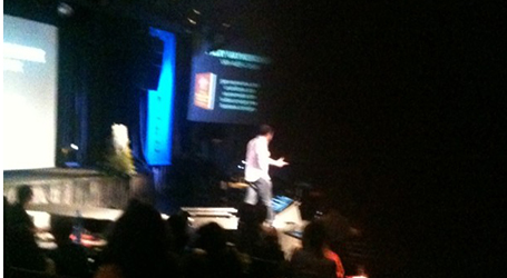
Gary Vaynerchuk spoke live at an event organized by the Tel Aviv office of advertising agency McCann Erickson last night, and it was the first time that I got to see him on stage in person.

Gary became an Internet celebrity after he started using wine reviews in video format to transform his family liquor business from a mom and pop store to a major force in the US market. Since then, he he broadened his activities. He is a well-known author of books, runs a marketing consulting firm, and is a sought after speaker.


The one thing that got him were he is, is for sure his passion and energy that shines through in his presentation style. One of his opening statements was that every single brand that has been successful over the past 150 years has been one that managed to tell its story well.

Gary delivers a great performance in a unique style while breaking many of the rules of presentation delivery. And maybe that is what makes it interesting. He can pace back and forth, looking at the floor while speaking. His story line is an improvised sequence of stories. But these stories are memorable and delivered well.

Gary is good at building up tension in a talk. He is hinting at a crucial question he will ask you, or that he is about to reveal a major insight (what do I think that the Old Spice guy campaign was a failure), but he waits and waits with giving the answer.

It was a shame that after this powerful, high-energy talk that on multiple occasions challenged the practices of most people in the audience (traditional advertising agency staff), the audience was mostly silence and had limited questions (I felt compelled to ask one, which I usually do not do). Maybe it is a bit hard for a Israeli/Hebrew audience to follow the flood of high speed English.

SlideMagic: a platform for magical presentations. Free student plan available. LEARN MORE

Budget enough time for design

Theory and rules are not enough to create good looking slides. It is a bit like interior design. Architects can use nice materials, pick matching colors, and still, somehow the overall design does not look good. And you cannot exactly pinpoint why this is.

I often have these moments where I am starting over, trying again, do something different, put a design away to give it a few extra days, because it just does not feel right, despite that I used good fonts, matching colors, the right proportions. So why is it not good? I would not be able to tell you.

This is not a problem if you allow enough time for the design process.

SlideMagic: a platform for magical presentations. Free student plan available. LEARN MORE

Using your laptop monitor as a 2nd monitor

Computer screens have gotten bigger and bigger, and I suspect that most users will use the extra screen real estate to keep multiple windows open on their desktop. One for email, one for Twitter, one for PowerPoint, one for Skype. Designers do not have this luxury to spread everything out in front of them, they need a big calm design environment with minimal distraction. My PowerPoint or Keynote screen is always set to the maximum.

I used to work with a laptop in clam shell mode in my office: the laptop is closed, and a big external monitor is used as a display. For copying and pasting, inserting Excel charts in PowerPoint, I was constantly moving windows around. Until yesterday, as I looked at the closed laptop screen.

So now I created a dual monitor screen set up. My slide design application is up full screen on the large monitor, and my laptop screen is used as a collection bin for all kind of bits. It has been a liberation. My 17" laptop actually is big enough for the little side apps that I am running in that screen. Great.

If you are on a Mac, here is how to do it:

SlideMagic: a platform for magical presentations. Free student plan available. LEARN MORE

Device proliferation: email PDFs instead of PPTXs

It is better to email a PDF of your presentation than the original PPTX PowerPoint file.
  1. Fonts get rendered correctly, even if the receiving party does not have them installed on their computer. This is especially true now that more and more people are starting to use Macs and are running PowerPoint for Mac, an application that does not allow font embedding. 
  2. Many people open PPTX files on their Blackberry. A PDF is your safest bet that everything renders correctly.
  3. Many people use Gmail as their email system (hiding a gmail address behind what looks like a regular domain). In Gmail, you have the option to view a file rather than downloading and opening it. When you select view, the document gets opened in Google Docs, which is not very good at rendering PowerPoint files (not only fonts go wrong, but entire shapes can go missing)
  4. A PDF opens nicer and cleaner than a PPTX that lands in you the slide edit mode.
  5. PDF file sizes are usually a lot smaller than PPTX file sizes.
The consequence of all this is that you should think twice about using animations in your slides. I switch more and more to just copying a slide and building content page by page, so it will show correctly in PDF format.

SlideMagic: a platform for magical presentations. Free student plan available. LEARN MORE

Motion graphics: Stuxnet virus explained

Here is an impressive piece of video animation work by Patrick Clair. Watch the use of narrow all caps fonts.

SlideMagic: a platform for magical presentations. Free student plan available. LEARN MORE

Using hand drawn graphics in slides

Hand drawn graphics can work great together with images in slides. As an example, see these ads below. (I am not sure whether these ads do a good job in selling markers, they are great though in warning you to take care of your health).


It is possible to draw shapes using a mouse or a drawing pad in PowerPoint, but I always find it hard to replicate that marker effect. Instead, I scan in real hand writing using a scanner, and then kill the white background with the Photoshop color range filter.

SlideMagic: a platform for magical presentations. Free student plan available. LEARN MORE

1970s label font

The Impact label font by Tension Type can work great in a presentation design. It is open source, you can download it here at Dafont. It also comes in a white reverse version.

SlideMagic: a platform for magical presentations. Free student plan available. LEARN MORE

Sentences are useful sometimes

Back at McKinsey in the 1990s we would write a long-hand sentence, or a "lead" at the top of every slide (similar in length to today's 140-character Tweets. This sentence would give you the message of the chart and you could get the whole story by reading all the leads in a document, without looking at the exhibits below.

I am re-discovering the sentence recently.
  1. In some presentation designs, I switch to a slide template with a 2 line title, creating space for longer sentences at the top of a slide.
  2. Certain thoughts or concepts are just too complex to shorten to 2 bullets of 3 words each, so I am just writing them out.

SlideMagic: a platform for magical presentations. Free student plan available. LEARN MORE

White frames or not?

Most slides with images work best when you scale up the photograph until it bleeds of the page.


Making the image a bit smaller leaves a distracting white border around your slides that does not look good when projected on a big screen.


However, recently I started using a layout that is very often used in print advertising. An image which is more horizontally cut and more white space above and below the image. It is maybe not the best for large on-screen key note presentations, but it looks great for corporate decks that are discussed in a smaller setting.


This layout is often used in CD covers, see Similar to this album cover of a 1990s hit by Everything but the girl:

SlideMagic: a platform for magical presentations. Free student plan available. LEARN MORE

Sync narrative and visuals in web presentations

Online presentation sharing services such as SlideShare allow you to upload an audio track alongside your slides. You need to make sure that the narrative is exactly in sync with the visuals.

I have seen (heard) examples where the audio presenter starts talking about data or concepts that are not present on the visual in front of you. As a result, the brain starts to wander off, looking for missing pieces of information on the slide.

When talking to a live audience in person, you can draw the attention from the visual back to you. An exact sync is less important, and it is easy to fit in a slide story. During a short web presentation with audio, your audience is using the narrative as an explanation of the slides. Make sure they are lined up.

Sometimes, when you are short in time, that might actually mean inserting a slide with some quick (very short) bullets (did I just write that?) or a short sentence to support your side story. Something like: "Case example: 22% cost savings"

SlideMagic: a platform for magical presentations. Free student plan available. LEARN MORE

Making Gmail more Zen

We sit almost our entire day behind a screen, and most applications we run are an ugly collection of screen clutter. Clutter and distractions are creativity killers. Gmail is incredibly useful, but also incredibly ugly. Here is a partial solution, Ansel Santosa has designed minimalist Gmail a Chrome extension that let's you switch off unwanted features.

SlideMagic: a platform for magical presentations. Free student plan available. LEARN MORE

Font mix up that hurts the eye

Finally I spotted a newspaper ad of the store that I often drive by in the morning. A mix up of typography that hurts the eye. Here in Israel, many people might not notice since they are used to seeing a different character set all together.


Update: this company actually operates stores all around the world, with the same logo...

SlideMagic: a platform for magical presentations. Free student plan available. LEARN MORE