Reinforcing loops

Reinforcing loops

At McKinsey, we used to call this Business Dynamics, mapping reinforcing and opposing forces using arrows. The concept is borrowed from systems theory in mathematics and physics. These circles can make a great chart to show the main growth drivers behind your business.

The notorious US army spaghetti chart is a more complicated execution of the same principle. Contrary to many critical review, I actually liked it as a visualization of the incredibly complex situation over there.


UPDATE: There is now a PowerPoint slide template with 3 reinforcing loops available in the template store.

SlideMagic: a platform for magical presentations. Free student plan available. LEARN MORE

PowerPoint for Mac color rendering

If you cannot get excited about color rendering in software, please skip this post.

There is something weird in the color rendering of Microsoft PowerPoint 2011 for Mac. First, text and shapes get treated differently. If you make the text and the background the same color, the text will appear different. At first it looks like to be designed on purpose. But the adjusted color is actually a bit off on the hue spectrum, creating color clashes. See the example below.


Maybe there is a problem inside the software though. Look at the screen shot below of a presentation in presenter mode. I copied 2 exactly the same slides and you can see that the preview of the second (identical) slide pulls the blue into same purple direction as the text in the previous example. There must be more than one color rendering engine inside PowerPoint.


PowerPoint 2010 for Windows does not suffer from this, and I hope that Microsoft will fix it in a subsequent update (even it was done on purpose). If I want my text to stand out on a background, I want to freedom to decide myself what colors to pick.

SlideMagic: a platform for magical presentations. Free student plan available. LEARN MORE

Duarte launches Diagrammer

Nancy Duarte’s firm Duarte Design just launched an online market place for PowerPoint diagram templates: Diagrammer. You can select from a library of 4,000 diagrams that are ready to be included and edited into your own PowerPoint presentation. Each file costs $0.99.


I always found one of the best parts of Nancy’s first book Slide:ology (review of the book) to be the collection of diagram concepts. Now this collection has been digitized and automated.

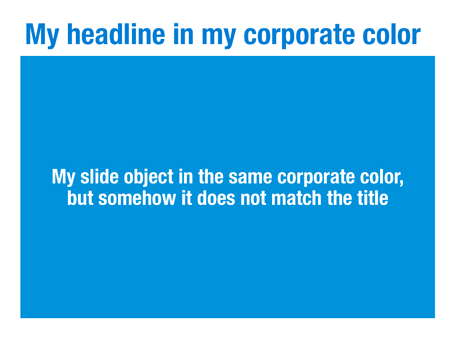
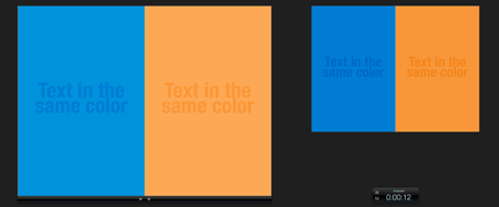
There is one competitor to Diagrammer built right into PowerPoint, the 
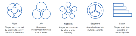
smart objects. But somehow, smart objects never worked for me, they are awkward to edit and to fit into the look and feel of the overall presentation. Moreover, Diagrammer has a much more powerful classification method, helping you to zoom into the exact diagram you need (flow, 2D, 4 steps).

Diagrammer also competes with other template sites such as Slideshop. Slideshop has more elaborate graphics (not always a good thing) and a broader variety of slide types.

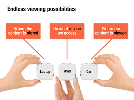
Diagrammer fills a clear need for diagrams in everyday, corporate, strategy-type presentations. One of the easiest ways to replace a bullet point chart is to shorten the bullets and put them each in boxes with a framework that shows the relationships between the elements. (Still, it might be hard to resist for many users to shrink the font sizes in each of the boxes and cram in some more text...)

Congratulations to Duarte with the launch of Diagrammer, it shows that they have an open mind to innovate presentation design. It is impossible for bespoke presentation design (like the service I provide) to free the world of poor presentations. Self-service technology might get us there eventually.

SlideMagic: a platform for magical presentations. Free student plan available. LEARN MORE

Liberated from the email attachment

Clients that run conservative IT infrastructures (usually the larger enterprises) still have a cap of around 10MB on the size of an email attachment. As presentations contain more images, file sizes are getting increasingly larger. Over the past years I have been cropping and compressing to keep file sizes in check, but I think we have finally reached the time to get rid of the email attachment as the preferred way to send files across.

Solutions such as Dropbox provide a very convenient alternative to the email attachment, send a download link to a file, or sync a file both on your hard drive and the hard drive of your colleague.

Now that 10MB is no longer an issue, we can go to 100MB and beyond and this introduces incredible design freedom.
  1. Put images in at full HD resolution, keep the areas that you cropped out to change a slide design in the future, and have the option to produce very high-grade print material from your working document. There is no need anymore to do destructive compression to your source file. With new devices such as the new iPad with retina screen resolutions going to more than 2000 pixels this becomes essential. A 700 pixel image will look OK on a crappy VGA overhead projector, but will look fuzzy and unprofessional on a tablet
  2. Embed HD videos right into the presentation file. No more linking, saving files in the same directory and worrying about whether things work. Over the past months I have become convinced of the power of short 30 second videos in presentations. You could even start replacing background stills of a landscape with a looping video that show a gentle breeze going through the tree tops with some birds flying by.
Last week I delivered my first 64MB presentation to a client and I am sure that record will not hold long.

SlideMagic: a platform for magical presentations. Free student plan available. LEARN MORE

iPad: Keynote tipping point?

I am continuing my research in mobile presentation platforms, with very useful input from you guys.

Until now, the Keynote versus PowerPoint battle has been a feature debate. While Keynote has some better features in some instances, they are unlikely to be enough to switch people over who just invested years in getting to grips with one user interface.

Mobile devices might change that.

There are two types of presentation decks. The everyday presentation is a PowerPoint file that is used in corporates to make business decisions; it is not really meant for presentation, rather it is a more visual substitute for a word processor. The second one is the key company pitch, sales, or fund raising presentation. You use it all the time. You perfect it all the time with small changes. You use it in different settings, mostly for audiences outside the company.

I would argue that by now, it is better to have that crucial presentation in Keynote than in PowerPoint. Why? Mobile devices, and the integration of PowerPoint with iPads is non-existent, while by now Keynote has pretty decent mobile apps.

Pulling out a laptop in a coffee shop to go through a deck is unnatural. Flipping on your iPad is not. An iPad could also be a powerful replacement of the PC + clicker combination that we use for conference room, or even on-stage presentations.

One scenario. You sitting at the reception of a venture capitalist waiting to be picked up. On your iPhone you click through your slides to do a final mental rehearsal. Ah, a typo, a quick fix. You walk into the conference room and one of the VC partners is late. Instead of an on-screen presentation you tell your story verbally, while pointing at a key chart on your iPad when necessary. The second VC partner walks into the room, and immediately you Airplay the presentation onto the conference room screen. You quickly repeat the main points you made by picking off a few slides from your iPad (because of presenter mode, the audience does not see you browsing through tiles) and finish the discussion with the detailed financials, and the use of the funds that you are trying to raise.

I think it is important to have to crucial, all-important, pitch deck available on a phone, table, lap top to be prepared for any situation. And at the moment, only Keynote allows you do that.

Even for big corporates, this might still not be a reason to switch platform. But for the sales department, it could be a reason to invest in a Mac (or install Parallels on a PC) and equip the mobile sales force with iPads with the Keynote app installed on it.

SlideMagic: a platform for magical presentations. Free student plan available. LEARN MORE

Do not dilute your pitch

Usually, a pitch starts really great. When asked, out comes a short and to-the-point story about what you are about. Then we add more info on this, more info on that, until we have diluted our story so much that it sounds pretty much like any other company or fund in your market.

Use the fact that everyone in your industry is creating noise about why the market is so bit, how it is growing so fast. Trigger a recall of this information in the mind of your audience through simple charts. Focus the majority of the time and slides on that unusual story about why you are different than all the others.

Maybe it is good to record that very first pitch on video so you can go back to it in the middle of the design process. Part of the value of a professional presentation designer is sticking to the story that came across in the briefing.

SlideMagic: a platform for magical presentations. Free student plan available. LEARN MORE

iPad, Prezi, and remotes

The iPad could be the ultimate device for presenting on-stage, solving many problems I have blogged about before:
  • It can create a dual-screen view: the presenter sees a different screen than the audience (timer, next slide coming up etc.). Now only PowerPoint and Keynote support this with dual monitors. The iPad can create it instantly for any application, including Adobe Reader, enabling presenting from PDFs
  • It can create a non-lineair presentation interface (like Prezi). On your iPad are all the slides in thumbnail view, and you can pick them on the spot without disturbing the audience screen.
There is a real jungle out there of iPhone/iPad presentation apps and none of them get it right. None of them have the thumbnail slide mode, and no one has found a good way to work around the iPad's font limitations (images instead of text?).

This last point is essential if the iPhone/iPad moves from being a remote control directing a computer to becoming the device that powers the project itself.

Has anyone found the ideal iPad presentation app?

SlideMagic: a platform for magical presentations. Free student plan available. LEARN MORE

Evidence versus detail

They may sound or look the same, but there is an important difference:
  • Detail is a pile of facts that bores the audience
  • Evidence is that critical (and sometimes detailed) fact that convinces an audience

SlideMagic: a platform for magical presentations. Free student plan available. LEARN MORE

The counter top presentation

I am currently designing a presentation that is supposed to run on an iPad that sales people take into busy, noisy small businesses to sell something to an owner who does not have time to listen to us.

Of course it has to be short. But we are pondering whether to go with lots-of-big-pictures-slides in 4 minutes, or a few condensed slides in 4 minutes. Big images are better to catch the attention of the owner, but constantly swiping through slides on an iPad might be awkward, and standing in the way of creating a human one-on-one interaction.

On balance, I think to go with the first, what do you think? Have you had experience with this?

SlideMagic: a platform for magical presentations. Free student plan available. LEARN MORE

I told this a 1,000 times

If you are in sales, or you are pitching for investment, you might end up giving that presentation a 1,000 times. Do not say that to your audience, they hear it for the first time. Do not skip over points that seem obvious to you, they are not to the audience. And finally, do not leave that enthusiasm that you had the first time you gave the presentation.

Think of that musician that managed to inspire you with that song that she played for the 1,000th time. In short, give the 1,000th presentation as if it were your first.

SlideMagic: a platform for magical presentations. Free student plan available. LEARN MORE

Trackpad only

A while ago I wrote this post comparing a Logitech Mouse, the Magic Mouse, and a track pad. Nine months later, I have switched complete to a track pad, which is not only much better for navigating the Mac Lion OSX, but I also find it highly accurate for drawing shapes and general slide design work.

The key thing that I had to learn was to move things around not by using the old PC method: click the track pad and hold it pressed down while moving your finger, but work with 2 fingers: one presses the track pad down, the other one moves the object. Once you get the hang of that, your movements are as precise as with a mouse.

My pile of obsolete hardware is getting bigger.

SlideMagic: a platform for magical presentations. Free student plan available. LEARN MORE

Rigorous deal selection

A U.S.-based healthcare-focussed venture capital fund only invests in a company if it pushes forward on of seven trends in healthcare. The page below tries to visualize that.

The point here is only about the rigorous selection, the trends themselves get explained on separate slides, and the portfolio companies get discussed somewhere else in the presentation. After the presentation, institutional investors should remember that the fund is very picky in investing their money, “remember that magnet slide?”

SlideMagic: a platform for magical presentations. Free student plan available. LEARN MORE

iPhone commenting on this blog

Sometimes, a reader manages to publish a comment on my blog using the Blogger commenting system, and not the Disqus engine that I have embedded. My blog does not show the Blogger comments, nobody will see them, and I cannot respond to them. Two requests: firstly, please use the Disqus commenting system, and secondly, if you were the victim of this glitch, could you please let me know how you managed to still get into the Blogger commenting system? Maybe it is via the RSS feed? (Obviously, when telling me this, please use the Disqus system :-))

UPDATE: If you comment on my blog using the iPhone mobile template, you get the Google Blogger commenting engine, not the Disqus one. As a result, your comment will disappear on a Google server somewhere, never to be seen by anyone, ever again. I have contacted Disqus support.

SlideMagic: a platform for magical presentations. Free student plan available. LEARN MORE

Endless permutations

Here is a nice way to visualize an unlimited amount of possible combinations. The sanitized example below was designed for a client with a new digital media technology. You could create a similar concept with a suitcase combination lock, or maybe a slot machine.

SlideMagic: a platform for magical presentations. Free student plan available. LEARN MORE

Uncover versus popup

I am not a big fan of animation, spectacular effects do not support a serious business message and documents with animations do not convert well to PDF for emailing.

Sometimes there is no escaping though, especially when you need to explain components of a complex system. The best way to do this is to add elements one-by-one through a series of clicks.

The usual way to do this is to use pop-up animations. However, these can be cumbersome to edit: you often forget one item in a group, and have to start all over again.

There is an alternative: cover the critical elements in your slide with boxes and remove the boxes one by one. Easier to edit. You can even make it more sophisticated by given the boxes a 10% transparency: the viewer sees sort of what is coming, but not completely. When you want to PDF and email a version of your document, you simply delete all the boxes which leaves the full diagram intact.

SlideMagic: a platform for magical presentations. Free student plan available. LEARN MORE

Links to full screen YouTube videos

The most reliable way to include video in your presentation is to include it in your presentation file. Dragging a video file into Keynote for example creates huge file sizes, but you eliminate the hassle of having to save files in the same location.

A less elegant option, but one that saves space, is to rely on live YouTube links for playback. Here is an approach to do this:
  1. Play the video (in the highest resolution possible) and pause it at the moment you want to use for the placeholder image.
  2. Take a screen shot and paste the image into your slide
  3. Draw a big triangle and place it in the middle of your still image as a play button
  4. Insert the hyperlink to the YouTube video inside the triangle and you are done.
In presentation mode, you can click your play button triangle with the mouse and your browser will open to play the video.

By default, the video will play in the standard YouTube view with all the screen clutter around it. Here is a way to get a link that triggers a full screen view of a YouTube video.

The standard format of a YouTube URL is this: http://www.youtube.com/watch?v=R55e-uHQna0. Here is the trick. Replace the watch?v= bit with this v/ to get this result: http://www.youtube.com/v/R55e-uHQna0. Make this the link your play back triangle points to.

SlideMagic: a platform for magical presentations. Free student plan available. LEARN MORE

Need a simple planning tool

Business is going well and I am in need of a basic time planning tool. My work style has changed from one that is management consulting-like (1 project at a time, from start to finish), to a more erratic (creative?) work schedule. I take on many projects at the same time, ponder about creative approaches in parallel, and have become much, much faster in execution once I have the ideas for the killer slides in my head.

With all of this, it has become hard to get a good grip on my actual work load and give clients a realistic delivery date of a project. Most project planning tools available are designed for large projects executed by multi-person teams doing tasks that are defined in days and not hours. These tools also find it difficult to manage multi-tasking: one person who is working on more than one project at a time.

So, I wonder whether you have come across a tool that allows me to do the following:
  • Quickly add lots of short projects
  • Sync with a calendar to take into account holidays and other commitments
  • Put in hard deadlines for some projects, while leaving others open
  • Allow multi-tasking
I have been playing around with Omniplan and Clarizen, but these do not seem to do what I need.

SlideMagic: a platform for magical presentations. Free student plan available. LEARN MORE

Writing it on every page

Sometimes a senior executive comes in at the end of a presentation design process and starts making some “edits for clarity”. She probably does not have a lot of time to go through the deck in detail, but wants to make sure the key points are said. No better way to do this than adding the words “flexible solutions ” on as many pages as possible. Now the deck says at least what it is supposed to say.

When this happens, it is time to stand up for yourself.

SlideMagic: a platform for magical presentations. Free student plan available. LEARN MORE

So what?

The first day of your career at McKinsey, you learned about the concept of “So what?”. It meant asking yourself what the real point of a chart full with analysis was, and writing that down as the title.

A so what should be meaningful, and not simply stating a fact for example instead of “We are making a loss in France”, maybe it should read: “It is time to leave the French market”

Once you established what the so what of the chart is, you could then go on an cut down any facts, data, or analysis that was not essential to make the point.

If you identified the key messages correctly you would be able to understand a document by just reading the headlines, the content of the slides just backs up what the title says.

A useful day-one concept, I still use it pretty much every day.

SlideMagic: a platform for magical presentations. Free student plan available. LEARN MORE

Getting the most out of a designer

Designers can do good work, or can do great work. How can you get them to do great stuff?
  • Give them plenty of time. Introduce your pitch way before the deadline, build a relationship, start the actual work with enough head room for creativity and iterations. Good presentations are not born under deadline stress
  • Give them a broad briefing. Tell the story you want to tell in double the time you have. Give background about the story, the audience, the occasion. What goes in the design process, will come out.
  • Give them freedom. Very strict instructions will return your own presentation with the objects on the slide just a little bit better aligned.
  • Give them budget. If after a a long negotiation the designer utters “OK, I will try to squeeze it in” followed by a a sigh, it is unlikely that you just switched on all the creative genius that is present in the designer.
  • Give them a blank sheet of paper. Insisting on using an ugly corporate PowerPoint template is a set up to failure for the presentation design project.
  • Give them access. If the CEO needs to give a presentation, the CEO needs to talk to the designer directly. Chinese whispers through corporate hierarchies dilute the message.
  • Give them sleep. If you are working in different time zones, it can be tricky to find overlapping meeting times. A designer having to get (stay) up in the middle of the night is unlikely to do the best she can.
In short, managing design is not like managing a production line. Pushing, dragging, squeezing is not going to get you better results.

SlideMagic: a platform for magical presentations. Free student plan available. LEARN MORE