A Microsoft strategy mistake

This Twitter conversation just unearthed another feature that is missing in the Mac OSX version of PowerPoint:


There are many more, see older posts about PowerPoint 2011 for Mac versus PowerPoint 2010 for Windows here.

I do not think the reason for this is a technical one, it should be possible to write the same software for both platforms. Hence, Microsoft must be thinking that by making PowerPoint 2010 for Windows just that tiny bit more feature rich, it will convince users to stay on the Mac platform.

I think this will be backfiring: Mac users will simply switch to Keynote. Microsoft should create an organizational separation between the Windows and Office business, the latter should consider the Mac a highly profitable platform for selling software.

SlideMagic: a platform for magical presentations. Free student plan available. LEARN MORE

Use that video

When you have invested in a great animated promotion video to put on your website, why not use it in your presentation? A good video can tell a relatively complex story in under 2 minutes. Most of these videos contain high quality art work that is great for use in a presentation.

Embed the video in your presentation (I prefer putting in the actual file rather than linking to an YouTube video) and create visual connections later on in the deck using screen shots of the video (either page-filling or small thumbnails).

Do not feel embarrassed that that video just cut your bullet point product explanation from 15 minutes to just 2, your audience will appreciate it.

SlideMagic: a platform for magical presentations. Free student plan available. LEARN MORE

Elevator pitches are 2-way

If you got the attention of a potential investor in a random setting you can decide how to use your 2 minutes. One option is the 1-way monologue, where every single one of these precious 120 seconds is filled with information and facts.

The other option is pitch your idea briefly, read someone’s face, interpret a quick question and adjust your story to the concern you see.

I think the second approach is better. Maybe you lose 30 seconds of airtime, but the other 90 seconds are definitely more effective.

SlideMagic: a platform for magical presentations. Free student plan available. LEARN MORE

PowerPoint as a word processor

PowerPoint or Keynote are perfect alternatives to word processing applications to write documents that are primarily intended for reading and not for presenting on-stage. Corporate executives are so overloaded with information that the memo written in long-hand text is making way for a more visual way of presenting that is somewhere in between a dense text and a keynote presentation. If you write a book or a complex legal contract you probably rely on some of the more advanced word processing functionalities (style sheets, numbering, revision marking, etc.) For all other situations, PowerPoint or Keynote work fine.

The first and most important thing to do is to realize that you are writing a document for reading not presenting and adjust your style accordingly:
  • Reduce your font size to make space for more elaborate sentences. You will not be there to present the document, so the text should be self-explanatory. Big bold fonts work great for catchy headlines, for actual reading a smaller font size is more readable (a bit counter intuitive).
  • Don’t make your sentences to long. A book has only 7-10 words on a line, and newspapers use columns to keep lines short. The eye can get lost if it needs to make left-to-right movements over longer distances. Consider using a column layout of the page as well, either across the page, or one column at the side of the page and an illustration covering the rest.
  • Add tracker pages, page numbers, and other reminders of where the reader is in the document. I believe that in short stand up presentation these elements just add clutter, when we sit down to read, we need to bring them back in.
  • Maintain white space on the page, use wide page borders to create a calmer look. It is better to shrink the text and give it space to breath, rather than increase the font size until you covered the entire canvas.
  • Use very subtle techniques to highlight text. Too many bolds, italics, and underlines create clutter. Only use a few different font sizes.
  • Make sure that objects and text columns are properly aligned on each page.
  • Dark background are usually not very readable with smaller text, and are definitely a problem when your document has to be printed. Go for a light background instead.
Remember that writing a text document in presentation design software might sometimes require deviating from the standard presentation 4:3 landscape aspect ratio, PowerPoint or Keynote can equally work with a vertical A4 or letter page format.

SlideMagic: a platform for magical presentations. Free student plan available. LEARN MORE

Cropping a composition

The 2 photos from a birthday party below show what an impact cropping a good composition can have on the quality of your images. I used the iPad app Snapseed (affiliate link) to do the following:
  1. Cut out the eating man, cut out the light/bright parts of the image at the top to focus on the boy in the foreground and the girl reaching fro the bubble in the back
  2. Take out the color since the composition of the greens and the clothing of the kids does not really look interesting. The B&W image enhances the texture of the bubbles, leaves, and grass
  3. Selective up the brightness around the faces of the boy, the girl, and the boy back to the left
  4. Up the sharpness and structure of the image


The result is a transformation from a bland image to one that looks like a Matrix-style freezing in time. I am constrained here by the 455 pixel limitations of Blogger, the final image looks better at its proper resolution.

SlideMagic: a platform for magical presentations. Free student plan available. LEARN MORE

How to put video inside PDF

More and more of my presentations start to use video, and my preferred format for emailing/Dropboxing decks is PDF, so how do you insert a video in PDF? It is easy with Adobe Acrobat X:
  1. Save your presentation (PowerPoint or Keynote) as a PDF without the video
  2. Open the deck in Acrobat X and select tools at the top right
  3. Select multimedia, select video, and draw where your video should go with the cross hairs
  4. Select the video file, or insert a YouTube link (I went for the first option, the video size was below 10MB)
  5. Select advanced options, and select use poster image from file to pick the right cover
  6. Click done
The investment bankers of a recent client insisted on the traditional Executive Summary to send to potential investors. I used this video and a 3 column dense text layout to turn a boring bullet point list into a nice looking one page document meant for reading and watching.

Unfortunately, the video does not (yet) play on an iPad...

SlideMagic: a platform for magical presentations. Free student plan available. LEARN MORE

Creating cartoons with PowToon

PowToon aims to enable you to create cartoon-style, animated presentation and video clips without professional illustration and motion graphics software. I test drove the beta version.

When you look at many cartoon-style videos you see that they are actually not that complicated from a graphics point of view. Usually they involve a number of scenes (slides), they use static characters, basic entrance, exit, and emphasize animations and sometimes a cute hand that puts items on the slide, all accompanied by some simple music.


And this is what PowToon does. The edit interface looks Windows blue, it allows you to place items in a slide and specify the animations. In theory, PowerPoint or Keynote can do the same things, but it requires a deep understanding of the software, plus a library of characters.

There is definitely a market for a tool like PowToon. I do not envision these type of animations to be used in a stand-up presentation, but rather they could be useful to create demo videos on web pages, or presentations for emailing to prospects.

The basics of PowToon work great. I spent 10 minutes to stitch together this video based on a pre-defined template. PowToon is still in beta, and there are a number of features that I would recommend the team to incorporate:
  • Invest in the object library, and make them look less clip-arty (the picto character has some resemblance to the 1990s screen bean), this could also be a good revenue model: premium illustrations
  • Create the ability to export the presentation as a movie and embed them in a regular PowerPoint or Keynote file, this will make adoption in corporate environments a lot easier.
  • Make it easy to embed presentation videos in sites (I am sure the team is working on this)
  • Find a way to let the hand draw shapes and write text, so everyone will be able to make animations in the style of RSA Animate.
PowToon is also powering a market place for designers to offer custom-design services on the platform. I am looking forward to incorporating PowToon animations in my client work!


UPDATE: PowToon is extending 100 beta invites to readers of this blog: sign up here.

SlideMagic: a platform for magical presentations. Free student plan available. LEARN MORE

Pretty, but hard to understand

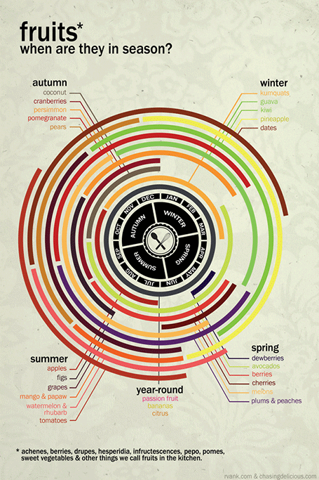
Infographics can be beautiful, but many times this comes at the expensive of clarity. This chart explaining the seasonality of fruit on Life Hacker is an example. The designer went for a circle concept because nature does not break up years between December and January. Still, this one would have been clearer with (fatter) horizontal bars.


Original design by Chasing Delicious.

SlideMagic: a platform for magical presentations. Free student plan available. LEARN MORE

"Cute" investor pitches, watch out

The other day I could a project inquiry. The current deck looked like an infographic, it was very nicely done: soft pastel colors, retro fonts, nice icons. Still, the company had difficulty finding traction with investors: where is the meat, where are the numbers, this looks like an ad.

Many VCs come out of the world of engineering or banking which has a certain quantitative, macho communication style to it. Even if your product positioning is “cute”, your investor presentation should probably a bit more testosteron-loaded.

In my previous life as a management consultant, I have spent many years inside consumer goods companies. Believe me, their management presentations do not look like the ads they put on TV for their products.

I am not saying that you should kill the cute slide deck (the world would be a lot more boring if that happened on a large scale), I just wanted to emphasize that if you decide to go with this style to be aware of your audience and compensate in some other way.

SlideMagic: a platform for magical presentations. Free student plan available. LEARN MORE

Even CEOs cannot wing it


Everyone would agree that Steve Jobs was a pretty good presenter. But he is said to have practiced two to three full time days before a major product launch speech. Two to three full time days! I bet if you put in that effort before your next presentation, you would be pretty close.
Practice means real practice: standing up, going through the slides first to last without interruption or a quick skip back when you make a mistake, you cannot do this on stage either. Make a video of yourself if you can. Put your screen where your monitor laptop will be (so you do not have to look back at your screen to see what slide is on).

It may sound counter–intuitive, but you actually need to know your story inside out to be really spontaneous. There is no such thing as “winging it”. Your audience will notice, you will use “uh” and “oh” all the time, the key lines will not come out the way they should, you will repeat yourself all the time.

And memorizing the talk line by line is not enough. If an actor has to go back to her memory for every line in the play, she will not have the mental energy to focus on the mood of her character. You need live and breathe your story. Then it will come out naturally, and you can improvise around your story line depending on the reaction of your audience.

The exception here might be webinars. Here, the audience cannot see you and you can probably get away with reading through a presentation line by line.

Many high profile public speakers are so good at what they do because they basically give the same speech with the same story over and over again (unlike Steve Jobs who had a new product to announce every six months or so). These people can go up the stage without any preparation at all, but it took them a dozens of performances to get there.

Sometimes it is hard to convince a really senior and experienced executive to rehearse a presentation in pretty much the same way a junior intern needs to do. The solution is to create a hidden, risk free environment. Convince her to do a run through once; the stuttering that will happen is usually enough motivation to do a few more. Or tell her about Steve Jobs’ rehearsal habits.

SlideMagic: a platform for magical presentations. Free student plan available. LEARN MORE

PowerPoint guides using xScope

One of the most annoying shortcomings of PowerPoint 2011 for Mac is the inability to lock drawing guides. An external app can solve the issue.

A guide is a thin blue line on your design canvas along which you can align slide objects. If you drag an object close to the line, the object snaps into place. In this way objects on multiple pages are positioned in exactly the right place. I use them to mark slide borders, and more importantly the vertical center of my drawing canvas when it does not coincide with the center of the screen.

It is very important that these drawing guides stay exactly in the right location, and this is the issue. As soon as your cursor comes anywhere near a drawing guide, PowerPoint will make moving the actual drawing the priority. So if you try to straighten out an object that is a little bit off and want to fixate it against the guide, PowerPoint moves the guide rather than moving or resizing the object.

xScope (affiliate link) is an app for Mac that allows you to draw screen guides independent of the underlying application. The good news: PowerPoint does not move your guides anymore. The bad news, objects do not snap, you have to make sure manually that they are perfectly aligned. One other comment, the app lets you decide where to draw lines and where not when you use 2 screens. xScope does not allow you to manage this on 3 screens.

The app costs $30 and this because the guide feature is part of a full set of tools for graphics designers: measurement rulers, crosshairs, iPhone mirroring, screen shots. Most of these features I actually do not use. As a professional presentation designer, the $30 was money well spent just to sort out the drawing guide issue, I guess for most other people it is not.

Does anyone know cheaper alternatives to solve PowerPoint 2011 screen guide locking?

SlideMagic: a platform for magical presentations. Free student plan available. LEARN MORE

The table as a grid

It can be a real pain to space out logos in a logo page nicely. My trick is to use a table with a really fine grey line between cells. It is easy to adjust the grid when you need to insert and/or delete columns and/or rows.

See here an earlier post on how to make great looking logo pages.

SlideMagic: a platform for magical presentations. Free student plan available. LEARN MORE

Tables can look good

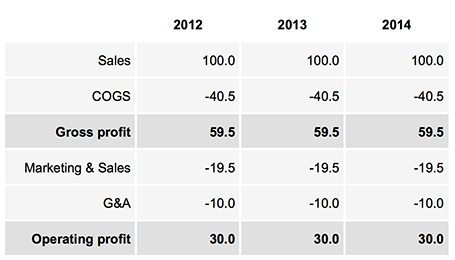
Sometimes, you do not need a data chart at all, and nicely formatted table with rounded numbers might just be the best option to visualize your data. This is especially true for financial statements with lots of information, or in situations where one chart contains a lot of numbers with completely different orders of magnitude. Some quick improvements you can make to make a table look good:
  • Space out rows and columns, the more of them are the same size, the calmer the table will look 
  • Round up numbers to a reasonably precision, use a “,” to separate thousands Right-align numbers, make sure the decimal dot lines up 
  • Right-align the first column with descriptive text, so it is as close as possible to the first column with numbers. 
  • Use highly muted background colors, I usually pick the lightest grey that I can get, and draw the cell borders with a white line 
  • If necessary reduce the font size, very big fonts with unnatural line breaks do not look very good in a table. 
  • Enter data manually: yes typing in every single number by hand is often the only way to get the table to look exactly the way you want it to. Fifteen minutes that are well-spent
UPDATE: on request an example of a table layout I often use.

SlideMagic: a platform for magical presentations. Free student plan available. LEARN MORE

The real case study

Case studies in investor and sales presentations are most of the time hollow and fluffy quotes that were clearly the result of an email saying “Do you mind if I quote you saying that our solution is highly flexible and scalable?”.

Here are a few ways to make a case example real:
  • Focus on one specific benefit, if you try to put your entire story in the mouth of your customer, you need 30 slides, not one
  • Cut the fluff
  • Be very specific, and very detailed, quantify if you can. 
  • Add an image of your client to make things more authentic.
Case studies can be more than a simple quote of text. If you want to show that your system can be installed within 6 weeks, why not show a bar chart of your last 10 customer installations, with the exact time it took to install the system?

Tell a real customer story.

SlideMagic: a platform for magical presentations. Free student plan available. LEARN MORE

Content creation on iPad

I have been experimenting a lot with using my iPad as a laptop replacement. It boils down to getting used to a new user interface: designing slides in Keynote works fine, and even building a spreadsheet in Numbers might be more intuitive on a touch interface, it is easier to navigate around cells. Strangely enough picking up a regular pen and paper feels a bit weird the first second after all that digital handwriting.

There is a very big issue though, an issue that was solved on the PC in the mid 1990s: multiple application windows. Quickly getting the data out of a PDF, running a side calculation in a spreadsheet, browsing through your images before putting them in a deck is simply not possible yet.

Here are some features that should be baked into a future tablet operating system:
  • Touch-friendly application switching that does not create the cluttered window mess of regular computers
  • A universal file format so you do not have to worry about in which application to open what
  • A new clever archiving system that is not (only) dependent on file names and directories, maybe find files based on the time you were working on them, based on the people you cooperated with.
Maybe the successor to Microsoft Office is not a new series of software, but a standard file format that covers text, graphics, and calculations on top of which everyone can build applications.

SlideMagic: a platform for magical presentations. Free student plan available. LEARN MORE

Ooh, that's complicated!

Sometimes it can be useful to create a slide that is hard to understand. If your technology is really complicated and impossible to replicate, why not show it?

They easy way to show a complicated chart is to take a few pages of code, and shrink them down to font size 7. While this gives you a complicated chart, it does not convince your audience how clever your technology is.

The best way to show complexity is take a micro case example, show that it is complex, but explain it very clearly. A recent client had a very powerful real-time customer screening algorithm. To show the power of the technology, I visualized all the checks that are conducted within 0.1 s. The chart was highly readable and very clear. Still it was complex. And that was exactly the message we wanted to convey to potential investors.

SlideMagic: a platform for magical presentations. Free student plan available. LEARN MORE

Lying to potential investors?

It can be tempting to omit some details about your company in an investor presentation. Especially in the healthcare industry with its complicated data from clinical trials it is definitely possible to hide something from a potential investor until very far into the due diligence process.

A due diligence process that can takes weeks, sometimes months. You enter an exclusivity period, stop talking to other investors, continue to burn money until... the investor finds out. You lose the investment, probably not because the company all of a sudden looks completely bad, but because of you burned your integrity, your trust with a potential new Board member. And by that time your company could have run out of finances and have no other investors to talk to anymore.

Do not make an investor presentation that emphasizes your weaknesses with all the visual power in the world, on the other hand, be honest.

SlideMagic: a platform for magical presentations. Free student plan available. LEARN MORE

Custom font U-turn

After a year of experimenting with custom fonts, I noticed that I am going back to Arial more and more in my presentation design, so my decks can be read on Windows, Mac, iPad, PDF, Dropbox, SlideShark, Keynote, PowerPoint on any device in any place. Well at least it forces me to make more effort to let my slides look good if I cannot rely on a pretty font...

SlideMagic: a platform for magical presentations. Free student plan available. LEARN MORE