Put things in perspective

I just returned from a camping and hiking trip in Israel’s southern desert (the Negev) and came home with some beautiful pictures.

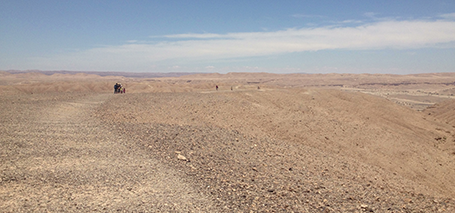
It is very hard to capture the sheer size of a landscape in a photo, and one trick to do this is the make sure to have an object in your frame that the viewer knows the size of. In the example below you see that the perspective greatly diminishes when I Photoshop my friends out.


The same is true with data in presentations. Putting the stunning image with the word “53 million” on it does not put the size of the number in perspective. Relate it to something instead.

SlideMagic: a platform for magical presentations. Free student plan available. LEARN MORE

You understand everything?

An aspiring presentation designer asked me this question. “You really are confident that you can grasp any story that is thrown at you (scientific, financial)?” I answered positive.

Yes, I have some background in business, engineering, and financial analysis, but there are cases where I do not get it the first time around. I do not think that that is my problem though, if I do not get it, the audience of reasonably intelligent people will not either. Time to try to explain it to me again.

I am not embarrassed to ask stupid questions, and never say that I got it when I did not.

SlideMagic: a platform for magical presentations. Free student plan available. LEARN MORE

Oops, doesn't fit

PowerPoint is not very good at creating line breaks in a shape. With lots of space left, it breaks your long word (&lquo;management” is a favourite) to the next line. Two things you can do:
  1. Right click the shape, hit format shape, select text box and un-tick the wrap-text-in-shape box. Now you can make your own line breaks
  2. For bigger fonts a 1.0 leading between lines is too much. Select the shape, click format, go to paragraph, and set the line spacing to multiple and put in the value 0.8 or 0.9 instead of 1.0.

SlideMagic: a platform for magical presentations. Free student plan available. LEARN MORE

Tell people what they should see

What is clear to you is hardly ever clear to everyone in the audience. A screen shot with a cleverly integrated login feature, a photo of a long line of people who cannot wait to try your product, an image of an unhappy customer. When in doubt, put a big call out or title that says what the audience is expected to see.

SlideMagic: a platform for magical presentations. Free student plan available. LEARN MORE

Viewer churn

The big challenge of website design is people clicking away to more interesting places. when you send a pitch deck without verbal explanation, you have the same challenge. Will your prospective customer or investor make it all the way to the end? Maybe presentation designers can learn from web designers?

 I was brainstorming this with a client the other day. We were thinking about how to include a fake demo in the presentation. Demos always look better with the biggest possible screen shots. The result however, is a very large presentation and the viewer might not make it to the end. A possible solution: add big PREVIOUS and NEXT arrows to the left and right of the screen, maybe a counter (Demo slide 4/12) and a bit SKIP button to keep the viewer on board.

Just a random idea, I need to think more about how to add navigation that is actually useful inside a presentation.

SlideMagic: a platform for magical presentations. Free student plan available. LEARN MORE

Preaching to the converted

Most sales presentations go on and on and on about an issue that the client might already be convinced of. Worse, if you present slide after slide in an amateurish format making the same point, your client might actually start to doubt what she believed when entering the meeting room.

That is time and slides wasted. More time efficient and effective ways to tackle this:
  1. A couple of really professional and serious looking slides with the highlights, plus an invitation to visit your web page for all the details
  2. Discussing the weakness of your competitors verbally and informally: it is hard to put this on paper. Suggest your client some tough questions to ask when they meet the competition. Note that this is actually a presentation design challenge, without creating the actual slides. You need to have this story prepared, maybe even with the help of a “spontaneous” flip chart sketch
Now spend the time you gained on the issues that really matter: are you expensive, is it hard to switch supplier, etc.? Preaching to the converted is never a good use of time.

SlideMagic: a platform for magical presentations. Free student plan available. LEARN MORE

Working title “Pitchera”

I am brainstorming names for my upcoming presentation app and am currently using the working title “Pitchera”. You can start signing up for the mailing list to stay updated on progress here. In that same form you can indicate what sort of presentation designer you are, I am still pondering to what type of audience the app should be targeted at launch.

SlideMagic: a platform for magical presentations. Free student plan available. LEARN MORE

I will talk to that

That is what many experienced executives say. It is true that not every point your want to make in a presentation needs to be spelled out in a slide. But sometimes the crucial message of a presentation gets omitted.

Some slide that has been used for a thousand times (often a bad one) is the trigger for the experienced presenter to tell her story that has been told a thousand times before. It looks like a slide presentation, but in practice the presenter is telling the story without slides.

In a focussed one-on-one meeting, the message gets across. It might get lost in a presentation for a big audience, and it will for sure not be communicated when sending the deck by email without verbal explanation.

A really fundamental point in your presentation deserves a slide. It often takes an outsider to point out to you what that point is. “Hey, that is sort of obvious, I can talk to that!” Not really.

SlideMagic: a platform for magical presentations. Free student plan available. LEARN MORE

From PPT to HTML

Web design involves technical skills that a presentation or print designer does not have. At the same time, (if I may say so), presentation/print designers might have a better feeling for page layout (understatement). Yeah, yeah, I agree, on the interactive technology front the geeks still beat us.

I have blogged many times over the past few years about the similarities between web and presentation design.

Most automated web design tools are aimed at small business owners with zero design or software skills: Wix is an example, or look at Striking.ly. So I was pleasantly surprised to discover Webydo that offers a design environment similar to PowerPoint or InDesign and enables presentation/print designers to create some pretty decent web sites.


The company is still in beta, so there is always the risk that your web site might go down with it in case the company does not get traction (that is why I am giving it some publicity here). Also, the software still has some tiny bugs that I am sure will be ironed out in the near future.

SlideMagic: a platform for magical presentations. Free student plan available. LEARN MORE

The other side of the table

As I am making slow but steady progress with my presentation app I have had a chance to sit on the other side of the table: being the one who pitches an idea, rather than my usual role as a presentation designer who gets pitched with business plans. Observations:
  • Yes, not everybody loves your idea like you do (but all designers do)
  • Most people form an opinion about your business without actually understanding/getting to what the truly great thing about it is
  • Spending dollars on designers becomes a whole different thing when it is your own money
  • When you live and breathe your own story, you actually do a lousy job pitching it to an outsider who has never heard of it. Having a pitch deck at hand (guess what, I do not have one) might actually be handy to slow myself down and take someone to the story that I assume to be common knowledge.
  • People point out - rightfully - that it is not only about product, I need a market strategy 
When listening to these people I hear myself speak when discussing client presentations. Funny. In any case, the process is making me a better presentation designer.

SlideMagic: a platform for magical presentations. Free student plan available. LEARN MORE

Where is the money?

Most business presentations address the financials of an idea at some stage. Resist the temptation of using a cartoonesk clip art image to introduce the topic. Financials are serious stuff and you are not asking for your weekly candy allowance from investors or corporate decision makers.

SlideMagic: a platform for magical presentations. Free student plan available. LEARN MORE

A good PowerPoint template

I just gave a client some feedback on new PowerPoint template options, I might as well share my thoughts with all of you:
  • Flat: no drop shadows behind fints, no gradients, no reflections. These look dirty in a world of razor sharp retina displays
  • Out with the subtle waves and watermarks, they 1) make slides hard to read and interfere with the slide design and 2) make your presentation look like 2003
  • Lighter fonts: there is no need to scream to get your point across. Keep a lot of white space around the slide title.
  • If you have to put a logo on each slide, put it at the bottom right, not top right (or even left), you want to leave the maximum space for the slide title.
  • The client spent a lot of time on the cover page, but my suggestion is to worry about it last.
  • Design your template around a real presentation rather than empty pages.

SlideMagic: a platform for magical presentations. Free student plan available. LEARN MORE

One minute pitches

Last night I attended a startup pitch event in New York where contestants had 60 seconds to pitch their idea, followed by 2 minutes of questioning by a panel of judges. Some observations on elevator pitches:
  • No slides (everyone got that right)
  • Get right to it, no uh oh, my background is, a small joke
  • Most important thing in 60 seconds: get people to understand what you actually do. When rehearsing the 60 second pitch (easy to do) test not only whether people like your idea, but more importantly, do they understand what your idea is. I struggled to understand about one third of the ideas, and I am used to deciphering startup pitches, so it must have been worse for other members of the audience. Luckily the panel of experts was helpful and dragging it out of people in the Q and A. Example: an in-restaurant ordering system actually turned out to be a $3,000 table where guest could order food using an integrated touch screen. 
  • Avoid going down a feature list, a user can do this, a user can do that, instead stick to the overall concept
  • Do end your pitch with something more uplifting than “That’ it!”, even if you feel embarrassed that there are still 25 seconds left on your clock. This is actually a good thing.
  • Tell people why the thing you do is so tricky. Example: nobody really got excited about a group video chat app until we learned that they solved a very complex technical issue in establishing a 1-to-many live video connection in 2 seconds 
  • Breathe, pause, speak calmly. It is better to skip a few points than speaking to rapidly, nervously.
  • In this case, the audience had a say in selecting the winner. They use different criteria than the professional VCs in the panel. For an audience entertainment value, or actually even the ability to remember what you were about after 20 pitches might be more important than the credentials of the founding team of your company. Pick the right battle, at the right time.

SlideMagic: a platform for magical presentations. Free student plan available. LEARN MORE

Why suffer?

Often when I visit a client and we do some on-site slide edits together, I am surprised to see how people suffer from working in PowerPoint because of things that can easily be prevented:
  • Make sure you actually see what you do. Make your work area as big as possible, reduce the size of the slide note box to the minimum. If you have a docking station for your laptop, use it to hook up to the big monitor. Ask IT to help sort out a 2-screen configuration, where you can have presentation inputs (an older version with comments) can be on the small screen while you do your edits on the big screen (I went further and work on two 27" monitors, plus the 3rd  small screen of my laptop, one of the best investments I have ever made).
  • Write down actions that you use all the time (aligning objects, [un]grouping items, switch to slide sorter view and back, etc.) and spend 20 minutes Googling how to do them using short cuts. Read this old post about how to create the essential PowerPoint toolbar.
  • Use a proper mouse and not the IBM/Lenovo red dot
  • If your computer is slow, close down windows, applications, de-clutter your machine until you have only the files open that you actually need
  • Ask someone in IT to sort out the default settings in your PowerPoint template so that you do not have to look for fonts, colours, etc.

SlideMagic: a platform for magical presentations. Free student plan available. LEARN MORE

Flat design: good news for you

Flat design is the big trend in graphic design at the moment, and it is great news for the layman designer. You can stop worrying about what you thought were “sophisticated” graphics: 3D, drop shadows, gradients, reflections.

Take the Microsoft approach for example: blacks and greys, one bright accent color, tiles spaced out in a grid, thin font, sharp edges. Perfect for a presentation look and very easy to replicate. Resist the temptation to make it “sophisticated” again...

If you are interested in the Microsoft design revamp, here is a 45 minute video that provides a look in the kitchen:

SlideMagic: a platform for magical presentations. Free student plan available. LEARN MORE

Substance in TED

Many people claim that they now design TED-style presentations. They understand that bullet points are bad, and hey, it is actually very easy to put a word in white type on a black background (maybe even add that stunning image).

What many forget though, is that the substance of these TED talks is in the narrative, the story. Just having 10 slides that look like TED does not mean that your performance is TED-worthy. Sorry.

SlideMagic: a platform for magical presentations. Free student plan available. LEARN MORE

88% of spreadsheets have errors

bug in an Excel spreadsheet influenced the outcome of an economic study. Flawed numbers can lead to bad decisions and/or take the credibility out of your presentation. “If the number on this page is wrong, I might as well have to check the numbers on every page....”

I have built my fair share of models (mostly discounted cash flow valuation models of big companies) and a small bug can make a few billion dollar difference in valuation.

My main strategy against bugs:
  • Simple formulas: plus, minus, times, divided by. 
  • If possible only 2 numbers per formula, intermediate results appear as another line
  • Round up to a unit that leaves you with one digit behind the dot (millions, thousands, etc.)
  • Everything points down, a result always depends on values higher up in the spreadsheet, never the other way around
  • And finally: adhere to the rule that if it looks wrong, it is probably wrong. Averages should be within the minimum and the maximum value, gross margins are usually around 50%, etc. etc.

SlideMagic: a platform for magical presentations. Free student plan available. LEARN MORE

One story throughout

You can simply describe your product/app with a dry feature list. Better: you can use case examples to show how things work in practice. The best approach: use one case example/story throughout your entire presentation:
  • You can go into a bit more depth to set the challenge your product tackles
  • You do not need to reintroduce the case example all the time, we already know the full background of the main character in your story
  • You can show that your product can be used on multiple occasions at different times of the day
  • You can also introduce smaller features using the framework of the overall story
  • You can instantly create a consistent look and feel across your presentation

SlideMagic: a platform for magical presentations. Free student plan available. LEARN MORE

PowerPoint as a picture frame

I am working with architects to help them pitch a building concept. The client requirement: no PowerPoint presentation, so we are designing the meeting around an informal discussion of sketches (some of them made on the spot).

PowerPoint will be reduced to a picture database from which we can pull up a building image quickly if (and only if) needed in the meeting.

SlideMagic: a platform for magical presentations. Free student plan available. LEARN MORE

How to pitch on demo days

I enjoyed talking to Israeli and Palestinian MEET graduates last Thursday about pitching at demo days. Here are some of the things we talked about:
  • Objective: get to the next meeting rather than landing the full investment which you will never be able to pull off in five minutes
  • 101: bullet points are boring (everyone knows this by now) and buzzwords do not work
  • Entertainment: marathon investor pitches wears out the audience. When you are the first up, you need to make sure people still remember you at the end of the day. When you are number twenty seven, you need to make sure everyone is still awake. Make sure your pitch is high on entertainment value, while staying professional at the same time
  • Five minutes: you cannot solve the time limitation by cramming in more content (denser slides, speaking faster), so chop those slides that are not important for the purpose of your pitch (getting to the next meeting). Detailed financial forecasts, team bios, technology explanations, can all wait for later
  • Carefully plan your app demo. Show what you want to show, do not spend time on boring log in screens. Tell what the audience is seeing, it might be obvious to you that things are beautiful and fast, the audience does not see it. If you can, avoid a live demo in a 5 minute pitch and instead go for fail-proof screen shots
  • One story throughout. If possible tie everything (consumer problem, your solution, demo) to one consistent case study throughout the entire five minutes.
  • Rehearse until you drop. Five minutes of content can be rehearsed until you know the content in and out. Spontaneous guitar solos sound spontaneous because the guitarist knows her scales  and melody lines so she can improvise them
MEET offers Israeli and Palestinian high school students the opportunity to go through an advanced high-tech training program (coding, business) in cooperation with MIT. People work in joint teams for a couple of years in addition to their normal education. Selection is very tough, only the very brightest, most creative, and most entrepreneurial applicants make it through the admission process.

Join the MEET facebook page to stay up to date on the initiative.

SlideMagic: a platform for magical presentations. Free student plan available. LEARN MORE