Sloppiness

When you have done your sales pitch hundreds of times, sloppiness can sneak into your meeting preparation.

You forget your business cards, you forget to remove that food stain your small son made on your laptop, you forget to check out the prospect’s web site and LinkedIn profile, you forget that the person in front of you hears your story for the first time and you should deliver it as if you gave it for the first time.

Every meeting requires concentration, even sales pitch number 723.

SlideMagic: a platform for magical presentations. Free student plan available. LEARN MORE

A new business language?

Most PowerPoint decks are not designed for standup presentations to large audiences, rather they are documents that are used to get a smaller group of people to agree business decisions (the implementation plan, next quarter’s budget, etc.). The language used in these documents has changed over the years.

First, there was the memorandum that was dictated and written on a type writer, later replaced by a word processor. It was full of fluffy and formal language and people quickly learned how to skip most of it by jumping straight to the “Executive Summary” on the first page. All of these documents looked sort of the same.

In the 1930s, the management consulting profession was invented. Engineering mixed with business resulted in scientific charts full of frameworks with fancy names and buzzwords. Like the executive summary, managers had to acquire a method to skim through the content quickly, ignoring padding and business school speak to cut through what the document really wanted to say. All of these documents looked sort of the same.

I think it is time to create a new business language that injects good design into the management consulting-style charts and I am trying to write my upcoming presentation app around it. Yes, all of the documents it produces will look sort of the same, but it will make business decision making easier and more beautiful on the eye.

SlideMagic: a platform for magical presentations. Free student plan available. LEARN MORE

Is this our strategy?

Young companies often have an ambiguous strategy. Nobody is really clear, and everybody has a different interpretation. The moment you need to write a press release or an external presentation it all has to be clear. That is why it can take a long time to agree on 1 single page of text.

SlideMagic: a platform for magical presentations. Free student plan available. LEARN MORE

PowerPoint toolbar buttons

As I am rebuilding my work machine, I googled my own blog to remind me what are the absolute essential toolbar buttons you should have available in PowerPoint and came across this old post. These are absolute time savers!

SlideMagic: a platform for magical presentations. Free student plan available. LEARN MORE

One captain please

Committees are not good at designing effective presentations. You need one captain on the ship, while all others provide input rather than picking up the pen themselves.

Each person has a slightly different preference for structure and story lines. When there are multiple authors, nobody really understands what is already in the deck and what is not, resulting in duplication of people’s hobby horses on every slide. Each person has a slightly different style of writing.

That is why I am not a big believer in online collaboration systems where hundreds of people can edit a presentation Wiki-style (call me old fashioned). What we do need though is a sophisticated slide-by-slide commenting system to manage input.

SlideMagic: a platform for magical presentations. Free student plan available. LEARN MORE

Customers do not want a lecture

Market positioning can be difficult for a product manager. Your product has so many features, you know the detailed spec comparisons versus all your competitors. Everything is not simple or black and white. But marketing is about making choices: who to target, with which benefits and turn that into a really simple story. And that means making decisions about what to cut out.

Designing a presentation is similar. Your story might have many angles, many background stories, an interesting history of how you got where you are, interesting perspectives on how your competitors are positioned in the market. A clear presentation has eliminated these distractions.

Remember, a marketing presentation is not a lecture about your industry, your company, or yourself but about solving your customer’s problem.

SlideMagic: a platform for magical presentations. Free student plan available. LEARN MORE

Cramped museums = bullet points

We have all been in them: museums full of densely packed displays of artefacts with tiny description signs that provide factual information rather than the story behind the objects. Crowds of people pass by without anyone paying attention.

Good museum design involves empty walls with just a few pieces to focus on. The explanation and background text are prominent, it could even be bigger than the object itself. People take a moment to absorb the piece, get interested in the story, read it, ponder the artwork a bit more, maybe take a picture.

Think about these 2 different approaches in the context of presentation design.

SlideMagic: a platform for magical presentations. Free student plan available. LEARN MORE

A hard drive crash in 2013

I had to swap my hard drive a few days ago and the experience was quite a different one from similar accidents that happened to me in the 1990s. What is different?

First of all, the total lack of panic. After I diagnosed the problem, I did not have to think long about hitting the delete hard drive button. All my data is in Dropbox.

A hard drive crash would have been an excuse to splurge on a new machine a decade ago. Then, there were dramatic performance degradations in just a few years as PC software become more powerful, especially because of the improved graphics. No such thing in 2013, software does not get more complicated, often the opposite is true as PC software is replaced by web applications.

I decided to rebuild my computer from scratch rather than recreating it from a Time Capsule backup. The machine got a little slow and cluttered full of applications that I tried once but never used again afterwards.

One decision: I did decide not to re-install my virtual Windows machine that I put on my machine the first day I bought my Mac to calm down my fears that the whole transition just might not work. PowerPoint 2013 for Windows is better than PowerPoint 2011 for Mac, but not enough to justify breaking my Mac file system workflow and colour picker, and to sacrifice disk and CPU performance to a huge virtual machine (Parallels).

Some things to remember with Dropbox. Move the default photo directory of your Mac inside Dropbox so you have your personal pictures backed up. (But then again, 99% of my personal pictures are actually sitting on my cell phone now, and the reason that it is very important to back up your phone, personal photos on your phone are more important than PowerPoint files on your PC). And secondly, move your Mac download folder into your Dropbox. Some software that you bought online do not allow for re-downloading the installation file (stupid).

I am now moving my software licenses for Adobe and Microsoft to a subscription model, making it easier to manage software installations across multiple machines, although I fear that we users might end up paying more for our software once the developers have forced us all to move to the new pricing model (probably in a few years from now). Adobe upgrade offers end on August 31.

The Mac app store is great to get an overview of what software you bought and quickly reinstall it on your new hard drive.

One final thing to get right, store your passwords and logins in a central place. I use 1password to sync this data across all my computers, phones, and tablets. Essential software.

SlideMagic: a platform for magical presentations. Free student plan available. LEARN MORE

"This is what I usually do"

These are the best client situations. A presenter who has delivered a story a thousand times, the story flow is great but completely disconnected from the (poorly designed) slides. When I receive the existing slide deck without explanation I cannot make much of it. But as soon as the presenter ads the verbatim (“This is what I usually do...”) a powerful story comes out that is usually told over slide 1 of the presentation.

When redesigning a presentation, start with the audio track and ignore the existing slides.

SlideMagic: a platform for magical presentations. Free student plan available. LEARN MORE

Summer time

The coming weeks I will be spending more time with my family and less at the computer. Apologies for a lower posting frequency. I hope you are enjoying the summer as well.

SlideMagic: a platform for magical presentations. Free student plan available. LEARN MORE

Shutting down your brain

This post by Nancy Duarte about how taking long walks inspires her, resonated with me. She describes the experience of shutting down your brain to help you focus and be more creative. Almost all pleasures in life are someway or another about cutting out noise, worries, and random thoughts out of our mind.

Ancient oriental wisdom encourages us to focus deeper on the natural experiences of enjoying what we eat, making love, meditation. Artists try to create a disconnected world through a good story or beautiful craft. More brutal, unhealthy, and/or illegal ways to reach that stage of disconnection are alcohol and other banned substances. Mass media tries to achieve that same escapism through retail therapy, (loud) music, or bone-shaking visual effects in movies. Endurance sports fanatics can even get hooked to to beta endorphins that are released as the result of heavy exercise.


Nancy choses hiking, I use mountain biking as a way to shut down the brain. It is the perfect combination of being outdoors, doing a physical workout, but also requiring your brain to focus heavily on obstacles on the trail ahead of you and being aware of the balance and flow of your body at all times. There is literally no time to think of anything else.

SlideMagic: a platform for magical presentations. Free student plan available. LEARN MORE

Remote-controlled slide editor

When you are designing a presentation for either your boss or a client, there is always the temptation towards the end of the project just to do the required changes and stop thinking creatively with the finish line in sight. Slowly, your original radical design idea can be diluted into a more ordinary and less powerful presentation. Resist the temptation of becoming a remote-controlled slide editor and protect your work of art.

SlideMagic: a platform for magical presentations. Free student plan available. LEARN MORE

Useful colors

If you have the freedom to pick the colours of your presentation yourself, try if you can find ones that have enough contrast both with black and white. The Idea Transplant orange for example can be a background for both white and black text. Skype blue also works. Design is always a combination of aesthetics and practicality.

SlideMagic: a platform for magical presentations. Free student plan available. LEARN MORE

Entire story on 1 page

Sometimes it is useful to frame your entire story in 1 table on 1 page. The other day, I had a client in the semiconductor industry. The story centred around 3 things that matter (the column headings). Then, the rows were: first: current product features, next row: why they cause problems, next row: what bottleneck you need to overcome to solve this, next row: how the bottleneck is overcome, next row: alternative product features. In a written management consulting report, you can stop here. A live presentation requires more work. The presentation design challenge is now to take this boring table and turn it into a compelling story, spreading it out over many pages and many minutes. The table is a little cheat sheet to make sure you have captured everything.

SlideMagic: a platform for magical presentations. Free student plan available. LEARN MORE

Rehearsing in one go

When you are rehearsing your presentation it is tempting to speak softly, sit down rather than stand, and re-start parts of your talk that did not come out well. The best practice however is to simulate the real thing as much as you can: in one go, standing up, looking at the audience, while speaking at the same volume you would do on the stage.

SlideMagic: a platform for magical presentations. Free student plan available. LEARN MORE

Overdoing special effects

Image manipulation software can do a lot, but most of the time it is used over the top. All that technology causes most ads to look worse than those elegant compositions from the 1960s.

First of all there are the clear Photoshop disasters such as this nice composition below (via the PSD blog).


One step up, designers get the technical execution right, but the chosen concept just hurts the eye (via Ads of the World).


Finally, it possible to get it right, but in most cases these compositions are beautiful illustrations rather than image manipulations. The only difference with the 1960s is that the analogue pencil has been replaced with an electronic one (via Ads of the World).

SlideMagic: a platform for magical presentations. Free student plan available. LEARN MORE

Fitting the trend

The world of Internet startups is filled with buzzwords: SoLoMo (social, local, mobile), freemium, wearable computing, big data, social sharing, sticky eyeballs (2000), monetization, consumerization to name just a few.

I see many startups trying to force-fit themselves into one of these trend boxes. You start with the buzzwords, then steal charts about the buzzwords from analyst reports (“online video will be huge in 2017”), and then present a diluted story about your company, showing how it fits in.

A better alternative is to explain how your company solves a big problem in a unique way and worry about the buzzwords later.

SlideMagic: a platform for magical presentations. Free student plan available. LEARN MORE

Investor infographic

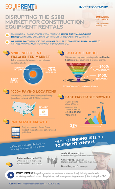
Equiprent is raising money, and put together an infographic to attract the attention of investors (found it on the Cool Infographics blog).
What I like about it:
  • One page Executive Summaries are boring and yes, this is a much better way to grab attention. Equiprent is realistic and does not think that this graphic is landing them the investment. Its sole purpose is to get a 5 minute phone call to discuss the next steps in the fund raising process
  • The company is not afraid to get the fact that they are fund raising out in the open: it says so, it shares their suggested valuation, and it states how much they are raising in return for what % of the company. I feel that the benefits of publicity and reaching more investors outweigh the drawbacks (putting some of your company secrets out in the open). The fund raising process can be much more open than hush hush discussions in small venture capital meeting rooms.
  • The infographic itself catches the basic points of an investment pitch, if an investor is convinced that all the claims are true, she will for sure invest in the venture.


Some feedback on where it can be improved:
  • From a design perspective: some objectives on the page can be aligned better
  • Content-wise: maybe the fragmentation point can be beefed up more. It is the core argument of the pitch. I have no immediate suggestion how to do it better though
  • Financial projects look impressive, but have little credibility without the accompanying assumptions
All in all, a refreshing approach to an investor presentation.

SlideMagic: a platform for magical presentations. Free student plan available. LEARN MORE

The 2-line slide heading

In some presentations, I use a template with a 2-line slide title, giving me more screen real estate to spell the key message of a chart. The format is very similar to exhibits I drew at McKinsey, where the message of the slide was written in a paragraph that could span 2-3 lines of text in point 12 font above the chart headline.

When to experiment with this format? Smaller audiences, lots of complicated data charts, chart messages with nuances that are hard to capture in a newspaper-style article heading.

Oh, and when you use the longer headlines, there is not reason to re-write that same sentence in a big bubble or box on the right of the chart.

SlideMagic: a platform for magical presentations. Free student plan available. LEARN MORE

Difficult strategy meetings

A story works great in a TED talk, but a cute personal anecdote might be less effective in a highly charged and political Board room meeting where a strategy decision has to be made. What can you do when you are in the hot seat? Some thoughts.

Cut to the chase. In a typical Board meeting, most attendants are probably familiar with the basics of what is being discussed. Leave out the descriptive intro, send big data fact packs before the meeting as background reading.

Create some sort of pro and con chart that summarises your logic for picking a certain option. Group the no-brainers on both side of the argument to avoid losing a lot of presentation time on issues that everyone agrees on. Single out the more contentious issues that should be debated. Keep coming back to this chart if someone brings up a point that has already been discussed, or that is a no brainer.

Push the rational argument with quantification and analysis all the way to the end. Not just the inputs (market share, customer satisfaction) but take things right down to a metric that matters (profit in scenario A, profit in scenario B).

Think about how to push the emotional side of the argument. Focus group quotes by customers look like just another text slide, adding a picture of the participant makes it a real person, putting a video snippet makes it even more credible.

Good luck!

SlideMagic: a platform for magical presentations. Free student plan available. LEARN MORE