Presenter fatigue

Giving your presentation over and over again makes you a better story teller. You need to know your stuff inside out in order to be spontaneous. Pretty much like a musician who can only start to improvise after the basic song can be delivered on auto pilot.

But, some presenters go to the other extreme, they get bored of their own presentation. Energy levels drop, and slides get cut and reduced to generic bullet points that say it all. They say it all to the experienced presentation, they say nothing to the novice audience who hears the story for the first time.

So, how can you freshen up a presentation? Some thoughts
  • The most important one: now that you are more confident about your story, you can move toward much more daring and unconventional slides.
  • Add stories or anecdotes
  • Go for a totally new look and feel (dark background, light text)
But different slides can only do so much. In the end you have to power yourself up to tell that story the way did it the first time to your audience who hears it for the first time.

SlideMagic: a platform for magical presentations. Free student plan available. LEARN MORE

We are big

What you measure is what you get is a common management saying. Most line managers in large corporations are focussed on market share rankings and top line sales figures. Chart after chart of many investor presentations often repeat that same message, look how big we are. But a simple “We want to bet the biggest” is unlikely to be a compelling strategy to investors. How are you going to turn that size into shareholder return?

SlideMagic: a platform for magical presentations. Free student plan available. LEARN MORE

Listen to yourself

Most data charts are cluttered with numbers that hide the actual message that you want to convey. So next time, listen to what you actually say when you walk people through the chart. Next, try to design a chart that only contains the numbers and items you spoke about, leave everything else out. It does not matter that you do not have the full comprehensive analysis on the screen, what matters is that your message comes out.

SlideMagic: a platform for magical presentations. Free student plan available. LEARN MORE

Slides = confidence booster

Most clients give an almost perfect verbal investor or sales pitch in our first briefing meeting. Somehow, in one on one meetings it is easy to connect with the 1-person audience, and construct a compelling story with a natural flow.

As soon as the number of people increases, something goes wrong.  Luckily we have our presentation slides projected big on the wall to remind us to get on with telling our story just like we did in the 1-on-1 meeting.

And here is the secret of the professional presentation designer: I often follow that first raw 1-on-1 pitch very closely in my story flow design. But do not tell anyone.

SlideMagic: a platform for magical presentations. Free student plan available. LEARN MORE

Two types of detail

  1. A tangent that distracts from the overall story, especially confusing for a novice audience who comes in completely cold to what you want to say
  2. A deep dive that serves as an example to support a major point in your presentation.

SlideMagic: a platform for magical presentations. Free student plan available. LEARN MORE

Audience perspective

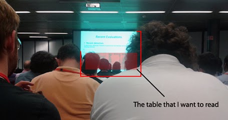
The PowerPoint or Keynote slide sorter view with the small thumb nails is a good proxy for how the audience will see your slides. But sometimes, they are even worse off as in this image by Ali Eslami.


While I would not go as far as recommending to fill the top of the slide with all the important content, it is true that this is the part of the slide that will get the most visibility. At least write the message clearly in the headline, rather than using the space for a descriptive title.

SlideMagic: a platform for magical presentations. Free student plan available. LEARN MORE

Perspective

Have a look at this image (I did not buy it, so cannot embed it). The tilted but aligned rows of numbers in different font sizes give an instant depth effect. You can easily replicate this in PowerPoint or Keynote.

SlideMagic: a platform for magical presentations. Free student plan available. LEARN MORE

Twitter IPO presentation review

The Twitter IPO presentation is posted online. Overall it looks good and very professional, here are my thoughts on how it could have been even better (comments in random order):

UPDATE: The official presentation has been taken down, it is still out there on YouTube:

  • The whole story is structured around a description of Twitter, what do we do, how do we make money, how are we going to grow. It could have been pitched more to the point: why is Twitter such a great company to invest in. This would have changed the flow of the story significantly
  • For knowledgeable investors, there are a number of huge elephant-in-the-room questions about Twitter: the biggest one being, how are you going to make money? The presentation should have included hints to the answer to that question upfront in the presentation, and elaborate on it more during the presentation (the CFO only gets to the meat around 27 minutes into the talk, many potential investors might have tuned out by then).
  • The presentation is full of social media speak: engagement, driving conversation, rich media experiences, content, etc. To an industry insider, the sentences make the exact point, but to an audience who might be tuning in and out (watching the presentation online, while now and then checking the email inbox in another tab), this creates too much white noise to which the brain pays limited attention.
  • The look and feel. Twitter has an incredibly powerful branding (colour blue and the bird). It could have been used more prominently in the slides. Not by increasing the side of the logo, but by using the graphical language in the actual content of the presentation. 
  • Using the actual embedded Tweets in the presentation is good, but the small print makes them hard to read for the audience. Also complicated conversations (a celebrity chefs replying to a person preparing for a dinner party for example) do not really come across, or worse, the audience is trying to read all the stuff that is going on on the screen (windows, tweets, hashtags) and loses the audio narrative that drivers the big point home. A better solution would have been a tiny representation of the actual Tweet with an extreme close up of the content that actually matters.
  • The 16:9 aspect ratio leaves some canvas blank on the tiny 4:3 screen of this 1990s video delivery platform of the Retail Roadshow service. For an IPO this size, they should have resized the slides.
  • The energy of the presenters (CEO, CFO) is held back a bit sometimes. In some sections, it flares up. For example: the interesting statistics about Tweets during TV shows, or the CEO closing remarks about the importance of the platform that can give everyone a voice.
  • Some very interesting messages are not reinforced by explicit slides. I found interesting for example that on Twitter, advertisers can target people by their actual interests in life, while traditional advertisers have to derive/guess these interests from demographics information. A big point, it deserves a slide. Another example: the majority of Twitter users are outside the US, while international ad revenue is a fraction of the US one, again a point that can be made in a slide, ideally with some growth curve that shows that it is not unreasonable to assume that international ad revenue is catching up to US levels fast.
  • Video is used only in the beginning of the presentation (mainly portraying the founders), it could have been used throughout the presentation.  Interviews with people, or snap shots of important live events that were broken on Twitter. The video animation of the spread of the Obama-4-more-years Tweet was amazing to watch, and only popped up in a small window.
Overall, Twitter comes across as a company that is organised and diligently working to monetise its user base and make a decent profit from advertising. But maybe it could have upped the story and add the ambition to do something amazing to the Internet, or even humanity, and remind us of that at the end of the presentation with a closing by the CEO, and not a simple thank you for your attention after the financial slides. A bit more courage!

SlideMagic: a platform for magical presentations. Free student plan available. LEARN MORE

Crappy screen, crappy impression

When you invite people over in your office and you run a pitch presentation on a 10 year old screen with a stretched aspect ratio, pixelated images, and burned in colours you are not leaving a very good impression.

LCD screens are not very expensive today, and the right cables plus a bit of tweaking with screen and laptop settings will give a razor sharp picture. Maybe it is time for a meeting room upgrade.

Other quick wins: removing used coffee cups, empty cookie boxes, de-greasing the screen remote, eliminating chewed-on pens and used stationary, open the windows.

First impressions count.

SlideMagic: a platform for magical presentations. Free student plan available. LEARN MORE

Months in advance

Waiting with the preparation for your presentation until the last minute is not a good idea. At 3AM at night before the 9AM meeting, you are not the most creative person in the world.

The other extreme is useless as well. Preparing for a big presentation months ahead will not help you get better results. When the content is not ready, none of your colleagues are focused on it, you are simply freewheeling and wasting your time.

Sometimes I see the long lead time in big companies that prepare for a big investor day. Work starts 3 months before the deadline, but people only start to focus for real 4 weeks in advance.

And yes, the best option is somewhere in the middle: start a few weeks (up to 6) before with thinking about what you want to say. Put it aside, get back to it, maybe design one slide all the way to the end in the look and feel you want, and slowly iterate your way to presentation day.

SlideMagic: a platform for magical presentations. Free student plan available. LEARN MORE

Personal chemistry

Now you hear it from VC Fred Wilson himself: personal chemistry is hugely important in the VC pitch process. What does it mean for your presentation? That your body language and interaction in the meeting are as important (maybe even more important) than the actual content of the slides.

A pitch meeting is an excuse for a venture capitalist to figure you out. How are you to work with?

SlideMagic: a platform for magical presentations. Free student plan available. LEARN MORE

PowerPoint web app

After my quick review of Keynote and its new web app version, I went back to check out the Microsoft PowerPoint web app, which is free to use for anyone with a Microsoft Sky Drive account.

Overall the look and feel of the app is similar to the desktop version, interactions are reasonably snappy, but there are a few very simple roadblocks towards making this a credible alternative to the desktop version. I did not bother to go into a more detailed review at this stage:
  1. Fonts. If you used custom fonts in a presentation designed on your desktop, they will not show up in the web app (I use a Mac so I cannot embed fonts inside a PowerPoint file). This is a showstopper: it is very difficult to edit a presentation when you cannot see what you are doing, and completely kills the option of using the browser to present your slides.
  2. Data chart. You cannot edit or create them. No use for a business presentation.
 We are heading in the right direction, but are not there yet.

SlideMagic: a platform for magical presentations. Free student plan available. LEARN MORE

Focus on the decision

Most business meetings are about getting to some sort of decision or agreement on next steps. So why not focus your presentation completely on that?

Take out or put in the appendix:
  • Long-winded sections with historical backgrounds
  • A detailed description of the process your team took
  • All the dead ends you hit and excluded from the analysis
  • Vast analysis that proofs a point that everyone already agrees on
  • Market analysis for the sake of market analysis, without supporting a point you want to make
  • Explanations of management theory and frameworks you used, extensive parallels with other industries
  • Elaborate competitor profiles
Instead:
  • Frame the options that you see
  • Provide a summary why you think you need option C
  • Quickly mention the evidence that everyone agrees on
  • Boil things down to the decision about the more controversial parts of your argument
  • Provide your logic, and provide deep fact-based analysis that support the points you are making.
A business school professor would not agree to this violation of providing an academic argument, but you ensured that your meeting will be as short and to the point as possible.

SlideMagic: a platform for magical presentations. Free student plan available. LEARN MORE

Unexpected perspective

Everyone will agree that this image by Christian Xavier is beautiful and grabs the attention. Why? It is because the implied position of the photographer is impossible, it should be in the middle of the air. We are not used to seeing pictures of the Chrysler building from this perspective. Most pictures of the skyline of New York are taken from the same viewpoint (the roof of the Rockefeller Center for example).


How was this image created? He took a regular New York skyline picture with a good camera and zoomed in, cropping out areas of the picture he does not need.

Two lessons here. The theoretical one of using unexpected perspectives. And two, you can actually use this zoom/crop technique with high resolution stock images to make them more interesting.

SlideMagic: a platform for magical presentations. Free student plan available. LEARN MORE

Imagine your audience - literally

Yeah, yeah, we know that our audience matters and we should take it into account, but in practice, most of us dive straight into designing the slides.

Thinking of your audience is especially important for sales presentations. I have had a few clients situations where I was asked to help design decks that are used by a sales force that targets small business owners.

In those cases I actually imagine the actual/real owner of a restaurant or pharmacy who I have seen recently and wonder what it would take to convince her.

SlideMagic: a platform for magical presentations. Free student plan available. LEARN MORE

New Keynote - first impressions

Together with a whole range of other product updates, Apple released a new version of iWorks (including Keynote) last night. I installed the Mac OS X Mavericks (warning, this will take your computer down for an hour) and played around with the new software. Observations in random order.

All iWorks apps are now free for people buying new Macs. iWorks was already a lot cheaper than Microsoft Office, but now the economic argument against enterprise adoption has been removed completely. Still, the huge installed base of both Windows hardware and PowerPoint with its familiar user interface will make it hard for Apple to make an inroad here.

What could help them is the cross platform compatibility. As of today, there is one file format both for desktop and mobile versions of keynote. I still do not fully understand iCloud, where my files are, where things get saved or not, but the duplication of a file when opening it on your mobile phone is gone. A step in the right direction, but not all the confusion has been removed.

Apple has also launched their suite of iWorks web apps. You can now edit and present Keynote presentations right from your browser. You can simply share a link to the presentation with your co-workers, rather than sharing heavy email attachments. More than one person can edit the live presentation. Many other services offer this feature, but personally I find it a bit scary when I loose control of how makes what edits (including deletions) in the master document. Anyway, that the feature is available does not mean that you have to use it.

Still, there is inconsistency in the user interfaces on iOS, Desktop, and web. For someone like me who makes presentations for a living, it was easy to figure out. For the other 99% of presentation designers, it might be a learning curve. The iOS app is completely different, the web and desktop interfaces are similar.

On to Keynote itself. As with all software updates, Apple boasts about the large number of new features that are included. I would actually prefer that they remove some. We have more animations, slide transitions, and now interactive data charts. The latter means that you can break up a graph and show different scenarios on mouse click. I doubt whether the average presentation designer really needs them.

The user interface now looks similar to that of iOS7. The textures, linen, etc. are gone and replaced by clean surfaces. A big improvement. The tiny inspector window that always gets lost on a busy desktop screen is now integrated in the application windows as a solid panel on the right of the screen.

So, the new version of Keynote is a natural, gradual evolution from the previous version. I will for sure use it intensively for my client work and will update you later in the future with 10,000km feedback.

SlideMagic: a platform for magical presentations. Free student plan available. LEARN MORE

Market research lingo

Questions in market research surveys are long and wordy, partly because you need to make it unambiguously clear to your participants what you want them to answer, and partly because marketeers want to put their own language into the mouth of consumers (see a previous post).

When presenting the results of market research I often chop down these sentences to the bare essential. It makes them easier to digest. A small footnote sends people to an appendix where they can read the full prose.

SlideMagic: a platform for magical presentations. Free student plan available. LEARN MORE

Bottom up versus top down

If your corporation consists of business units, than your corporate presentation is likely to end up as a series of chapters, each talking about a different business unit. If the corporate centre is organised, then each chapter might have the same repetitive template/structure. Each business unit gets airtime based on how important it is (usually in terms of sales). The order of the chapters is probably in line with the seniority of the business unit leader. It all makes sense in the political structure of the company.

Your real story might be different though. A small business unit might have all the growth potential that your investors are curious about. A more junior manager might be a captivating speaker. The same presentation template might not fit the specific story of each business unit. Seeing exactly the same template 10 times is boring. And how do all the business unit stories link together to a bigger picture?

Sometimes it is better going top down than bottom up.

SlideMagic: a platform for magical presentations. Free student plan available. LEARN MORE

"Do something like this"

I get this request sometimes, with an attached presentation of another company. Most of the time, the example presentation is actually not that good.

My theory of why it still appeals to a client? It is written in the same corporate language that she uses. As a company insider in a similar industry, she can instantly decode the language and it all makes perfect sense. Two CEOs communicate to each other in highly efficient compressed CEO speak.

The problem is a competitor CEO is unlikely to be the audience of your presentation...

SlideMagic: a platform for magical presentations. Free student plan available. LEARN MORE

Powerpoint vs Keynote - redux

It is a question that comes back all the time: PowerPoint or Keynote. I have given my opinion in the past.

After I got my first Mac, I was really excited to be able to design in Keynote. Now, a few years later, I must say that both products are more or less the same to me. Keynote is cleaner, auto-aligns and distributes objects when you drag them, and does not have the problem of drawing guides that you move by accident, and has a tight integration with the iPad. PowerPoint has a more convenient photo cropping UI and a much better data chart engine (Excel).

But workflow is a very important consideration as well. If the people in your organisation find it difficult to get up the learning curve with Keynote, why torture them? This is especially true if people need to do a lot of copying back and forth between Excel and PowerPoint. Probably 90% of presentations are quick and dirty documents to discuss business data, and in those cases tight integration between the 2 programs is a big time saver.

In the end both applications can deliver exactly the same look and feel of presentations. When I tell clients that Keynote presentations do not automatically look better than PowerPoint ones, they are surprised.

So in short, it actually does not matter what software you use, it is your design that matters.

SlideMagic: a platform for magical presentations. Free student plan available. LEARN MORE