Summer posting schedule

Summer posting schedule

I will be spending more time with my family, and less time at the computer over the coming weeks, so blog posting will be irregular and unpredictable. Going straight against the rules of good social media behaviour, I do not build up an article bank and auto post new posts at the optimal time for maximum impressions. Most of my posts are spontaneous and written "live". I hope all of you have a good summer.


Art: Caspar David Friedrich, The Summer, 1807 

SlideMagic: a platform for magical presentations. Free student plan available. LEARN MORE
Lots of data in one chart

Lots of data in one chart

You hear it from a presentation designer: busy charts can be useful. Take this one from the Economist for example. It shows a ranking of country populations over time.

The chart contains a number of dimensions:

  • A ranking
  • Three different moments in time
  • Information about the continent of the country (colour)
  • A rough indication of the population number (the length of the bar)

It is especially interesting to see how the designer integrated the labels of the bar chart in the bars itself. Connecting lines guide the eye over the three time periods.

A number of conclusion jump out:

  • India / China are still going to be the most populous, they just get a lot bigger
  • Europe is vanishing, Africa is coming
  • Especially in 2050, there are a number of countries in the top 10 that you would not have expected there, based on the attention they are getting.

A chart like this is OK to present in a document that is meant for reading/pondering, on a big screen in front of a live audience it is a bit hard to digest. In the latter scenario, I would present the chart in full, apologise for the data complexity and then start covering up specific parts of the chart so that it supports just one message. You can have 3-4 instance of the same chart.


Photo credit: US Army, 2008 Bejing Olympics opening ceremony

SlideMagic: a platform for magical presentations. Free student plan available. LEARN MORE
SlideMagic update

SlideMagic update

My presentation design app SlideMagic is slowly making progress. I filed a full patent application for the design UI concept with the US patent office and added new features plus many bug fixes:

  • The UI colour of the app now changes to black if you pick an accent colour that is close to SlideMagic blue
  • CTRL clicking multiple cells enable you to copy paste formatting quickly
  • PDF exports now have page numbers

We are working to make the user interface for the stack chart the same as the bar/column one, add a colour picker that allows you to extract the accent colour from your logo image and enable drawing arrows. With these updates we can start something that we have not done before: marketing the app to a larger audience.


Art: Arthur Streeton, The Golden Summer, 1889

SlideMagic: a platform for magical presentations. Free student plan available. LEARN MORE
People catch up quickly

People catch up quickly

In many investor presentations, startups want to educate the audience first on a big trend that is happening. But, especially in consumer/internet, people catch up really quickly and you will loose the audience attention and your credibility of you spend time and slides on explaining things that everyone understands. 

Some examples I can remember (some of them from my time at McKinsey):

  • Home pages
  • Sticky eye balls
  • Portals
  • Market places
  • Social networks
  • Social media
  • Viral videos
  • Location-based services
  • Online video and the growth of bandwidth
  • Sharing economy

Smart VCs read the same blogs as you.


Art: Student at his desk, Pieter Codde, 1630

SlideMagic: a platform for magical presentations. Free student plan available. LEARN MORE
"This is how we always start"

"This is how we always start"

Your company changes rapidly, your pitch stays the same. I meet many company CEOs that started their company years ago, often at some startup pitch event. The story opening then was about them, in the absence of a real company. Years later, that same intro can often still be found in the presentation, just with an update of the sales and employee numbers.

Your pitch presentation should be one step ahead of your company, not one step behind.


Art: Lautrec, Woman at her toilette, 1889

SlideMagic: a platform for magical presentations. Free student plan available. LEARN MORE
Facebook is a bad way to read this blog

Facebook is a bad way to read this blog

If you are following this blog through facebook, there is a big change that you will have missed many posts. Since I am investing my funds in SlideMagic features and not yet in marketing, I cannot afford to buy facebook ads. The best way to follow the blog is via a good old RSS or email subscription. You can add yourself to the list here: subscribe.

That email list is purely for blog updates, only people who opted in for SlideMagic product updates after registering for the app might get the occasional product update email.


Art: Vincent van Gogh, Postman Joseph Roulin, 1889

SlideMagic: a platform for magical presentations. Free student plan available. LEARN MORE
Finding the bottleneck

Finding the bottleneck

If you are struggling to get traction with your investor presentation, it is worthwhile to try to find out where the bottleneck is:

  • Do investors understand what I am trying to do?
  • Do investors understand that this is a big problem/opportunity?
  • Do investors understand that someone can make a big business out of this?
  • Do investors understand that I am the person who can make a big business out of this?

These are slightly different questions than the ideas entrepreneurs often have:

  • My slides do not look "slick" or professional enough, let's add some colour
  • The story flow is not completely right, let's talk about the market earlier
  • We have not put in aggressive enough financial forecasts, let's bump it up to $100m
  • We did not put in that Gartner total market number for 2016
  • We are not mentioning the right buzzwords, let's add a few
  • The deck is too long, let's cut it down to 5 slides by combining pages
  • We should use Keynote or Prezi, PowerPoint is stale
  • We should invest in a video clip
  • The deck needs more animated slides
  • AirBNB raised a lot of money, let's copy their pitch deck

SlideMagic: a platform for magical presentations. Free student plan available. LEARN MORE
Keeping things up to date

Keeping things up to date

Some presentations contain a ton of data that needs to be updated all the time. Quarterly results, LP updates of VC/PE funds, the latest sales data. Updating the numbers is time consuming and errors can easily sneak in (especially problematic with presentations to investors).

I do not recommend cutting and pasting Excel data into PowerPoint. You need serious PowerPoint skills to format the data correctly, and most spreadsheets are not build to present data, they are build to analyse it. Hence my approach of cutting the link between the spreadsheet and the presentation software, and creating a data chart from scratch, 100% focused on the audience, not the analyst.

How to deal with the updating?

I would suggest to create a special spreadsheet alongside your presentation. A new worksheet pulls the required numbers from the big "data dump" worksheet, rounds them up correctly. Place the numbers exactly as they should show up in your presentation slide. Now it is easy to update your presentation data. Add check sums to see whether percentages add up to 100%, and breakdowns go back to the total sales figure.

When the new quarter arrives, you over-write the data dump worksheet, and fix any broken/misplaced links.


Art: painting by Ivan Aivazovsky

SlideMagic: a platform for magical presentations. Free student plan available. LEARN MORE
Windows 10 is great

Windows 10 is great

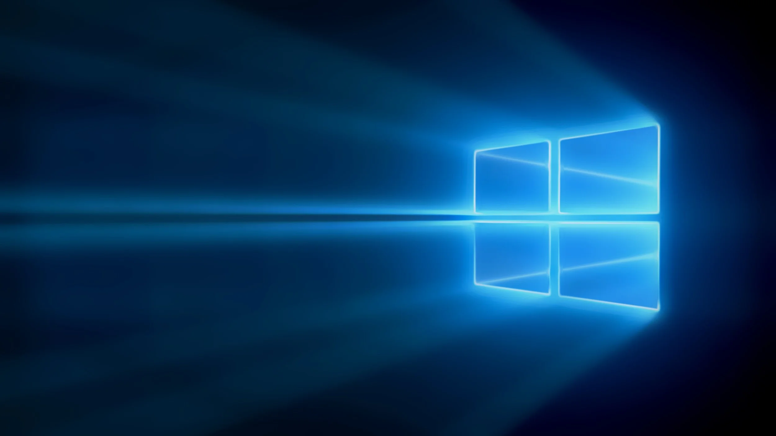
In an earlier post, I have already declared Microsoft to be cool again, and the release of Windows 10 this week proves the point.

Microsoft products in the past looked like the inside of boring office cubicles that they were most used in. Fuzzy gradients, drop shadows, it all blended perfectly in the surroundings. That started to change with Windows 8. Windows 8 looked great but was hard to use for people that grew up with Windows since the mid 1990s. With Windows 10 Microsoft has got it right. A nice clean look, flat design, no gradients, monochrome app icons, fantastic. It looks better than OSX. (If you switch off the live tiles)

The whole operating system is built around apps and has the feel of a mobile device. The minimalist mail app can easily be set up with my gmail account (it misses some functionality though). Beautiful Twitter and Facebook apps.

Some 1990s features that I miss in OSX are still there. Windows resizing/maximizing/minimizing is more intuitive. I like the bread crumb threats when browsing through file hierarchies. While other 1990s features have gone. The messy control panel is still there, but there is now a more friendly, simpler way to access basic computer settings.

The Edge browser is great, minimalist and beautiful. Browser innovation always starts with a basic, fast browser that then gets loaded with features over time (Firefox, Chrome). Hopefully Edge stays simple.

I installed Windows 10 on top of a Parallels 10 virtual machine. The install was not yet completely smooth. Microsoft complaints that the Parallels display adaptors is not compatible. After a few hacks I managed to bypass this bottleneck, but after installing Windows 10, I see the issue. The screen resolution in some apps is not there yet. I am sure that Parallels is working hard to fix this issue. It is strange that it still pops up, Windows 10 has been released to developers for some time now.

With great Office apps for desktop, Android, and iOS, Microsoft will remain the environment of choice in enterprise productivity I think. Apple hardware is still ahead, but Microsoft has caught up on the software side. Here, I said it.

SlideMagic: a platform for magical presentations. Free student plan available. LEARN MORE
The loooong Executive Summary on page 1

The loooong Executive Summary on page 1

The 14 bullet points with they key messages you want to give in a presentation is not a summary slide, it is the entire presentation.

  • Those 14 points are not messages, they are pieces of content, story elements. A presentation usually has 2-3 big points that qualify as messages
  • Nobody can remember 14 things
  • If you cram 14 points on a summary page, you have to write them down in a way that is too short, too generic, too vague (= not interesting)
  • If you discuss 14 points on a summary page, you have to spend too much time on each of them to explain things

What to do? Use the summary page to set the stage of your presentation, give a hint at an interesting, counter-intuitive, surprising conclusion, and say what it is you actually want. Then dive into the 14 story elements one by one, slide for slide, without summarising them beforehand.

So, the mistake of the 14 bullet point slide, is not the slide design. (The correct summary slide might actually consist of 3 bullet points), The mistake is the way you structured the presentation.


Art: Flaming June is a painting by Sir Frederic Leighton, produced in 1895

SlideMagic: a platform for magical presentations. Free student plan available. LEARN MORE
Filter your VCs

Filter your VCs

Fred Wilson discusses a blog post by the CEO of eShares about his fund raising experience. Let's throw in my experience as an investor presentation designer (both for startups and VC/PE funds themselves).

  • A decision in 5 minutes. Yes, most VCs will make a decision whether an investment merits deeper due diligence in 5 minutes.
    • This might actually be good news for startups. If you have a good deck, you can get to a decision without travel-meeting-travel. 
    • It proves again that a 5 minute pitch is not 5 minute filled with fluffy buzzwords.
    • If the feedback from a phone call is "no", it is probably highly unlikely that banging the VC on the head for 60 minutes in a meeting or coffee chat is going to change her mind. Better spend that energy on another investor. If you ask why, and she says "the market size" politely, coming back with 50 slides about the market size is not going to change her mind. Market size is probably not the real reason
    • That coffee chat, is actually a meeting that is further in the due diligence process: you passed the first stage (you seem to have an investable idea), now things have moved on to checking you out as a person/CEO. There is no better way to do that then a brief meeting. Even if you just talked about the weather, the investor will make up her mind about you.
  • Risk-related questions are a sign that you are moving in the right direction. An interested investor is trying to figure why she should not invest in you, much better than a bored investor trying to fill the 30 minutes with asking questions why she should invest.
  • Combine the above points and you can see the implication for your pitch deck: very focused, highly emotional, visual, charts to get the big idea across in a few minutes, and actually more charts for those risk-related questions, to take the obvious questions out of the investor who has bought into the basic idea.
  • Investors are increasingly specialised and have a specific mental model against which they evaluate opportunities. If your business does not fit a specific model/investor profile, find a different one rather than forcing let's say a semiconductor business into a CAC/LTV/churn SAAS spreadsheet
  • One more point about the 5 minute pitch. I had client briefing meetings where I only go the point of the pitch after 45 minutes of discussion. I tried from the left, from the right, tried again, thought it was just me who was to ignorant not to see something, until finally the coin drops. Be very perceptive when someone in front of you who is willing to grant you the 45 minutes, this might just save your 5 minute pitch.

Reading body language is important skill that can save you a lot of time and wasted effort.


Art: Company of ladies watching stereoscopic photographs, painting by Jacob Spoel, before 1868

SlideMagic: a platform for magical presentations. Free student plan available. LEARN MORE
Boring updates

Boring updates

Many presentations contain updates: sales results of markets, investment return on portfolio companies, productivities of plants. If the list of markets, portfolio companies or plants gets pretty long, the presentation gets pretty boring. How to cut the boredom?

  • Instead of a sequential flow (market, after market, after market) break things up and compare repeating elements of data: the sales ranking, the profit ranking, headcount ranking for each market. It is much more interesting and insightful.
  • In update presentations, people feel obliged to create slides, even if there is not that much to say. Don't. Update people about things that stand out, are counter intuitive, are really important. 
  • Put the factual slides as an appendix in the presentation file and leave the audience to read it.
  • Cut the length of the meeting to make sure everyone is focussed on getting the updates that are really important, and can spend time on the really important decisions
  • Don't be too restrictive with the presentation template. If all the slides for all the markets look exactly the same, people get bored. Make sure the right content is covered, but each market is different and might require a slightly different visual approach.

Art: Barbara Takenaga, Forte, 2011. Acrylic on linen

SlideMagic: a platform for magical presentations. Free student plan available. LEARN MORE
How to make a sankey diagram in PowerPoint

How to make a sankey diagram in PowerPoint

Sankey diagrams can be useful to show flows.

They are tricky to make in PowerPoint. The width of the arrow needs to correspond with the value of the stream. The curves of 90 degree arrows in PowerPoint are hard to control. If there is no escaping (maybe you can create a waterfall diagram instead), I create Sankey diagrams using boxes and triangles, see the example below.


UPDATE: I have added a PowerPoint template for a Sankey diagram in the SlideMagic template store:


Art: Minard's classic diagram of Napoleon's invasion of Russia, using the feature now named after Sankey.

SlideMagic: a platform for magical presentations. Free student plan available. LEARN MORE
SlideMagic versus PowerPoint

SlideMagic versus PowerPoint

Some interesting feedback from SlideMagic beta testers:

  • I promised some SlideMagic beta testers to convert the presentation to PowerPoint in the end (there is not yet an automated feature that does that), and it is encouraging to see that these users are postponing that conversion again and again. 
  • For some clients I quickly re-do a short presentation in SlideMagic. Client response: the SlideMagic one looks better, why can't you do that in PowerPoint? Answer 1): SlideMagic uses a pretty font, not Arial, and 2) the corporate PowerPoint template has a slightly less elegant composition of the slide (position of titles, margins etc.)
  • Some clients want the templates that ship with SlideMagic in PowerPoint. After sending them, there are issues with modifying the template in PowerPoint, adjustments that take a second in SlideMagic
  • Some users ask where you can upload PowerPoint slides to convert them instantly to SlideMagic, that will not be possible I am afraid.

Most users are hesitant to switch because 1) it requires changing 20 years of presentation design habits, and 2) yes I admit, SlideMagic had a few bugs that need sorting out. As we make progress with the app, that second excuse becomes less relevant. SlideMagic is slowly reaching the production release.

If you have not tried SlideMagic, you should, Try it here.


SlideMagic: a platform for magical presentations. Free student plan available. LEARN MORE
Image captions

Image captions

What do people read in text? Big headlines (if there are not too many of them), and tiny captions under a photo. So watch out what you put right under the image, people might read before the other beautiful things you have written down.

A screen shot from an article on TechCrunch

A screen shot from an article on TechCrunch


Art: In 1928-1929, Belgian artist René Magritte painted this piece called The Treachery of Images. Below the image of the pipe he painted the French words for "This is not a pipe." Photo by Daryl Mitchell on Flicker

SlideMagic: a platform for magical presentations. Free student plan available. LEARN MORE
Images from museum collections

Images from museum collections

Step by step, museums are putting their entire collection of paintings online. These archives make for a great source of images: consistent in style, without copyright issues (if you go back sufficiently far in time). You won't find stock images of smartphones though, but maybe that makes your presentation actually look better.

Here are some examples of well developed web sites:

There are still big differences in how advanced museum web sites are, but ultimately every museum will come to realise that access to their collections should not be restricted to the people who happen to be in town.


Art: View from a balcony, Gustave Caillebotte, 1880

SlideMagic: a platform for magical presentations. Free student plan available. LEARN MORE
Cleaning up survey results

Cleaning up survey results

Quantitative market research companies come back with pages and pages and pages of data in PowerPoint. It is tempting to cut and paste to "add the survey results in the presentation". Not so fast, let's clean things up first.

  1. Find out what the research actually says. This is the most important step. There is meaning in 2 levels. Level 1 is to discover what trends the data displays (not always obvious from a randomly generated bar chart or a dense table of numbers). Then level 2: is this an important insight? A segmentation or cut is not always meaningful, sometimes data points do not actually vary that much. Sometimes conclusions are obvious / not surprising, not interesting.
  2. Ask for access to the original research data in a spreadsheet to find patterns, trends that have not been put in the final report of the research company
  3. Clean up the graphs you want to use (or even better, create them from scratch with just the data you need):
    1. Move non-essential statistical lingo/jargon/details in small print to the foot note: n values, standard deviations, etc. etc. are not worth the screen real estate in a stand up presentation. The person who wants to read them, will find them in the foot note. (Exception: certain scientific disciplines where one statistical value is all that matters, in that case make a very prominent chart with just that value.)
    2. Cut non-essential filler words from the data series labels, think as if you were writing headlines for a newspaper article or blog post. Simplify questions that were asked to respondents, put the original questions in the footnote or in an appendix chart.
    3. Re-sort data series to match the point you want to make. 
    4. Take out tick marks, make bars/columns fatter, take out Excel labels and titles, and insert your own in PowerPoint/Keynote, round numbers, fix chart colours to match your corporate colour scheme
    5. Where necessary, add circles or arrows to highlight the point you want to make. Adjust the colours to emphasise your points (apply accent colours correctly)

Art: Edward Burne-Jones, The Mirror of Venus, 1875 

SlideMagic: a platform for magical presentations. Free student plan available. LEARN MORE
The web page has become the style guide

The web page has become the style guide

A decade ago, a company's look & feel could be tightly controlled by the corporate communications department, with tight brand guidelines and consistently executed print advertising.

Today that design capability is fragmenting: PowerPoint presentations, product PDFs, web pages, mobile apps. Design is everywhere. Especially in large corporates that span multiple countries/continents it becomes hard to find what the corporate language actually is.

When in doubt, I revert to the corporate web page to get inspiration for a PowerPoint design.


Art: Gerard van Honthorst, The Concert, 1623

SlideMagic: a platform for magical presentations. Free student plan available. LEARN MORE
SlideMagic as a sketch board

SlideMagic as a sketch board

Some of you out there are probably still afraid of using a new presentation design tool that is still in beta for live presentations. Here is another way to get started: use SlideMagic as your sketch board.

Many of you use bullet points to sketch out the content of a presentation. Maybe in a word processor, maybe in PowerPoint. The problem is that once you have iterated those bullets and everyone agrees to them, it is hard to turn those lists into visual designs.

Here is where SlideMagic could come in handy. It is very easy to set up charts that are not lists: a quick table, a quick contrast between two options, a quick 2x2. Jot your ideas down, and if you set your accent colour and logo, the whole sketch board will probably look better than a finished end product in PowerPoint.

Use SlideMagic to form your first ideas of your presentation, until the moment has arrived when you "have to" translate the designs to PowerPoint or Keynote. You can of course, but I think many of you will find that it is much easier to stick to SlideMagic after trying a few pages.  


Art: an unfinished painting by William Berryman, created between 1808 and 1816

SlideMagic: a platform for magical presentations. Free student plan available. LEARN MORE
Presentation design principles

Presentation design principles

The more I work with SlideMagic, the more I realise that it is not really a presentation design tool in itself, it is a tool that supports a philosophy how people in corporations should communicate with slides. Ultimately, I might write all this down in a more organised way, but hey, why not use this blog post to throw out my ideas.

  • Soul. Presenters should be given the stage to be themselves, be convincing, use human language.  
  • Efficiency. The big objective is to cut the amount of time that is wasted on presentations / corporate communication:
    • Time to prepare slides.
    • Time to deliver a presentation
    • Time to understand what the presenter actually wants to say
  • Aesthetics. Ugliness pollutes the work environment: cheap, disorganised, second tier. Every corporate communication needs to look decent. 

How do we get there, and how does SlideMagic help?

  • A small, simple set of presentation "Lego" bricks, a visual language with very few words. It is similar to English. "Business English" that 2 non-native English speakers use to communicate actually requires a very small vocabulary. 
    • They are easy to learn. Most people do not get past the level of bullet points in PowerPoint/Keynote because they don't want to, they do not have to courage to venture into the advanced features of the software. SlideMagic is simple enough to learn that people can push themselves and go beyond the bullet points
    • It removes a source of writers' block: no procrastination and thinking what advanced slide layout to create. In business, you actually only need a few concepts to express your ideas and SlideMagic enables you to create them. (A list, a table of pros/cons, a contrast, a progression in time, etc.)
    • Uniform layout: it always looks good, the audience know where to look for what, the designer knows where to put stuff. Uniformity is not boring, it is useful in business communication
  • A disconnect from software that is used to write reports, slide documents, and spreadsheets. At first, this might look like a disadvantage: not being able to copy past your spreadsheet across. But, starting from that clean sheet of paper makes you focus on creating a slide that says what you want it to say, not a slide that shows page 53 of your analysis.
  • Elimination of typography/design freedom to set margins, padding, title positions, etc. It is too hard to get it right, and too easy to get it wrong for the layman designer

What I am trying to get people to do in corporation is work really hard on their projects in PowerPoint, Excel, to find the right answer and recommendations. That can take months. But preparing the presentation to communicate the findings should take not more than a couple of hours.


Image: Wikipedia

SlideMagic: a platform for magical presentations. Free student plan available. LEARN MORE