Do you need the "Thank you" slide as the last page?

Do you need the "Thank you" slide as the last page?

Here in Israel everyone puts a "Thank you" slide as the last page of the presenting. Almost to thank the audience as it is impossible for the voice to be heard during the roaring applause. People ask me, should you use it?

It depends how.

The huge "thank you" with a big cheesy stock image of applause is definitely not the way to go. A dense page the repeats/summarises the entire presentation in detail also won't work.

You want to end any presentation with a strong upbeat message. The worst ending is, "well, this is it, we are running out of time, and I just managed to stay in my slot". It is better to put up a slide that puts in some call to action: "Sign up now to change the world!" or something.

For investor presentations, this is a bit harder. "Wire to this bank account" is pushing it too much. In these cases I actually put up a slide with a small/subtle "Thank you" (for your attention) title and the contact details of the person in charge of fund raising at the bottom. 

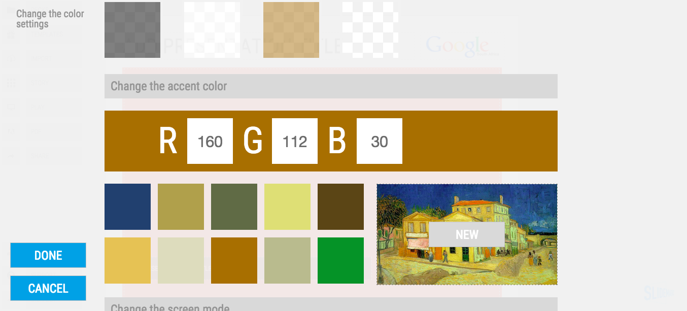
As a visual I tend to use the a memorable photo, graph, concept from the presentation that works as a memory shortcut to my entire story. 


"FolkRetabloRoomChalma" by Thelmadatter - Own work. Licensed under CC BY-SA 3.0 via Commons.

SlideMagic: a platform for magical presentations. Free student plan available. LEARN MORE
Raw data in due diligence

Raw data in due diligence

Fundraising involves multiple interactions with investors. It could be along these lines

  1. The opening 1 minute pitch
  2. Some slides that you send ahead to give a bit more detail
  3. A first one-on-one "coffee meeting" with an investor
  4. A full stand up pitch to the VC investor committee
  5. Follow up in due diligence meetings

For stage 5, investors probably ask you to show them answers to a 1000 different benchmarks and ratios. It is tempting to create a dedicated presentation with all the answers to all the questions that looks exactly as polished as your first investor pitch.

But maybe that is not necessary?

  • Investors want answers to specific questions, and are probably comfortable with browsing raw Excel data in an informal meeting. Some VCs actually like to query tools like Google Analytics or Mixpanel "live" in a meeting
  • Raw data shows authenticity and freshness, you are not trying to hide something
  • After one week, one month, all your custom-made PowerPoint charts will be out of date and you can do the whole exercise again
  • A CEO of a startup has better things to do than prettying up Excel data

If you go the raw data route, make sure though you understand your own numbers and do not get caught off guard in the meeting.


SlideMagic: a platform for magical presentations. Free student plan available. LEARN MORE
Thoughts on the iPad pro and presentation design

Thoughts on the iPad pro and presentation design

The inevitable is happening: tablets get more powerful, screens get bigger, and we are getting pressure sensitive screens and a stylus. What are the implications for office applications and presentation design?

I think the big screen is the most important factor here, not a stylus. Until now, tablets screens were too cramped for design work. More breathing space makes for a more manageable user interface. I think only a very small subset of users will use the styles for making sophisticated sketches.

A highly precise input device (the stylus, the mouse) is actually bad for the layman designer. There are just too many degrees of freedom to move, drop, stretch objects. That was the thought behind the design of the SlideMagic user interface (try it out here).

I did not design SlideMagic for use on smaller tablets and phones, but on a 2732 x 2048 screen, it might just be the perfect fit, a lucky coincidence.

SlideMagic: a platform for magical presentations. Free student plan available. LEARN MORE
Don't take it personally

Don't take it personally

Some of my clients probably recognise case examples I use in my blog posts, which is not a coincidence. As inspiration, I take something that happened in my work recently, generalise it, strip out confidential information, and write something that could be useful to my readers. 

But don't take it personally! I never use blog posts as an indirect communication channel. And, I do apply a reality distortion field here and there.... Your case was just inspiration that blends in with other experiences I had.


Art: Elena Kostenko, Offended, 1963

SlideMagic: a platform for magical presentations. Free student plan available. LEARN MORE
How to format a spreadsheet

How to format a spreadsheet

A few simple rules to keep your spreadsheet readable and error-free.

  • Use one set of column headings through the entire worksheet and freeze the panes to the top of the sheet. If you need a completely different table, create a new worksheet in your workbook
  • Avoid using too many colours, use shades of grey instead
  • Round data by dividing by thousands, millions so that they are readable. Round to 1-2 digits behind the comma. Excel will continue to calculate things with the highest precision, even if you do not see it
  • No underlines, italics, but use bold, uppercase, and bold upper case
  • Use long, descriptive row headings
  • Write your formulas top down, a lower row depends on a result that was calculated the line above. Keep formulas as simple as possible. A spreadsheet is a form of computer code: it should be readable the week after you created it. One formula with 15 cell references is the equivalent of code spaghetti.
  • Add totals where ever you can to check for formula errors and to keep things readable. The brain often memorises a number quicker than a description (35.4 instead of "North Africa sales 2014 H1")
  • If you need to source data out of a "data dump" keep that data in a separate worksheet and pull the numbers via links into your analysis. It creates a nice clean separation between your data source and the analysis, and makes it possible to over write your source data with new information and have the analysis updated instantly (always double check)

SlideMagic: a platform for magical presentations. Free student plan available. LEARN MORE
This, this, this, this, and this!

This, this, this, this, and this!

Startup CEOs usually have their heads full of ideas for future growth. Investors usually like this. But, investors also like CEOs who have a clear prioritisation and what happens next.

  • Use your core business, most important activity to introduce the pitch to the investor. Adding too many tangents before the audience has grasped your concept fully will just confuse people.
  • Now, make a clear break and introduce future growth options. If there are lots, rank/time them somehow.
  • And yes, it is OK to be not 100% certain of which growth options you are going to use 5 years from now. Present the most likely case in full detail, and show the sort of trade offs you need to be making. (Obviously, don't reveal this lack of confidence for things that are going to happen in the next 5 weeks).

Art: Fritz Beinke, The Juggler, 1873

SlideMagic: a platform for magical presentations. Free student plan available. LEARN MORE
Google uses "glow" to put its logo over images

Google uses "glow" to put its logo over images

I don't think it looks very good. Adding a glow around an object always makes it look "dirty". The better solution in my eyes is to create an all-white version of the logo and put that over the image.

SlideMagic: a platform for magical presentations. Free student plan available. LEARN MORE
Experience versus facts

Experience versus facts

During my holiday, I visited the rebuild house of Nelson Mandela in the Soweto township just outside Johannesburg. The house was turned into a museum and full with information, awards, factual information, and artefacts in glass vitrines. It was a museum, not a house.

I would have designed the exhibition differently. Mandela's presence is so huge that very few visitors would need the facts about the honorary awards he received. What is interesting of the place is the incredibly small and modest surroundings he used to live in (he tried returning there after his release from prison but the press attention made it difficult for him to stay there).

The best way to design the museum would be a simple replica of the house, including furniture to give an experience what it would have been to live there. People would take time to soak it up and take the impression with them. No facts needed.


SlideMagic: a platform for magical presentations. Free student plan available. LEARN MORE
The one-way-communication tour guide

The one-way-communication tour guide

On one of the trips I did in South Africa I encountered the one-way tour guide.

  • "You can stand here"
  • This was followed by a rehearsed, line by line, explanation of what is on display. I know it is literal because she repeated it exactly the same way later on without realising that we already heard it before
  • End the explanation with "Right, any questions? [no pause] Let's move on"
  • This process repeated about 12 times

This tour guide was obviously new, very young, and mostly concerned that she could remember her lines, and serve the maximum amount of visitors in a day. I doubt that any of the readers of this blog would present slides in this way.

Still, when potential clients run a first pitch of their project to me, it is surprising to see how many ignore body language and simply press on with the story as if they were rehearsing in front of the mirror.

  • One group of presenters fails to see obvious questions (elephants in the room) that almost any audience will have, and proceeds with a general pitch (problem, solution, etc. etc.). For example, you ignore the obvious question: "this sounds exactly what Google started doing in 1998".
  • The other group of presenters spends too much time on concepts that are common knowledge among an expert audience (i.e., the basics of "the sharing economy").

Art: War Elephant by an anonymous artist, 1558

SlideMagic: a platform for magical presentations. Free student plan available. LEARN MORE
Investor presentations are not (exactly the same as) TED talks

Investor presentations are not (exactly the same as) TED talks

TED talks have done great things for presentation audiences. They set the standard for minimalist slide design, carefully thought through story lines, and well-rehearsed on stage performances. These are great things for investor presentations as well. However, there are differences.

  • TED talks have a broad general audience, investor presentations face highly specialised, knowledgeable audiences that will have heard dozens of similar pitches by similar companies trying to do similar things
  • TED talks have big audiences without Q&A, investor presentations are dialogues before a smaller audience
  • TED talks are watched live or via online videos (i.e., the presenter is there to explain), investor presentations are often read on a screen without someone present to make the points
  • TED talks aim to change the audience behaviour or stun the audience with a new/little known fact/innovation. Investor presentations aim to get you through to the next round of a due diligence process
  • TED talks do not require detailed information, audiences of investor presentations might obsess over the value of very specific benchmarks (web site visitor behaviour, clinical research results)

In short, use all the good things that you learned from TED performances, but don't copy a TED format blindly when pitching investors.


Image by urban_data on Flickr

SlideMagic: a platform for magical presentations. Free student plan available. LEARN MORE
I am back

I am back

I just returned from a fantastic holiday in South Africa and will pick up my daily posting schedule soon. Apologies for the radio silence.


Art: Henri Rousseau, The Hungry Lion, 1905.

SlideMagic: a platform for magical presentations. Free student plan available. LEARN MORE
Can you test the new color picker in SlideMagic?

Can you test the new color picker in SlideMagic?

We have just deployed a new color picker in my presentation design tool SlideMagic. It extracts suggested colors from images. By default, it takes your logo image and offers a menu of accent colors that can be selected with one click. 

You can also select any image that is in your SlideMagic image library.

This feature had some especially stubborn and unpredictable bugs. It would work on one machine, not on another. Maybe you can check and let me know if it works (well, especially if it does not) together with your OS/browser combination that you used.

Not a user yet? You can sign up here for SlideMagic.

Apologies for infrequent posting, I am driving through beautiful South Africa at the moment. 


Art: Vincent van Gogh, The Yellow House in Arles, 1888

SlideMagic: a platform for magical presentations. Free student plan available. LEARN MORE
Product structure versus presentation structure

Product structure versus presentation structure

Product architectures evolve over time. For you the owner of a company, or the manager of a product category, there is no easier way to structure your story then the structure along which you see the world: the product architecture. Customer issues, competitors, customer segments, it all fits brilliantly together.

That is, it makes sense to you, not necessarily to your audience. Product structures tie your hands and force you to follow a certain story line. Not all products are interesting, not all products are relevant. 

Maybe it is time to take a step back from how you organise your internal reports and take a fresh look at how to tell the story of your company.


Art: Paul Signac, Railway Station near Bois Colombes, 1885

SlideMagic: a platform for magical presentations. Free student plan available. LEARN MORE
Summer posting schedule

Summer posting schedule

I will be spending more time with my family, and less time at the computer over the coming weeks, so blog posting will be irregular and unpredictable. Going straight against the rules of good social media behaviour, I do not build up an article bank and auto post new posts at the optimal time for maximum impressions. Most of my posts are spontaneous and written "live". I hope all of you have a good summer.


Art: Caspar David Friedrich, The Summer, 1807 

SlideMagic: a platform for magical presentations. Free student plan available. LEARN MORE
Lots of data in one chart

Lots of data in one chart

You hear it from a presentation designer: busy charts can be useful. Take this one from the Economist for example. It shows a ranking of country populations over time.

The chart contains a number of dimensions:

  • A ranking
  • Three different moments in time
  • Information about the continent of the country (colour)
  • A rough indication of the population number (the length of the bar)

It is especially interesting to see how the designer integrated the labels of the bar chart in the bars itself. Connecting lines guide the eye over the three time periods.

A number of conclusion jump out:

  • India / China are still going to be the most populous, they just get a lot bigger
  • Europe is vanishing, Africa is coming
  • Especially in 2050, there are a number of countries in the top 10 that you would not have expected there, based on the attention they are getting.

A chart like this is OK to present in a document that is meant for reading/pondering, on a big screen in front of a live audience it is a bit hard to digest. In the latter scenario, I would present the chart in full, apologise for the data complexity and then start covering up specific parts of the chart so that it supports just one message. You can have 3-4 instance of the same chart.


Photo credit: US Army, 2008 Bejing Olympics opening ceremony

SlideMagic: a platform for magical presentations. Free student plan available. LEARN MORE
SlideMagic update

SlideMagic update

My presentation design app SlideMagic is slowly making progress. I filed a full patent application for the design UI concept with the US patent office and added new features plus many bug fixes:

  • The UI colour of the app now changes to black if you pick an accent colour that is close to SlideMagic blue
  • CTRL clicking multiple cells enable you to copy paste formatting quickly
  • PDF exports now have page numbers

We are working to make the user interface for the stack chart the same as the bar/column one, add a colour picker that allows you to extract the accent colour from your logo image and enable drawing arrows. With these updates we can start something that we have not done before: marketing the app to a larger audience.


Art: Arthur Streeton, The Golden Summer, 1889

SlideMagic: a platform for magical presentations. Free student plan available. LEARN MORE
People catch up quickly

People catch up quickly

In many investor presentations, startups want to educate the audience first on a big trend that is happening. But, especially in consumer/internet, people catch up really quickly and you will loose the audience attention and your credibility of you spend time and slides on explaining things that everyone understands. 

Some examples I can remember (some of them from my time at McKinsey):

  • Home pages
  • Sticky eye balls
  • Portals
  • Market places
  • Social networks
  • Social media
  • Viral videos
  • Location-based services
  • Online video and the growth of bandwidth
  • Sharing economy

Smart VCs read the same blogs as you.


Art: Student at his desk, Pieter Codde, 1630

SlideMagic: a platform for magical presentations. Free student plan available. LEARN MORE
"This is how we always start"

"This is how we always start"

Your company changes rapidly, your pitch stays the same. I meet many company CEOs that started their company years ago, often at some startup pitch event. The story opening then was about them, in the absence of a real company. Years later, that same intro can often still be found in the presentation, just with an update of the sales and employee numbers.

Your pitch presentation should be one step ahead of your company, not one step behind.


Art: Lautrec, Woman at her toilette, 1889

SlideMagic: a platform for magical presentations. Free student plan available. LEARN MORE
Facebook is a bad way to read this blog

Facebook is a bad way to read this blog

If you are following this blog through facebook, there is a big change that you will have missed many posts. Since I am investing my funds in SlideMagic features and not yet in marketing, I cannot afford to buy facebook ads. The best way to follow the blog is via a good old RSS or email subscription. You can add yourself to the list here: subscribe.

That email list is purely for blog updates, only people who opted in for SlideMagic product updates after registering for the app might get the occasional product update email.


Art: Vincent van Gogh, Postman Joseph Roulin, 1889

SlideMagic: a platform for magical presentations. Free student plan available. LEARN MORE
Finding the bottleneck

Finding the bottleneck

If you are struggling to get traction with your investor presentation, it is worthwhile to try to find out where the bottleneck is:

  • Do investors understand what I am trying to do?
  • Do investors understand that this is a big problem/opportunity?
  • Do investors understand that someone can make a big business out of this?
  • Do investors understand that I am the person who can make a big business out of this?

These are slightly different questions than the ideas entrepreneurs often have:

  • My slides do not look "slick" or professional enough, let's add some colour
  • The story flow is not completely right, let's talk about the market earlier
  • We have not put in aggressive enough financial forecasts, let's bump it up to $100m
  • We did not put in that Gartner total market number for 2016
  • We are not mentioning the right buzzwords, let's add a few
  • The deck is too long, let's cut it down to 5 slides by combining pages
  • We should use Keynote or Prezi, PowerPoint is stale
  • We should invest in a video clip
  • The deck needs more animated slides
  • AirBNB raised a lot of money, let's copy their pitch deck

SlideMagic: a platform for magical presentations. Free student plan available. LEARN MORE