Pitch who you are

Pitch who you are

I cannot find the original tweet anymore, but the gist of it was this: if you are pitching your company to investors and pretend it is later stage than it really is, don’t be surprised that the whole story will come crashing down if the VC starts discussing metrics that are appropriate for the stage you claim to be in.

It is better to be honest about the stage of your company, but then blow investors away with indicators that show that you are well on track to reach the next level soon, either with or without her.

Cover image by Miguel A. Amutio on Unsplash

SlideMagic: a platform for magical presentations. Free student plan available. LEARN MORE
Listen to the CEO

Listen to the CEO

The other day, I watched a documentary about film scoring, in which the composer could not stress enough how important it is to listen to the director, and the director only.

In presentation design, I see something similar. There is only one owner of a story. In many cases this is the CEO of a startup who needs to raise money, the Senior Partner in an investment fund that needs to raise money, the CFO of a publicly traded company that is updating the analyst community.

This person has a clear idea (most of the times) what her story should be. Or this person might actually not be 100% sure about the story. Or have ambiguous ideas, or contemplating different options. Existing slides/decks or other people’s stories are an interpretation of that story, or a representation of last quarter’s story. These sources hardly ever show ambiguity or uncertainty.

Part of the challenge of being a good presentation designer is to have the credibility to stand up to the CEO and push back against her if you think it is wrong, but also challenge interpretations of other people in the organisation. Credibility you get from being a good visual designer, a good communicator, but most of all, actually understanding what the story is about at a reasonably detailed level. The latter has nothing to do with presentation design.

Cover image by Holly Mandarich on Unsplash

SlideMagic: a platform for magical presentations. Free student plan available. LEARN MORE
Fresh ears and eyes

Fresh ears and eyes

Artists and designers often say that when you use a fresh pair of ears and/or eyes to examine your work again, things can appear to be completely different from how you remember them (both in a positive or negative way). Why?

The brain mixes up reality and imagination. When writing songs for example, I can get totally immersed in what I am creating, and after a while my brain probably hears what it wants to hear, which could deviate somewhat from what my instruments produce. Your brain added context.

Listening to it again the next morning with the imaginative context, can be a rude awakening… This is a similar effect as the “Curse of Knowledge”, which says that experts find it so hard to explain something to an audience that misses their mental frame of reference.

With first versions of presentation, I almost always try to avoid sending things out “hot from the oven”, instead sleep on it one night, and use those fresh eyes as a sanity check.


Cover image by Rachel Pfuetzner on Unsplash

SlideMagic: a platform for magical presentations. Free student plan available. LEARN MORE
When it is in the papers, it is not new

When it is in the papers, it is not new

People do not update their presentation decks that often, and as a result, case examples or data that was really cutting edge 6 months ago, can quickly become stale, or even incorrect. Putting up a slide with Stuxnet, the $1 Shave Club, the Gig Economy, mobile first, can flick a switch in the mind of a clued up audience to stop paying attention or worse, feeling offended.

Usually when examples hit mainstream news sources, it is not going to wow your audience anymore. Keep your presentation fresh, with insights and data that only you can provide (and are allowed to share): meetings with customers, discussions with portfolio companies, niche scientific and technical publications, access to different countries, languages.


Cover image by Manuel Pena on Unsplash

SlideMagic: a platform for magical presentations. Free student plan available. LEARN MORE
One spreadsheet = truth

One spreadsheet = truth

Small inconsistencies in the numbers of your presentation (28 or 27 portfolio companies, 27 or 28 investments?) can confuse the audience (they are trying to figure out the numbers instead of listening to your story and evaporate your credibility (if that number is wrong, what about the others?).

Most of the time, what looks like small mistakes aren’t actually mistakes, just different cuts of the numbers (including follow up rounds, excluding Ireland, first 9 months instead of half year, rounding, etc. etc.). The analyst can easily defend them and nobody did anything wrong.

But, these “mistakes” are a pain. How do you prevent them?

Create one very simple spreadsheet with the top line numbers that is the source for every slide in the deck, and in case your presentation derails into an argument about data, put in that spreadsheet in the appendix to kill these discussions in a second.

This all sounds very easy and obvious, but think about it next time, someone makes a direct edit in a column chart from the top of her mind (“hmmm, that 27 should be 28”).


Cover image by Mathyas Kurmann on Unsplash

SlideMagic: a platform for magical presentations. Free student plan available. LEARN MORE
Upwork scams?

Upwork scams?

Upwork is a huge platform for buying and selling freelance services. I start seeing of lot posts and complaints about scams recently. My 2 cents as a freelancer (who is not on Upwork by the way).

Outsourcing work to freelancers can be incredibly valuable to companies, and creates a huge opportunity for employment including parts of the globe which are not downtown Manhattan. Over the past decade, I had many clients who were a bit nervous in the beginning to trusting a stranger 7 time hours ahead in time with their important presentation slides.

Platforms like Upwork can be helpful to match buyers and sellers, but the current effort to scale things up are taking it too far I think. Getting hundreds of applications for a small job, mechanistic monitoring (forced screenshots every 10 minutes), the whole thing just sounds wrong and is turning freelancers into the cog wheels pretty much like what happened in factories in the 19th century. If you try to make things efficient, stir price competition among suppliers, you get cheats, poor quality work, disputes.

If you want a $10 logo done in 24 hours, it will always be “a lottery”. The other approach is to look for a longer-term relationship, with potentially bigger projects. Take more time to get to know the freelancer, have a dialogue, check out previous work rather than star ratings generated by a system.

As the use of remote freelancers grows, the best way to find one might simply be the oldest: ask around among friends and/or colleagues, pretty much the same way you would find a piano teacher for your kid. The advantage over the piano teacher is that you now can engage designers anywhere in the world.

There are other hints that tell you that you are talking to a good freelance designer, she might charge a bit more than the rest, maybe is more honest about time it will take than the rest, and the best sign of all, she is very busy and might not have time to start working for you right away.


Cover image by Lidya Nada on Unsplash

SlideMagic: a platform for magical presentations. Free student plan available. LEARN MORE
Apple's iPhone XS / Watch 4 event

Apple's iPhone XS / Watch 4 event

I watched the live stream of Apple’s iPhone and Watch product update presentation last night. Here are my quick observations (from a presentation perspective, not the products :-) ).

  • The slide presentation quality was incredible, a combination of great layout, great photography (editing), and importantly this massive, massive projection screen

  • The transitions between slides, videos, build ups, animations was very well done

  • Guest speakers were a refreshing break, small company entrepreneurs who get the chance to tell their story to an audience of millions

Watching the whole event, I felt that the overall presentation was a bit too long, a feeling that crept in towards the end of the iPhone part of the session. The Watch presentation had lots of new features (all the heart sensors), but the iPhone story was similar to previous iPhone presentations: bigger screen, more power, better camera. I think Apple could have delivered the same message in a shorter time frame.

The videos with Jony’s voice over were duplicating messages that were said before. In previous events I could remember, these videos would go into the details of things that were not addressed by the presenter (for example how to machine drill phone casings). It looked like the video and the slide deck were done by separate teams and their content were merged relatively late into the process.

From a content perspective, the difference between the XS and XR phones was left less clear to the audience. The presentation of the XR phone felt and looked a top of the range phone, so there was a constant voice in the back of my head, “hey this is the cheaper one, what is different?” In the end, I got the answer from reading press reviews rather than the presentation itself.

While the audience for the Apple Watch are people who do not own an Apple Watch yet and consider buying one for themselves, or their parents who are prone to falls or heart problems, the audience for the iPhone XS/R are iPhone 6, 7, and 8 owners. The comparison of screen sizes between the old phones and the new ones were powerful, and could have been emphasized more in the presentation, maybe.

The Apple presentations have become so professional, well-rehearsed, and in a sense “serious” that I am starting to think whether there is space for a bit of humor, human improvisation, a sentence that is not planned.

Anyway, overall this was obviously an extremely well-prepared event as we have come to expect with incredible visuals.

You can watch a recording of yesterday’s event here.

P.S. The product shots of the iPhone XS with the “planet” on it give the impression of a bulging shape from a distance, reminding me of the original shape of the iPhone 3, and going against the flat characteristics of the current product.

SlideMagic: a platform for magical presentations. Free student plan available. LEARN MORE
Slideshare RIP?

Slideshare RIP?

This blog post popped up in my Twitter feed the other day: SlideShare is no longer what it used to be.

I agree, personally, I do not use the service anymore, and a quick visit to today’s home page shows a stale site showcasing “today’s” top presentations that are 4 months old. I can still remember those annual presentation design competitions a couple of years ago that attracted a lot of attention.

In retrospect, SlideShare was a mix up of a lot of businesses:

  • A tool to save email attachment size

  • A place to search for content

  • A curated content discovery platform

  • An engine that enabled you to embed presentations in web site

  • Etc.

The service was hindered by technical limitations: somehow the quality of played back presentations was not that high, and full of SlideShare branded links and content, which is why I moved away from the platform. Recently, SlideShare killed the re-upload feature that preserved back links and view counts. Also, the acquisition by LinkedIn which then got acquired by Microsoft did not help to focus management. And finally, there are lots of other platforms out there that can host clickable slides somehow. None of them have managed to attract crowds that SlideShare could assemble though.

Ultimately, there is a market for a SlideShare-like platform I believe. And now 10 years after SlideShare was founded the economics of running the platform (storing lots of media rich content) could be fundamentally different.

SlideMagic: a platform for magical presentations. Free student plan available. LEARN MORE
Those terrible manuals

Those terrible manuals

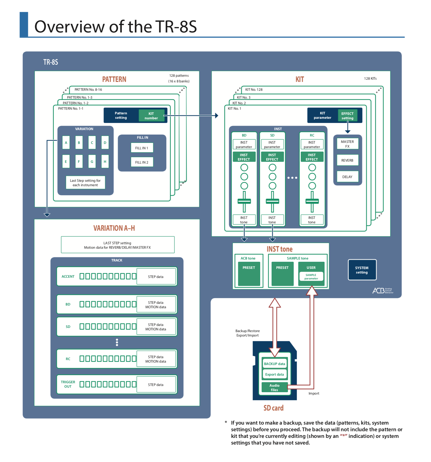
I own some pieces of music gear and most of these devices have a manual which is pretty much incomprehensible. Why is it so difficult to create a manual?

The opening page of one of my manuals

The opening page of one of my manuals

  • Users have vastly different experience levels, some are just starting out, others are pros
  • A manual serves different purposes ranging from a getting started tutorial, to a reference lookup for obscure featrues
  • Sequential pages of A4 is a poor media platform to navigate complex technical content quickly
  • Technical language is inherently boring and looks almost the same for descriptions of different features
  • Manuals are written by people who understand the product in and out, they have reached a point where it is impossible for them to understand what issues a novice user might have when first encountering the product.
  • Logical grouping of features usually do not correspond to the way people learn things. Some features in a certain category are more important (at first) than others.

Manufacturers try. Quick start guides, how-to videos, etc. etc. But still they are not pushing it far enough I think. They should take the perspective of an introduction course that someone would give in person. Forget about the logical structure of the device menus. Forget about the logical groupings of the content. Just record how you would go about creating something from start to finish and touching on all the device's essentials on the way. Basically, a presentation.

In the case of this drum machine, you could recreate the drum track of a well-known pop song, starting from the moment you switch on the device for the first time, all the way down to recording the full track.


Image via WikiPedia

SlideMagic: a platform for magical presentations. Free student plan available. LEARN MORE
Shana Tova!

Shana Tova!

Tel Aviv is celebrating the Jewish new year today and tomorrow. Misaligned holidays and weekends (ours are Friday to Saturday) can be inconvenient for clients and maybe even you, blog readers, but then, many have discovered the joys of slide decks being turn around over Xmas :-) Shana Tova to everyone who is celebrating.


Photo by Clique Images on Unsplash

SlideMagic: a platform for magical presentations. Free student plan available. LEARN MORE
Writing cold VC emails that work

Writing cold VC emails that work

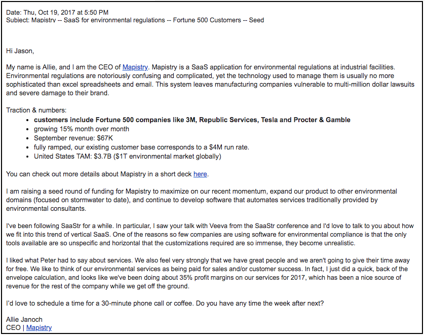
Here is a very good blog post by Allie Janoch about 2 cold emails she sent: the first one got ignored, the second one led to the funding of her startup.

Cold email.png

The second email explains what the company is about (surprisingly not all emails do), a tangible description of the problem it solves, meaningful metrics, an explanation why this is a fit for this VC, links for more detailed info, the right length of text, not too generic, not too much, good typography and paragraph spacing.


Cover image by Marius Christensen on Unsplash

SlideMagic: a platform for magical presentations. Free student plan available. LEARN MORE
"Please pause this video here"

"Please pause this video here"

I am watching a lot of tutorial and training videos at the moment, and many of them make the same mistake as the presenter who reads out bullet points.

Usually the introduction of a 10 minute video is an overview slide with 4 lines explaining what the course is going to cover. You read it in exactly 5 seconds, but the video narrator talks and talks and talks around the bullets for ever. Usually somewhere in the comments below is someone who posts a link with a time stamp and says "the real stuff starts here", followed by lots of thank you's from other viewers.

Videos are usually not very well scripted, an instructor just talks around the subject (in my case computer code that is edited "live" on the screen). But sometimes, some visual structure can be useful. For example, discussing pros and cons of multiple approaches to a problem, different software solutions, etc. These subjects are usually discussed in a conversational style where the viewer is losing the overall picture at some stage. It is better in this case to put in a very clear overview table where all the options are compared side by side.

For both these scenarios, you could ask your video audience to simply pause the video, asking them to read what is on the screen and press play again when they are done. Now, you can go through this video slide more as a voice over, providing additional comments, rather than feeling the need to read out the content.


Cover image by Bethany Legg on Unsplash

SlideMagic: a platform for magical presentations. Free student plan available. LEARN MORE
4 types of VC meetings

4 types of VC meetings

Why did the VC take your meeting after reading the pitch deck that you emailed?

  1. She pretty much understood what you are trying to do from the slides you sent, and is now moving to the next stage of due diligence: figuring out you as a potential new colleague to work with in her portfolio.
  2. She pretty much understood what you are trying to do from the slides you sent, already knows it does not fit her investment strategy, but takes the meeting anyway because of external pressure (someone who referred you for example)
  3. She pretty much understood what you are trying to do from the slides you sent, already knows it does not fit her investment strategy, but gives in to a relentless pressure from you insisting that she is wrong and you have answers for all her questions and doubts.
  4. She did not fully understand what you are trying to do from the slides you sent, and is really looking forward to sit down for an hour to clarity what's in the deck.

Think about which of these scenarios you are in. Think about which of these scenarios are most likely to happen. Think about what your chances are in scenarios 2, 3, and 4.


Cover image by rawpixel on Unsplash

SlideMagic: a platform for magical presentations. Free student plan available. LEARN MORE
Updated market numbers

Updated market numbers

Most companies have them: a slide deck with market size data by geography, segment, etc. Every quarter, half year, year, the source data gets updated. How to present it?

Maybe first: how not to present it. Create a slide for every breakdown in the report before thinking what the data means or is telling you. Then read out the percentages and growth rates page by page to the bored audience.

A better approach. Build an appendix that contains a good overview of all the data in the report. These charts are meant for reading, reference material to look up a number. Because the breakdowns and set up of the data is unlikely to change from quarter to quarter, people will get used to your chart layouts and can find their way quickly in the report.

Now drop the report all together and write down the key market trends you have experienced yourself. Open up your appendix charts and look whether these trends are reflected in the numbers. Adjust your list. Now, and only now, start making charts that back up the key trends you identified. The charts should only present the relevant data, a chart with just 3 numbers could do the trick. For broader context, people can open the appendix.


Cover image by Ricardo Gomez Angel on Unsplash

SlideMagic: a platform for magical presentations. Free student plan available. LEARN MORE
Back...

Back...

I just returned from a most wonderful holiday in Sri Lanka and the Maldives.

Obviously these 2 countries are great holiday destinations with beautiful nature, interesting cultural heritage sites, and great food, but this trip also reminds me once again how the whole world, and especially Asia, is developing and changing rapidly. The more countries I had a chance to visit, the more I see that economic development does not really happen at a country, but at a city/metropolis level. Driving through Colombo, the capital of Sri Lanka, you see development and energy all around you.

Fifteen years ago, I was one of the pioneers to deliver high end design services from a relatively "remote" location (guy in Tel Aviv making presentation decks for New York and SV clients), but as people now get used to this model of working, there is great opportunity for young people with a laptop and an internet connection to do this kind of work also from the more remote villages in countries such as Sri Lanka, not just in the main capital cities. I receive more and more emails from people offering to help me with my work from smaller towns across Asia.

I will pick up my regular posting schedule again and I hope that you also had a great summer break.


Cover image via WikiPedia

SlideMagic: a platform for magical presentations. Free student plan available. LEARN MORE
Infrequent postings...

Infrequent postings...

I will be spending time away from my desk over the next few weeks, posts will be less frequent than usual. I hope all of you are having a great summer as well.


Cover image by Maxwell Gifted on Unsplash

SlideMagic: a platform for magical presentations. Free student plan available. LEARN MORE
Mission implausible

Mission implausible

This was the title of a recent article in the Economist. (The link is behind a paywall*). The general idea is that corporate mission statements are all the same, and are totally not credible. A company's mission and values is communicated by how it behaves, not what it says on the web site.

What does it mean for presentations? Putting your company's mission statement on page 1 is unlikely to get your audience to move to the edges of their seats.

* I actually tried licensing the content, which took me through an interesting process. "Do you want print as well?". "Please list all the countries where you want to use it" (Worldwide was not an option in the drop down). "How many months?". And in the dropdown menu of "who are you?", the blogger did not show up. In the end The Economist suggested GBP 500 for linking to an article for just one month that might have gotten them more subscribers. 


Cover image by Marc-Olivier Jodoin on Unsplash

SlideMagic: a platform for magical presentations. Free student plan available. LEARN MORE
Not all grey is grey

Not all grey is grey

Design mistakes happen to the best of us. See this screen shot of a blog post from a few days ago. The image the looks black and white, is actually not black and white. It is always good to remove all colour from all images, even when they appear to be black and white already.

Screenshot 2018-08-01 09.50.50.png

In PowerPoint you do this in picture format - colour, see the screen shot below.

how-to-remove-color-from-images-in-powerpoint.png

Cover image by Oleg Laptev on Unsplash

SlideMagic: a platform for magical presentations. Free student plan available. LEARN MORE
How to make your presentation less formal

How to make your presentation less formal

I thought this comment exchange on a post of a few days ago is worth sharing with all of you:

Disqus embedding is not perfect, here is the discussion:

Question: My presentation looks very formal for a first-level discussions. I need a way to turn presentation to rough sketches. Is there an app or an easy way to transform my formal presentation slides into paper napkin sketches?

My reply: I am not sure you need paper sketch-style slides to make your presentation look less formal. I would loosen up the existing design, cutting words, changing language, etc. One way to do this is to find another presentation somewhere with an informal style you like, now copy the style of the template and re-create your existing presentation so that it exactly fits this model. I am pretty confident that in the end, you will discard your "formal" presentation all together and run with your new deck in all meetings (both formal and informal).

If you insist on making "sketchy" presentations, here are two approaches:

  1. Apple Keynote has rougher border styles. combine this with a custom hand-writing-style font
  2. The manual way: recreate your presentation but leave selected bits out (boxes, maybe certain charts, arrows), print it, take a big marker, draw in the elements, scan the thing to PDF. It will look really good, but is hard to edit.
  3. A variant on this: take a print out of the half-finished deck to your meeting, and complete the charts on the spot, "live". This could work in a meeting setting.

Cover image by Evan Clark on Unsplash

SlideMagic: a platform for magical presentations. Free student plan available. LEARN MORE
The business plan "voice over"

The business plan "voice over"

Business plans are usually "mechanical" documents: systematic analysis of markets, competitors, economics, milestones, etc.. It is the document trail of a strategy consulting project. Hard work, systematic, rigorous (hopefully).

For investors, it can be comforting that you can rest your hand on a beefy pile of paper, she will be confident that you have thought things through as best as you could, and that there is some direction and a sense of budget in that early stage company.

But, business plans make long and boring reads. They are structured as, well, a business plan, not an exciting story. Text is usually written in one go, as information is captured: creating duplications, side tangents, and an excess of buzzwords that were not zapped by an editor. Also, they are often written by more than one person, adding inconsistent styles on top of the duplications.

A good investor presentation (or even a good "business plan edited for investors"), is more like a "voice over" (lots of quotation marks in this post), of they dry exhaustive, duplicate, raw, business plan. Let's pause on this diagram that shows you exactly what we are doing, now look at this market in a new way, see this picture that shows why all existing solutions are so poor, in this long list of competitors there is this guy we should be worried about, look the CVs of our team, we all have a Phd in [x], yes I know, the obvious, elephant in the room question is [y], the answer is on page 35, etc. etc.

Note how this voice over is different from a summary, and how "voice over charts" are likely to look different from "summary charts".

A super confident entrepreneur could pull of an investor presentation just like that, a big PDF file, annotated with digital yellow stickies providing the narrative. For the other 99%, crafting an investor presentation would be translating those stickies with the voice over into a decent looking slide deck.


Cover image by neil godding on Unsplash

SlideMagic: a platform for magical presentations. Free student plan available. LEARN MORE