More than presentations

More than presentations

Modern presentation software today is much more than a slide design tool:

Presentation files are the main documents for decision making, most PowerPoint presentations were never intended as background visuals for stand up presentations to large audiences.

Most of the time, it is not about finished, final slides, but jotting down rough ideas, organising work and splitting it up amongst the members of a team, defining what the work is what needs to be done and what sort of analysis is required.

It is not all about slides, analysis is equally important:: manipulating data, graphs, and complex diagrams, to extract insights, understand systems, and sort of planning and sequencing of activities.

Office software plays a key role in converting and fitting the same document to different screens, devices, and file formats.

Today’s presentation is important, but presentation software is probably the main filing system used in corporate world at the moment, often linked to the email inbox (“what was that version I sent 2 weeks ago?”)

You can edit and design slides yourself, but you also need to manage collaboration with others: the technical issues of getting and integrating comments, and the management of the decision making process of what goes in, and what does not.

Presentation design software can be used to jot down bullet points like a word processor, or play the role of the platform to stage sophisticated designs and animations that professional designers use.

It is impossible to create a piece of software that can be excellent in all these areas. Some of them require specialised software development skills and understanding of user needs. Some of them contradict.

With SlideMagic, I am trying to carve out a specific use case, and give others a lower priority.

Photo by Phad Pichetbovornkul on Unsplash

SlideMagic: a platform for magical presentations. Free student plan available. LEARN MORE
Jargon overload?

Jargon overload?

Rabobank CEO Wiebe Draijer replied in an interview in NRC Handelsblad to comments made in an article by a columnist targeting the use of corporate jargon in Dutch companies.

The journalist view:

  • Jargon creates a distance between senior management and the rest of the organisation

  • Jargon creates a distance between the bank and its customers

The CEO view:

  • Frequent meetings in English at a Dutch company creates a “language soup” that can come across a bit strange to outsiders

  • Certain words have become efficient and convenient shortcuts for a big project, initiative, philosophy, strategy and summarise months of work and discussions in 4 letters.

I think both have a point: efficient meetings full of shortcuts are better long and slow discussions where everyone is looking for the right words. Still, you should watch out when external audiences are involved: especially large gatherings of people and written material that can end up on anyone’s desk (including presentations).

SlideMagic: a platform for magical presentations. Free student plan available. LEARN MORE
Subscription link issue

Subscription link issue

Because of all the social media noise, I think that most of the frequent readers of this blog do so via email updates. When updating my website (the new user license for a desktop app that I am developing), I discovered that subscribe links under each post were pointing to the template store subscription page: “If you like this blog post, please pay me right now”, which does not makes sense. Apologies. I fixed things below. I am still running RSS feeds and email subscriptions on Feedburner, since 2008…

Photo by chuttersnap on Unsplash

SlideMagic: a platform for magical presentations. Free student plan available. LEARN MORE
The quick fix boomerang

The quick fix boomerang

As a kid (I must have been 13-14 years old), I actually saw one of my friends getting hit by his own boomerang from behind while he was searching the sky (ahead of him, ignoring 180 degrees of his surroundings) where it had gone. In addition, he ignored our warnings…

Almost all the time delays in coding are the result of some short cut that I took before and did not bother to fix.

I learned the same the hard way in my early days at McKinsey as an analyst, when I was building spreadsheet models. Just before the presentation, your manager would come and require a quick change in the numbers to reflect a new insight (or complication). In the end, the numbers that count are the ones on the PowerPoint slide, not in your model, so the changes were easily made.

But after the presentation, the adrenaline levels dropped and there was no immediate need to mop up that spreadsheet. Mistake, because by the time the next presentation came along you had no way to get everything consistent again.

So, quick fixes are fine, just clean things up quickly afterwards to be ready for future changes. As an analyst, you control the numbers with your model. If people don’t agree with the outcome, and/or feel it does not makes sense (unfortunately senior people have a good nose for this), something inside the model has to change, to reflect that insight. Simply overriding the output cells will work for one presentation only.

SlideMagic: a platform for magical presentations. Free student plan available. LEARN MORE
A matter of speed

A matter of speed

A few years ago when I started thinking about about the SlideMagic project I though it was all about the design. Just find a way for people to make beautiful charts and it will be a big hit.

I am close to completing version 2.0 of the SlideMagic app, and am now in a position I have never been in before: I can design the actual user experience of someone creating slides click by click, being free fom common software design platforms, standards, and practices. And here is the real magic. I make dozens of user interface decisions a day, what colours get copied, what things get highlighted, how font sizes are set, what box is selected after you did an action. Hundreds of small decisions add up to a big experience. You cannot pinpoint why it works, but it does somehow. It is all a matter of incredible attention to detail.

The pitch of SlideMagic is changing. It will all be about the speed at which you can design a pretty decent looking slide.

(Don’t tell this secret to anyone).

Photo by toine Garnier on Unsplash

SlideMagic: a platform for magical presentations. Free student plan available. LEARN MORE
Tricky slide

Tricky slide

In the beginning, I see early adaptors of SlideMagic using it as a tool to create slides that are integrated in a regular PowerPoint presentation. Now that a 100% accurate and instant on the stop PowerPoint conversion is integrated in SlideMagic 2.0, this will be no issue. Your colleagues won’t notice your secret (and don’t tell anyone).

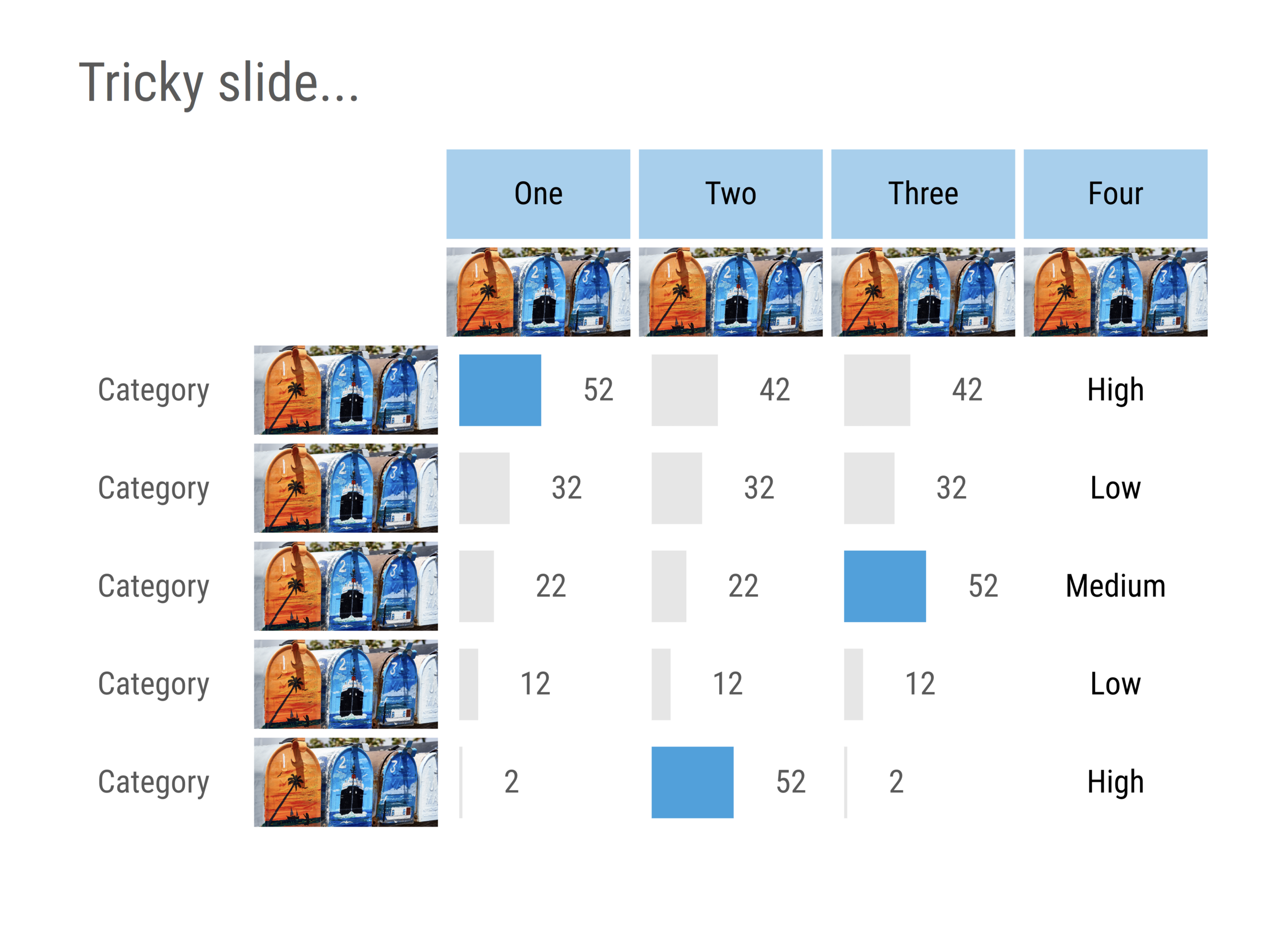
This is the the example of the type of slide that is very time consuming to create in PowerPoint:

  • Lots of images that need to be cropped, scaled, and positioned in a grid (often logos, or product shots)

  • A mix of text, data, and data charts

  • Multiple data charts that need to be lined up exactly

  • Multiple data charts that need to have the exact comparable scaling

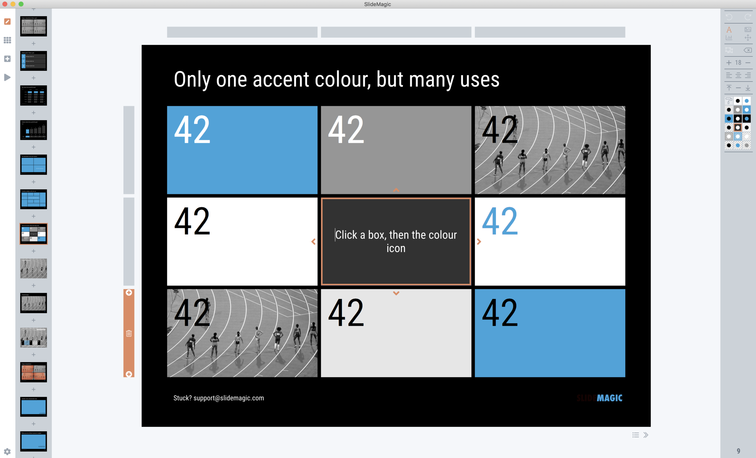
SlideMagic 2.0 can do it in less than a minute and plop the chart straight in your presentation :-). Everything is a fully editable PowerPoint shape, every chart is a regular PowerPoint/Excel object.

And… if your boss wants you to add 2 rows (one between rows 2 and 3, and one at the bottom) 5 minutes before the presentation, you will have 4 minutes left to get yourself a coffee before the meeting starts.

Screenshot 2019-05-21 08.04.56.png
Screenshot 2019-05-21 08.32.09.png

SlideMagic: a platform for magical presentations. Free student plan available. LEARN MORE
Presentation hell

Presentation hell

Overheard at a dinner last week: “when you paste one presentation into the other, all the colours and fonts got mixed up, we have to deal with this all the time”.

This happens for 2 reasons:

  1. By design: PowerPoint and Keynote offer lots and lots of designer freedom: fonts, colours, layouts, styles. Multiply even a small team x the number of things you can change in a file and there will always be differences.

  2. PowerPoint tries to help the user by harmonising formats when Frankensteining decks together. This is actually pretty hard to do and a better user experience would have been to make preserving the original layout the default one. Usually, charts look actually pretty similar, but if 2 users use a different colour code for “blue”, disastrous things happen when your computer is going to try to sort things out for you. (You can control this behaviour in PowerPoint, see this link)

How to deal with it? Have somewhere on the corporate file server a pristine, clean PowerPoint template that will always be the starting point of any presentation. Open this one first, then paste the slides of any other deck inside it (not vice versa), and fix any mistakes you notice. In that way, you prevent the spread of template degradation as each deck is reset to its original colours all the time.

The above is one of the reasons why SlideMagic has stricter template guidelines to have you spend less time in presentation hell at the expense of slightly reduced creative freedom

Photo by Hans-Peter Gauster on Unsplash

SlideMagic: a platform for magical presentations. Free student plan available. LEARN MORE
"You are coding at this stage in your life?"

"You are coding at this stage in your life?"

Over the past 30 years, I did an INSEAD MBA, worked for a decade at McKinsey, and built a global micro brand in presentation design. Why coding, when this is something that 20 year olds do in far away places like Ukraine?

Yes, it is a bit crazy, but I would call it “calculated craziness”:

  • The world has changed a lot. It is now possible to build a software product with the only investment involved is the missed income of other things you could have done with your time. Try doing the same thing 20 years ago and think of the investment and effort you need

  • My previous business model exploited the fact that usually people who understand business are clueless about design, while I was lucky to combine both in my head. What I am doing now is exploiting the fact that people who can code (backend), usually do not understand design (frontend) either, and both of these usually do not understand user needs very well. When it comes to the niche of business presentation design, I found a way to master all three (still learning the coding part).

  • There is a big difference in between being a developer in a huge organisation with 1,000s of colleagues, working on a specific feature, and coming up with an idea, designing and implementing it in a full product.

  • I think it is very hard to design a completely new product by committee. Something needs to stick their neck out and do something bold, try it, change it, try it again, change it again, without the delays of too much debate about ideas and ho unfair it is that you ask people to turn around and undo/redo their work completely after 48 hours. For me on my own, there is no such thing as wasted time.

This all might not work, but at least I want to give it a try.

Photo by Kevin Ku on Unsplash

SlideMagic: a platform for magical presentations. Free student plan available. LEARN MORE
Canva buys Pixabay and Pexels

Canva buys Pixabay and Pexels

Canva acquired the free stock photo sites Pixabay and Pexels. The libraries of these companies will now be integrated in the platform (users creating documents with Canva can access the images for free).

Canva’s is a design platform with a much broader focus than “serious” business presentations: leaflets, websites, social media images, it enables small businesses to avoid paying for a graphics designer. The core revenue model is based on buying images to go into your design, and as such the acquisition makes sense.

For everyday business presentations though, I think images are actually less important, and cheesy stock images in the hands of the non-designer can actually do more damage than good. And Pixabay and Pexels have a fair share of these.

I hope Canva takes the opportunity to prune the stock image collections of these 2 companies. The player to beat is the free image web site Unsplash with images of much higher quality, but - for now - has a much smaller collection and lacks functional images that designers might need (a red bucket isolated on a white background).

The good thing of all of this is this acquisition shows investor appetite for the design market.

SlideMagic: a platform for magical presentations. Free student plan available. LEARN MORE
Crisp napkins

Crisp napkins

If you are pitching a premium offering, your product/service needs to beat/exceed the combination in terms of quality, speed, weight, or anything that is relevant in your industry sector.

But then there are the small details. People don’t go to an expensive restaurant just to enjoy crips napkins, no the food quality should be right in the first place. But the small details are important to remind and reassure your customer or investor that they made the right choice (there is always that nagging insecure voice in the back of their heads that tells them they are “suckers” who have been taking for a ride at a silly high price).

Being on time for that meeting, replacing that 1990s PowerPoint template, it is not the most important thing compared to your core product offering, or is it? You are who you portray you are.

Photo by Lightscape on Unsplash

SlideMagic: a platform for magical presentations. Free student plan available. LEARN MORE
Feature preview: matching slide and user interface colours

Feature preview: matching slide and user interface colours

In SlideMagic 2.0, I have pushed the use of colours in the application user interface further. The look and feel of the application will be the opposite of the slides you are working on:

  • If the slides have a dark background colour, the application will be light

  • The accent colour of the application will be the opposite colour on the colour wheel from the colour .you are using in your slides.

Here are some screen shots from the alpha version:

Brown/red in the slides, green in the app

Brown/red in the slides, green in the app

Switch the slide background to dark, the app turns light

Switch the slide background to dark, the app turns light

Slides on the clipboard are in the template bank are presented in the opposite colour so you can differentiate easily between the slides that are already in your presentation, and the ones you could add.

Slides on the clipboard are in the template bank are presented in the opposite colour so you can differentiate easily between the slides that are already in your presentation, and the ones you could add.

SlideMagic: a platform for magical presentations. Free student plan available. LEARN MORE
"Super chill"

"Super chill"

This post by Humans of New York follows on my post from yesterday. This person might have it all sorted out, but 1) you are not working to please your boss, 2) you are not working to achieve “super chill” status, humanity will not progress much if we all do that.

SlideMagic: a platform for magical presentations. Free student plan available. LEARN MORE
Pleasing versus learning

Pleasing versus learning

There are two ways a mentor can be really helpful in your career:

  • She continues to pull you up with her as she knows you will always deliver what she wants

  • You learn a lot from her and your increasing skills get recognised by other people than your boss

Photo by Joshua Ness on Unsplash

SlideMagic: a platform for magical presentations. Free student plan available. LEARN MORE
One directory workflow

One directory workflow

File organisation on a computer is a pain. Going up and down directory hierarchies to find the right folder, then going backwards again if your machine prompts you to load a file from the location you last saved something in.

Back at McKinsey, one senior partner had a different paper filing system from everyone else: simply plop everything in chronologically: mixing up different projects, personal and work, etc. The arguments: it saves a lot of time to put things away, and a calendar timeline is actually a pretty good access mechanism for your stuff. (‘Where is that presentation I made 3 weeks ago?”) .

More and more, I go to a one directory workflow. The one directory usually ends up being the default downloads folder:

  • Save and load everything in one folder

  • Don’t bother naming images, look them up by thumbnails, if you can’t find them, search for a similar one online

  • Once in a while, go through the folder and put the most important things away properly:

    • Most work files expire: that version 29 you were so keen on saving in order to roll back to it, is no longer relevant by version 37. After returning from holiday, the hotel and car reservations are not needed anymore. All can be deleted safely. (That is the reason that the few bits of paper that are still floating around in my office first go in the “buffer box” before filing, usually the archive problem solves itself after 2 months)

    • There are exceptions: for my app source code: I need to be careful not to cause a massive corruption. Family photos, medical files, contracts, they go somewhere properly.

  • Use gmail search as your archiving index:

    • You can find when that meeting or call was, and pull up the required document

    • A true ‘commit’ of a document is usually not the version you save and call '“final final”, it is the one you deemed good enough to send to someone.

Photo by Mr Cup / Fabien Barral on Unsplash

SlideMagic: a platform for magical presentations. Free student plan available. LEARN MORE
Car user interfaces...

Car user interfaces...

My venture into software design also sparked an interest in user interface design.

A recent road trip through Europe provided an opportunity to catch up with modern car user interfaces thanks to many car rentals in different countries. Most of the cars I used now had an all digital display, without any physical indicators.

This should provide a great opportunity for automotive engineers: there is no longer a need to reserve space for warning lights and indicators that you only need when things go wrong (engine temperature, brakes, etc., and you can include things like maps for navigation.

Well, they still have something to learn, up to the point where I think a car’s user interface could be competitive advantage similar to the one Apple exploited in computers in the 2000s.

Take navigation for example. The screen is littered with information you don’t need, and items you want are hard to find. It looks like designers still consider a map (used since the Middle Ages by explorers to ponder and plan routes) and a navigation app to be the same.

Navigation apps show maps in great detail. You pass by a city and are offered the full road map with street names of the city inside the ring highway. Furthermore, the app shows the full detail of the next upcoming 15 turns 100km ahead. Instead, what you need is actually different:

  • A huge display of time now, time to go, km to go (scattered in small print across the screen now)

  • A very clean display of the flow of the road you are currently driving on (hair pins), plus an ultra zoom of complicated junctions with bus lanes that come in handy inside the town centres of Italian cities

  • A very clear indication of landmarks on the road: a city, an airport, a river passing, gas stations.

  • Better selection of destinations: it was impossible for me to enter Milan Malpensa airport as a destination more than 100km from Milan.

And then for the graphics itself. Designer try to emulate physical clocks using all kind of shadows and gradients, that actually give away the imperfections of the screen resolution (far worse than you have in your phone). Straight simple graphics will look much better and classier.

Someone will get this right eventually.

Photo by Dawid Zawiła on Unsplash

SlideMagic: a platform for magical presentations. Free student plan available. LEARN MORE
Why you are not getting the sale

Why you are not getting the sale

A good sales presentation is important for landing a deal, but other factors play a role as well. It is important to understand the dynamics of the decision makers. Investing a lot of time and effort in making slides prettier is a waste if the decision has nothing to do with the presentation.

Some thoughts that can go on in the back of the mind of the decision maker:

  • “These slides look totally 1990s and are full of typos, they are not serious professionals”

  • “Great slides, but I have no idea what they are trying to say”

  • “They never seem to understand/answer my questions”

  • “They are always 5 minutes late, what about future project deadlines”

  • “Better play it safe and hire a big brand for the project, I need a promotion at the end of the year”

  • “Sorry, but I cannot see myself working with this woman managing the project for the next year”

  • “Hopefully she notices my favourite tie I always wear on the days of the tender meetings”

  • “We need on the ground presence in China, and I already told them it is a deal breaker if they don’t have it”

  • “They do not know what they are doing, they charge far too little for all they are doing”

  • “Again trying to argue why we need to spend $10m when our budget is $5m”

  • “The other contender offered a summer job position for the daughter of my boss”

  • “Last night’s venue was a bit shady, but they kept their promise and opened a 1996 Dom Perignon at the end”

  • “All these small calculation errors, not a big deal in a presentation, but a catastrophy for the project”

Photo by Zan Ilic on Unsplash

SlideMagic: a platform for magical presentations. Free student plan available. LEARN MORE
Subtle Photoshop errors: as bad

Subtle Photoshop errors: as bad

Either you make a perfect digital fake image, or you go for a less ambitious slide layout. I laugh when you seen an obvious Photoshop mistake, I cringe when I see a 95% correct image. “Something is not right”

Screenshot 2019-05-01 14.43.11.png

In the image above, the light on the cars, the camera angles, something is not working. Ultra high definition monitors now also give away the artificial digital backgrounds of movies.

In a few years time, software will have solved this problem. Until then, your presentation slides, web sites, and other marketing material will look like the work of a young kid who slowly starts to add the 3rd dimensions to its drawings. (In the early years children do not actively notice the concept of perspective, and things getting smaller towards the horizon).

SlideMagic: a platform for magical presentations. Free student plan available. LEARN MORE
App update: the finish line! (well, a finish line...)

App update: the finish line! (well, a finish line...)

Today I reached the point where I have much improved, fully working, stand-alone version of SlideMagic running on my machine, every line of code put in by myself. That was quite a journey…

  • I started with experimenting with PowerPoint macros to automate some processes for the template store

  • Then I moved on to Windows and C# to start writing a 100% accurate conversion plugin that can read and convert SlideMagic files to native PowerPoint and was considering expanding the plugin to cover a full slide edit engine inside PowerPoint

  • I got the sense that Microsoft is not putting all its energy into C#/com plugins for Office, but rather is focusing on Javascript. At the same time, I discovered Electron (owned by Microsoft…), that would allow me to write an app that would run on both Mac (early adopters) and Windows (the market).

  • Next phase: learning JavaScript and coding a stand alone SlideMagic to PowerPoint converter, outside of PowerPoint.

  • Then came the big leap: why not write the whole app from scratch…. Writing a converter is relatively straight forward: you read the file and translate it. An app where the user can click an unlimited amount of items is a different piece of cake…

  • Bit by bit, I made progress: all app modes in one screen, live what-you-see-is-what-you-get editing, hard core image cropping and processing, drag-and-drop (tricky), shift-click selecting multiple objects (app complexity to the power n), and a complete PDF rendering engine in addition to the PowerPoint conversion.

Next challenge is to make the software enterprise grade (users are unpredictable), by closing presenter view windows randomly, canceling file downloads, adding huge amount of images, and crazy long data charts, to name just a few abuses. Also, I am running everything on an i9 processor at the moment, not your average corporate IT infrastructure. And Electron needs to deliver when it comes to runnings things on Windows.

In addition I am checking whether I should expand my existing patent to cover a few small but clever additions I made to the user interface, and until that is closed I cannot yet share a lot of info and/or alpha test version here.

To be continued.

Photo by John Cameron on Unsplash

SlideMagic: a platform for magical presentations. Free student plan available. LEARN MORE
It is hard to delegate presentations

It is hard to delegate presentations

Most people who go up the career ladder in big companies have no choice but to delegate the activities they were good at and got them promoted. (This provides problems for brilliant stock analysts, architects, coders, designers and other creative people…).

One thing will stay with you though: making presentations. Good managers know how to tell a story, and it is almost impossible to leave creating the story to your junior team. Yes, a little help can be useful to run the numbers and fill in the data, but when it comes to sequencing the points and getting it just right, you are on your own.

Sometimes it looks like you delegated presentation design. But the old-fashioned senior manager who is micro managing the slide production process by making corrections on slide print outs and handing them over to a large team of secretarial staff is still writing the presentation herself, when it comes down to the actual content. She just could not be bothered to learn the basics of PowerPoint herself and is using an army of people to make up for it.

SlideMagic 2.0 is trying to solve this: creating a tool that enables busy people to jot down their story in a decent format quickly.

Photo by Sagar Dani on Unsplash

SlideMagic: a platform for magical presentations. Free student plan available. LEARN MORE
Mixing up the waterfall

Mixing up the waterfall

This chart appeared to today in Dutch newspaper NRC Handelsblad, showing the revenues of soccer team Ajax Amsterdam:

Screenshot 2019-04-30 06.48.53.png

There is lot wrong with it in my opinion:

  • Mixing cumulative and non-cumulative

  • A missing final total that leaves the chart “dangling” at the end

  • The typography of the horizontal axis (the matches above the columns are actually much better to use as the x-axis)

  • Than the “extra” bit at the end which makes a comparison to revenues over the past 10 years

Image via WikiPedia

SlideMagic: a platform for magical presentations. Free student plan available. LEARN MORE