Cheating with statistics

Cheating with statistics

The chart below (source) is a good example of “axis”. The drop in life expectancy looks huge, but upon closer inspection, we see the the vertical axis starts only at 72.

There is another problem with the chart: “the sharpest since World War II” is not supported by the data.

One way to bring out the significance of the message, and support the WWII point is to show the annual change (not the absolute number) in life expectancy since 1940.

SlideMagic: a platform for magical presentations. Free student plan available. LEARN MORE
Different levels in presentation templates

Different levels in presentation templates

A “presentation template” is usually a PowerPoint file that new employees receive on their first they of work. There is more to a presentation template I think.

  1. Your corporate visual communication style/culture

    • Consulting firms: lots of complicated diagrams and frameworks, meant for solving a problem rather than presenting

    • Investment banks: dense text and tables with graphs, meant for reading rather than presenting

    • Consumer goods company: product packaging shots and bullets

    • University: list of bullets

    • Etc. etc.

  2. The actual software file that holds the basis layouts, logo, and colours (this is the one you get on the first day of your employment)

  3. Running versions of important presentation documents that get constantly updated and tweaked

    • Sales presentations, each for a different lead or a different customer segment

    • Quarterly results presentations with - well - different quarterly results

    • Strategic planning presentations, each one for a different product group

    • Etc. etc.

Most of the day-to-day presentation work in companies is in step 3, the tweaking of existing documents to update it for the latest sales meeting or board meeting. These presentations are in fact the “templates”, not the empty file.

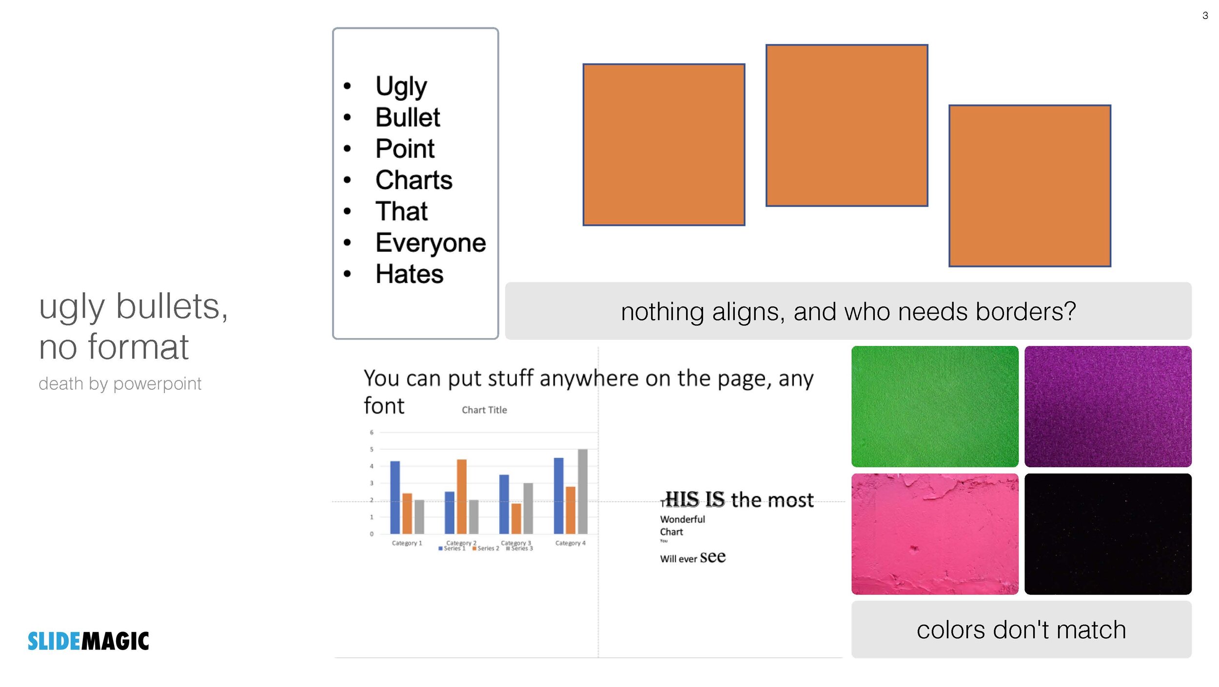
In most presentation design software the tweaking of an existing slide is tricky and over time a slide degrades after many iterations where users insert the wrong fonts, colours, and trip up a decent slide layout that worked for 5 boxes, but not for 6. (“Template rot”).

The above is true for both existing corporate presentations and shiny new templates purchased online. The latter look amazing fresh off the press, but it shows when a non-designer tried to fit it to her needs.

With SlideMagic we are trying to fix this. Make it easy to create decent looking presentations from scratch, but even more importantly, make it super easy to tweak this presentations, keeping everything aligned on an brand.

By fixing step 2 and 3, we hope to fix step 1 as well…

SlideMagic: a platform for magical presentations. Free student plan available. LEARN MORE
Trying to understand vaccine effectiveness

Trying to understand vaccine effectiveness

Here in Israel we are ahead of most other countries in terms of vaccination and the prevalence of the delta variant. After almost zero cases, the count is starting to creep up again. There is a lot of confusing data going around and it is surprising to me that the scientific community does not have a generic approach to evaluate the effectiveness of vaccines.

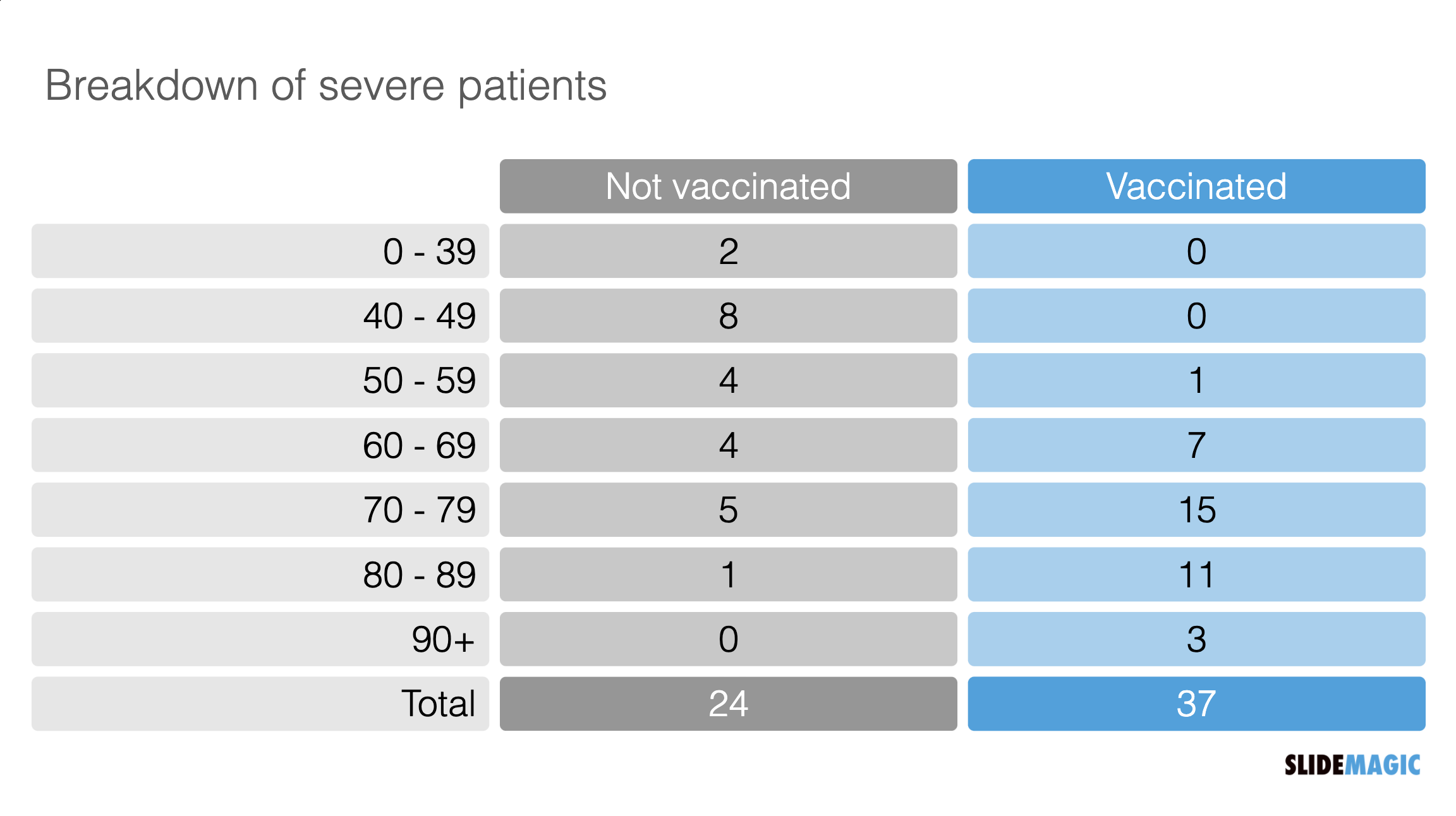
Last night the following table appeared on the TV news. Severe cases by age category and vaccination status. But these absolute numbers cannot be taken at face value.

Screen Shot 2021-07-19 at 12.24.52.png

“Open source” statisticians went to work and made some adjustments. The population categories are not equally big (there are more young people than old people), and the vaccination rate is not the same (older people vaccinate more). So the correct approach is to look at severe cases / million, split by vaccinated and unvaccinated. I put the results in the graph below and added the chart to the SlideMagic library.

Screen Shot 2021-07-19 at 12.05.23.png

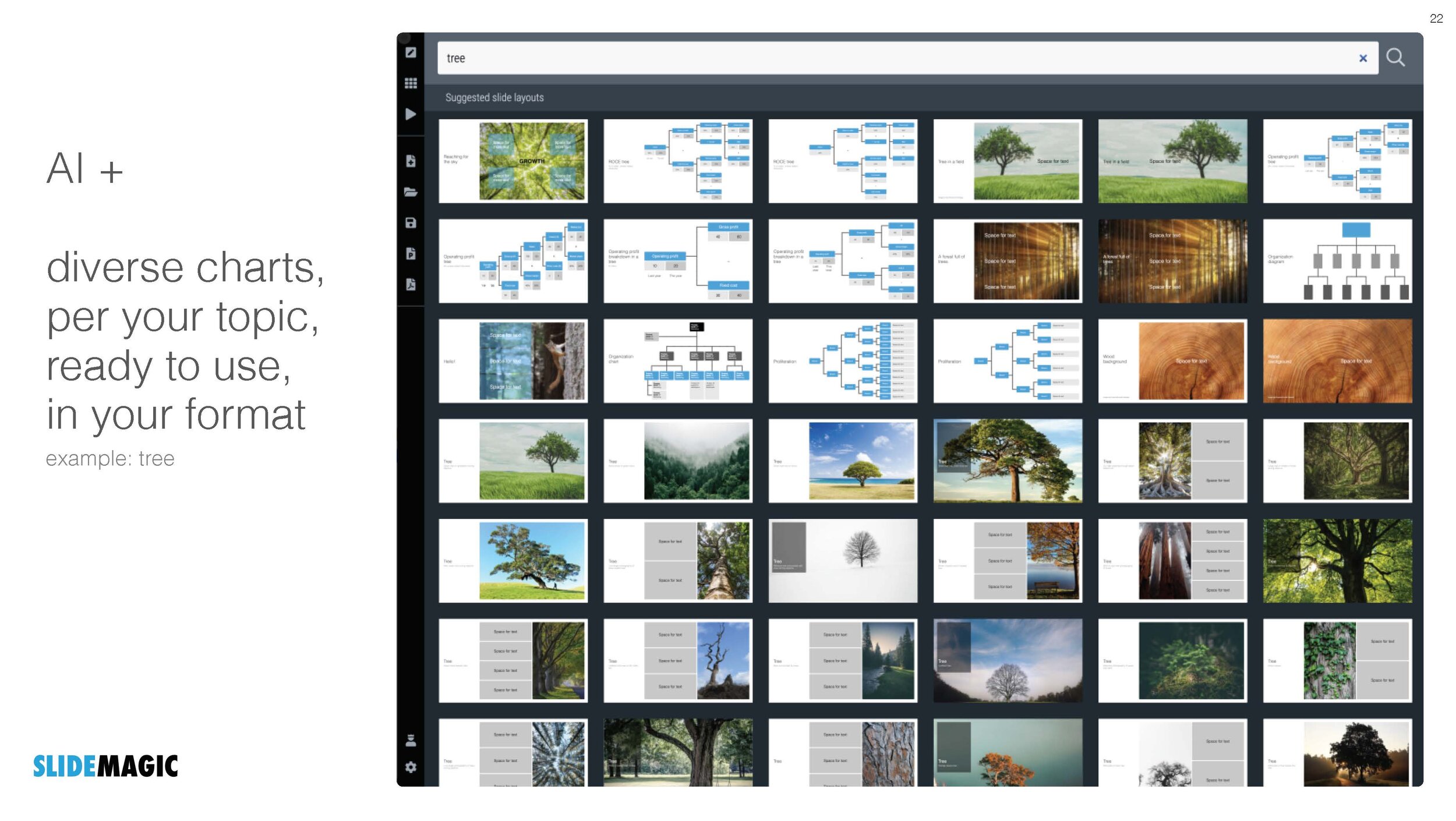
I put the results in the graph below and added the chart to the SlideMagic library. Search for “vaccine’ in the SlideMagic app and the designs will pop up, either for use in a COVID-related presentation, or maybe something completely different that requires a similar layout.

SlideMagic: a platform for magical presentations. Free student plan available. LEARN MORE
Lost in translation

Lost in translation

Many presentations are good because there are many steps involved between the “source” and the “receiver”

  1. You have the story in your head as a complex set of ideas that are entangled and interdependent

  2. You start writing it down in short hand, which require you to “flatten” the multi dimensional story into a sequence.

  3. The sequence of bullet points now becomes a visualisation of your story. Instead of listening to a complex verbal argument, your eyes glance through the points and you can change the order at lightning speed. Cut, paste, slice, dice, until it looks good to you (without taking into account how it sounds).

  4. Many people stop here and jump to stage 6

  5. Now, chunks of this “visual” bullet point story get translated into visuals, another transformation: sentences, words, paragraphs get turned into visual compositions and graphs.

  6. The presentation to the audience is no longer your story, it is you translating the visuals back into sequential verbal text.

  7. The audience listens to the sound track of your slides and tries to reassemble the story that was in your head when you started the whole process.

Photo by Eirik Skarstein on Unsplash

SlideMagic: a platform for magical presentations. Free student plan available. LEARN MORE
Your presentation "secret weapon"

Your presentation "secret weapon"

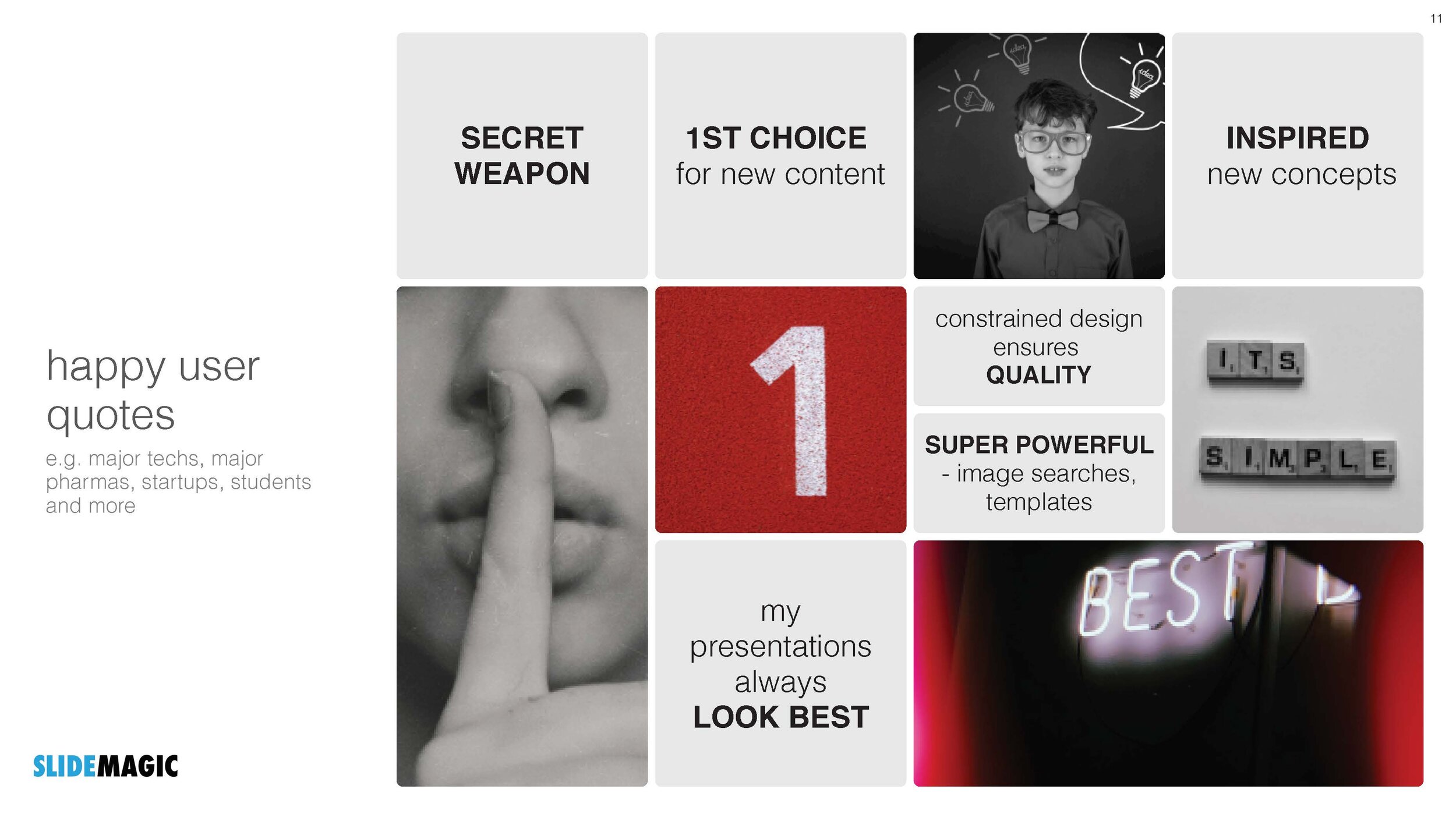
We are doing some SlideMagic user interviews and the term “secret weapon” came up. One user, somewhere in a big office tower, is a lone user of SlideMagic and uses the build-in PowerPoint conversion to share slides with colleagues. People start to notice the difference in the slide the person produces.

Here are some situations where you can use SlideMagic as a secret weapon, a starting point for setting up the beginning of your presentation. Most of these slides are very time consuming to set up in PowerPoint or Keynote:

  • A perfectly lined up, massive grid of logos (you finished the 10 x 4 grid, and now you need to move to 7 x 6 because you got 2 more logos)

  • Data tables with bar charts that need to line up (oops, 12 rows instead of 10)

  • 2x2, 3x3 matrices, other consulting style matrices

  • A diagram with boxes that are connected with arrows

  • A team chart where all the headshots need to have more or less the same size, with the “eye line” at the same height

Nobody needs to know / find out that you use SlideMagic, but we would not mind if you spread the secret…

Photo by Joshua J. Cotten on Unsplash

SlideMagic: a platform for magical presentations. Free student plan available. LEARN MORE
Think of image colour

Think of image colour

Image libraries (including the ones that are available in within SlideMagic) have become so huge that you can afford to be very picky when it comes to image searches. Next time, don’t just use a keyword, but also pay attention to colour. And not just your accent colour of your brand book, but also complementary colours. We will add this colour filtering to the feature pipeline of SlideMagic.

I am in the process of a total overhaul of the SlideMagic web site and using this principle myself, focusing on images that fit with SlideMagic blue, or its opposite, orange.

Screen Shot 2021-07-14 at 12.48.00.png

(Still great to see how SlideMagic’s automatic image cropping gets it right in most of the cases)

SlideMagic: a platform for magical presentations. Free student plan available. LEARN MORE
A bit less logic, a bit more story

A bit less logic, a bit more story

Most project or research result reports go like this:

  • Objective: what were you trying to do?

  • Approach: how did you do it?

  • Results: what is the data you got?

  • Conclusion: what did you find?

This is almost a chronological recording of your work. Logical, organized, exhaustive. Your peer scientist, boss,, teacher, will approve, you did the work thoroughly and got to some interesting findings.

It is not the most exciting structure though. Most novels or movies do not follow a chronological timeline. To make things more interesting, you need to take your audience through a story, which might mean breaking the logical flow a bit.

  • Conclusion: what did you find?

  • Objective: why was this so special, why was it never found before?

  • Results: what is the (tiny) subset of all your data that proves your point?

  • Approach: why was this so tricky to achieve, what hurdles did you overcome to get there?

The key to story writing in business is to pick off the questions your audience is likely to have next. The biggest one first (often surprisingly: “what are we talking about?”), which leads to the next big one (“Isn’t Google doing this already?”), which leads to the next one, (“That does not sound like a big deal to me?”), etc. etc.. The sequence of questions are different for each situation, depending on your topic and your audience.

The results upfront approach works well in business: leaving your audience guessing will just distract them. When it comes to movies, you might want to leave the plot reveal to the very end…

Photo by Daniel Cheung on Unsplash

SlideMagic: a platform for magical presentations. Free student plan available. LEARN MORE
Making it personal

Making it personal

Audience or customer segments can be very abstract. Mid thirty women in socio economic class C… C-level executives with operational responsibility.

To make things more personal, you can replace the abstract definition by someone you know that fits the segment. A friend, a colleague. What if I had to present to her?

Photo by Mario Purisic on Unsplash

SlideMagic: a platform for magical presentations. Free student plan available. LEARN MORE
Changes to the commenting system

Changes to the commenting system

After more than a decade, I switched of the commenting system on the blog. In a world with Twitter, commenting volume was relatively low on the blog and often abused by spammers posting below posts from years ago. The Disqus commenting engine I used started off great, but has turned into a huge burden of tracking code over time after the company was sold by its initial owners. The SlideMagic blog now loads a lot faster and offers more privacy.

Photo by Margarida CSilva on Unsplash

SlideMagic: a platform for magical presentations. Free student plan available. LEARN MORE
Explained: vaccine 90% effective, vaccinated still expected to be 50% of infected

Explained: vaccine 90% effective, vaccinated still expected to be 50% of infected

There is a lot of confusion here in vaccinated Tel Aviv, now that around 50% of people infected with COVID appear to be full vaccinated. Newspapers are heavily quoting the “64% i.s.o 90% for the Delta variant” which does not seem to be based on the correct calculation of vaccine effectiveness.

I used an explanation by Dvir Aran to make a slide that explains how it is expected that 50% of infected people are fully vaccinated, even with a 90% vaccine effectiveness.

The logic is as follows:

  • Take 100 people who are seriously exposed to the virus

  • Assume a 90% vaccination rate (the case for the at-risk population in Israel at the moment):

    • A small group is exposed: 10 people

    • A big group is protected 90 people

  • Assume a 90% vaccine effectiveness:

    • 10 out of 10 unvaccinated people will get infected

    • 8 out of the 90 vaccinated people will get infected

  • Of the total of 18 infected people, 8 will be fully vaccinated, so around 50/50

Of those 18, the majority of cases with symptoms and serious complications will be unvaccinated of course.

I have added this slide to the SlideMagic library, search for “COVID” and it will pop up, or download it here. Pro subscribers can convert this chart to PowerPoint, if you have to. (Students, you can claim a free membership!).

SlideMagic: a platform for magical presentations. Free student plan available. LEARN MORE
SlideMagic student program

SlideMagic student program

We are working on new pricing plans, one of which is a free plan for students. Ahead of any formal announcements and websites, blog readers can already take advantage of this options. Email support at slidemagic dot com from your school/university email address (after you created a regular free account), and we will switch you on the new program for one academic year.

Photo by Good Free Photos on Unsplash

SlideMagic: a platform for magical presentations. Free student plan available. LEARN MORE
VC pitch cliches

VC pitch cliches

If you are pitching VCs for money, it is a good double check to scroll through these suggestions how to ruin a VC pitch in 5 words or less.

Some of these are funny, some of these are not. But more interestingly, it reveals the cliche jargon that people are using in these pitch meetings. The first check is if your pitch is directly dependent on one of these. The second check though is whether a VC or other investor who might not know you very well, is a bit tired (you are pitch #15 of the day), and just got distracted by a message on her phone, might actually perceive that you are making this mistake, are just the same as all the others.

How do you come across when people are not paying attention 100%?

Photo by Daniela Holzer on Unsplash

SlideMagic: a platform for magical presentations. Free student plan available. LEARN MORE
How to hire a design agency

How to hire a design agency

Hiring a creative agency is a bit different from negotiating with a building contractor or a car dealer. And talking to a small 1 - 2 person firm as a different story than dealing with a large design firm. Let’s talk about hiring a small firm (I used to be one these myself).

A good designer is busy and can basically decide which projects to take on and which not. Good designers will be expensive, but there are limits to budgets that people have for creative work, so besides “can you afford me” there is a range of other factors which makes a good designer pick you.

What is a good designer after: delivering beautiful work for clients that inspire and are fun to work with.

  • Crazy deadlines, “you know how this works, we really need something yesterday”. If you are not an existing client, is unlikely to fly. Working under extreme time pressure is not only unpleasant, it also hurts the quality of the work you can deliver. If the designer is will to accept this, it might be bad sign for the buyer

  • Disrespect: showing up late for calls, not replying to emails, taking other calls are all indications for how it is to work with you and whether you are going to pay the bill (in time) when all the work is finished

  • Taste mismatch, if the sort of examples you discuss totally do not match the style of the designer, the project is a no go.

  • Getting pushed outside of your speciality, “you would have no problem finding someone who can turn this into video right?” Any good designer would refuse this since the end result is almost guaranteed to be suboptimal.

  • Creative freedom, if your hands are tied, and you need to follow someone else’s ideas literally, you will get bad end products.

  • “We are big, and can give you lots of work, so please discount”. Big design agencies need to fill their fixed cost base of designers with a predictable work stream, the freelance designer who is running out of hands to work with has no such issue.

  • “Can you give us some ideas, examples [free of charge]?”. If the designer agrees, she is not busy.

  • Very complicated processes: lots of different people involved, lots of decision makers. Big design firms can deal with high maintenance clients via project managers and account managers and more managers. One person creative shops cannot.

A good designer is usually very busy, and very good in a highly specialized area of design. Make her excited work for you.

Photo by Tim Arterbury on Unsplash

SlideMagic: a platform for magical presentations. Free student plan available. LEARN MORE
Goldman Sachs predicts the Euro 2020...

Goldman Sachs predicts the Euro 2020...

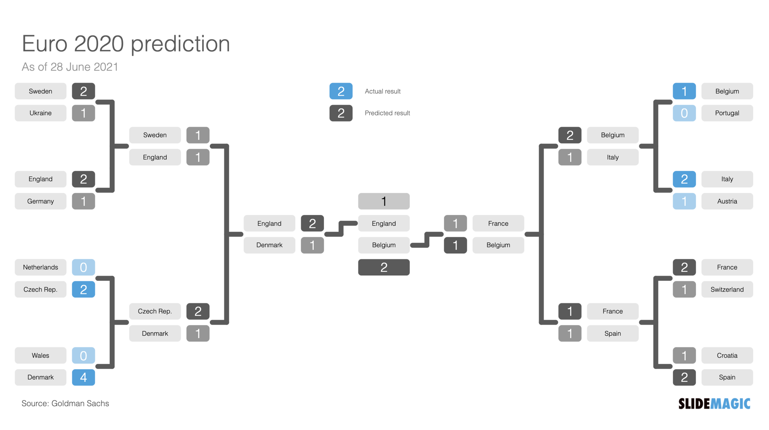
The economists of Goldman Sachs traditionally have a go at predicting the outcome of major soccer tournaments using models that are usually deployed in the field of economics. As of 28 June, the predication was as follows (you see it is outdated already).

Screen Shot 2021-06-28 at 12.06.59.png

I have added a slide layout based on this to the SlideMagic presentation platform. This type of layout can come in handy for any sort of scenario analysis, not just soccer. It is free to use for anyone inside our desktop app (download it here), search for “soccer” and it will show up.

Screen Shot 2021-06-29 at 15.32.20.png

I made a few changes to the layout:

  • Better use of colour

  • Flip the position of the score numbers on the ride side, to create a more balanced layout

  • Make sure the order of the teams in the matches corresponds to the results of the previous match

SlideMagic: a platform for magical presentations. Free student plan available. LEARN MORE
Corporate vs consumer audience

Corporate vs consumer audience

Here is a fragment from the introduction of the upcoming Windows 11 operating system by Microsoft’s CEO Satya Nadella.

I think I sort of get what he trying to say, but it is not obvious. This looks like a derivative of the many internal Microsoft discussions that must have taken place how to position Windows against Mac OSX, iOS, and Android, but now with these names taken out. It makes sense for Microsoft employees that were part of these discussions, to a consumer, a bit less so.

He also builds up to a major message in the beginning that ends in making the “consumer agency” point. For most foreign English speakers, “agency” is usually a group of people that work in advertising (or even presentation design). The other meaning is not very well known and it is risky to make this the headline of your whole pitch.

SlideMagic: a platform for magical presentations. Free student plan available. LEARN MORE
Picking a useful accent colour

Picking a useful accent colour

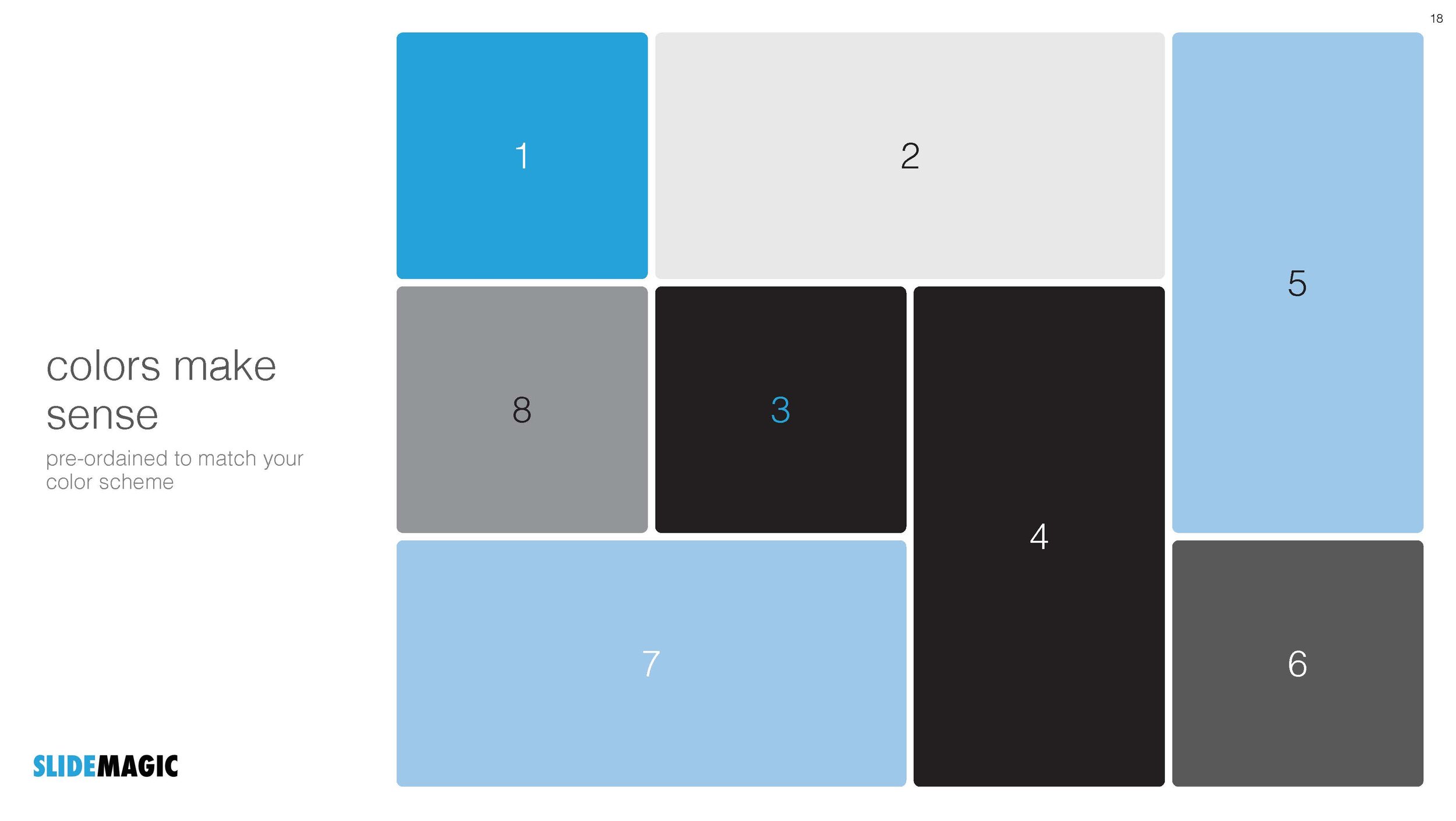
SlideMagic uses a simple colour scheme: (just) one distinct accent colour and lots of shades of white/grey/black.

What are good accent colours?

  • One that stands out

  • (This is the tricky bit):

    • One with good contrast with white

    • One with good contrast with black

  • One that fits with your brand and/or industry, or the opposite one that really sets you apart from everyone else in your industry if that is what you want to do.

  • One that you like

People often forget about number 2, which cuts off a lot of creative possibilities with your design

Photo by Daniele Levis Pelusi on Unsplash

SlideMagic: a platform for magical presentations. Free student plan available. LEARN MORE
This is emotion in a presentation

This is emotion in a presentation

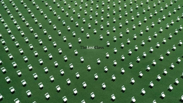
The former head of the US gun lobby was tricked into rehearsing a graduation speech in front of 3000+ empty chairs. The event was fake and the chairs represented the number of high school victims of gun violence.

Whether you are in favor or against guns, the visuals of drone going over the audience with the voice in the background make an impression.

In the comments below each of the posting of the video you see the hard core pro and con camps engaging in typical uncivilized internet debating.

I think adding the sounds of gunshots and 911 calls was actually not needed at all, the effect of the video might have been better without them. It is the doubters, the ones that are sitting on the fence, who the video needs to influence. Most anti gun media has lots of noise, graphic images, and violence which might not be the right influencing strategy for the middle group. People discount it, tune out, and it sets up everyone for that heated debate that polarizes even more.

SlideMagic: a platform for magical presentations. Free student plan available. LEARN MORE
Not understanding is not your problem

Not understanding is not your problem

When your project manager tosses a bunch of vague suggestions your way, “ok this deck is easy, we start with the vision, then show the strategic buckets and mirror these against our core competencies”, and you don’t get it, it is not your problem.

Asking for explanations of everything might annoy her. Instead, ask for a quick example. “Which bucket for example?”, and “and can you mirror it against 1 core competence for me”?

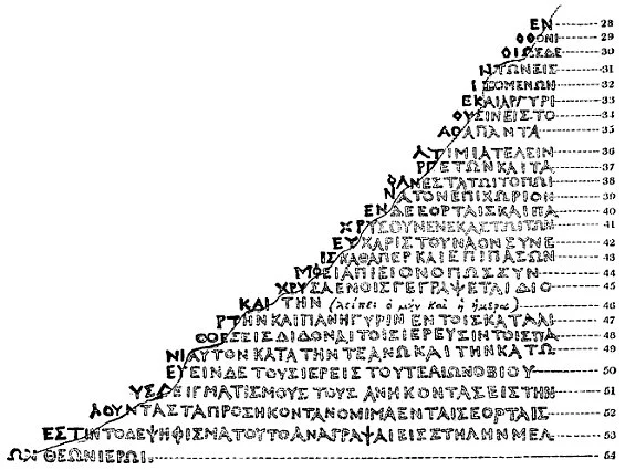
This is like a small “Rosetta Stone” for you, you have decoded this particular case example, now you can take on the rest (and in the process write a presentation with fewer buzz words).

Image by Richard Porson - “Rosetta stone, brought to England in 1802” in Archaeologia vol. 16 (1812), Public Domain, https://commons.wikimedia.org/w/index.php?curid=10617134

SlideMagic: a platform for magical presentations. Free student plan available. LEARN MORE
Nagging does not sell

Nagging does not sell

Seth “stole” my thunder… A blog post about how nagging and insisting without introducing new information or ideas is not going to get you anywhere has been sitting in my mental pipeline for a while. Some examples.

  • People here in the Middle East can be very defensive, and this happened a few times in presentations I attended here around Tel Aviv. After your presentation you get a question, the presenter answers it. The question gets asked again, but it was not really answered. The presenter is not really listening, and more or less repeats the same answer, this time a bit louder. This pattern might repeat itself a few times without a resolution

  • As a startup CEO, I get tons of “spam” emails with subject lines and opening sentences that sound like spam. That first email does not trigger a response from me, but it gets followed up by pretty much the same email, with the same subject line in bold

  • The investor is not going to invest in you, because she does not invest in medical diagnostics companies, and you are a medical diagnostics company. Trying to convince her that she should invest in these companies will get you nowhere. Either move one, or give the pitch of your company a different spin, away from that particular field.

Parents might succumb to repeated pressure and buy calm in the house, pretty much everyone else will just ignore you.

Photo by Dan Burton on Unsplash

SlideMagic: a platform for magical presentations. Free student plan available. LEARN MORE
"Life by SlideMagic"

"Life by SlideMagic"

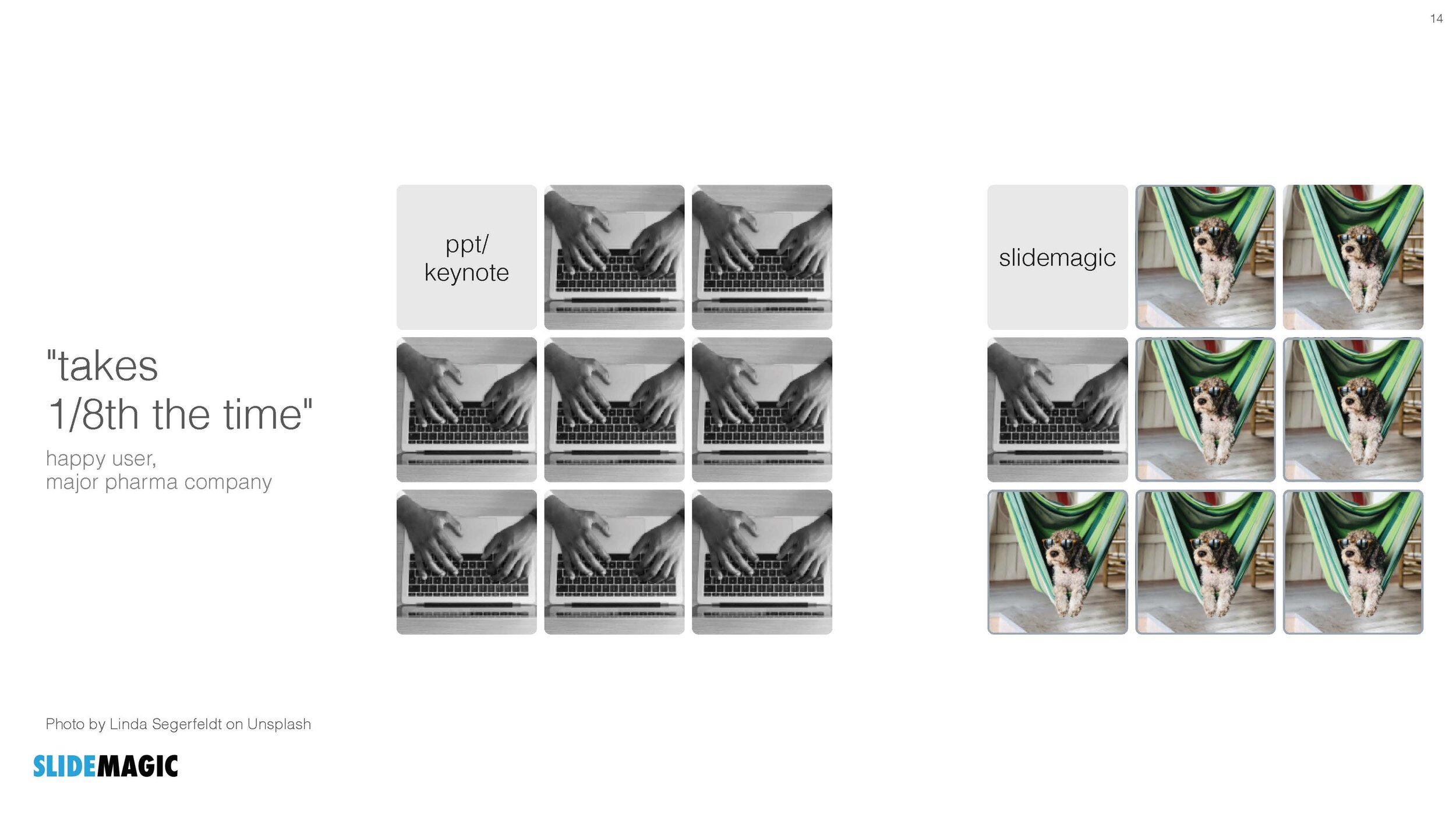
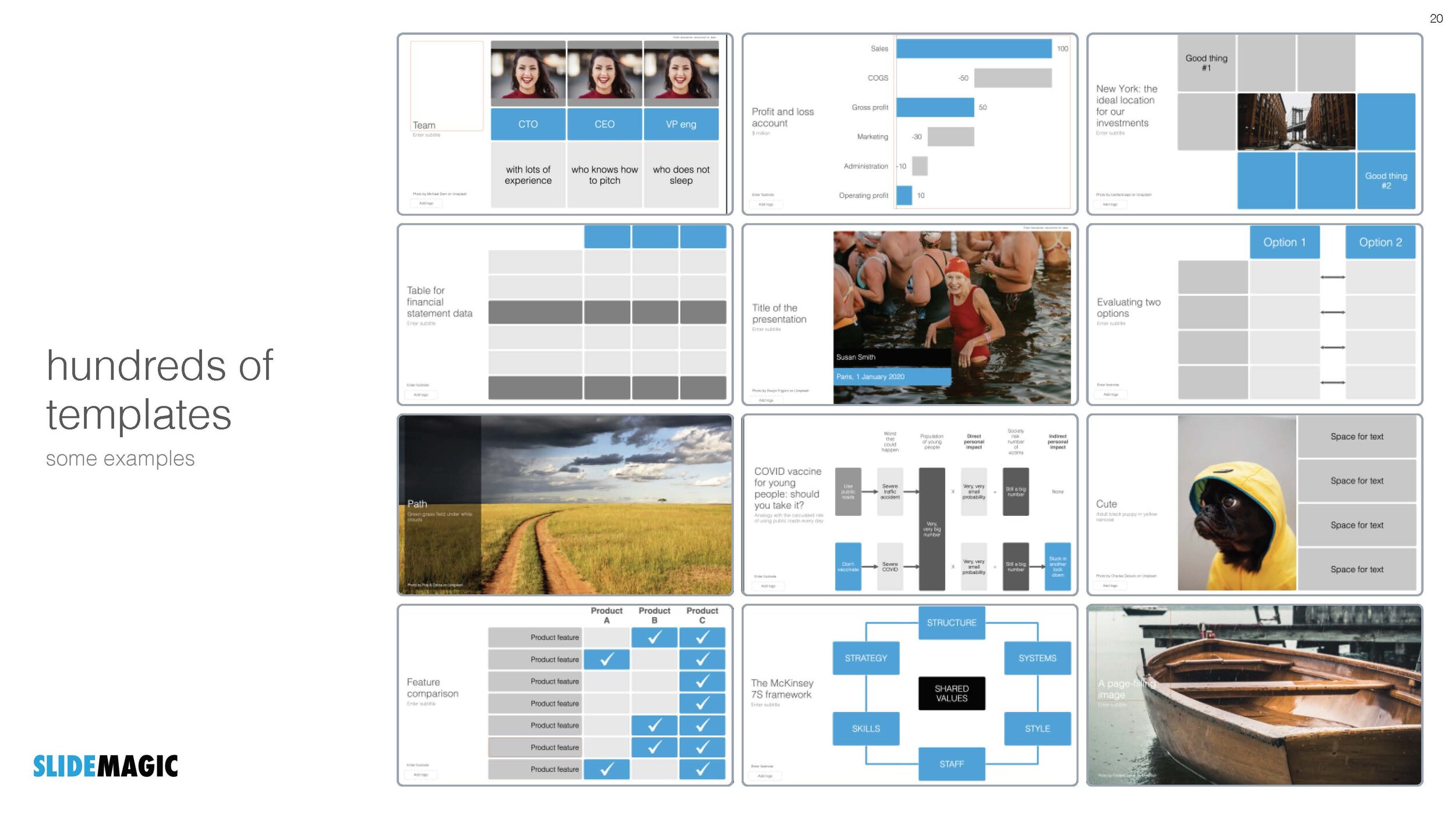
My amazing wife Anat Naschitz has always supported me in developing SlideMagic behind the scenes. Going forward, she will become more visible to the outside word. Recently, she created a deck to demo SlideMagic to a potential client. We have added these slides and the entire deck to the SlideMagic template database, so they all should be available in the SlideMagic app for you to use in your own presentation, simply search for “anat” and the slides will pop up.

SlideMagic: a platform for magical presentations. Free student plan available. LEARN MORE