ALL CAPS

ALL CAPS

Some people use ALL CAPS TO MAKE A TEXT STAND OUT. That’s not a good use of all caps. It looks busy/messy, especially when used frequently on the same page. A subtle use of bold is better, and if you find yourself bolding every other word, maybe it is a signal to reconsider the design of the slide.

I like using all caps for labels or tags, especially if the text in these tags has similar length. The consistent height of the characters creates nice and stable elements on the page.

Consider reducing the font size of your all caps tags though, from the font your are using for the rest of the page. All caps look bigger (by design).

SlideMagic: a platform for magical presentations. Free student plan available. LEARN MORE
The song is always too long

The song is always too long

Advice from a music teacher to amateur musicians: “You think the song is too short, the audience (almost always) will perceive the song as too long”. When you are an amateur musician, who sticks her out by performing on stage, you get instant sympathy, even without having heard a single note. If you play decently, people will enjoy your performance as well. But, because you are not (playing like a) famous rock star, patience / novelty might run out after a while. “Ah, she is going for another verse”.

Have the courage to keep it short.

SlideMagic: a platform for magical presentations. Free student plan available. LEARN MORE
Huge audience speeches

Huge audience speeches

The protests against the attempt to weaken the Israeli democracy are continuing. Every weekend there is a 100,000+ demonstration in central Tel Aviv (14 weeks and counting). As a result, I have heard my fair share of speeches made by politicians and activists.

The bar for a good speech gets higher. A politician who tries a very long sequence of cliche sound bites (we will win, it unfair, we won’t let them), is unlikely to excite the audience anymore. What can work?

  • Crowd managment, some people have the charisma, voice, and ability to time sentences to sweep up a crowd.

  • Personal stories. Some speakers, even with weaker voices and/or a smaller stage presence, manage to connect to 100,000 people who listen quietly

  • Original plots. Coming at things from a different angle, drawing possible future scenarios, rather than cliche sound bites / one liners

  • Keeping it short. Most speakers fall in the trap of repeating themselves, and taking too much time. Shorter, even very short, speeches are way more memorable.

SlideMagic: a platform for magical presentations. Free student plan available. LEARN MORE
Selective highlighting

Selective highlighting

This chart in the WSJ shows how you can focus on data points that matter to your story, while literally ignoring other data points that are less relevant.

This slide is obviously super complex, but you can also apply this style with more mondaine, everyday slides.

Instead of complex animations, it is easer to copy a version of your chart in consecutive slides, and adjust the coloring and messaging to highlight the points.

This approach also makes sure that your story is visible in environments without animations (PDF, mobile devices)

SlideMagic: a platform for magical presentations. Free student plan available. LEARN MORE
Student plan applications

Student plan applications

SlideMagic offers free Pro subscriptions to students (sign up here). For many countries there is automated, instant approval if you log in with your university/school credentials. For some countries, reviews are still manual. Make it easy to get approved by filling out the form correctly if you are in the latter box. Use your university email address, and provide a link to a profile (LinkedIn, school/university) so we can verify your status. We see many anonymous gmail addresses, and empty profile links in the applications, and we won’t switch these account on to the student plan.

SlideMagic: a platform for magical presentations. Free student plan available. LEARN MORE
Designing with actual data

Designing with actual data

There is a reason why many presentation templates and data dashboards look so bad: they have been designed without actual data.

Most corporate presentation templates are the result of the work of a designer who has been given a white page to add some stuff to. The resulting white template page might still look OK, but when it is filled up with typical slide content…

Information dashboards looked great in the mock up screens: dials, tables, buttons, graphs, until they are populated with typical data: text blocks are longer shorter than in the mockup, important data is actually not there, non-important data is, all graphs look flat, and all dials have more or less the same color because the values don’t change that much.

Presentation template designers, ask for an actual deck to start working on. Dashboard UI designers, ask for a real data set.

SlideMagic: a platform for magical presentations. Free student plan available. LEARN MORE
And we are back

And we are back

The past few weeks have been quite a roller coaster here in Israel. I spent a lot of work, and emotional energy on preventing that Israel would loose its democratic foundation. It looks like we are out of the woods for a couple of months and I will try to pick up the blogging effort. From a communications perspective, I learnt some interesting things over the past weeks.

SlideMagic: a platform for magical presentations. Free student plan available. LEARN MORE
Women in the workface

Women in the workface

On women’s day, here is an interesting visualization by The Economist to show the role and influence of women in the workforce:

What is used:

  • Big, bold, fat lines

  • Color coding using a gradient based on the last available year’s ranking

  • (Not visible on the static image) When you hoover over a line, it lights up with the rest being faded out

Lines that break the pattern will pop out (Israel, Hungary).

One caveat though, these are all 29 reasonably wealthy countries. The situation might be a lot worse in the other 150+ countries that are not on this list.

SlideMagic: a platform for magical presentations. Free student plan available. LEARN MORE
The first take

The first take

On many famous music recordings, an artist’s first take often made it on the final record:

  • A stress-free, we will just try something, approach

  • Some happy mistakes that turned out great

  • A clear mind, free of tangents

In presentations, something similar often happens. After weeks of work, you sit down and say “OK, this is what it actually boils down to”, and out comes the perfect story.

This only works after, you invested in the hard work and really understand what you are talking about. It is a first take of telling your story, not a first take of doing the project.

SlideMagic: a platform for magical presentations. Free student plan available. LEARN MORE
More logo cropping

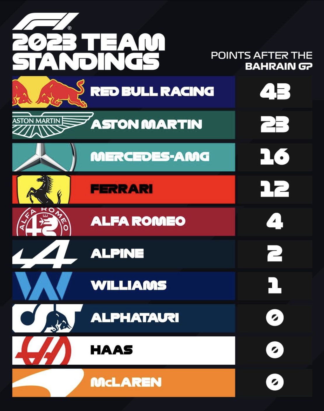
More logo cropping

The F1 graphics designer has the same problem that we presentation designers face: how to deal with logos that have completely different aspect ratios. Very long ones vanish in a square tile, square and round ones don’t look good in a wide rectangular box.

Their solution: let go of the requirement that the entire logo should be visible. Carefully crop out parts of the logo while making sure that it can still be recognized and read. All this is supported by borrowing the dominant color of the logo in the text box.

SlideMagic: a platform for magical presentations. Free student plan available. LEARN MORE
Cold email subject lines

Cold email subject lines

As a founder of two software startups, I started to receive a lot of cold emails from software vendors that sell to startups. Most people who write them, have read the marketing story telling Bibles: people try to catch my attention with a headline that tries to connect with me (“Hey SlideMagic, wouldn’t it be great to increase conversion by 10%?”), take action (“Speak to you on our Zoom next Tuesday” , but I never agreed to the call), and are persistent and very self-aware (“Yes, I know this is the third time I send this email”).

The only thing these subject line tells me, “this is spam”, before I even understand what they are trying to sell.

A better way (for me at least) would be to write a subject line about what your company does without the marketing language that in 2023 sounds spammy.

PS. A startup idea for someone to build: develop a granular set of codes to classify software vendors, include that in the email (subject line), and offer an email filter to classify the marketing emails. Recipients can browse later for solutions they need and/or (silently) let emails from relevant vendors get through (some sort of category subscription). Lots of revenue model options.

SlideMagic: a platform for magical presentations. Free student plan available. LEARN MORE
Replying to comments of trolls and hecklers

Replying to comments of trolls and hecklers

The current crisis in Israel (this Economist article sums things up pretty accurately) is waking up a whole group of the population that until now was not really involved in politics. People start posting politically charged messages on LinkedIn and other social media platforms that they used only for work or family updates. As a result, things can get out of control quickly, with heated debates turning up in the comments. Some thoughts.

  • The people you are most likely to convince are the ones in the center. A die hard believer in an extreme position will never change her mind. So write for the people who might be sitting on the fence.

  • Aggressive images, rude language, calling people stupid, is unlikely to work. It confirms stereotypes of you being unreasonable. “Hmm, that person just called me an idiot, maybe she is right, and I should change my mind / upgrade my intellectual capabilities” Nope.

  • Write your post with a real person in mind, a friend who might disagree with you, but is not unreasonable. What would you tell her? What are her beliefs?

  • When you get flaming comments back, count to 10, and either ignore, or post a polite reply. “Everyone has the right to their own opinion”. Maybe correct a fact that was wrong. As a result, the aggressive heckler will look bad, not you. And remember, you are not replying to the heckler to convince her that she is wrong, you are writing to other people who could be more reasonable and are glancing over the comments.

SlideMagic: a platform for magical presentations. Free student plan available. LEARN MORE
Speaking at mass rallies

Speaking at mass rallies

Israel is going through a major political crisis now that has little to do with the traditional conflict here that usually makes headlines around the world. As a result, I have been attending a number of large rallies pretty much for the first time in my life, to try to prevent the current government from making the Supreme Court and legal system subordinate to the parliament with a simple 51% majority vote, effectively ending the separation of power that is crucial for a democracy to function properly.

Some lessons here when it comes to public speaking at these events with 100,000 attending:

  • Your script is basically a list of sound bites, paragraphs of tension / release. Build up tension one way with a problem, then provide release with a punch line. There is very little room for sophisticated story lines.

  • Don’t be afraid to put really, really long pauses in between, to get the crowd to calm down.

  • Make sure your punch line is short and does not get washed out by the noise of the crowd.

  • Balance your voice volume. If you are at the top of your voice all the time, you can no longer add extra drama to the punch line. (Yes, some people have a microphone voice with lots of lower frequencies, giving them an unfair advantage).

  • Use the crowd creatively. “Raise your hand if you…” “Turn on the flashlight of your mobile phone if you…”

Most of the people in these rallies follow the speaker on giant screens. In between speakers, video clips are shown with a mix of regular footage and “slides”, usually big text messages that come in and out with animations.

There is an opportunity here for a carefully crafted, synchronized slide show and speaker performance. But I guess it will be pretty difficult to get all the technology to work: managing slide transitions, and switching between speaker and slide on the giant monitors. It should be possible though for events that are planned long in advance. The ones in Israel now are created at the very last minute, as things are moving very fast.

SlideMagic: a platform for magical presentations. Free student plan available. LEARN MORE
An alternative calendar

An alternative calendar

Here is an interesting twist on the traditional annual calendar:

Image credit: https://bigthink.com/starts-with-a-bang/one-page-calendar/

Yes, it is a lot more efficient when it comes to the amount of space it takes (or the required font size to fit a whole year on a page). But I think the point of the big, dense, calendar is to schedule and plan things across the year. Also, you need to do a few mental steps to get your head around looking at a specific month.

I added a template with this calendar to the SlideMagic template library, search for “calendar” in the SlideMagic app and it will show up.

You can read the full discussion of this alternative calendar format here.

SlideMagic: a platform for magical presentations. Free student plan available. LEARN MORE
Zelensky's UK speech

Zelensky's UK speech

Zelensky’s speeches will enter the history books as examples of powerful public speaking. Here is a link to the speech to the combined houses of Parliament in London on February 8, 2023. Zelensky starts speaking at around 10:33 (start the video at this time by clicking this link)

Some thoughts:

  • He speaks in English with a very heavy accent. Instead of hurting his talk, it makes it a lot more powerful. It shows courage and effort. And the way he speaks (slowly, determined) makes it actually sound very good and easy to understand. When he (almost) gets stuck, he pauses, looks at his notes, and keeps going confidently

  • Zelensky again drags the audience in. You fought your wars for values you believed in, you won, and now we are in the same position as you.

  • In very news sources, a few sound bites of the speech are summarized, but they do not reflect the whole speech, you need to hear things in context. (Although he has a few powerful one liners, for example the one referring to the UK having a king who is a pilot, while in Ukraine there are pilots who are kings.

  • Zelensky has a very clear agenda, he wants planes. It comes back in the one liners, it comes back in the examples, at the start, in the middle, at the end, all the time. It is very clear what he is asking for. Highlighting the bravery of the UK to be one of the first to support Ukraine, and implying that it should be ready to set the next step as a first as well.

  • He switches skillfully from complimenting the host, creating empathy for his country, referring to very big concepts (the find between Good and Evil) and zapping the tension with humor.

  • He uses props (the pilot helmet and the story with the meaning of the scribbles on it).

I think he will have changed the perspective of many MPs sitting in the audience.

SlideMagic: a platform for magical presentations. Free student plan available. LEARN MORE
Rehearsing the whiteboard

Rehearsing the whiteboard

Adhoc brainstorm meetings are very hard to manage. If you have to discuss a complex issue, it might be worth to prepare and rehearse your white board sketch before entering the room.

On its own, a white board (or a black board at school) is not very meaningful. A bunch of words and drawings out of context. For the person who sat through the meeting, the board is very meaningful. Every scribble on a specific location on the board is a visual anchor for the entire rich discussion that was held about it.

So rather than prepare a big slide deck, maybe you should prepare your white board. Where do you put what. How do you connect elements. The whiteboard gives you the perfect excuse not to make perfect drawings. Try 3, 4, 5, or even more versions until you are left with one you like.

SlideMagic: a platform for magical presentations. Free student plan available. LEARN MORE
Small fix for online image search

Small fix for online image search

The installation of the latest SlideMagic version with AI-powered image generation created an issue for some users where the access to online image search was blocked. It is easy to fix: log out, and back in again in the SlideMagic app and all should work. I deployed version 2.7.3 as well that eliminates this issue all together.

SlideMagic: a platform for magical presentations. Free student plan available. LEARN MORE
Useful OpenAI images

Useful OpenAI images

Most people use AI image generators to create something funny (a cat riding an elephant) or something artsy (a formula 1 car in the style of Van Gogh). This is not the primary motivation why I included OpenAI image generation in SlideMagic.

Image generators can be useful already in presentations, especially for image concepts that are relatively straightforward, but hard to find on stock image sites. The example that came along yesterday with an image of a ‘sleeping bull’ for a economics-related presentation. Perfect for OpenAI, see the result below.

SlideMagic: a platform for magical presentations. Free student plan available. LEARN MORE
Design culture

Design culture

It is tricky to get a big company all aligned behind one consistent approach to design. Twitter is going through a lot changes: changes in strategy, changes in people, etc. You can see it in inconsistencies in the web site. Colors, language, layout, icons,, other design elements, etc..

SlideMagic: a platform for magical presentations. Free student plan available. LEARN MORE
This presentation tool is not a presentation tool

This presentation tool is not a presentation tool

PowerPoint, Google Slides are presentation tools that most of the time are actually not used as presentation tools. Rather people use them as a visual collaboration tool. The organization chart that needs to go into the deck forces the issue: it is time to agree on where the boxes sit and which lines (dotted or straight) go between them. The tiny footnote is essential to agree the strategy for the North America entry strategy etc.

The visual character of these programs makes them more useful to do this than word processors. Online collaboration adds another option to manage multiple pens in one document. Comments give a system to manage todo lists.

SlideMagic on the other hand is a presentation tool.

Image credit: Jay Cross on Flickr

SlideMagic: a platform for magical presentations. Free student plan available. LEARN MORE