SlideMagic — Magical presentations. Fast. Easy. Beautiful

Viewing entries tagged
Animations

Share

"We need to animate that!"

The audience does not see the difference between 4 consecutive slides with different images, or 1 slides with 4 consecutive image build up, so there is no point in trying to cut slides by consolidating 4 images into one. Four slides are easier to edit, and four separate slides are easier to email as PDF.

Share

SlideMagic: a platform for magical presentations. Free student plan available. LEARN MORE

Share

European borders time lapse

This video shows how the political map of Europe has changed in 1,000 years. There is a lot of information packed in here, but the only one that gets across is: “lots of things have changed”. To bring more information to the surface, you need to slow down the pace, and add labels/stickers to highlight the key changes and go into the detail. Both visualisations work, the third option - stuck in the middle - will not.

Share

SlideMagic: a platform for magical presentations. Free student plan available. LEARN MORE

Share

The wow intro

Bombastic animated introductions are often used to promote movies, and some people might think they make spectacular product presentations. However, I think that a 3D animated product name with loud music does not make a good connection with the audience.

Share

SlideMagic: a platform for magical presentations. Free student plan available. LEARN MORE

Share

Uncovering

When you need a complex animation, it is often easier to uncover objects by removing a white box than build up a shape step by step, especially if the shape includes a data graph (columns, lines, bars).

Share

SlideMagic: a platform for magical presentations. Free student plan available. LEARN MORE

Share

Creating cartoons with PowToon

PowToon aims to enable you to create cartoon-style, animated presentation and video clips without professional illustration and motion graphics software. I test drove the beta version.

When you look at many cartoon-style videos you see that they are actually not that complicated from a graphics point of view. Usually they involve a number of scenes (slides), they use static characters, basic entrance, exit, and emphasize animations and sometimes a cute hand that puts items on the slide, all accompanied by some simple music.
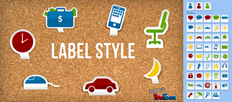


And this is what PowToon does. The edit interface looks Windows blue, it allows you to place items in a slide and specify the animations. In theory, PowerPoint or Keynote can do the same things, but it requires a deep understanding of the software, plus a library of characters.

There is definitely a market for a tool like PowToon. I do not envision these type of animations to be used in a stand-up presentation, but rather they could be useful to create demo videos on web pages, or presentations for emailing to prospects.

The basics of PowToon work great. I spent 10 minutes to stitch together this video based on a pre-defined template. PowToon is still in beta, and there are a number of features that I would recommend the team to incorporate:
  • Invest in the object library, and make them look less clip-arty (the picto character has some resemblance to the 1990s screen bean), this could also be a good revenue model: premium illustrations
  • Create the ability to export the presentation as a movie and embed them in a regular PowerPoint or Keynote file, this will make adoption in corporate environments a lot easier.
  • Make it easy to embed presentation videos in sites (I am sure the team is working on this)
  • Find a way to let the hand draw shapes and write text, so everyone will be able to make animations in the style of RSA Animate.
PowToon is also powering a market place for designers to offer custom-design services on the platform. I am looking forward to incorporating PowToon animations in my client work!


UPDATE: PowToon is extending 100 beta invites to readers of this blog: sign up here.

Share

SlideMagic: a platform for magical presentations. Free student plan available. LEARN MORE

Share

Uncover versus popup

I am not a big fan of animation, spectacular effects do not support a serious business message and documents with animations do not convert well to PDF for emailing.

Sometimes there is no escaping though, especially when you need to explain components of a complex system. The best way to do this is to add elements one-by-one through a series of clicks.

The usual way to do this is to use pop-up animations. However, these can be cumbersome to edit: you often forget one item in a group, and have to start all over again.

There is an alternative: cover the critical elements in your slide with boxes and remove the boxes one by one. Easier to edit. You can even make it more sophisticated by given the boxes a 10% transparency: the viewer sees sort of what is coming, but not completely. When you want to PDF and email a version of your document, you simply delete all the boxes which leaves the full diagram intact.

Share

SlideMagic: a platform for magical presentations. Free student plan available. LEARN MORE

Share

A cinematic presentation opening

Have a look at the way Francesco Paciocco credited this short video about Milan. It is a video, but the shots are very close to still images. We do not see the cliché images of the Duomo and other tourist attractions. Instead, a flow of scenes from daily live.


I like cinematic openings in PowerPoint presentations. A series of images to take the audience to a different place. While it might be a bit too complicated for the average designer to create such a video, you can create a very similar effect in PowerPoint by sequencing a series of Flickr images with a Creative Commons license. If you want, you can go one step further and add a slow-zoom effect to your images.

Via Fubiz.

Share

SlideMagic: a platform for magical presentations. Free student plan available. LEARN MORE

Share

Motion graphics: Stuxnet virus explained

Here is an impressive piece of video animation work by Patrick Clair. Watch the use of narrow all caps fonts.

Share

SlideMagic: a platform for magical presentations. Free student plan available. LEARN MORE

Share

IDU Biometrics: 41 slides in 6 minutes

One of my presentations in the public domain. This time the setup was the global finals of the 2010 Global Security Challenge in London. Startups that had won the regional semifinals were granted 6 minutes to pitch their company in the field of IT security to a jury. I designed the presentation for IDU Biometrics within the following constraints:
  • 6 minutes, no second more
  • An audience that understands IT security, but has no idea what so ever about the company the moment the 6 minutes start, we begin at level 0
  • A very tight startup budget: all designed in basic PowerPoint without sophisticated effects and/or illustrations, one file that forms the basis for the company presentation, a looping presentation inside the company booth at the exhibition that was held in the same venue, a video for online viewing, and a good introduction for a broader presentation for fund raising from venture capitalists.
Here is the video version of the presentation:

Share

SlideMagic: a platform for magical presentations. Free student plan available. LEARN MORE

Share

Demo slide sequence versus demo video

I get this question a lot when designing presentations for technology startups: "Hey, can you embed our demo video into the presentation?" I almost always try to avoid this:
  • Embedding videos always triggers Murphy's law: on-stage technology fail
  • As a presenter it is impossible to control the pace at which a story in a video is told
I prefer to go low-tech and create a sequence of slides that explains the technology innovation step by step with big arrows and markers highlighting what goes on. Sometimes I even use screen captures from the video as source material. The presenter can explain things in his own style, slowing down if the audience wants to (and without having to fear technology issues).

Share

SlideMagic: a platform for magical presentations. Free student plan available. LEARN MORE

Share

It is still hard to do it right in Prezi

Here is a Prezi-presentation (see earlier posts) with some facts about the growth of data sent over mobile networks. Praise for Byte Mobile to experiment with different presentation formats. Here: Prezi is used in the following way:
  1. Animated slide transition
  2. Zoom in on the title with the message of the chart
  3. Zoom in on the data in the chart
  4. Zoom in on the foot note with more detailed explanations
For me, this is not yet the best way to use the power of Prezi. But if you ask me what is the right way, I must admit I do not have an answer yet. 

Share

SlideMagic: a platform for magical presentations. Free student plan available. LEARN MORE

Share

More motion graphics about the size of the Internet

Another motion graphics video, again about the size of the Internet. This time by graphics designer JESS3. My opinion remains unchanged:
  • Beautiful graphics, and a beautiful color scheme
  • But (moving) text is not the best way to visualize the billions and millions
I do however like the slowly moving time line with the launches of social networking sites over the years towards the back of the video.


Found via Nancy Duarte.

Share

SlideMagic: a platform for magical presentations. Free student plan available. LEARN MORE

Share

The sort of animations we need in slideware: zooming

Most of the animations and slide transition effects currently available in PowerPoint do more damage than good to a presentation (an earlier post on the subject). The video below is guilty of some of these mistakes, but it also contains some effects that would be very useful to have in PowerPoint 2010 (preview in an earlier post):
  • Very slow moving zoom
  • Extreme image zooming
  • Image blurring
  • Zooming inside data charts
See how often I used the word "zoom" here. In the current version of PowerPoint you cannot control zooming enough: effects are blunt. Either via devices like the iPad, or via a breakthrough by software innovators like Prezi, or via improvements in Microsoft's/Apple's slideware, eventually we will get to advanced zooming capabilities in presentation software.


Video credit: Dan Meyer's 2009 Annual Report from Dan Meyer on Vimeo. Found via Fubiz
Further reading: an excellent post by Garr Reynolds about slow zooming and photographer Ken Burns.

Share

SlideMagic: a platform for magical presentations. Free student plan available. LEARN MORE

Share

Getting your idea across in 1:35

Sometimes, a live presentation can be a pretty inefficient way to get a message across. For example, TED presentations are usually really good, but they still need around 20 minutes of your time. Have a look at the new fund raising video of the Acumen Fund that was released yesterday. It lasts 1:35.
In this 1:35 the video manages to explain a completely revolutionary concept to charity. It is not about giving food, it is not about giving the tools to grow food, but it is all about investing in profitable businesses that produce goods/services, create wealth and can grow by themselves.
The video does not need long speaker introductions, does not use spectacular motion graphics, does not rely on "look how miserable these people are" images. Just a number of upbeat people talking straight in the camera at you. It is hard to do this in 1:35 on stage with PowerPoint slides.
Sign up for the recently established social network of the Acumen Fund to learn more about the dramatically different approach the organization is using to combat poverty.

Share

SlideMagic: a platform for magical presentations. Free student plan available. LEARN MORE

Share

Motion graphics done right

Two days ago I posted about a motion graphics video that was designed beautifully but relied too much on text bullet points to compare quantitative data, the brain had to do too much work in too little time (before the next piece of information shows up):
  1. Read sentence
  2. "Visualize" numbers internally
  3. Interpret them
This is a better example of the use of motion graphics. Zooming is used to visualize the enormity of the number 1 trillion. It comes at a price though: this video is almost a full-blown animation. A bit of PowerPoint/PhotoShop skills and After Effects are not enough to produce it (unfortunately).
Video by Maya Research, found via Core77

Share

SlideMagic: a platform for magical presentations. Free student plan available. LEARN MORE

Share

Motion graphics overload

Xplane continues to develop beautifully animated presentations using motion graphics. After Did you know 4.0, there is now another video developed in cooperation with the Economist: The carbon economy.
I really like the effects, textures, typography and animation of this presentation, but I think we still have to learn how to use all this technology effectively. The video is relying heavily on text to explain and compare quantitative data (similar to what bullet points do). The pace is so fast, that I have difficulty processing it all (and I had my 10,000 hours of data processing training).
My early thoughts on how to make the most of motion graphics:
  • Be careful with background music
  • Use text animation only to highlight quotes with non-quantitative information
  • For quantitative data go back to the good old simple data charts, but feel free to leverage those beautiful textures and typography
  • Beef up the animated character animation: things morphing into another shape, things growing/shrinking (the rising water levels in this video is a good example), the blend of animated film design and presentation design is great
  • Think about pacing of animations like you think about pacing of words. Have the courage to pause, accelerate, talk loud, talk softly, pause again. The entire video does not have to be an information roller coaster.
I am curious to hear your thoughts.

Share

SlideMagic: a platform for magical presentations. Free student plan available. LEARN MORE

Share

Beautiful motion graphics: "Did you know 4.0" video by Xplane

This video by Xplane (link to their blog with details) is making the rounds on the Internet. (Watch it in the original format on YouTube as blogger cuts off the right side of the wide screen video)
It's a beautiful example of kinetic type or motion graphics. Some comments.
  • It is made with software available to everyone, the source files are here.
  • There are some interesting visualization concepts, for example pie chart overlays abour 2:30 minutes into the video (thank you Steven Levy for pointing this out)
  • Quotes are great to get one number across. Still I believe that comparing two numbers is not very powerful in 2 consecutive quotes. Rather the good old bar chart does a better job.
  • The real artistic power in this presentation is the subtle use of informal cartoon drawing techniques, I style that I like.

Share

SlideMagic: a platform for magical presentations. Free student plan available. LEARN MORE

Share

Motion graphics - blending presentations and animated video

You should design a presentation for an online audience in a different way than those for a live audience. Software such as Adobe After Effects are bringing the graphical tools traditionally used in professional video animations within reach of everyone. As an example, see this recent video produced by Paul Durban: a teaser to get people to download an ebook created by the members of Seth Godin's triiibes community.
Two more examples of motion graphics:
A few observations:
  • The text-only animations are very useful for high energy, very short commercials. The bombardment of animations can carry one message across. "This tribes ebook contains a lot of questions, what was that tinyurl again, let's back up". "Got you, women are an underused resource in the 3rd world, we should help them help themselves rather than relying on food aid". Software opens this genre up to the masses.
  • The real master pieces are the ones that include images and artwork (like video number 3). I think these remain highly specialized projects almost similar to TV commercials that can only be executed by animation professionals.
  • (Amateur) presentation designers can still learn from these techniques. See how they use fonts, spread messages over different slides and create subtle transitions between slides that are far different from the spectacularly animated PowerPoint effects.
It is interesting to see how the Girl Effect video tries to make up for the lack of images: it constantly encourages you to imagine/visualize things ("No go ahead, really, imagine her") . See my review of the book Brain Rules, describing the difficulty the brain has with processing text.

Share

SlideMagic: a platform for magical presentations. Free student plan available. LEARN MORE

Share

How into insert an Adobe Shockwave Flash animation into PowerPoint

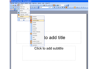
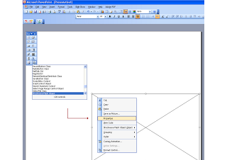
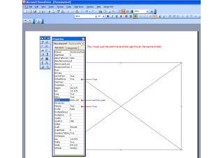
Maybe because Flash files are not a Microsoft format, integrating them into PowerPoint is a bit tricky. Here is how to do it. Make sure that the .SWF file is in the same directory as the PowerPoint file. Click on the images for a larger picture. When sending the presentation via email, it is best to ZIP the 2 files (PPTX and SWF) into one document. Still there is a high risk that the receiving party will not manage to see the Flash animation correctly. Do not use this for the critical slides in your deck. Thank you Karin Mazor for pointing this out to me.

Share

SlideMagic: a platform for magical presentations. Free student plan available. LEARN MORE