

Hopefully, you’re now convinced visual slides are far better practice than dense bullet point slides. Our next question is where to get good images for your presentation?
CLIPART, YES OR NO
Clipart was very popular back in the ‘90s, for early versions of Microsoft PowerPoint. Everyone remembers Screen Bean® who bobbed along many presentations across the globe. You can still download this guy from the Microsoft Clipart site.

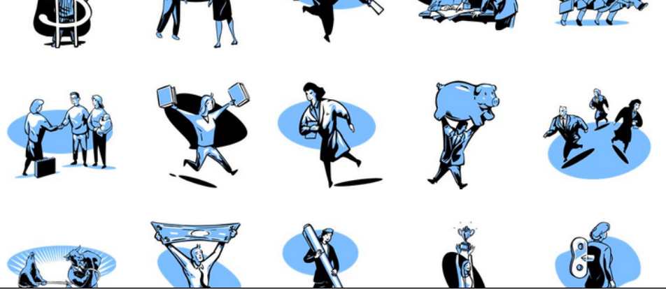

In 99% of cases, clip art does not work
You should keep in mind, though, that Clipart graphic simplicity renders your slides the look and feel of an invitation to a children’s birthday party, or a neighbor’s garage sale. It is possible to use Clipart sensibly, but it requires much work and dedicated search.
Creating more professional looking presentations using Clipart, requires delving deep into the Microsoft Clipart database, where advanced users can find a set of images that do not have that children’s birthday party look. There are some treasures there to be dug out, like ‘50s style cartoons or pop art characters. Style 802 is a good example. The good thing about clip art is that once you have found a suitable style, there are likely to be many, many, variations based on the same theme, an effect that is hard to achieve with photographs.
After importing the Clipart characters, some editing is required. This could include ungrouping the objects to deleting bits you don’t want, such as unnecessary background graphics. The remaining image can give a very distinct appeal to a presentation, especially if you position it well and scale it up to a grand size, instead of a marginal size icon floating on the page.
GOOGLE IMAGE SEARCH
A major resource many people turn to for presentation images is Google Images. Simply type in a keyword, and millions of images are filtered out for your choice. To improve your selection, Google Images offers additional filtering options, by image size or color. You can even drag an existing image into the search box to return similar findings for you.
However, there are two big drawbacks to Google Images you must keep in mind. First, most of the images are copyright protected, and second, most of the images are of poor quality.
Google Images is excellent for brainstorming on finding the best supporting image for each of your slides. Once you establish a good idea of what you need, turn to stock image sites to find such imagery that is legal to use and comes in high res quality.
STOCK IMAGE SITES
Professional designers buy pictures from image databases to be used in all their projects (ads, brochures, web sites, magazines, newspapers, billboards). These resources are available to everyone, and your presentation can benefit as well from the excellent imagery offered on stock.
Head over to stock image sites such as iStockPhoto or shutterstock where you can search for images by keyword, size, color, and many more search criteria filters. All the photographers on these sites are screened to ensure their high technical quality.
As for usage rights, pictures you buy on these sites allow you full use, as defined on these sites’ license agreements. For presentations, images usually fall in the lowest cost license option, since audience number is far smaller than that of a printed magazine, newspaper or television show.
You can easily download a sample version of the image, sealed with a watermark, and work with it while editing your presentation. Once your presentation is ready, and you are sure of your pick, buy the images and incorporate them permanently or at high res.

Many stock images are over-used and not real
While the technical image quality of stock photo sites is high, the actual visual composition might not always be optimal. Many images are staged, snapped in unnatural environments. For example, it’s pretty apparent the call rep operator is, in fact, a model earning her living posing on photo shoots, and not by courteously answering customers on support calls. The handshake in front of a skyscraper has been used all over the place, so that such a photograph is now just an empty cliché.
To answer the need, some stock photographers go as far as manipulating readymade visuals, creating compositions intended to capture a specific concept presentation designers may seek. They combine images, add illustrations or text. Most overstep themselves as they try to do the presentation designer’s work. Don’t fall for this - make your own compositions. The challenge is to find real, naturally rendered images, which best do the work for you.
A useful search term in stock image sites is “isolated.” It will return images of isolated objects over a white background. You can then easily remove the white background in Photoshop or PowerPoint, making it transparent and allowing you to fit the object well together with other elements on the slide.
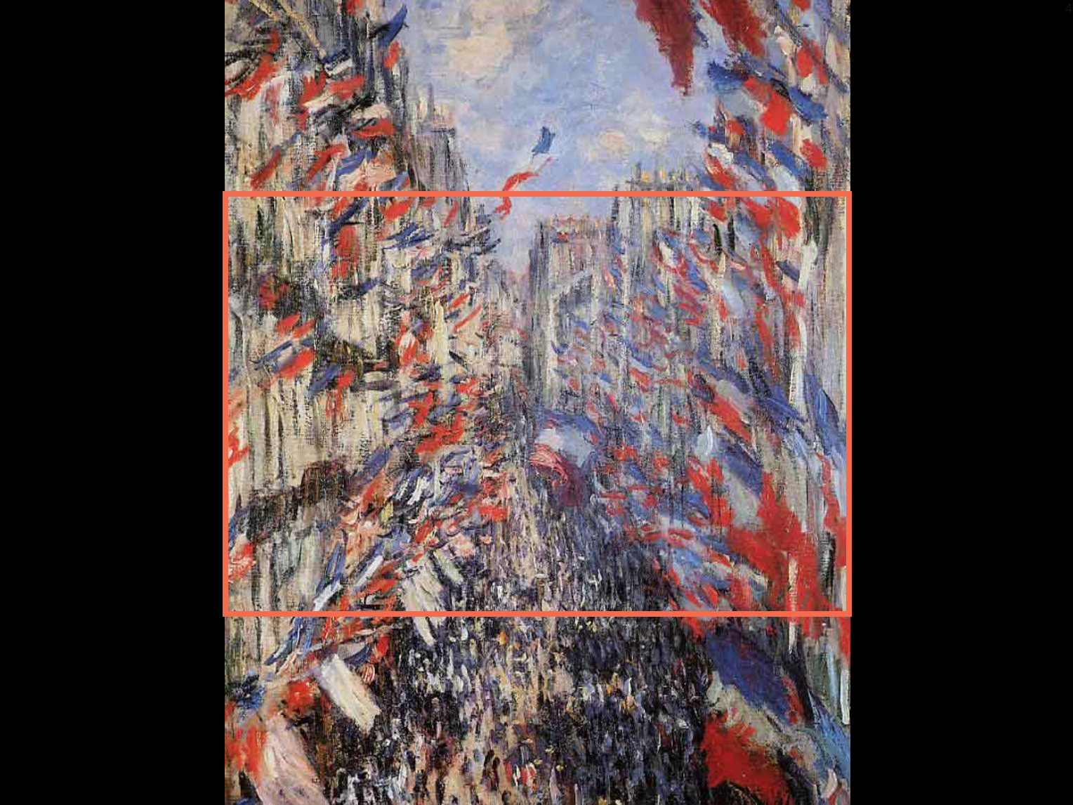
Another big advantage of stock image sites is that they allow you to be consistent in the style of images you choose. Often stock photographers produce different images featuring the same model, or follow a uniform visual concept. You can buy 5-10 such images of the same visual language, and design your entire presentation around them. You’ll attain a good consistent look and feel. In this book for example, I went for impressionist paintings.
The same picture can often be found on different sites, and prices can differ dramatically
In terms of pricing, stock photos can vary greatly. Size or resolution make a big difference to the buck. At the time of writing (December 2012) the highest resolution monitor out there is approximately 2,500 pixels wide. While this is great for billboards, most conference room overhead projectors have resolutions below 1,000 pixels wide. Still, it is good practice to download images in their highest resolution possible, to allow you to maintain focus if you zoom in on a specific part of it, or expand it onto a full page.
Often times, stock image sites price images differently. A handy tool for comparing prices across stock images sites is SpiderPic. Enter the image name or URL you want, and this software accesses multiple stock image sites, filtering up the same image with compared prices.
PHOTO SHARING SITES
Photo sharing sites such as Flickr or Instagram have the exact opposite problem than posed by stock image sites. None of the images are staged, but naturally captured, and depict people in real life situations. Keep this in mind as you think of the emotional impact an image may have in your slide.

Photo by Alexander Kess on Flickr
Flickr hosts some great presentation images
On these sites, the technical quality of images varies highly. People posting images to Flickr range from the world’s most famous professional photographers to the world’s worst amateurs. Your challenge is to find the good quality ones that will serve you best.
Keyword searches are less powerful here, in comparison with stock image sites. This is due to the fact, that pictures are labeled for searching by the photographers that uploaded them, and may not be accurate enough to filter in with your keyword search. Color based search is usually not an option. Date search is available on Flickr, a site that, over the years, has accumulated a huge library, inclusive also of older images that you can use to give your presentation a retro feel.
Keep in mind that such public photo sharing sites entail some copyright issues. I advise you to make sure the image you want is licensed under a Creative Commons license. This means you can use the image if you include a credit made to the photographer’s name. You can easily create such photo credits in very small print at the very bottom of your slide. Instagram images are all licensed to the photographers, so you’ll need to contact them for usage permission.
Personally, for my presentation, I have found photo sharing sites a great source of very realistic images, including people, crowds and specific locations.
WIKIPEDIA
WikiPedia is a good alternative source of images without copy right issues. License fees rise highly and are especially an issue if you require images of celebrities or historical news photographs. You can get them, though, from high end image sites such as Getty Images.
The same health warning as Flickr applies for WikiPedia too, stating images are typically not taken by professional photographers. While it is okay to use an image of a celebrity as an example, you’ll find it impossible to base an entire look and feel of a whole presentation, or its branding guideline, without owning permission rights.
GOOGLE EARTH AND STREETVIEW
Google Earth can produce spectacular mapping images for presentations. I find the detailed closeups great, and have often used a tilted map to simulate a pilot’s cockpit view.
Here too, you must watch out for copyright requirements. A professional license of some $400 a year, may be binding for usage right to images in your slideshow.
Google Streetview is a potentially useful source of images, however copyright requirements are even stricter than Google Earth. Google lets you use images only if you link to them via the approved API. This gives Google the option to adjust its images with updates (due to a privacy complaint, for example).
A good approach is to design your draft presentation using Google Streetview imagery. Then, as you are about to complete the final draft, send someone to take the actual shots in the field, and include them in your final version of the presentation.
CRAYONS AND INK
Instead of seeking an answer on the outside, you could go back in time yourself, and create an entire presentation using hand drawn sketches. These little artistic masterpieces can easily be scanned and incorporated well in any PowerPoint or Keynote slideshow.
You’ll find many iPad applications to easily make good hand drawn pictures. Pen strokes come out beautifully, even better than ink on paper, some would say. It’s also easier to correct and erase any part of an existing illustration at any time. These tablet drawing apps are really good for creating natural looking handwriting, you can deliberately enter on your slideshow, for the crossing out of objects or for natural looking on-the-fly manually jotted comments.
FORMATTING AN IMAGE
So, now that you have found the images you want, how do you go about incorporating them in your presentation? Here are a few points to consider in making your images look professional.
Aspect ratio: the proportion between the image height and width. Many television screens have distorted aspect ratios as users decide to stretch the image of an old 4:3 movie to a full screen 16:9 aspect ratio. As a result characters appear fat, squares stretch into rectangles, and circles become ovals. To prevent distorting your image, hold the shift key as you click and drag to resize an image.

Resolution: the measure of quality by pixels. Low resolution images look dirty, or pixelated, giving away you are an amateur who unprofessionally copied them off from Google Images. Always use good image resolution, to allow images to appear crisp on a large screen.

Cropping: cutting away bits from image margins. Instead of rescaling an image to fit a specific area on the slide, clip away bits from its sides. Losing a bit of image canvas is a far lesser evil than stretching the picture and risking it becoming distorted in ratio.
Full size: the original image size. There is no reason your image should sit idle and small, adrift somewhere in the middle of the slide. Stretch it out (remember to hold the shift key) without distorting the aspect ratio, to a full page scale. The image should reach the slide edges, and “bleed off the page,” as a print professional would call it.

Here are a few simple steps to create a page-filling image crop. Although you will lose part of the image, the overall composition still looks a lot better than the alternative: stretching the picture and distorting the aspect ratio.

Editing an extension: if the background of an image is relatively even, you can easily extend it to create the right size of an image, without resorting to advanced editing commands in Photoshop.

If you are past 100MB, you file might as well be 100MB
IMAGES AND FILES SIZES
Using images in your presentation can dramatically increase the size of your PowerPoint or Keynote file. Once you are past the 10MB mark, some email servers will bounce back your message. PowerPoint and Keynote both provide options for compressing images, making your presentation lighter.
While compressing does reduce file size, it also reduces the quality/resolution of your images. My recommendation is to keep your images nice and sharp by never going below the 150 dots per inch, for large screens. In an ideal world, you would keep an uncompressed presentation master file on your hard drive, work with it, and compress a copy right before you need to send it off by email.
There are powerful alternatives to emailing, allowing the sharing of large files. My personal favorite is Dropbox. As a side feature of a much larger overall offering, Dropbox allows you to synchronize data across multiple computers and devices, and large files can easily be shared. Instead of emailing the file itself, you email a Dropbox link for downloading the file. There is virtually no cap on file sizes, so, in theory, you can even email an HD movie to anyone this way. You can also share files with someone without the option of downloading the files or accessing them at a later time.
FILE MANAGEMENT
As you start using more and more images in your presentation, your image library will grow. When you save images, it’s good practice to follow some rules that will make it as easy for you manage your images.
Save them in one easily accessible directory on your hard drive. Sync them to Dropbox to make them accessible from multiple machines, if necessary.
Apply a powerful descriptive name to each file, instead of the serial number applied by stock photo sites. This allows you to search for images using keywords. Most stock image files contain pre-filled keywords that can be read by professional image managing programs, such as Apple Aperture. However for smaller libraries, a descriptive file name works well too.
Think about your image purchase as an investment on the future. Often, stock photographers offer different versions of the same image. Maybe one image is cropped a little differently, or the image may have some color filters applied to it. I always try to buy the most basic option possible, with no color effects or cropping, allowing myself the freedom to apply the specific effects and crops I will need. I could then reuse the image for any future presentation, cropping it again in any way I choose.
FINDING LOGOS
Logos work really great for creating attractive slide layout, and work better than entering the company name as text. To get the best possible logo image, you need to observe a number of steps.
Visit the actual website of the company whose logo you need. Companies often change logos, and you’ll want to use the most recent one.
Search for the logo in Google Images, setting the search criteria by size, for medium-sized or large files only. Even if you need the logo on a really small scale, it is always good practice to use high resolution. Large source files render you the cleanest and sharpest images.
Copy the logo file onto the slide, and resize it, holding down shift key to avoid distorting its aspect ratio. Next, compress the image to reduce the overall presentation file size.
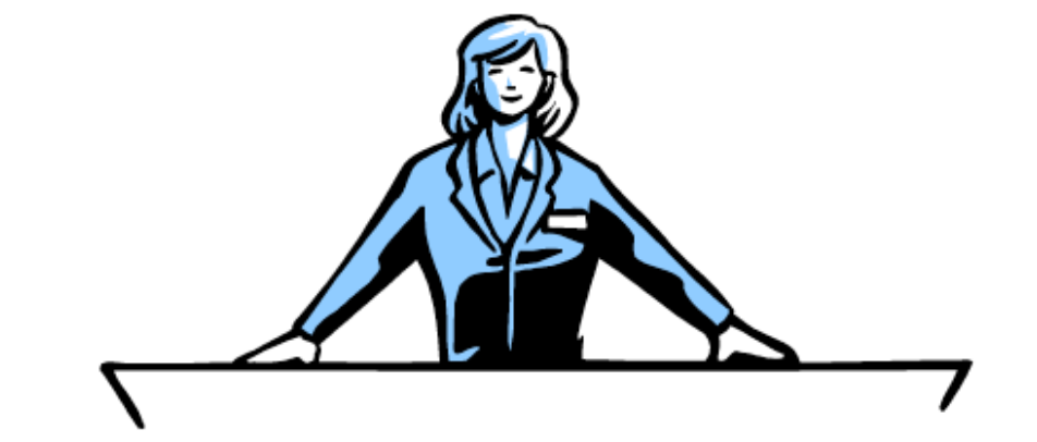
Leveraging white space with an image
PUTTING TEXT ON AN IMAGE
Images are often used as a background for text. The best images to use in presentations are those rich in empty spaces, or with a coherent background area, such as a blue sky, empty wall, or grassy field. Not realizing the importance empty spaces play in presentations, stock images often crop images before uploading them for sale. Notice that while the image composition might seem more interesting, the actual file is less useful for you, as a slideshow designer.
When looking for visuals in stock image sites, always scan for images with lots of white space. Some stock image sites let you specify the part of an image on which you may want to add text, and require it to be left blank. If that is not possible, try extending the background of your image, either in PowerPoint/Keynote, or in Photoshop.
Another useful trick, is to put the text over a semitransparent black box. I used this technique in a number of slideshow examples in this book. Set the transparency level of the box according to the specific image you are using. If it is very busy, the box needs to almost be completely black, and if it is reasonably calm, you’ll only need a bit of black.
PowerPoint and Keynote also provide options for drawing a line around text, adding drop shadows to characters, or giving them a slight glow. While all these effects increase the contrast of the text against the image background, I refrain from applying them because the text appears blurry, and somewhat unprofessional. Typographers refer to this effect as “dirty typography.”
Beyond PowerPoint and Keynote
SPECIAL SOFTWARE
Generally, it’s not necessary to use special image editing software for designing presentations. If you do have the budget, try investing in Adobe Photoshop that offers a whole suite of features you’ll find useful as a presentation designer. I won’t go into much detail here, but you can refer to standard Photoshop documentation for help, or turn to the excellent training videos available on Lynda. Here is a brief description of several Photoshop features you’ll work with as a presentation designer.
- Resizing images according to accurate pixel and resolution measurements. This is a better way to control file size and image quality, than the crude PowerPoint or Keynote functionality.
- Sophisticated image manipulation tools for eliminating or extending the image background. Basic proficiency in the software is required. Look for content-aware fill, and content-aware extend.
- The vanishing point filter in Photoshop makes it possible to put text over a 3D object. You can put words or logos on trucks, billboards or walls.
Another interesting application for the graphic adjustment of pics, is Filter Forge, which allows you to apply extreme effects and distortion to images. The application is not cheap, but is very useful. Here are three examples of potential uses for Filter Forge.
- Make all the images in your presentation look consistent by applying the same filter effect. For example, your images can be rendered a cartoon style, or an oil painting look. Filter Forge filters work much better than the PowerPoint or Keynote ones, and even better than those applied in Photoshop.
- Duplicate objects from the pic numerous times, to create images containing replicated instances of one single form.
- Apply a wear and tear effect to an image, giving it a worn out look.
REALISTIC PHOTO COMPOSITIONS
Geared with all the best available software tools, creating well adjusted photo compositions is a challenge even for the most expert graphic designer. Have a look at the blog Photoshop
Disasters for some design failure examples.
For a good presentation, it all boils down to having two choices. You can either create a 100% perfect photo composition, or do not use one at all. Because even if you are successful with some simple graphic editing tasks, such as adding logos or entering text over 3D surfaces using Photoshop vanishing point filter, or even inserting isolated objects with a cropped background, your picture will tarry even from a slight uneven light gradient or color difference. It will look artificial and your whole presentation will become unprofessional. It is better to completely refrain from adding pictures if they are not well adjusted graphically.
Ideally, your images have a consistent style throughout your presentation
VISUAL CONSISTENCY
Good presentations use imagery that is consistent across all slides. It’s often quite difficult to get consistency completely right, but if you stick to a common theme, you’ll have all your images focused around the same visual language. This can be attained using black and white photos, pictures that reflect a certain historical period, or set of unique handmade drawings. Series type of imagery is often also suggested by stock image sites.
Another approach to making your slides visually coherent, is using visual analogies based around a single theme. Introducing a new visual analogy on each slide will tier your audience, especially if the visual language is not uniform. Select a good solid theme for your presentation, considering the most important visual analogy you’ll need. Then apply that theme to all other slides, addressing each concept visually according to this one theme you selected.
QUICK SUM UP
There are many different sources of images available for you to chose from, each entailing different copyright requirements. The key guidelines for a great presentation is to use real, true-to-life imagery, in high resolution with undistorted aspect ratio. Graphically manipulating images are a good solution, but you must make sure the outcome is professional, or you’re better off without.