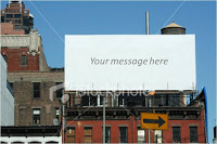
 There are many "empty billboard" images available on stock image sites such as iStockPhoto. Many of them are cheesy, but the more realistic ones could be useful.
I use them often in presentations as a place holder for information about a major product (re-)launch, or maybe a final slide to shout the key message home.
They look best when you use an actual add containing images instead of just text. Make it look more realistic by using grey scales instead of black, make the image semi-transparent and (for the pros) use a blur filter in PhotoShop.
Also, changing to a night setting adds more focus to the image. All the effects below were done in PowerPoint (gradient overlays).
 See an earlier post about pasting text on images here.
SlideMagic: a platform for magical presentations. Free student plan available.
