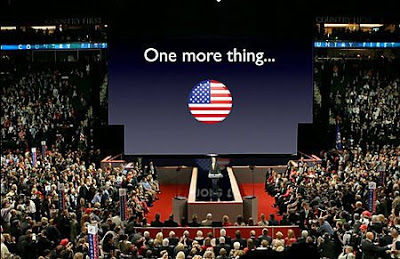
 Lots of linking to Garr Reynolds this week. After a lively discussion in the press, Garr added his review of John McCain's background visuals. An amusing read, the above image is a PhotoShop of what would have happened if Apple had prepared the visuals.
But it highlights a bigger issue: how to use these huge, huge projection screens? We have moved from the overhead project slide, to the PC projector, which in turn have gotten bigger. Now in a big conference, a video of the presentor and a PowerPoint visual are usually projected on a moderately big screen. We started to learn how to best use these screens.
But these size screens? I tend to think that they are actually too large for any image, graphic. Maybe just a few simple words? Anything else will distract the attention from the presentor.
SlideMagic: a platform for magical presentations. Free student plan available.
