Microsoft PowerPoint 2011 for Mac renders colours of shapes and text differently, it has given me many headaches and inspired many blog posts over the years.
So - finally - here is the simplest fix: create a thin outline in the same colour as the text around your characters, done!
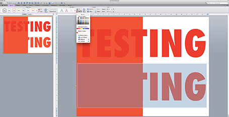
The screen shot below shows how normally text get rendered differently even if you apply the same colour code to it (#!@$#@). Below that, the same text, with the same colour, but now with a tiny outline (same colour) around it. In the small preview window at the right you can see that the text and the shape have the same colour.You can see how I selected the text, and picked the line option from the format ribbon to do it.

Microsoft, please acknowledge this as a bug and not a feature (which you suggested in the past) and fix it in the next Office 2011 patch.
The screen shot below shows how normally text get rendered differently even if you apply the same colour code to it (#!@$#@). Below that, the same text, with the same colour, but now with a tiny outline (same colour) around it. In the small preview window at the right you can see that the text and the shape have the same colour.You can see how I selected the text, and picked the line option from the format ribbon to do it.

Microsoft, please acknowledge this as a bug and not a feature (which you suggested in the past) and fix it in the next Office 2011 patch.
SlideMagic: a platform for magical presentations. Free student plan available.
