Viewing entries tagged
Software

New PPT for Mac now 1 year later

In a recent blog post, Microsoft announced a new version of Outlook (the email client for Mac), but at the same time pushes back the launch of a new Mac version of its Office suite (Excel, Word, and of course PowerPoint) by a year to the second half of 2015:
Historically we have released a new version of Office for Mac approximately six to eight months after Office for Windows. However, following the release of Office 365 we made the conscious decision to prioritize mobile first and cloud first scenarios for an increasing number of people who are getting things done on-the-go more frequently. This meant delivering and continuing to improve Office on a variety phones (iPhone, Windows Phone, and Android) and tablets (iPad and Windows)—brought together by the cloud (OneDrive) to help people stay better organized and get things done with greater efficiency at work, school, home and everywhere between.
Continuing our commitment to our valued Mac customers, we are pleased to disclose the roadmap for the next version of Office for Mac—including Word for Mac, Excel for Mac, PowerPoint for Mac and OneNote for Mac.
In the first half of 2015 we will release a public beta for the next version of Office for Mac, and in the second half of 2015 we will make the final release available. Office 365 commercial and consumer subscribers will get the next version at no additional cost, and we will release a perpetual license of Office for Mac in the same timeframe. 
Microsoft is prioritising mobile over its desktop software. It is true that mobile is the hot area right now. But - call me conservative - I still think that initial content creation and design still will require a desktop machine with a big screen. A quick reply to an email, a Tweet, a quick presentation edit, can all be done on a mobile device. Great design, great stories originate from someone focussing, rather than boarding a train.

The other reason behind the delay might be that Microsoft is simply running out of ideas what to add to PowerPoint. It is probably true, that the software has been pushed to its limits, and that the true innovation lies in what to take out. I am working on it.

SlideMagic: a platform for magical presentations. Free student plan available. LEARN MORE

App update

Many people are asking me for beta invites for my PowerPoint killer presentation design app. Here is where things stand at the moment. A handful people have been testing the app so far which provided feedback on a few glitches to iron out. The core engine (the concept behind the app) works great (big sigh of relief), there are now some things about workflow flow that needs fixing, so that you can move around faster in the app. Rather than widening the user base who will give me the same feedback, I will fix the obvious issues first.

A self-funded side project, patience please...

SlideMagic: a platform for magical presentations. Free student plan available. LEARN MORE

Presentation startups

Searching Product Hunt for keyword “presentation” gives a treasure full of presentation startup ideas.

SlideMagic: a platform for magical presentations. Free student plan available. LEARN MORE

The basics

Here is a checklist of basic PowerPoint design skills. If you master these, you are all set to designing great business presentations:
  • Program your company colours in the theme
  • Set default shapes and lines to fit your company colours
  • Delete all slides in a template master until you have just the title page and an empty page left
  • Know how to add text to boxes
  • Know how to make compositions of text boxes (including aligning and distributing them)
  • Know how to crop images (instead of stretching them)
  • Know how to make basic bar and column charts in your company colours
No need to learn anything more...

SlideMagic: a platform for magical presentations. Free student plan available. LEARN MORE

Apple Keynote is broken

I really try to like the latest version (6, October 2013) of Apple Keynote, but a year later, I still cannot. The user interface in the latest release has been cleaned up (gone is the cramped inspector window), and initially I thought I would overcome the initial confusion where functions are. I did not.

Basic stuff like centring text, changing background colours, fonts, font colours, all require me to think, which submenu to pick: style, text, or arrange? A flowing, fast user interface is not always a logically laid out one. Functions do not always have be grouped together based on whether they are related or not. In software, features should (partially) be grouped based on frequency of use.

Then there is the “Sorry, iCloud Drive isn’t compatible with OS X Mavericks” error message I get everytime I open Keynote. After Googling I now understand that I need to wait for the release of OS X Yosemite and that I upgraded my iCloud too early, still....

Never change a winning team.

SlideMagic: a platform for magical presentations. Free student plan available. LEARN MORE

Print posters

Sometimes I get questions from clients who want to print a physical copy of a slide in a very large format to use in conference boots. That usually does not work. PowerPoint slides have a low resolution to manage file size. Even recreating the slide with a super high resolution version of the image will not work. The solution: recreate the slide in Adobe Illustrator or Photoshop....

SlideMagic: a platform for magical presentations. Free student plan available. LEARN MORE

Converting PDF to PowerPoint

Until now, I did not notice this feature in the latest Adobe Acrobat XI: converting PDF files to PowerPoint. I tried it on a PDF file that had the look and feel of a typical PowerPoint presentation (boxes with big text) and the results were surprisingly good. Here and there, a slide needed a small manual correction (semitransparents, etc.), but hey, it worked. As expected, data charts do not come out in vanilla Excel format.

Now, I guess that if you want to convert a file that does not have a typical PowerPoint look and feel, your results will be less good, but that is not the point, is it?

How would you use it? I think very few would use the tool to be able to present a PDF file in a PowerPoint environment. The CMD-L option in Acrobat gives a beautiful full screen view of your PDF slides. But the tool could be handy to strip out images quickly from a PDF file.

Adobe Acrobat XI is a premium product, the free Adobe Acrobat Reader will not pull off this trick.

SlideMagic: a platform for magical presentations. Free student plan available. LEARN MORE

PowerPoint on iPad

I have now stopped dragging along a laptop to client meetings. The thing is (relatively) heavy, requires a bag, and being the guy with the lap top in a meeting always put you in an inferior social position somehow. The PowerPoint for iPad app has improved a lot. You no longer have to go through the tedious process of downloading a file from Dropbox, remembering your 365 password, uploading the file to the 365 cloud drive, and downloading the file again. Still potential font rendering issues (even with standard fonts that might drop to the next line), still makes me use the combination of PDF files and iBooks. It renders nicely and the iBooks folder/collection solution is good enough to keep things organised. A lighting-to-ancient-VGA-projector convertor enables you to present on a big screen.

SlideMagic: a platform for magical presentations. Free student plan available. LEARN MORE

Readability

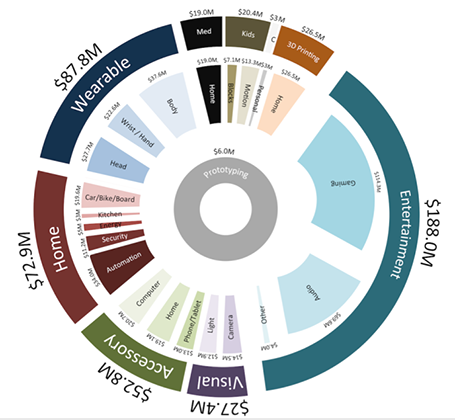
Here is a data chart that was published in TechCrunch, it shows a breakdown of crowdfunding-sourced investments in hardware.


The scattered pie chart looks nice, but is not easy to read:
  • A lot of data and many label are positioned upside down
  • The $ and M signs clutter up space
  • A lot of text is too small
Also, PowerPoint is not very well equipped to make charts like this. You see how the exploded pie points do not line up perfectly, and how the text is not curved right.

To make it readable, I would go for 2 stacked columns, one for the total categories, one for the sub categories. Put horizontal labels to the left of the totals, and to the right of the subcategory column. Use colours to link totals and subcategories together (like it is done in the above pie).

If you wanted to go fro an exploding pie as indicated above, do not explode the pieces in PowerPoint, but rather use extremely fat white lines around the elements of a regular pie to get a more organised diagram.

SlideMagic: a platform for magical presentations. Free student plan available. LEARN MORE

We need video!

Before investing a lot of time and money in designing a video to complement your presentation, take a step back and think why you want it, then brief the designer accordingly. Some uses of video are more useful than others:
  1. A spectacular, wow, stunning, noisy, beat drumming, flying effects filled, splash opening that leaves the audience shuddering in their chairs
  2. Customer testimonials and/or other interviews of people that are hard to bring to the presentation room
  3. An explanation/demonstration to show how your product works, is used in practice
  4. A high-paced, scripted story
  5. A funny, cute cartoon to support your message
  6. A complex animation that is hard to execute in PowerPoint or Keynote
  7. A narrated slide sequence that you can send to people you being present to explain it

SlideMagic: a platform for magical presentations. Free student plan available. LEARN MORE

What software did you use?

That question is a big compliment for your PowerPoint presentation: you have succeeded in making your PowerPoint not look like PowerPoint. Here are some simple steps that can help you:
  • No hierarchical bullet point texts (if you have to put three messages use 3 grey boxes with a short sentence)
  • Switch the standard Microsoft Office font Calibri typeface for Arial (other exotic fonts will cause issues on tablets)
  • Avoid the standard Office colours (blue, faded red, faded olive) and use your own colour palette, also in data charts
  • No dirty gradients, drop shadows
  • No heavy graphics and/or colours behind the title or at the bottom of your slides
  • Create many slides with page-filling images
  • Remove the default clutter of data charts (tick marks, etc.)
The same applies to Apple Keynote. Although a standard Keynote slides looks a bit better than a standard PowerPoint slide, Keynote also has ugly defaults (colours, texture fillings of data charts). 

SlideMagic: a platform for magical presentations. Free student plan available. LEARN MORE

The new slides.com

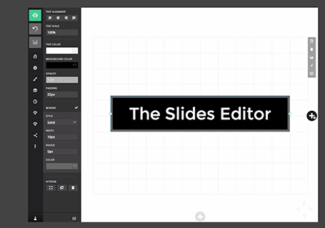
Slides has updated its slide editor. It is another example of people moving away from 1990s drop down user interfaces. The UI is simple and looks great. It has very powerful capabilities to insert HTML code in it. Still - as with all presentation design software - the average user is likely to use it to create bullet point slides... Check out the demo here

SlideMagic: a platform for magical presentations. Free student plan available. LEARN MORE

PPT Roomba

SlideProof is a neat PowerPoint plug in that cleans your presentation of common small mistakes - automatically. Misaligned boxes, titles, wrong page numbers, you name it.  A bit like the Roomba vacuum clean robot, a spell checker on steroids. You have complete control over the changes though, so nothing unexpected will happen to your slides, which is crucial since my guess is that most of the vacuum cleaning of presentations will happen just before the live presentation.


Fixing small mistakes might not be crucial to get your message across, but it does make a huge difference in the overall impression you leave behind. A bit like polishing your shoes.

SlideProof only runs Windows so I did not have a chance to test drive it myself (I work on the Mac platform). Please share your experiences in the comments if you managed to check it out.

SlideMagic: a platform for magical presentations. Free student plan available. LEARN MORE

Automated journalism

The Associated Press will start using a bot to generate verbatim on company earnings reports. The system takes as input the financial data, and then recycles that into human stories: earnings went up 3%, which is 0.5% higher than the financial services average and leads to an expected gross margin of 46% in Q3.

I never understood the point of journalists spelling out information in sentences that is much better communicated in graphs. Proof is that this translation is easily automated. The only use I can see is in translating data to audio for people who cannot take their eyes of the traffic and still want to digest data.

Instead of using the bot, AP should invest in better data visualisation.

SlideMagic: a platform for magical presentations. Free student plan available. LEARN MORE

The future of office software

The announcement that online file storage and sharing platform Box is adding a note taking app is another indication how the world of office software is changing (and that includes presentation design).
  • Work and communication styles are becoming more informal. Overloaded with information, we want to get to the point, quickly, with buzzwords or formal verbal padding.
  • Documents need to be readable (and editable) on mobile devices. Even more important, people need to find a document quickly on every mobile device that happens to be closest in reach.
  • People work on documents asynchronously, in different locations, and in different time zones, without the need for a time consuming meeting to discuss small changes.
  • More and more senior executives will make direct edits into documents, cutting out the traditional feedback editing loops involving secretaries, junior analysts,  (who used to be the in-depth experts in Office software), and print-outs/faxes.
  • Ad-hoc presentations in small groups with random/frequent interruptions grow at the expense of orchestrated, big, planned presentations where we let the speaker finish before asking a polite question.
Software needs to follow culture.

SlideMagic: a platform for magical presentations. Free student plan available. LEARN MORE

One pen

Problem solving in a team can be really powerful. You split up the work to save time by working in parallel. You can discuss data, findings, and ideas with your team tapping into a collective brain that is bigger than yours.

I find that designing presentations though is best done by one person who has the pen. One style, one approach, one story flow, everything gets said once, everything that should be said gets included. Multiple captains on a ship create an inconsistent story.

That is also the reason that I am not a big believer in realtime office document collaboration, a feature that many software publishers try to implement. The fact that the Internet makes it possible does not mean that it is a good thing.

Team input is important, but only one person should have the pen to incorporate them into the story.

SlideMagic: a platform for magical presentations. Free student plan available. LEARN MORE

App update

Regular readers will know that I am busy developing a “PowerPoint killer” web app in my spare time (and financed with my personal savings). Many of you have signed up to be part of an early testing group. Here is where I am at, at the moment.

The key innovation of the app will be the approach to designing slides, and that engine is now more or less up and running. I am very pleased with the result, it runs exactly as I have imagined it in my head and jotted it down in PowerPoint (my web design environment, believe it or not).

My clients do not know it, but I am slowly changing my approach to (PowerPoint) slide design in such as way that it will fit the design approach of the new app, and I am testing to see where the philosophy breaks down.

The slide design engine, cannot be tested on its down, hence development work is now focussing on getting the more trivial parts of the application working (presenting on a screen, managing files, etc.).

When this is finished, I will release the app to a very very limited testing crowd that will not be intimidated by unexpected bugs. The objective is to test whether the methodology appeals to more people than just myself. After the green light and a more robust design, I will open the app to more people.

Please be patient as I am trying to juggle time and financing carefully. Watch this space.

SlideMagic: a platform for magical presentations. Free student plan available. LEARN MORE

"We need to animate that!"

The audience does not see the difference between 4 consecutive slides with different images, or 1 slides with 4 consecutive image build up, so there is no point in trying to cut slides by consolidating 4 images into one. Four slides are easier to edit, and four separate slides are easier to email as PDF.

SlideMagic: a platform for magical presentations. Free student plan available. LEARN MORE

Keynote with Dropbox/Box/Gmail

The new Keynote creates files that look like a single file on a Mac, but on other machine appear as a folder with multiple files in them. This has implications for online file sharing:
  • Gmail: emailing a Keynote file as attachment does not work
  • Box: file syncing, or sharing a download link does not work
  • Dropbox: seems to have fixed the issue.
Has anyone had issues or is it just me?

SlideMagic: a platform for magical presentations. Free student plan available. LEARN MORE

Screenshots are great

Aspect ratios, dots per inch, file formats and conversions, forgetting where you saved that file, these are all problems that are disrupting my creative workflow. More and more I just work with screen shots. If the image looks sharp on my big 27" monitor, I crop it as I want it, and use it in my presentation. It could have been a JPG, a PNG, a web page, a PDF document, a Keynote file, it does not matter. CMD-SHIFT-4- and “click”, done.

SlideMagic: a platform for magical presentations. Free student plan available. LEARN MORE