They are all different activities, they all require different slides:
- Presenting and watching: The creator stands on stage with some visual support, the audience watches the performance. You have 3 types of slides:
- Slides that set the mood (a big picture/word/sentence)
- Slides that show a fact/trend
- Slides that show how things are related
- Writing and reading. The creator writes text (facts and ideas held together by a story line), and the reader reads them, without assistance. Slides: text pages or bullet points.
- Telling and listening. No slides, the creator imagines, translates to audio, the audience listens and reconstructs.
You see where it goes wrong. People use slides meant for reading to an audience that is watching.
The more I think about it, any slide that just lists stuff in a sequential order without any other relationship, should just be eliminated out of a presentation that is meant for watching and replaced by multiple "mood slide", "fact/trend", or "relationship" slides.
Fact and relationship slides could actually get complicated and busy in some cases. Bullet point slides of unrelated items can be incredibly clean and minimalist. The first are OK, the latter not.
I need to develop this quick thought a bit further in future blog posts.
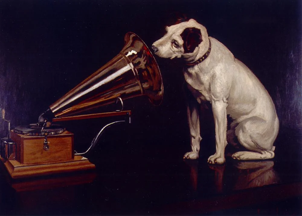
Art: In England, artist Francis Barraud (1856-1924) painted his brother's dog Nipper listening to the horn of an early phonograph during the winter of 1898. Victor Talking Machine Company began using the symbol in 1900, and Nipper joined the RCA family in 1929.

