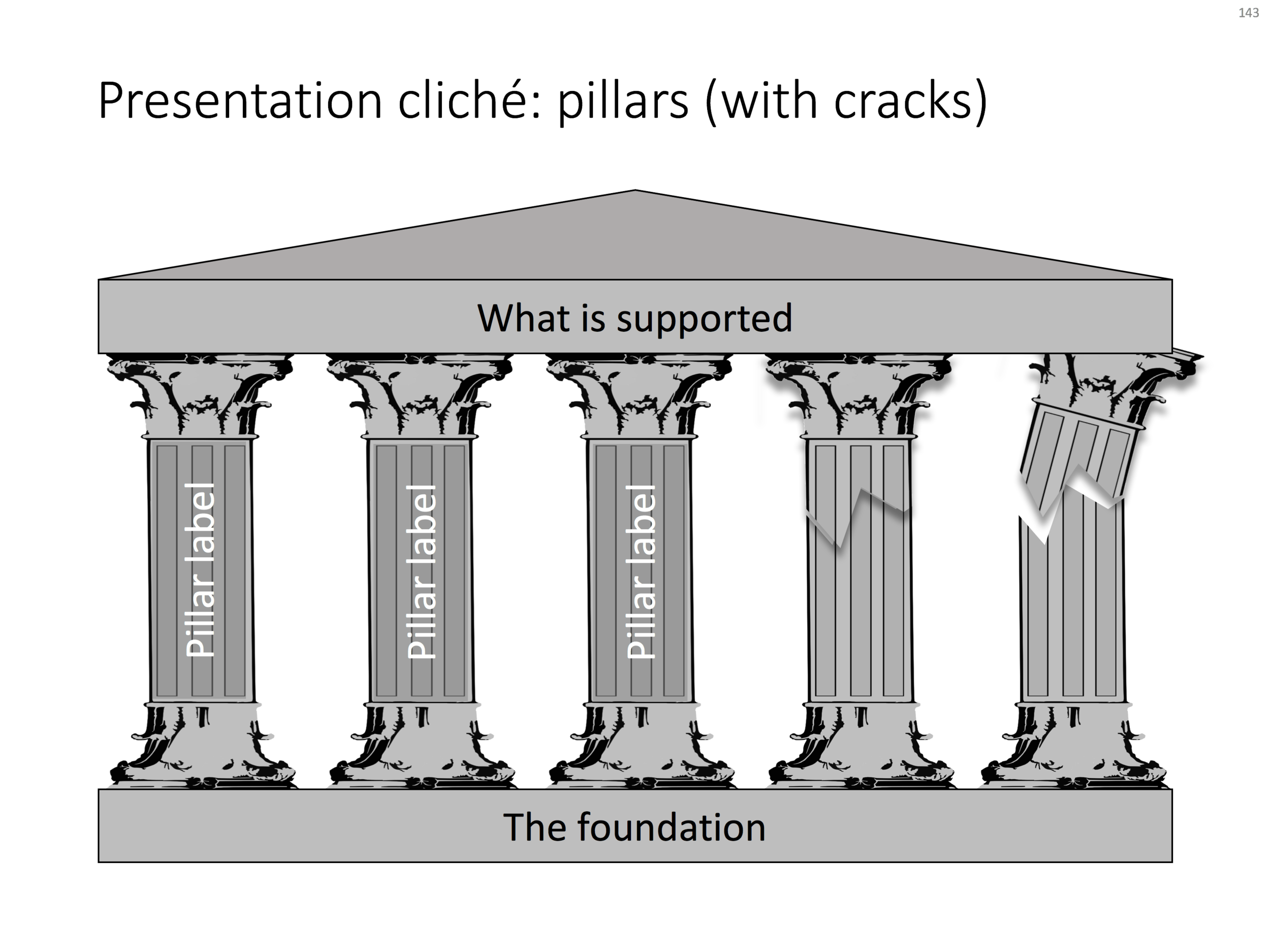
Some presentation slide layouts have been used so many times that they have become a cliche. You know it, when you see one. In very high profile presentations, it is a good idea to take them out and replace them with a different design, to prevent the audience from thinking "Oops, it's going to be one of those decks again".
I am pragmatic though, and I you need to stitch together a quick deck for tomorrow's strategy meeting, and yes, you have a case that your strategy depends on 5 pillars, I will forgive you for digging up that temple slide from the archives.
For your convenience, I have created a downloadable pillar/temple slide in the template store. This version can also come in handy when you need to address not totally stable strategies. In case you are curious, I have labeled some other slides as "cliche" in the template store, you can a run a search for the keyword "cliche" and see what comes up. Do you agree?


