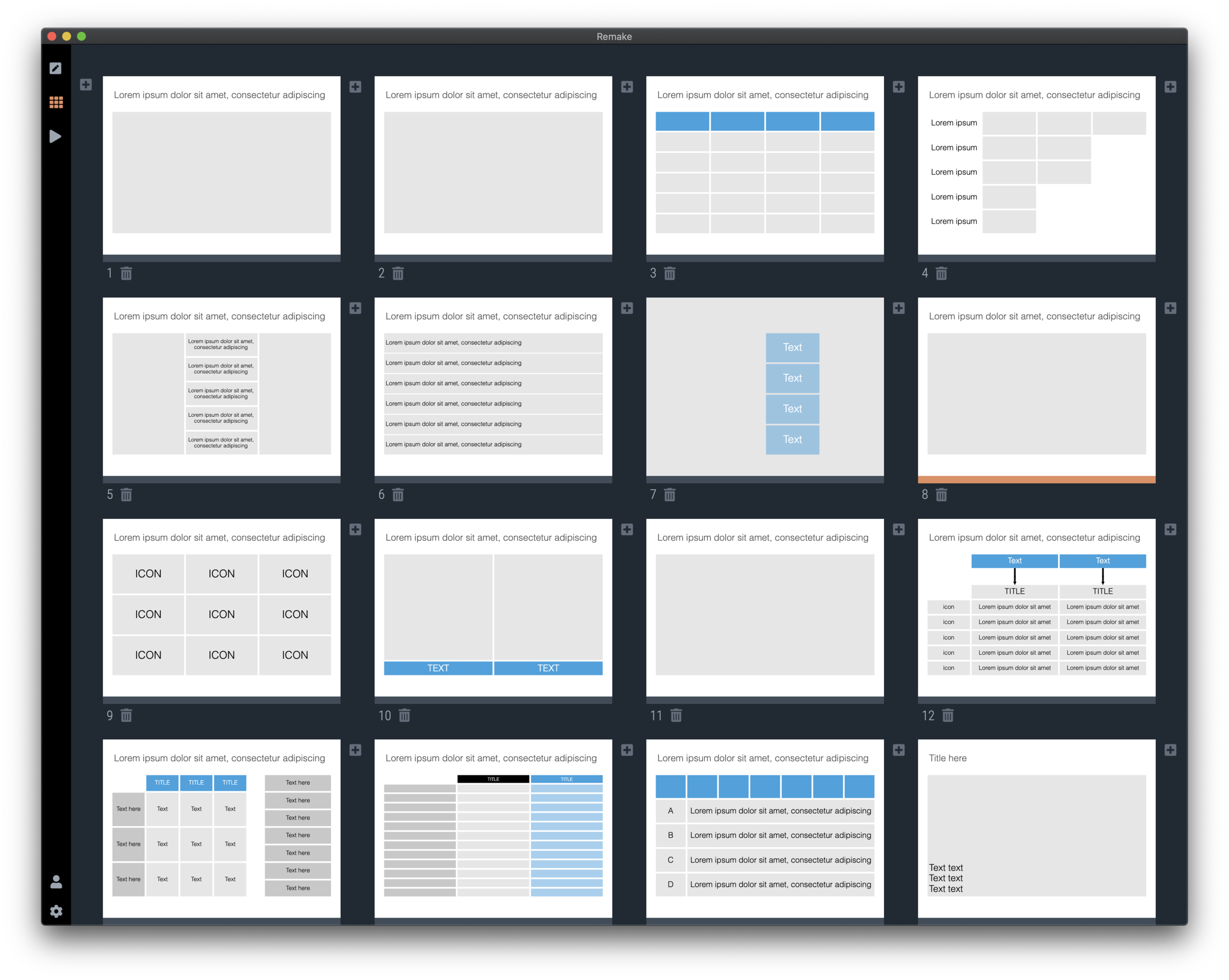
I took a recent draft presentation that came across my desk (in PowerPoint) and took out all the specific / confidential information and images, replacing them with dummy text and boxes.
This was by no means a final deck, but it highlights something that most people get wrong when creating a slide deck: tidying up your layout.
Some slides have a white frame, others having images bleeding off the page. Icons are different sizes. Things are not properly aligned. Get all these things right, and your deck will instantly look good, even without fancy fonts, graphics, colours.
This is easier said than done. In PowerPoint, you have the freedom to place anything, anywhere you want. You realise in the last minute that that particular text needs to go in, well it will always fit.
SlideMagic will not let you get away with this. Grids are strictly reinforced. Many users complain about that lack of freedom. I need that 5th box, and now the whole slide layout cannot handle it. And this, exactly, precisely, the process a professional designer has to go through. Unlike you, she does it instinctively and switches the slide layout. With SlideMagic, you will be reminded (kindly) as well.
Here is a quick layout of what a deck like this in SlideMagic should look like. This is not “super design”, SlideMagic helps you make a decent looking deck in the minimum amount possible. “Super design” requires a lot of investment (time and money), which gets you a great looking deck, but one that is sort of set in stone, it is very hard hard to make changes to it. Great for your IPO road show, less so for an every day presentation.
SlideMagic converts instantly to PowerPoint, here is the same deck ready to share with colleagues who are not using SlideMagic yet.
You can download the latest version of SlideMagic here and check it out yourself. (Notice the little SlideMagic logo that is sitting in my PowerPoint toolbar, it is the beta version of the SlideMagic PowerPoint plug in)


