

This tweet flew by about Warren Buffett’s slides during his annual investor meeting.
VCs: “please make sure you get someone to design your slides or nobody will take you seriously.”
— Yuri Sagalov (@yuris) May 2, 2020
Warren Buffet: pic.twitter.com/viu7wG17GK
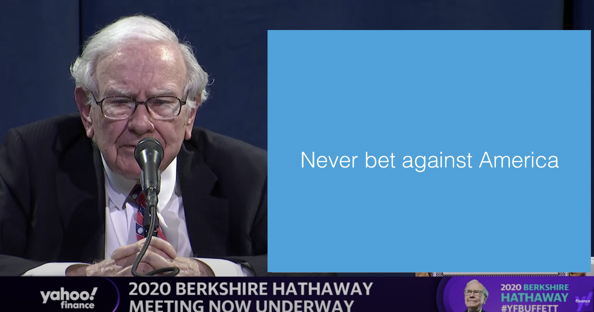
A sans serif font and centering the text would have made it look better, but overall, this slide is actually not that bad. One big message without distractions. (If Warren had used SlideMagic with this template, his slide would have looked like this)
Other slides are less crisp though, as seen in the example below:
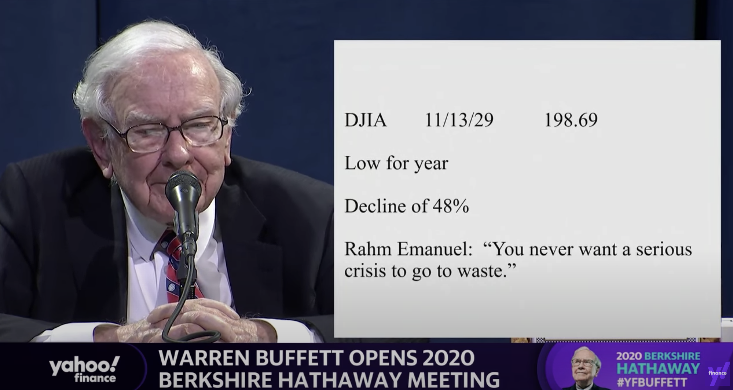
But, Warren does not read out the bullet points, he tells a story starting with background about his father. People will read the slide for 2 seconds, wonder about the quote, and then focus all attention back on him.
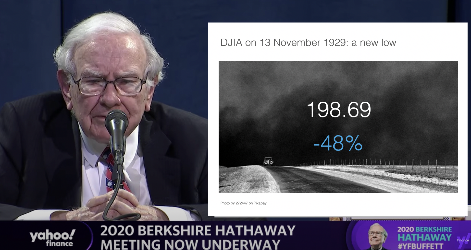
OK, I could not resist, SlideMagic would have produced the following slide (a quick search for “1930” in the built-in Pixabay image search delivers good results)
I would put the quote on a completely separate slide, if at all.
Coming back to the first tweet. If you are Warren Buffett, then you get away with pretty much any slide design. On the contrary, making it all too fancy is a direct contradiction to his modest life style. If you are not Warren Buffett, putting in 2 seconds worth of effort with SlideMagic will definitely make a difference.
I tagged these 2 slide examples with “buffet” in SlideMagic, you can use them in your own designs and find them in the presentation app, or download them here.