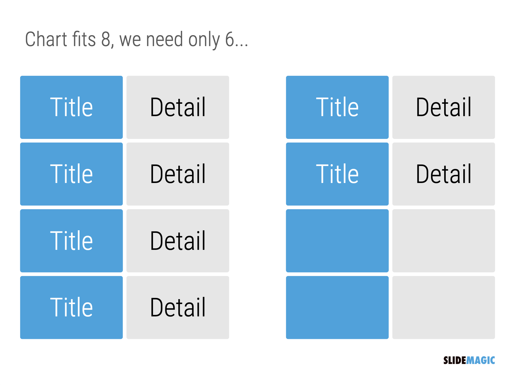
One of the biggest issues in business presentation design is adjusting frameworks to the amount of boxes you need. You had this great slide that fats 8 things, but thing number 5 and number 6 is no longer relevant, so now you need to rehash the whole slide layout…
I think this “bug” in the design process might be one of the biggest reasons for the popularity of bullet point lists: it is super easy to add and subtract things on your slide. And this is also the reason why pre-fab PowerPoint templates are so hard to use. The designer made that super pretty 8-box slide with sophisticated shapes, and 5 minutes before your meeting, you need to get rid of one without destroying the design of the slide…
In SlideMagic things are super easy. Option one: it is easy to adjust the grid layout to match your new box count. Or even better: a new box count might merit an entirely new slide layout. In the latter case, you will have to copy-paste your boxes, but at least SlideMagic takes care of the fiddly task fo lining things up.
Here is a pro tip: box counting is the first thing I do when staring a new slide. How many items, how do they spread across horizontal and vertical dimensions? Can we consolidate points? Should we break them up across multiple slides? Once you have your count, it is easy to find a matching design.


