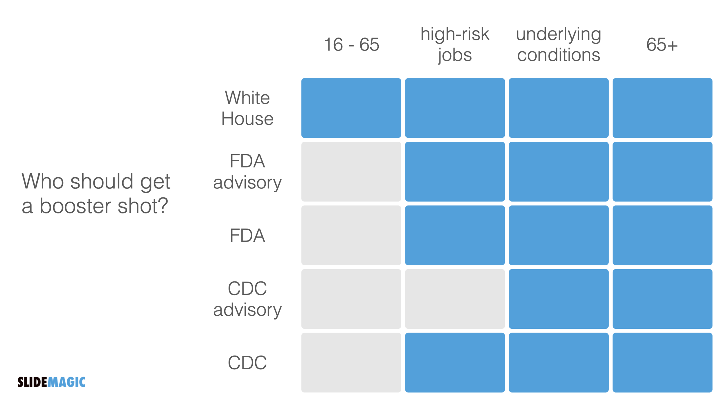
A boxy table caught my eye on Twitter:
Charting the US booster plan, a.k.a. how to model inconsistencyhttps://t.co/ddKg57PZJw by @nikasgari @FT https://t.co/PHqplyS9xv pic.twitter.com/f5rspWckUT
— Eric Topol (@EricTopol) September 30, 2021
The biggest flaw in this table is the White House line, that suggests a separate group of people. Then, you can shift the columns around a bit, until you get this result:
SlideMagic: a platform for magical presentations. Free student plan available.


