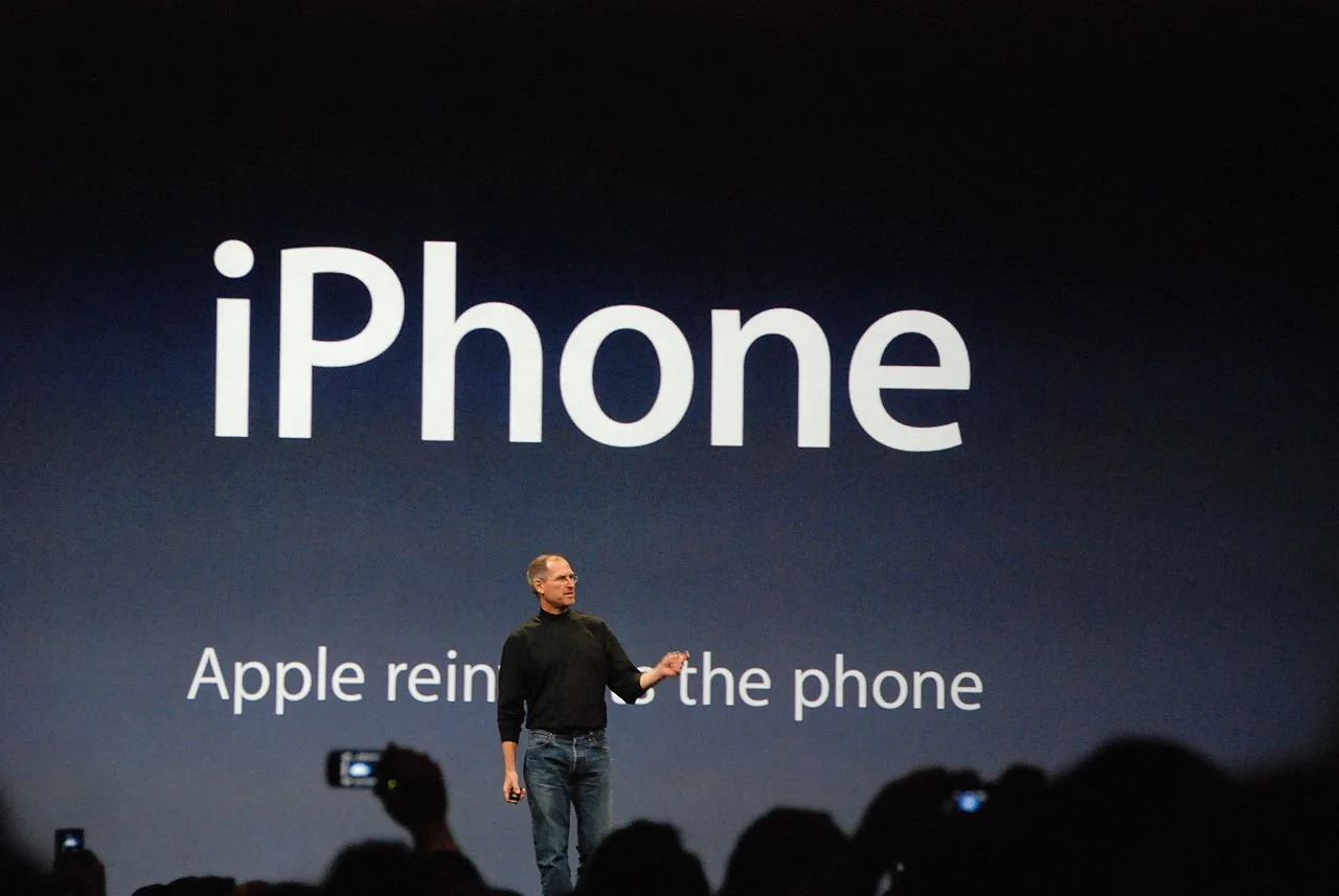
Most presentation experts (me included) describe the ideal slide layout as something similar to what Steve Jobs used to use in his big product announcements. Super minimal.
This type of slide works in auditorium or conference room settings. People sit relatively far from the screen, and the slide is competing for attention with the physical speaker (gestures, eye contact). Glance at chart, understand it in 5 seconds, focus back on speaker. The speaker and the slide are probably about the same size for someone sitting in the back of a conference room.
In a video call , the setting is a bit different. The slide is “in your face” on the screen, and the presenter is usually a small “talking head” in the corner of the screen (if present at all). Maybe the slide can carry a bit more information than the words “1.5 billion installs”.
I am not arguing to bring back the dense bullet points. The audience can read them faster than you can present both in a live setting and in a video call. But a Zoom call does open the way for slides that carry more information. Breakdowns of financial data, matrices with competitors plot in them, pros and cons tables.
Consider building them up in multiple slides to slowly add detail to support your story.

