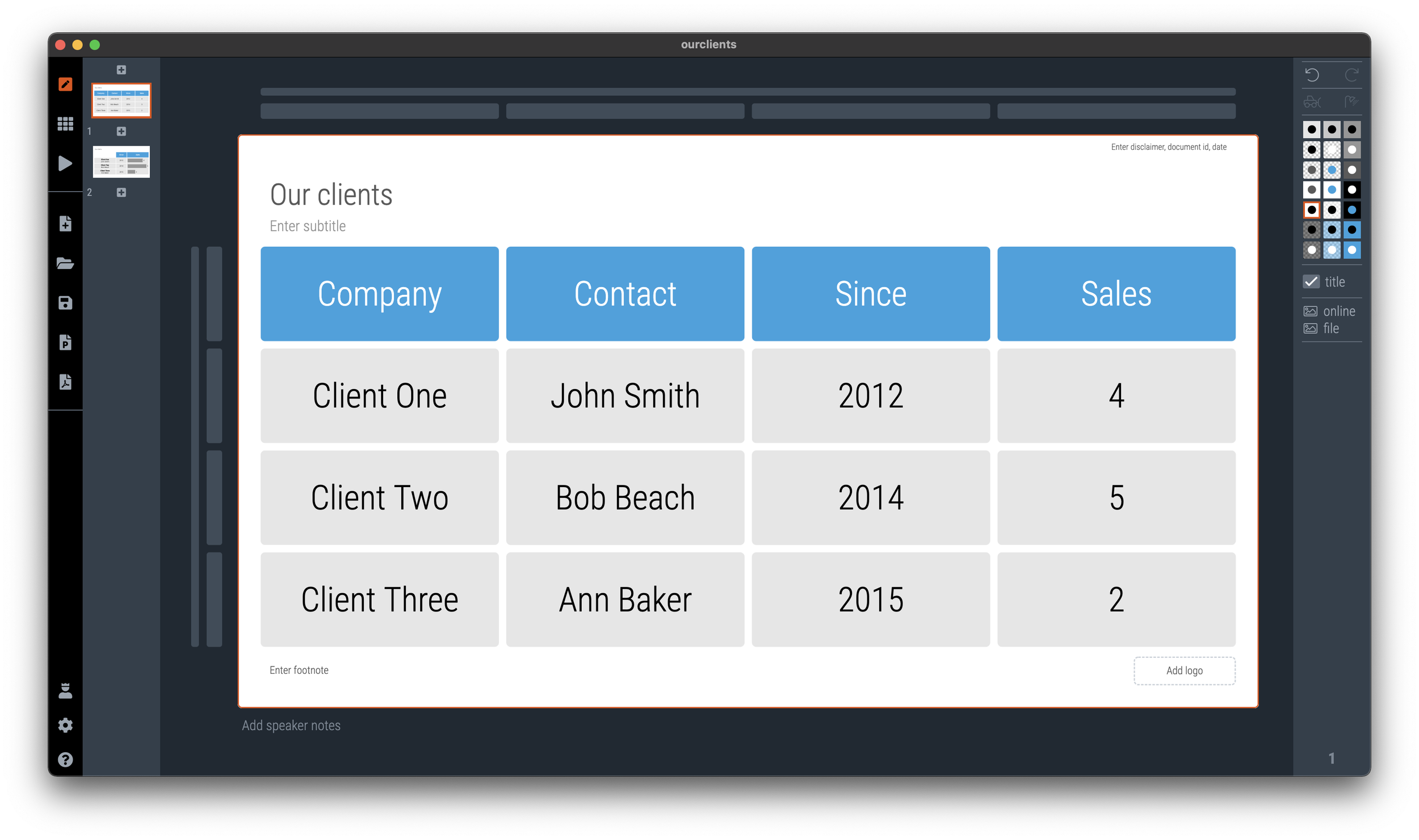
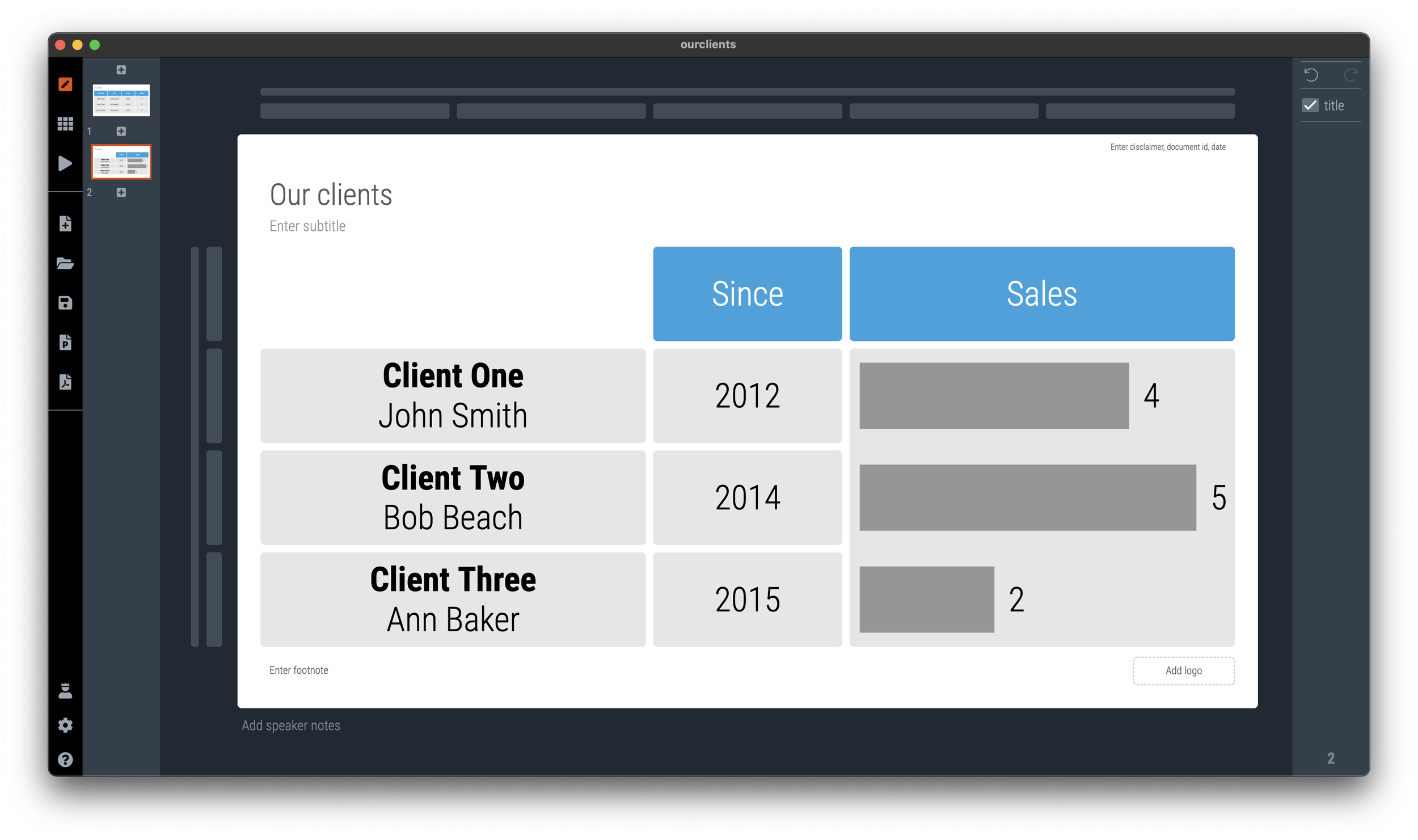
In spreadsheets or databases, things should be clearly labeled. Every column has a heading that describes what’s in it. When it comes to slide design, you can allow yourself a bit more freedom. Look at the 2 slides below
In the second slide, I omitted detailed descriptions of data that is probably clear to the audience, and grouped things together in one box. Easier on the eye.
SlideMagic: a platform for magical presentations. Free student plan available.


