Viewing entries tagged
Creativity

Your own style

Your own style

After years of design work, many of my presentations start to develop a similar signature style or look-and-feel. (Secret: it looks remarkably close to the templates in SlideMagic). I think there is nothing wrong with that: you can easily recognise the work of famous poster designers, painters, architects. Presentation designers should be no exception.

I would encourage you to find your own signature style. Once you have figured out a distinctive way to make any chart look good, you are free to focus on its content. No need to worry about fonts, image crops, data chart layouts, and all the time to worry about composition, content, what image to put and what data to visualise.

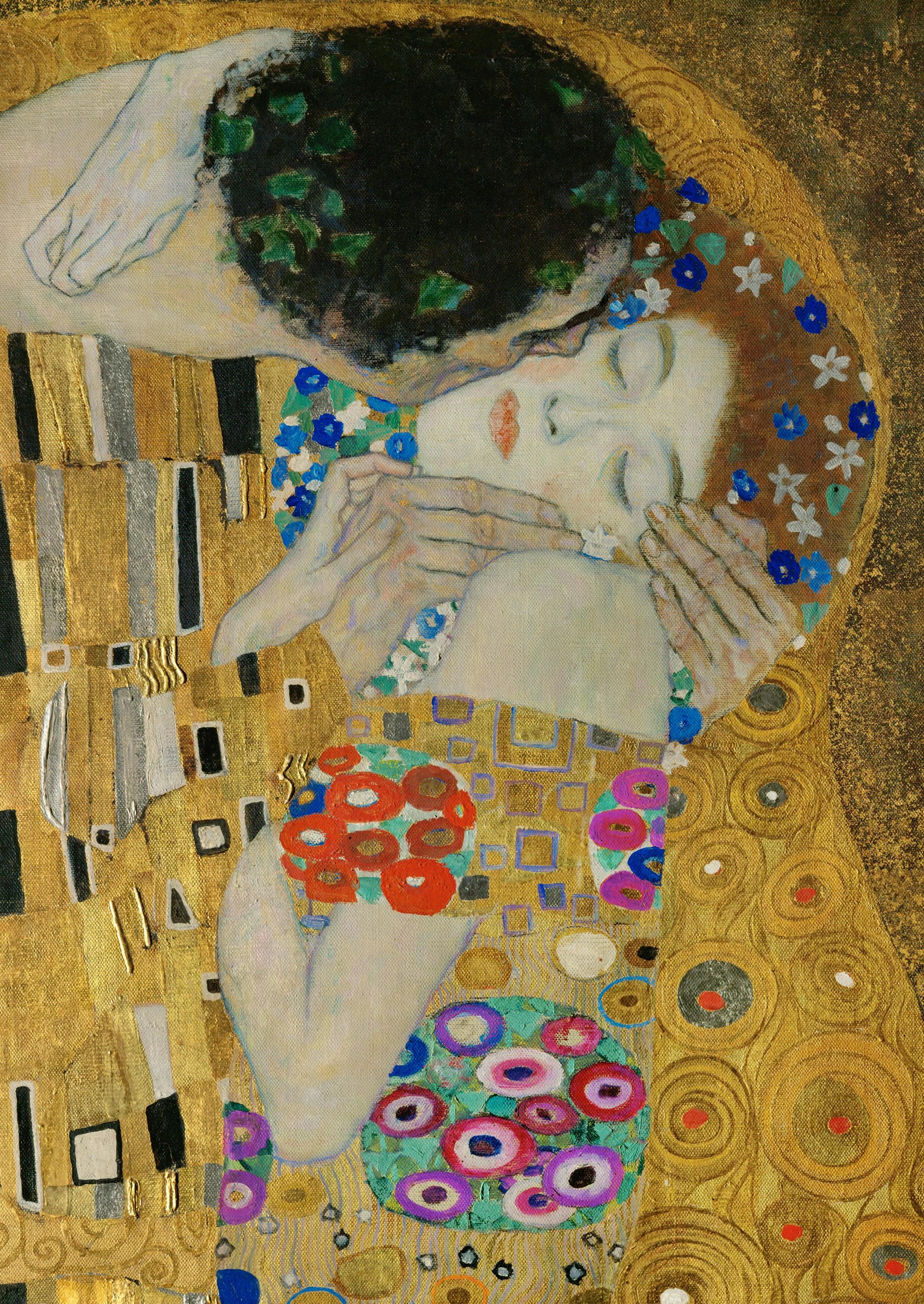
Art: detail of Gustav Klimt, The Kiss, 1908

Click here to subscribe to the blog

SlideMagic: a platform for magical presentations. Free student plan available. LEARN MORE

How to evaluate a designer

The web is full of freelance presentation designers and full of sample portfolios. How to get a true feel for the style/skills of a designer: go beyond pages 1, 2, or 3, and look at a page somewhere in the middle of the deck. What does the designer do when no one is looking?

SlideMagic: a platform for magical presentations. Free student plan available. LEARN MORE

3 types of people

There are 3 types of people:
  1. People who can spot that a chart is beautiful or ugly, and can design a beautiful chart in a snap
  2. People who can spot that a chart is beautiful or ugly, but cannot figure out what it is that makes it that way
  3. People who have no sense of design
Most of us are in category 2. How to get to number 1? Save screen shots of designs you liked somewhere on your hard drive. Try to mimic techniques the designer used, and see what effect it has on your own chart.

[Commercial break: I am targeting my upcoming presentation design app at segment number 2]

SlideMagic: a platform for magical presentations. Free student plan available. LEARN MORE

Levels of understanding

As a presentation designer, you need to understand the substance of your slides better than what is reflected in your final work. Here are the levels of understanding:
  • Level 5: the expert, your boss, your client
  • Level 4: the level you need to get to as a designer
  • Level 3: what is reflected in your slides
  • Level 2: the audience right at the end of the presentation
  • Level 1: what the audience remembers in 3 weeks
  • Level 0: where the audience and you start out on
The key lesson for the presentation designers: you need to shoot beyond level 3, if you cannot stand above your substance, you cannot make the right design trade-offs. So ignore the strange looks you get when asking probing questions during the briefing.

SlideMagic: a platform for magical presentations. Free student plan available. LEARN MORE

First complicate than simplify

In many presentation design projects, I start by building some sort of overview slide that is highly dense, complex, but has the whole story/solution on it. This enables me to shuffle things around, split things up, merge things, until I feel confident that I can move the other way: simplify. The designer has to go to the bottom of complexity in order to save the audience from having to do the same thing.

SlideMagic: a platform for magical presentations. Free student plan available. LEARN MORE

The big idea slide

I usually start a presentation design project by digesting all the available information, listen to a verbal version of the pitch, Google for market and competitor information, create a slide template based on a straightforward slide (the profit and loss account for example), and let the whole thing cook in my mind for a while.

I know when I leave the “cooking” phase when I am able to draw up the key idea of the presentation in one slide. That one takes a long time to design, but when it is done, all other slides follow really quickly.

SlideMagic: a platform for magical presentations. Free student plan available. LEARN MORE

Always beautiful

I try to keep ugliness completely out of my design work. Ugliness tends to spread like a virus that wants to take over your work.

Even if you make a quick mockup or even a paper sketch of a slide, it should look orderly, balanced, clean. This is what I learned on my first day at McKinsey, when a client walks in you should be able to talk her through the hand-written deck.

SlideMagic: a platform for magical presentations. Free student plan available. LEARN MORE

Scribling

I keep on looking for a good electronic solution for note taking, doodling, and scribbling. None of them are perfect. A new option has been added recently.

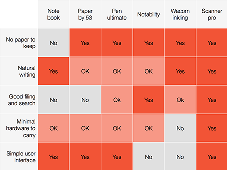
A good note taking solution needs to combine a number of things:
  1. No paper to keep
  2. Natural writing interface
  3. Good filing and search
  4. Minimal hardware to carry
  5. A simple user interface
See my highly sophisticated analysis below.


The new option is a smartphone-based scanner. Scanner Pro is a brilliant app. It takes photos, and lets you easily crop the image. You can keep the image as a photograph or flatten it to bold, fax black and white. Then upload the scan to Dropbox or Google Drive where you can store and search things.

So the best note taking might be scribbling on a piece of paper, scanning it, and throwing away the paper.

PS: earlier review of the Inkling, Penultimate, Paper and styli (?) for iPad.

SlideMagic: a platform for magical presentations. Free student plan available. LEARN MORE

From memory

I realised that I hardly look back at my notes from a briefing meeting when designing a presentation. The big story is designed from memory, only for facts I need to revert to my scribbles.

I guess that your brain gets used to recording stories when you design presentations for a living. When I listen to someone (more important than seeing an existing presentation) I record the information by creating a story flow in my head that is more memorable than scribbles on paper.

SlideMagic: a platform for magical presentations. Free student plan available. LEARN MORE

Learn to see

A child find it hard to draw realistic 3D perspectives, because her brain is still developing 3D perception. She draws a house with a front, and a side wall without that wall disappearing towards the horizon. She is not drawing what she sees, she is drawing what she thinks the house looks like. When the drawing is finished, she notices that someone is not right, but she finds it impossible to lay her hand on it what it exactly is.

The same is true for grown ups and graphics design. You see a beautifully designed page, you want to make something similar in PowerPoint and somehow, it does not come out. Why? Because you stuck to your own mental model of a PowerPoint slide (and what you think it should look like) and did not really see how the designer deployed white space, used of grey scales in text rather than blunt black, and set the space between title lines slightly tighter, and was careful not to overdo it with the colours.

Here is an exercise. Take a poster or design that you really like and literally recreate it in PowerPoint (or Keynote) until it looks exactly the same. Now apply that template to your presentation.

SlideMagic: a platform for magical presentations. Free student plan available. LEARN MORE

Shutting down your brain

This post by Nancy Duarte about how taking long walks inspires her, resonated with me. She describes the experience of shutting down your brain to help you focus and be more creative. Almost all pleasures in life are someway or another about cutting out noise, worries, and random thoughts out of our mind.

Ancient oriental wisdom encourages us to focus deeper on the natural experiences of enjoying what we eat, making love, meditation. Artists try to create a disconnected world through a good story or beautiful craft. More brutal, unhealthy, and/or illegal ways to reach that stage of disconnection are alcohol and other banned substances. Mass media tries to achieve that same escapism through retail therapy, (loud) music, or bone-shaking visual effects in movies. Endurance sports fanatics can even get hooked to to beta endorphins that are released as the result of heavy exercise.


Nancy choses hiking, I use mountain biking as a way to shut down the brain. It is the perfect combination of being outdoors, doing a physical workout, but also requiring your brain to focus heavily on obstacles on the trail ahead of you and being aware of the balance and flow of your body at all times. There is literally no time to think of anything else.

SlideMagic: a platform for magical presentations. Free student plan available. LEARN MORE

Remote-controlled slide editor

When you are designing a presentation for either your boss or a client, there is always the temptation towards the end of the project just to do the required changes and stop thinking creatively with the finish line in sight. Slowly, your original radical design idea can be diluted into a more ordinary and less powerful presentation. Resist the temptation of becoming a remote-controlled slide editor and protect your work of art.

SlideMagic: a platform for magical presentations. Free student plan available. LEARN MORE

High-Low-High

This describes my usual creative process. You start off with digesting a story at a high level, and things seem clear - although most of the times presented wrong. Then you dig in, start asking questions, go all the way to the very bottom of detail, and things are confusing, ambiguous and not clear. After this stage it is time to rise up again to come to a new high level story. And that high level story is most of the times a completely different one from the first version that we started off with.

A parallel can be drawn to financial analysis: you start with a napkin, build a very detailed spreadsheet, and end with an extremely simplified chart (that looks different from the napkin you started off with).

SlideMagic: a platform for magical presentations. Free student plan available. LEARN MORE

I did not do anything today...

I sometimes have these days where I sit at my desk thinking, sketching, being distracted, and some more pondering. It feels like nothing happened that day, until I sit down the next morning after a good night sleep I crank out the entire slide deck in under 2 hours...

SlideMagic: a platform for magical presentations. Free student plan available. LEARN MORE

The importance of starting

You have that big presentation coming up in a few weeks from now and you are a bit scared. It is easy to put off working on it, forgetting it, until a few days before the event. Wrong strategy.

Start the design process early on even if the brilliant ideas do not flow, then put it away for a while. Your subconscious mind will continue to grind on the presentation and you will be surprised what you can come up with later. If you start this process 48 hours before the event, this creative energy will never be released.

SlideMagic: a platform for magical presentations. Free student plan available. LEARN MORE

Being sick and designing

Back in my days as a management consultant, I would surrender to an illness only when I had a really big fever and stay in bed. Now, as a designer it is different.

My work no longer involves in running around, chasing things, sitting through meetings. And even the slightest disruption of your health has a direct impact on your design work and creativity. I often sense the onset of a cold before the first real symptoms such as a soar throat: not being able to focus, a simple chart that I simply cannot get right.

Well in these cases, there is always the end of the month accounting to do...

SlideMagic: a platform for magical presentations. Free student plan available. LEARN MORE

Pro tip: guitar in your office

I tend to work in focus bursts of 30 to 45 minutes (sorry, yes that is why I put my cell phone in a different room when you tried to call) after which my mental energy drops and my brain is looking for distraction.

I recently found the antidode to pointless facebook and Twitter browsing: put an accoustic guitar in your office, play for a few minutes, and dive back into your work. I do not miss reading about those 5 mistakes every designer makes...

SlideMagic: a platform for magical presentations. Free student plan available. LEARN MORE

2 great creative movies

Here are 2 movies I recently watched that talk about the revolution in the creative industry and how individuals can now deliver the work that a few years ago only could be done by big firms. This is also true for my own firm, where I often work alongside big PR or Investor Relations consultancies.

Indie Game: The Movie is about independent game developers realising their dream and incorporating some very personal stories in their work


PressPausePlay is a more general film covering a lot of creative disciplines

SlideMagic: a platform for magical presentations. Free student plan available. LEARN MORE

The hard bit

There are 3 levels in presentation design understanding:
  1. Spotting that a presentation looks really good (99% of people can do this)
  2. Spotting that a presentation actually does not look good (this is still relatively easy, although a surprising number of people, including some who call themselves designers, are unable to do this)
  3. Creating something that looks good, this is the really hard bit
A bit of modesty here: I too find myself stuck in level 2 often with my own work, pulling my hair out why it just does not come out right. In the end it is usually good, but it takes effort.

SlideMagic: a platform for magical presentations. Free student plan available. LEARN MORE

Paperless creativity - iPad calculators

I am continuing my experiment to create a completely paperless creative workflow to increase my mobility. Until now, I had to settle in my creative corner, have my pencils around, have my paper around, before I could get in the mood to do serious design work. I reviewed note taking apps here, now it is the turn of calculators.

Whenever I design a presentation, I almost always have a calculator open on my desk. I design all my data charts by hand, the old fashioned way, doing the final step completely analogue to make sure that resulting slide is really the very best to convey the specific message I want to get across. The calculator is used to calculate the % breakdowns, and to do the final check whether the whole thing adds up. Small calculation errors can distract the audience and undermine the credibility of your analytical work. (I she cannot get the numbers in the chart to add up, what about the underlying spreadsheets?)

So, over the past decades I have used the famous HP 12C as my sole calculator. First in hardware form, then as an app on my iPhone. Since spreadsheets arrived in the early 1990s, I have no need anymore for sophisticated NPV calculations on a calculator. I was simply used to the user interface of the machine, to such an extend that I replaced it for about EUR 100 with a new one a few years ago.

The iPhone HP 12C works, but is not perfectly convenient. I always fiddle with the landscape-only orientation, and the buttons are a bit too small to be convenient. So the iPad solves at the least the button size issue. Like note taking apps, there are an infinite amount of calculator apps available for the iPad (including the build in one).

I found only one that has an absolutely essential feature for the paperless creative workflow: a small electronic piece of paper to scribble notes. Hence, my preference goes out to Calculator HD for iPad. Just a shame that it does not have the Polish notation I got used to on my HP 12C...

A more serious shortcoming though is the inability to work with powers of ten in the basic note pad model. It is hard to tell those billions and millions apart. Does anyone have a better recommendation?

SlideMagic: a platform for magical presentations. Free student plan available. LEARN MORE