The recently joined web site Data USA (datausa.io) is a great source of maps that can serve as backgrounds for presentation slides.

SlideMagic: a platform for magical presentations. Free student plan available.
Fast. Easy. Beautiful.
Viewing entries in
Data visualization
The recently joined web site Data USA (datausa.io) is a great source of maps that can serve as backgrounds for presentation slides.
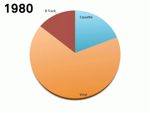
This animation (GIF alert) shows the distribution of music sales over time. Wait a few seconds and you see the pie chart changing for multiple years. This data can be represented much better by a series of stacked column charts. The animation takes too long, and the audience does not have the overview of all the years.
I copied this image from a Tweet that did not include the reference to the source.
There are other problems as well with this chart, gradients, standard Microsoft Office colours, drop shadows, small data labels, and ambiguous labelling ("Internet", "mobile", "video", etc.).
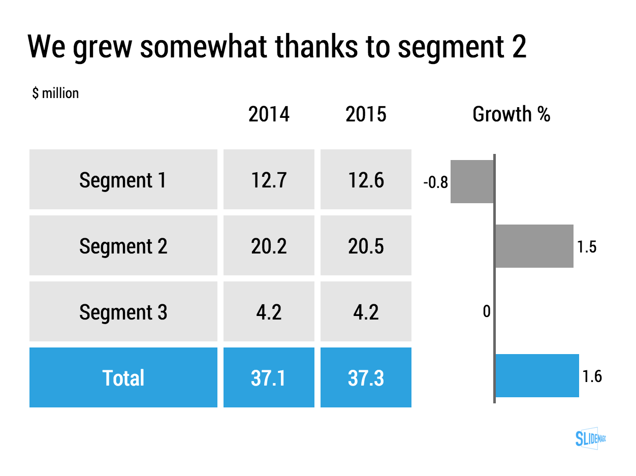
Lining up a data chart and a table in PowerPoint or Keynote is very tricky. And that is a shame, because it is one of the most useful compositions to present data. Just tables, and you cannot really see the trends. Just data charts, and it all becomes cluttered.
I took the data from an earlier blog post and quickly turned it into a combined table/data chart. You can clone the slides I create in presentation app SlideMagic into your own SlideMagic account by clicking this link.
Back in the good old days at McKinsey, we tend to put any range of data in a column or bar chart, even if that meant a chart with just one column, or one chart.
A nice clean bar/column chart works beautifully to visualise a data range. Especially if there are big differences between the values of the chart. If the differences between the numbers is not that big (I do not like broken axes), or you have lots and lots of data to present (the data labels just become too small), I resort back to a simple table.
Stick all the data in, round things up nicely, and use accent/shading background colour to make your messages pop.
I must admit, I start using tables more and more. (And that is why they are so easy to make in SlideMagic)
Art: Louis-Philippe opening the Galerie des Batailles, 10 June 1837 (painted by François-Joseph Heim)
A large of the data presented in business presentations is uncertain: future forecasts, market (share) estimates, competitive comparisons. Many people express that uncertainty by presenting numbers as ranges: cost per bottle as between $1.50 and $2.00.
While working with ranges might be required in a spreadsheet calculation, I don't like to use them in presentations:
So what to do? I would stick the mid point of the ranges as a point estimate in the presentation, and makes sure it is a nice, rounded number (7.49544 looks to certain). Much simpler and much clearer.
Art: a painting depicting women inspecting silk, early 12th century, ink and colour on silk, by Emperor Huizong of Song.
Often, clients tell me that they have to present to an audience of engineers, so the presentation should not be a "marketing" presentation.
The bad interpretation of this is: we are engineers presenting to engineers, so we can get away with text-heavy slides and diagrams full of numbers. We engineers understand each other. As soon as we add pictures or try to make the presentation more visual in other ways, we lose credibility.
What is really going on is this: if you are selling a high tech product there is no way you can avoid well, talking about the technology. But the high tech world is full of presentations written by people who do not really understand the technology, for an audience who does not really understand the technology. These presentations lack substance but are rich in marketing buzzwords. Engineers will recognise them in a second, and don't want you bring "one of those".
We need to eliminate two misconceptions:
Here are some of the things I do to create technical sales presentations:
Some presentations contain a ton of data that needs to be updated all the time. Quarterly results, LP updates of VC/PE funds, the latest sales data. Updating the numbers is time consuming and errors can easily sneak in (especially problematic with presentations to investors).
I do not recommend cutting and pasting Excel data into PowerPoint. You need serious PowerPoint skills to format the data correctly, and most spreadsheets are not build to present data, they are build to analyse it. Hence my approach of cutting the link between the spreadsheet and the presentation software, and creating a data chart from scratch, 100% focused on the audience, not the analyst.
How to deal with the updating?
I would suggest to create a special spreadsheet alongside your presentation. A new worksheet pulls the required numbers from the big "data dump" worksheet, rounds them up correctly. Place the numbers exactly as they should show up in your presentation slide. Now it is easy to update your presentation data. Add check sums to see whether percentages add up to 100%, and breakdowns go back to the total sales figure.
When the new quarter arrives, you over-write the data dump worksheet, and fix any broken/misplaced links.
Art: painting by Ivan Aivazovsky
Sankey diagrams can be useful to show flows.
They are tricky to make in PowerPoint. The width of the arrow needs to correspond with the value of the stream. The curves of 90 degree arrows in PowerPoint are hard to control. If there is no escaping (maybe you can create a waterfall diagram instead), I create Sankey diagrams using boxes and triangles, see the example below.
UPDATE: I have added a PowerPoint template for a Sankey diagram in the SlideMagic template store:
Art: Minard's classic diagram of Napoleon's invasion of Russia, using the feature now named after Sankey.
Quantitative market research companies come back with pages and pages and pages of data in PowerPoint. It is tempting to cut and paste to "add the survey results in the presentation". Not so fast, let's clean things up first.
Art: Edward Burne-Jones, The Mirror of Venus, 1875
This visualisation is brilliant. I have never thought about using columns in a column chart as domino pieces. One to add to your repertoire of visual tricks and let's hoop that this doom's day scenario does not play out.
The Greek Bluff In All Its Glory: Presenting The Grexit "Falling Dominoes" http://t.co/wLGBOp30Sn pic.twitter.com/JB9BSQ0Xfr
— zerohedge (@zerohedge) July 4, 2015
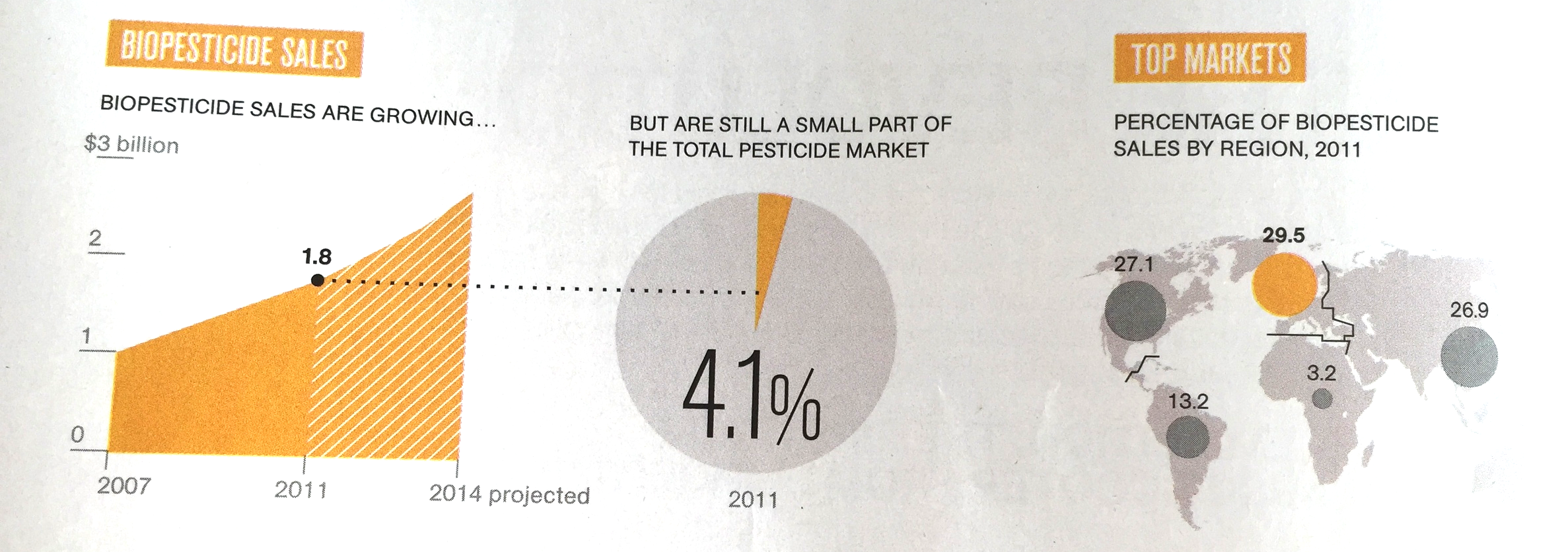
I came across these charts created by The National Geography in a special article about Food by the Numbers. The print article is an extraction from a video. (I made a poor quality image with my phone).
Like in most infographics, the rules of creating data charts are broken. It works well in the 2 graphics on the left, not so good in the map.
Art: Pieter Breughel the Elder, the Harvesters, 1565
If you do not have access to the source data of a graph you have two approaches to getting the data into your presentation:
How to get the best looking chart from a screen shot:
When you do not use data labels in a chart (bar, column, line) but rely on a value axis instead, you can get a way with a lower of level of accuracy. You can literally print a chart out (the larger the better), measure the position of the data points and recreate the chart from scratch in PowerPoint or Keynote.
Art: Interior of a tailor workshop, artist unknown, 1780.
In investor pitches there are usually 2 types of financial forecasts:
Why do investors want to see some sort of short-term budget?
A short term cost budget does not need to contain 25 lines of Excel, by month. A simple x% of revenues number is a bit too simple though.
Art: Marinus van Reymerswaele, The moneychanger and his wife (1539), Museo del Prado, Madrid
Most of the time, numbers in graphs look better than numbers in a table. There are exceptions though: when there is just one number, and when there is very little variation among the numbers. During my time at McKinsey, I have seen many examples of "lone columns", column charts with just one number in them, or tables full of tiny column charts with hardly any variations among them.
These charts are not only difficult to read, but they are also very hard to create in PowerPoint or Keynote SlideMagic's grid structure does it in a snap though, but hopefully users won't abuse the app for these type of consulting charts. Sign up for SlideMagic here.
Art: Painting of Trafalgar Square (c. 1865) by Henry Pether. Sign up for SlideMagic, subscribe to this blog, follow on Twitter
I have been designing presentation slides for over 20 years now (scary) and over time stopped using more and more types of data charts.
So, as a presentation designer you can get away with a very limited arsenal of data charts. Here is a quick run down of the ones I use: columns, stacked columns, and bar charts. (You can can guess which ones ship with SlideMagic)
The key to designing good data charts is careful, manual design (the opposite of copy pasting from a spreadsheet). What is the one single message that you want to pop out. What are the 10 to 20 data points that support this. Where to drop the accent colour, to what number of decimals should you round up the numbers. What breakdown categories should you group consolidate. Do I need a graph, or is it clearer to put the numbers in a single table? Data charts take time to prepare, but once you figured out what you want to show, can be produced in 5 minutes.
Art: Willem Claeszoon Heda, Breakfast Table with Blackberry Pie (1631), sign up for SlideMagic, subscribe to this blog, follow on Twitter
In management, being detail-oriented is not the behaviour that is considered good. Detail-oriented people get lost in tangents, loose track of the big picture, cannot focus to make decisions. Saying that you are not afraid of detail in a job interview will cost you points.
I think it all depends. Yes, staying stuck in unimportant tangents is not helpful, but when it comes to design, it is all about the detail.
You see this now best in mobile application user interface design. The screen is so small that you need to worry about every button or item you put in front of the user. I personally went through this experience when designing SlideMagic.
But slide design is the same. It is actually helpful to think of your slide as a visual on the screen of a mobile phone. This is sort of the perspective of an audience member who sits in the back row. Everything you put on the slide, everything, should be thought through:
All the detail will add up to a great slide that gives the big picture.
In case you wonder about the close up of Vermeer's painting "The Music Lesson", find out more here about Tim Jenison's attempt to recreate the Vermeer master piece using a lens, "accusing" Vermeer of being a very early photographer, rather than a painter.