Viewing entries in
Delivery

"We don't care"

"We don't care"

The little details in a presentation might not make or break its message, but they do count. A spotless presentation shows you made an effort, that you take your audience seriously.

The result of some maintenance work downstairs in the parking lot of my building

The result of some maintenance work downstairs in the parking lot of my building

Here are some things to look out for: typos in common words (if your spell checker flags something, there is probably something wrong), typos in names of people, inconsistent use of fonts and/or colours, small misalignments of objects, a text wrap gone wrong, or making sure that the positions of titles on all slides is the correct. I remember the senior partner on my first McKinsey project coming into the graphics design room to hold all the paper slides against a strong light to check these things.

Yes, I know that I am contradicting myself now and then as I get reminders about typos in my blog posts...


SlideMagic: a platform for magical presentations. Free student plan available. LEARN MORE
Slide makeovers are not always enough

Slide makeovers are not always enough

Most of my clients actually know how to present visual slides. Their problem: they don't have the slides. But once I create them, they get used quickly to the new presentation format without a lot of training. This is probably because they can identify with the target audience. A CEO pitching a startup idea is the sort of person you would pitch a startup idea to.

Scientists have a double problem. Yes, their slides need work, but the bigger problem is that they often need to cross into a different audience type than they are used to presenting to. Scientist, engineers, lawyers, have their own language for talking to each other, which can actually be every effective. But if you put a scientist with newly designed visual slides in front of an investor audience things start to break down without the proper training.

When deadlines were very short, I have recommended these clients to stick to their existing slides and practice their delivery, postponing the make over of their entire slide deck for the next conference a few months down the road.


Art: Louis Pasteur by Albert Edelfelt, 1885

SlideMagic: a platform for magical presentations. Free student plan available. LEARN MORE
Cold phone messages

Cold phone messages

Shortly after writing my post about cold emails, I received a cold, automated phone message. They did one thing right, don't call from a number with hidden id. But then:

  • It took a few seconds to start the message, presumably enabling me to say "good morning, who is calling"?
  • Then the message started (I heard the crackling recording background noise kicking in).
  • The voice that of a famous radio news reader, did not sound natural
  • And worst of all it started of with: "I know that these type of message.." [beep] [beep] [beep]

I wasted 2 seconds on this.

Now, automated sales messages are not the same as follow up calls for checking whether your recipient got the presentation you emailed, but still think about the parallels. An unplanned incoming phone call is always a disruption, an apology makes the experience even worse and will cost you valuable seconds. 


SlideMagic: a platform for magical presentations. Free student plan available. LEARN MORE
10 slides in, and we have not made the big point yet

10 slides in, and we have not made the big point yet

Impatient audiences of senior management or investors often complain (rightfully so) that they have been listening for 10 minutes, 10 slides, and still the main point of the presentation has not been made. 

The common reaction to this feedback:

  • Shuffle slides around, and drop slides from the back of the presentation all the way upfront. The result: a broken story flow. The sequence of slides in the front does not make sense anymore, and the left over slides in the back don't connect together.
  • Cram a lot of content on the first 3 slides and call them "summary". The result: your audience never gets to see you beautiful, highly visual slides in the back, as you are fighting your way through the bullet points in the front.

What causes the delay?

  • Think about why it takes you so long to get to the point. Does the audience needs all that background? The company mission? The company history?
  • Think about what the audience means when they say "getting to the point"? Do they really want the full detail of your solution on the first page, or would simply telling your audience what you are about quickly be enough to calm them down and stop them from guessing?
  • Think about whether your existing summary is stuck in the middle: too long to serve as a real teaser for what is about to come, and too short to give the full detail of the pitch.
  • Are you taking too much time to present your slides? Uuuh, uuums. Side tangents. Details, exceptions, apologies for rounding errors, footnotes.
  • Are you going off script: you put up a slide, but take the story in a different direction ("let me give you some context first")
  • Do you spend too much time on the obvious: explanation of buzzwords ("let me explain what the sharing economy is", "look at this data about the stellar growth of mobile phone penetration").
  • Are you reading out all the elements of a slide one by one, but because someone else designed the slide for you, they don't really fit the way you want to tell the story. So after you are done reading, you tell the message the way you wanted it, effectively presenting each slide twice.

Keep your summary super short, it is more a teaser of what is about to come. Then tell the story at a pace you would use when explaining your idea to a friend, without slides at all. 


Image from WikiPedia


SlideMagic: a platform for magical presentations. Free student plan available. LEARN MORE
"Let me explain it to you again"

"Let me explain it to you again"

A good pitch of an idea provokes feedback of the audience. If people are just sitting there, watching politely, smiling, and walking out of the room, you are unlikely to land an investment.

When you get feedback (praise, criticism, difficult questions), it is important to realise who it is coming from. Do people care about you, want to help you? Do you they have the right background?

  1. Your mother: she totally admires everything you do, but in most cases might not have deep knowledge of what it is you are actually doing
  2. An industry incumbent who cannot see any change happening having worked in the field for 30 years
  3. A (potential) competitor who is jealous
  4. A friendly investor who does not understand the field
  5. A friendly investor who does understand the field
  6. An interested investor who is negotiating with you
  7. A friend of a friend of a friend who is an expert in the field but who was arm twisted in listening to you to return a favour but does not really have time for this and/or you
  8. Etc.

Pay special attention to people who know what they are talking about, or people that are an example of a type of audience you are going to pitch to a lot (confident, successful investors, that might not fully understand the ins and outs of your market). Group one helps you bullet proof the content, group 2 helps you bullet proof the presentation.

What sort of feedback do you get:

  • Generic praise
  • Generic suggestions to change your presentation (summarise everything early on, re-order these 2 slides, cut the amount of charts to max 10, the 10/20/30 rule)
  • An easy question with 3 buzzwords in them
  • A difficult question that you know is a difficult question but you don't have the answer to
  • A difficult question that you thought you explained well in the presentation
  • A difficult question that you heard for the first time

Some feedback can be ignored (the audience is not qualified, the feedback is generic, polite small talk). Some feedback is an "attack" aimed at hurting you (a competitor who feels threatened, an investor who wants to push the valuation down). But most feedback probably is from people who try to be helpful or really don't understand something.

Faced with criticism, humans tend to go in defence mode. We hardly let the questioner finish her question. We don't read body language. We fire away our ammunition. Repeat the same answer, the same slide one more time, forgetting that it failed to convince the audience the first time. Point at a huge Excel model (cell C27) that has 5000 lines of code that proves that you are right. Do what politicians do: divert the attention to another issue.

The most useful feedback might a small unexpected question, from someone who has no reason to help you, is not negotiating with you, has no time for this meeting, and is a huge expert in the field. Read the body language. Ask the person to elaborate on the question. Ask why she thinks it is an issue, what experience does she base it on.

Other good candidates for feedback are potential customers or users. Hold your fire, and listen carefully.

Sometimes it is useful to ask a lot of questions to the people who ask you questions.


SlideMagic: a platform for magical presentations. Free student plan available. LEARN MORE
Presenting as a teacher

Presenting as a teacher

I got to speak with a high school teacher yesterday and he made an interesting remark about the use of on-screen presentations in the class room. He uses pictures and very simple visual concepts to keep the attention of the teenagers focused. The charts' main purpose is not to transfer information, they are there to keep people focused and interested.

What a different approach than most of my teachers in the 1980s: copy a page from the course book on an overhead transparency and uncover paragraph after paragraph, slowly. Or, turn your back to the class and re-write the book on the black board.


Image from WikiPedia

SlideMagic: a platform for magical presentations. Free student plan available. LEARN MORE
Presentations are not the only issue

Presentations are not the only issue

Communication in the work place in general has its problems:

  • Email wording
  • Making a point in a meeting
  • Trying to get to a decision in a meeting
  • Annual feedback sessions
  • Handing over web/app designs to the implementation team
  • Product one pagers
  • Press releases
  • Keyword-loaden blog posts
  • Marketing slogans
  • User manuals
  • Travel policies

In presentations, the issue is most visible but it is sitting everywhere. People are used to transferring ideas in a dialogue where the recipient asks questions to help her understand what is being said. All this breaks down in one way communication.


Art: Tower of Babel by Pieter Breughel the Elder

SlideMagic: a platform for magical presentations. Free student plan available. LEARN MORE
The problem with projectors

The problem with projectors

I have written about the poor quality VGA projectors that are still sitting in conference rooms of many companies before, but I myself fell into the trap again yesterday. A presentation that looked great on my computer screen was barely readable in a conference room, I have gotten used to high resolution screens and the option to use thin fonts and very subtle colour shadings. Reminder: these do  not come through on projectors.

Now we have a dilemma:

  • Presentations designed for retina displays are not readable on crappy VGA projectors
  • Presentations designed for crappy VGA projectors look "1990" on a retina display

My presentation app SlideMagic should be OK, it uses fat Roboto fonts and reasonably blunt shadings. For PowerPoint, think about where your deck will be used most: a person reading the attachment of an email or an audience watching things on the screen. If the latter, test your presentation before the all-or-nothing pitch.

SlideMagic: a platform for magical presentations. Free student plan available. LEARN MORE
30 x 10 feet

30 x 10 feet

A SlideMagic user asked the the other day what to do with a 30 x 10 feet (10 x 3 meter) projector screen that he was supposed to use in a presentation. A 10 x 3 meter screen has a 3:1 aspect ratio and is incredibly wide and "low". Displaying a regular 4:3 slide on it will leave huge black bars to the left and right of the slide.

The first decision you need to make is whether you want to use the entire screen or not. Pro: you can create spectacularly large slides. But there are drawbacks:

  • A huge screen might overpower you, the speaker
  • It is actually very hard to design slides in this unusual format. Image crops are not natural, and there is almost no avoiding to putting content in boxes from left to right on the slide
  • Finally, it is work to do the above

If you decide to go for the full big screen redesign, then you do not need to create a 30 x 10 feet custom slide format in PowerPoint, any 3:1 aspect ratio will do.

No, my presentation app SlideMagic does not support custom screen aspect ratios, that would go against its philosophy.

SlideMagic: a platform for magical presentations. Free student plan available. LEARN MORE
The last minute changes

The last minute changes

One of our clients back at McKinsey in the 1990s used to say that "the paper in McKinsey documents is always warm", i.e., they came of the printer only minutes before the meeting. Now that documents/presentations are all in digital form there is even greater opportunity to make last minute changes, especially if you travel by taxi to the meeting.

It comes at a price though. First of all, last minute analysis is prone to mistakes. But secondly: "frankensteining" quickly a chart into a presentation might break that super professional and impeccable look of the presentation.

If the change does not involve the correction of a major error,  it might be better to make that missing point verbally.

SlideMagic: a platform for magical presentations. Free student plan available. LEARN MORE
"What is different about an American audience?"

"What is different about an American audience?"

I get this question a lot from (potential) clients in Europe and here in Israel. Ten years ago, I would have answered the question with a usual rundown of presentation design basics: not too many bullet points, visual slides, etc. etc.

But in 2016, I think the playing field has levelled. Audiences in any country now recognise a good or a bad presentation.

There are still differences between audiences though, but they do not differ across geographical boundaries. Here are some contrasts that I often come across. It is especially in these situations that an outside presentation designer can help to bridge the cultural gap.

  • Engineers that need to present to more sales & marketing oriented people
  • Engineers that need to present to potential customers
  • Founder/inventors that need to present to potential investors
  • Small company that needs to present to a big trade show and/or large Fortune500 company
  • Internally focused managers (production, logistics, finance) that need to present to an outside audience (M&A due diligence for example)
  • Local subsidiary that needs to present to corporate headquarters
  • CEO that needs to present to Wall Street analysts
  • Sales Director who needs to present to distribution partners

When presenting to someone outside your typical circle of "audiences" it is important to put yourself in their shoes. Simply recycling your usual presentation is unlikely to work.


Art: Jasper Johns, Flag, 1954


SlideMagic: a platform for magical presentations. Free student plan available. LEARN MORE
The old tricks won't work anymore

The old tricks won't work anymore

Because they have been used so many times, or maybe better, disappointed so many times, some of the old (and often expensive) tricks of presentation design are not at all that effective anymore.

  • Complicated language. Buzzwords, complicated sentences, clarifying footnotes. This person must know what she is talking about, better believe her.
  • Scientific frameworks. Management consultants loved these. It looked complicated, scientific, they were delivered by smart people. Even if you don't understand the framework, the message must be true.
  • Excel-generated hockey sticks. The highly complicated spreadsheet produces the $500m revenue in year 5 number, all assumptions seem sound, it must be true
  • Noisy/flashy/spectacular videos. Stuff is flying in, drum rolls, this looks professional, these people probably tell the truth.
  • Stunning images. "Yes! We should follow the guy who jumps of a a building with a parachute!" That sun set looks amazing.

I am afraid we are back to humble, human communication again.

And here is the pitch for my presentation design app SlideMagic: make it easy to create slides that look pretty decent/professional, and let you spend the majority of your time creating your story.


Image: fake cathedral ceiling in Rome's Sant Ignazio Church

SlideMagic: a platform for magical presentations. Free student plan available. LEARN MORE
Learning from Seinfeld

Learning from Seinfeld

Saturday, I visited one of 4 sold out performances of the stand up comedian Jerry Seinfeld here in Tel Aviv. The setting: 10,000 people in a covered basketball stadium with poor acoustics. Here are some of the things that Jerry did to get through to the crowd. And was interesting to see how effective he was in comparison to the warm up act who had less experience.

  • Timing of punch lines. Know when to keep the flow of words going, know when to pause, and when you pause, pause for a really long time to let a point sink in with the audience.
  • Immediately build a connection with the audience. This is more than speaking 1 word of Hebrew, and more than showing how you appreciate the country. Seinfeld build an entire series of jokes about the experience of fighting traffic and crowds to go to a major event (and leaving it). It created an instant bond with the speaker, but also a shared experience between the members of the audience. This was a good set up for the later sections in his show that often were derived from material targeted at a US audience. Started to throw these types of jokes into the crowd right at the beginning would not have gone down well.
  • Fake eye contact, there was now way that Jerry could see anyone in the audience because of the lights, still he was moving his eyes around and holding them left, right, front, and back as if he was connecting with a member of the audience.
  • It was interesting to see how Jerry ended the show with a punch line, and then boom, said goodbye and thank you, walking of the stage immediately after. There was no time for the "well, this was it..."

Still, you could see that the whole 1 to 1.5 hours without a break is pretty tough even for someone like Seinfeld. You could spot when he was "in the moment" and where energy levels were dropping.

SlideMagic: a platform for magical presentations. Free student plan available. LEARN MORE
"This is my usual introduction"

"This is my usual introduction"

"When I put up the first [incredibly busy bullet point] I start of with this introduction before I take people through the slide"

Usually, these introductions are great. They come out naturally, in a conversational style. Next time:

  1. Use that introduction as the opening of your presentation, add a visual slide here and there to support the story. And don't stop there, finish the entire presentation in that style
  2. Second best option. Put in a black slide before your busy opening slide and tell that introduction without encouraging people to start reading your bullet points.

SlideMagic: a platform for magical presentations. Free student plan available. LEARN MORE
Designing presentations for print

Designing presentations for print

In some industry sectors, especially financial services, people still insist on printing the presentation slides and handing out booklets at the start of the meeting. You can have groups of 10-20 people sitting around a conference table flicking through pages.

It is great for taking notes, analysing detailed financials, but it is not that great for a close connection between speaker and audience, and that last minute typo in the name of the CEO cannot be corrected once on paper.

Sometimes you have to pick your battles and if print is the way to go, think about these issues when starting the design of your slides. The bottom line, get a slide to look good on paper on day 1 of the design project, not at 3AM the night before the meeting.

  • Colours appear different on screen than on paper, especially on cheaper, older, or almost-out-of-toner printers. Bright blue can turn into faded grey, lively orange can become girly pink, subtle grey shadings turn into bright white, just to name a few potential problems.
  • Hole punchers for binding machines require extra space at the top of your page, test it.
  • Dark back grounds empty toner cartridges and make make the fingers of your audience black.
  • You can get away with low res images on a 15 year old VGA overhead projector, on paper though, you will get caught. Use high resolution images.
  • A monitor frame, or the light rectangle on a projection screen provide an implicit frame for your slide. Paper should do the same in theory, but A4/letter/4:3 and other issues makes it highly unpredictable how your slides are scaled on paper. In the worst case you might have draw a tiny grey line around your slides to anchor things (yes really).

Professional print designers will laugh at all this, this is design 101, and these issues have long been solved with Adobe InDesign, and printer driver software. A whole industry has been built around this, you are unlikely to see page scaling issues in your print newspaper. The problem is, these designs are hard to maintain/change in a corporate environment.

The one good thing about print though is that it shows that your slides are as fresh as the croissants in the bakery down stairs if the pages are still warm from the printer. A compliment I got many times in my previous life as a management consultant.


Art: Vincent van Gogh, The Bakery in Noordstraat

SlideMagic: a platform for magical presentations. Free student plan available. LEARN MORE
Take that conference tag of

Take that conference tag of

Name tags are a necessary evil when visiting a conference. The security guard can see you paid, and people can read your name, company, and role casually. It is also a great way to store the day program and your lunch coupons.

But when on stage, it looks a bit weird. When presenting right that moment, when someone watches the online video of the talk 6 months later, when the entire panel consists of 12 people with the 12 white dots on their shirts.

Oh, and also ask people to take of their tags when posing for a group photo.


Art: Albrecht Drurer, Portrait of a young Venetian woman, 1505

SlideMagic: a platform for magical presentations. Free student plan available. LEARN MORE
Comcast pitching lessons

Comcast pitching lessons

The Comcast-Time Warner Cable merger fell through. Fred Wilson makes the case that this is probably a good thing, not so much because of consumer choice, but on the other side of the business: content providers trying to get through to consumers with their offering (Netflix, etc.).

This article in the NYT provides some interesting background on the failed $25m lobbying and pitching effort. Some quotes:

"He was smothering us with attention but he was not answering our questions"

"And I could not help but think that this is a $140 billion company with 130 lobbyists — and they are using all of that to the best of their ability to get us to go along"

1) If there are elephants in the room, huge obvious issues that need to be addressed, you have to deal with them, somehow. Avoiding the issue will not make the issue go away.

2) Beyond a certain point, "slick" is actually working against you, when you try to convince a human. (The same point I made with respect to highly sophisticated videos).


Art: The colossus, Francisco de Goya, 1808–1812

SlideMagic: a platform for magical presentations. Free student plan available. LEARN MORE
What did you remember?

What did you remember?

It is a good exercise to go back in your memory and try to recollect presentations you saw, and what you still remember of them.

Chances are that you forgot:

  • The names of the 7 forces affecting that guy's industry
  • That complex logical argument structure
  • The mission statement
  • That inspirational quote
  • The benefits: flexible, scalable, cost efficient, and customisable
  • Etc.

There is a good chance that you still remember:

  • That personal story
  • That detailed but unexpected fact
  • That French accent
  • The Skype message notification icon
  • That image of a container ship that summarised the big idea
  • The button that was missing on the shirt
  • That clever analogy that ran through the entire presentation
  • That unexpected turning/break point in the story
  • The benefit that you get that whole thing up and running 7 minutes 30 seconds
  • Etc.

Now look back at the presentation you are working on.


Art: Gilbert Stuart's unfinished 1796 painting of George Washington, also known as The Athenaeum. Sign up for SlideMagic, subscribe to this blog, follow on Twitter.

SlideMagic: a platform for magical presentations. Free student plan available. LEARN MORE
Smaller screen, better presentations

Smaller screen, better presentations

There is a nice side effect of people ditching their laptop and carrying a small tablet device instead: presentations get better. But it has nothing to do with technology, it is the setting of the presentation that has changed.

In the absence of a big projector screen or LCD monitor, that small conference room just changed from a mini cinema theater to a discussion table. The attentions is shifting back from the screen to the presenter. The presenter vaguely points at the device and continues "what this chart wants to say is [and out comes the story]". Only when you have to, the iPad gets passed around the table to show that important piece of data on page 37.

Good stuff until Airplay-enabled projects are hooking up our mobile devices to projectors again.


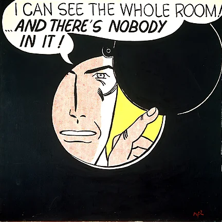
Art: Roy Lichtenstein, The whole room, 1961
Subscribe to this blog, follow me on Twitter

SlideMagic: a platform for magical presentations. Free student plan available. LEARN MORE
Alcohol against stage fright?

Alcohol against stage fright?

The supply of liquor in this tweet below probably was more symbolic than functional, but I have heard other stories about people getting offered a drink back stage before appearing in a major TV broadcast.

A bit of alcohol relaxes nervousness, but it is actually not the sort of relaxing you want on stage. You need to be sharp and switched on to remember your story and react to audience feedback. Some other things you can do to deal with nervousness:

  • Know your story inside out, rehearse, rehearse, rehearse. Seth Godin suggests that you can even start with dogs as your risk free audience. Work especially hard on the opening of your presentation, since these are the most difficult moments. Once you are on a roll, the rest will follow much easier.
  • Remember that everyone (including the pros) is a little nervous before going on stage, remember that a bit of nervousness gives you the right alertness to deliver a good performance (alcohol does the opposite), remember that the audience wants you to succeed there, remember that for most people stage fright is like that first chill when jumping into a pool, it is over in 2 seconds once you get going.

Art: Edgar Degas, L'Absynthe, 1876
Subscribe to this blog, follow me on Twitter

SlideMagic: a platform for magical presentations. Free student plan available. LEARN MORE