Viewing entries in
Hardware

Computer update 2022

Computer update 2022

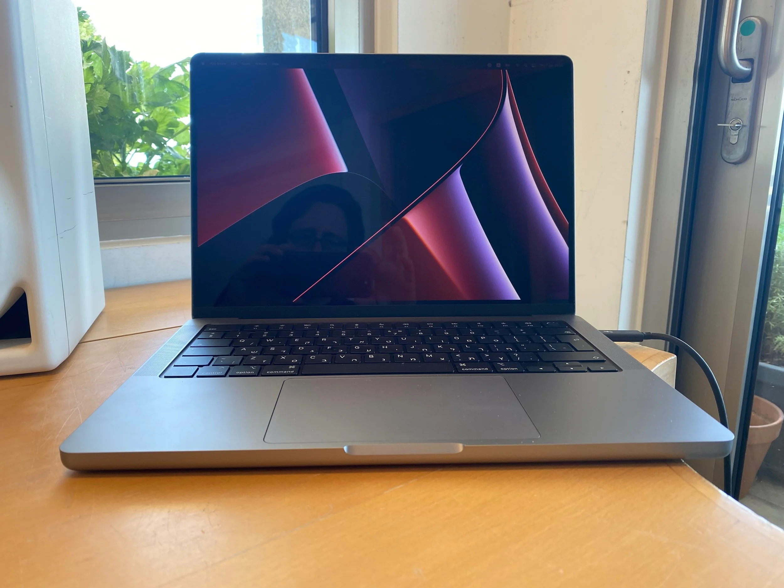
After 4 years, my MacBook died on me during a holiday abroad last week. A flat battery would not recharge again to bring it back to life. I upgraded to a new computer instead of fixing my old one.

I am trying to remember the Macs I went through since 2008:

  • Air

  • 17” MBP

  • 15” MBP

  • 27” iMac

  • 15” MBP

  • And now: 14” MBP

Of these, the iMac is still running in great shape as the living room computer.

Updating a computer used to be a huge deal in the 1990s and 2000s, because you had to get your data across, or worse, recover your data, or even worse: give up on your data. Now, computers have become a disposable tool. Get a new one, quickly install your software, and you are good to go with all data being available and backed up online.

Some thoughts on the 2022 machine:

  • Again a laptop. Mobility is important. Even more now than in my previous life as a designer, a critical bug in one of my sites might need patching instantly, no matter the place on earth or time of day.

  • I am on continuing my 1 big monitor, laptop as side screen setup. There was a time I would run 2 giant 27” monitors side by side. Just too much stuff: I would use the space to add Twitter feeds, email inboxes and other distractions. It is better to focus. The small screen is my “copy paste” scratch pad.

  • I went for the more compact 14” screen. The 16” machine is too bulky. Especially given my monitor setup in the my day to day office. Less heavy, and it fits in antique hotel room safes that have not been updated over the past 20 years.

  • I took it easy on the performance upgrades. Some of my earlier machines had custom high end specs. I think it makes more sense to upgrade more frequently. This M1 processor is a huge step in performance for example, easily outperforming a few extra MHz on an i7 CPU.

Let’s hope this one will last a few good years.

P.S. It is good to see that SlideMagic is running snappy on the new machine….

SlideMagic: a platform for magical presentations. Free student plan available. LEARN MORE
Old computers...

Old computers...

My main work machine is in repair, which in Israel, means you lose it for at least a week. So I am back to working on old computers: a 2015 iMac, and a 2016 MacBook. And I must say: things are mostly fine on machines that I abandoned more than a year ago.

The 27” screen of the 2015 iMac somehow feels more comfortable than the LG 5K display that I use with my top of the line MacBook Pro. Processing speed for the work I do (writing code and designing slides) is totally fine. Even on the 2016 MacBook (with minimum spec even for 2016), things are fine. And that light weight is actually a real bonus versus the hot, heavy 15” MacBook Pro. It makes me think of future setups: desktop for the bulk of the work, and an “emergency” lower-spec laptop to enable working outside the office if needed.

The only issue I have is running a Windows machine via bootcamp to build the Windows version of SlideMagic. That software is noticeably slower.

If you are not a gamer, or a movie editor at Pixar, computers probably last a lot longer than you think. Come to think of it, most machine replacements were probably due to hard drive crashes. Now with solid state drives, that might happen for less frequently.

Another upside, I now get to test the SlideMagic app thoroughly on smaller screens and lower-spec graphics cards…

Photo by Nicholas Santoianni on Unsplash

SlideMagic: a platform for magical presentations. Free student plan available. LEARN MORE
Stress-testing monitors

Stress-testing monitors

A critical feature of any presentation app is the management of screens when presenting for a live audience. The presentation needs to show up on the big screen, and if possible, the presenter windows with the slide count, next slide preview, and timer needs to pop up on the secondary monitor.

Messing with monitors under the stressful time pressure of standing in front of a waiting audience requires serious stress testing. I am now doing this for SlideMagic 2.0. Pulling out monitor cords mid-presentation, sticking them back in, closing windows. I removed many bugs, but there are still a few left (the dual operating system set up is causing some additional challenges).

Soon, I will have ironed them out all. But as a precaution, I might not go as far as PowerPoint or Keynote where the user does not see the presenter and audience windows explicitly. I will leave them visible as non-maximised windows so the user can find them and move them around if Murphy’s Law strikes.

To be continued.

SlideMagic: a platform for magical presentations. Free student plan available. LEARN MORE
Apple pencil, finally there

Apple pencil, finally there

I have been trying electronic pencils for years and years: different 3rd party iPad styli (is that the correct plural?), the previous Apple pencil itself and previous solutions by Wacom. None of these worked good enough for me to get rid of my note book.

I think has changed with the latest Apple pencil that works on a 2018 iPad Pro. The updated pencil solved a few annoyances when compared to the previous one:

  • It snaps to your device (but still falls of in your bag)

  • When snapped, it charges, no more need to stick it in the iPad connected

  • It no longer rolls

  • It has a matt finish and feels nicer to work with

The biggest issue though used to be work flow, with 2 poor options:

  • Log into your sleeping iPad all the time when you want to jot something though in a meeting

  • Keep your notes app running all the time and thereby letting the graphics intensive app drain your iPad battery.

That has been solved by a feature buried in the settings of the Apple Notes app: a simple double tap of the pencil on the screen wakes up the Notes app. The iPad is still locked as a security precaution, you can set the time it takes for the iPad to open a new note instead of displaying the last note you were writing to anyone who taps the screen.

Photo by Kim Gorga on Unsplash

SlideMagic: a platform for magical presentations. Free student plan available. LEARN MORE
PowerPoint on iPad review (2018)

PowerPoint on iPad review (2018)

Microsoft is on a roll, and now that I am turning temporarily into a developer, I appreciate them even more with very powerful code editors, and repeated decisions to open source their software (the entire Windows platform engine is going open source), and make other sensible decisions (moving to the Chromium browser rendering engine inside Edge).

The office apps are no exception, and I took some time to play around with PowerPoint on my new iPad.

The app looks and feels fantastic (I have something to aspire to), and all the basic design features work flawlessly. I find it easier to find my way around coming in “cold” then the keynote app for iPad. The small screen encourages you to design simpler slides, and spend less time adding stuff that is not essential to your story.

In 2018, things are still not perfect though. But most shortcomings are to blame on the iPad form factor, not Microsoft:

  • Presentation design is a creative process that needs space, a big screen, accurate placing of objects (fingers are less good here than a mouse). An iPad is just not a focussed design interface.

  • File management is still cumbersome on an iPad. Finding that deck from last week, opening a spreadsheet side by side, copying an image from the web browser, things that take a second on a computer are not intuitive on an iPad.

  • Because of the form factor Microsoft has cut down the features for PowerPoint on iPad. In itself, this is great (I am also focusing the features in my app), but, once the genie is out of the bottle, it is very hard to have the same application on different platforms with different feature sets, especially if you are working with collaborators on different devices. “Please create this bar chart”, is emailed to the analyst working on an iPad in the taxi who then discovers that data charts are not really supported. It also hard to create custom themes and colour schemes.

So my verdict is basically the same as in previous review: a beautiful application that is an extension of the computer version: best used for delivering presentations to small audiences, and make emergency slide edits.

Now that iPads become very powerful the logical thing to do for Microsoft, to switch to a full blown 1-in-1 copy of the desktop application as soon as it recognises that the user has hooked up a bluetooth keyboard and (let’s see if this will ever happen), a bluetooth mouse to the device.

SlideMagic: a platform for magical presentations. Free student plan available. LEARN MORE
iPad Pro 2018

iPad Pro 2018

I upgraded my 9.7” iPad to the new 12.9” version after trying one out. Here are my observations:

  • The size and weight of the bigger iPad is now manageable (unlike the first models). It is so light that the programmed weight to size ratio in your head gets confused. Still, this remains a “2 hand” device in most cases. If you need a 1-hand device, this one is not for you.

  • The size is the main reason I got it, it enables me to read “magazines” by smaller publishers do not have the resources to invest in proper iPad apps and simply send out a PDF every month. For this purpose it is great. An A4-sized PDF on iPad is now one on one comparable to a paper one, probably even better.

  • The best way to get a feel for the screen quality is to go back to your old device that you thought was great. It is not yet as stark as the iPhone 3 to iPhone 4 jump, but it is a huge step up.

  • The thing is incredibly fast and snappy

  • The pencil is a huge improvement. I tried working with styli and pencils right from the launch of the first iPad, none of them really worked for me. This one snaps against the iPad with magnets (although it will fall of in your bag), has a matt feel, cannot roll away due to a flat side, has a tap function to quickly change pens, and charges on the side of the device rather than sticking out of the connector. Writing and drawing is awesome. The killer question will be how it behaves in an hour meeting: unlocking the device, battery life, both of which were wrong in the previous version. Constantly messing around with buttons and passwords to jot down something, and then leaving your meeting with a drained battery. Face ID should help (hopefully).

  • I did not get the keyboard, I still believe that writing long texts can be better done on a proper laptop.

  • The iPad is expensive, but you can save on storage if you restrict your movie downloads to those you need on one long haul flight.

SlideMagic: a platform for magical presentations. Free student plan available. LEARN MORE
Set up stress

Set up stress

This post on AVC describes a common situation: technical problems when setting up a presentation. Different computers and different screens (dimensions, operating systems, resolutions, cables, plugs) make it unpredictable what happens when you connect the 2.

This a particular problem in marathon meetings, where a large number of presenters show up one after the other. It is a time waste for the audience and a concentration breaker for the presenter.

The solution in the post was an interesting one: use Zoom (or another web conferencing service) locally (i.e., standing in the same room). This eliminates the need for hardware connections and allows presenters to line up, solve any technical issues before they are due on stage.

In the absence of such a solution, my recommendation would be to always carry a USB stick with your deck around (in PowerPoint and PDF), just in case. Ultimately portable projectors will be compact and capable enough that everyone who has a high-stakes presentation to pitch will carry one around.

Photo by Jeremy Yap on Unsplash

SlideMagic: a platform for magical presentations. Free student plan available. LEARN MORE
Macbook Pro 2018

Macbook Pro 2018

I am now working with my new MacBook Pro computer set up for 2 weeks. In 2015, I got an iMac because it was the only option to enjoy that huge 5k screen back then. Some observations:

  • I am happy to have the option of mobility again. If your work consists of replying to emails, mobile devices are OK to work outside your office, but for design and coding, that is a different story.

  • While the LG 5K monitor is less sturdy than the iMac, it is easier to adjust and has a much smaller footprint. The screen quality is exactly the same (it is probably the same hardware panel as the iMac), some might perceive the glossy finish of the iMac to produce deeper black tints.

  • Having worked for a number of years on 1 monitor, I rarely switch back to a 2 monitor set up (laptop + monitor). I tend to use that second screen for distractions (email, Twitter), and life is actually better and more productive without these. (I do need those 2 monitors to test my “presenter mode” feature of my app, pulling my hairs out over how hard it still is to coordinate 2 application windows in 2018…)

  • The monitors have become so good today that there is no longer the issue of “compromise”: working on the desktop monitor is better because the screen is better. Now there are 2 different work modes with equally good monitor options: laptop screen at close range with trackpad, fixed monitor and mouse at longer range. Both are good.

  • There are a number of 13” screens in the family, and I must say I much prefer my 15”.

  • People have been bashing the MBP in reviews, but I must say it actually works fine. (Contrary to popular taste, I got the silver one and not space grey for that retro feel).

  • USB-C dongle hell is hidden, after some trial and error with USB hubs, I now have my entire office (plus music studio) feed of one single charging/monitor/USB cable, easy connecting and disconnecting in my office.

  • I am not using the touch bar that much. The ESC key could as well have been a real key. It is baffling that the volume slider is not present as the default option, but requires an extra click. Touch ID is great.

Image via WikiPedia

SlideMagic: a platform for magical presentations. Free student plan available. LEARN MORE
Windows on Mac in 2018 (3)

Windows on Mac in 2018 (3)

I upgraded my setup to the latest MacBook Pro (the i5 processor started to struggle with some of my music creation plugins) and can gives some updates on my previous posts over the last 2 months or so. Basically all glitches were due to the late 2015 iMac, especially its graphics card. All is fine now:

  • No pink letter rendering in Chrome

  • No corrupted cursor when waking up from sleep

Now it is just down to small things: a colour picker, screen shots, and that CMD vs CTRL issue.

Cover image via WikiPedia

SlideMagic: a platform for magical presentations. Free student plan available. LEARN MORE
Logitech MX Master 2S review

Logitech MX Master 2S review

My recent deep dive into the writing code (More than 1000 lines and counting) forced me back on the Windows platform to make the best use of Microsoft’s development tools (see an earlier post). The biggest problem I faced with the Apple Magic mouse: wild UI swings when navigating PowerPoint slides because of the imperfect calibration of the glass touch surface in Windows 10.

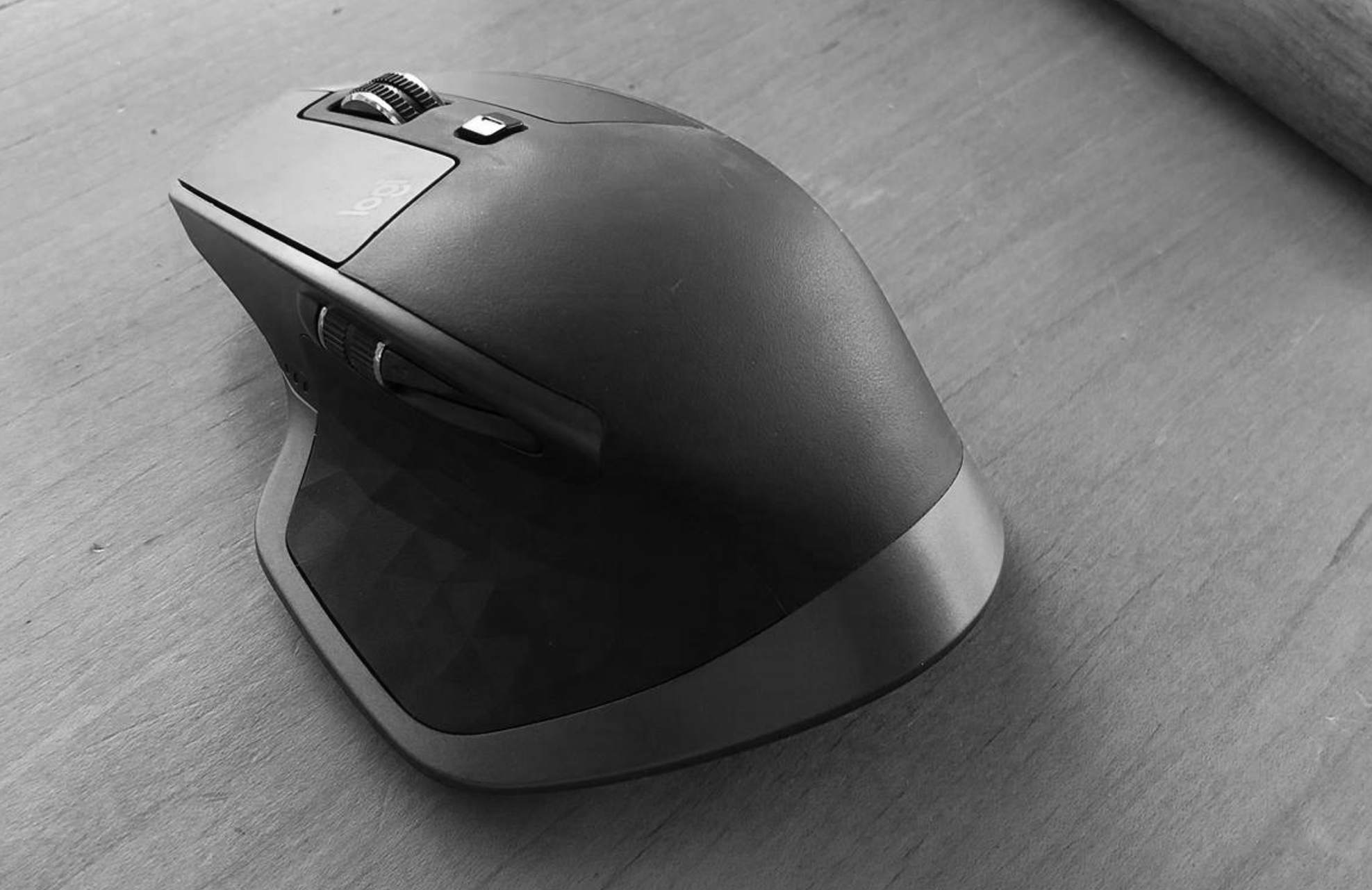
So, I got myself a Logitech MX Master 2S mouse…

I burnt through many of these clunky mice in the 1990s and 2000s and actually liked them, except for the “silky” silicon covers of them that would turn sticky after a year of use.

This Master 2S version got rid of that silicon by the feel of it. Yes, it is bulky and looks nerdy but I must admit, it feels actually a lot more comfortable to have something you can rest your hand on when working all day. That resting is the big problem of the Magic Mouse: by design you cannot really rest your hand on the touch sensitive glass, your hands is always hovering above it, requiring constant energy. On Mac, the calibration works, on Windows it does not.

Instead of the glass, the Logitech mouse has scroll wheels. The vertical scroll is brilliant: you feel a clicking resistance when while moving slowly, but the wheel starts spinning smoothly when you race up and down (pages of code). Horizontal scroll is another (small) wheel on the side, which is definitely less natural than the Magic Mouse.

And yes, you can continue to use the Logitech mouse when it is connected to your computer for charging.

If the silicon stickiness stays away, I can actually live with the increased comfort at the expensive of a nerdy looking device…

SlideMagic: a platform for magical presentations. Free student plan available. LEARN MORE
Presentations on mobile - 2018

Presentations on mobile - 2018

Now and then, I go back and analyse the inroad that mobile devices have, and have not made, on mobile devices, after the state of euphoria we all had back in 2010.

As a viewing device, phones and tablets have made great progress. In a significant number of face-to-face and small conference table meetings, people are using mobiles and tablets to present theirs slides.

As a creation device though, things are not that advantaged. And now that we have apps that do  perfectly fine job at creating presentations on a tablet, we can no longer blame it on technology. Here are some reasons why it is (and will remain) difficult to create presentations on a tablet (let alone phone):

Presentation design is a creative process that requires a big, bold, clutter-free work environment. This means it will always work better with a big screen, a nice big desk to work on, and a quiet environment. Trying to type things on a small screen in a crowded cafe, or in the back of the taxi will never create brilliant presentations.

The default work setting for creating a presentation is the office, and, when given a choice, the small tablet is inferior to the laptop or desktop computer.

File management is still tricky on small screens. Having 3 presentation decks open, plus 2 spreadsheets, plus the dashboard with last quarter's results in the BI system, plus a stock photo site, plus 4 old emails with attachments that contain slides, is by definition hard to manage on a tablet.

Cooperation among colleagues requires compatibility: iOS, Android, Windows, MacOS, corporate network and file systems. This means that pretty much the only app that can work is the Microsoft Office suite, which is actually pretty good on mobile devices, but still is too steep a learning curve for the average Office user on a desktop/laptop.

So, I see little change in the the way presentations are created for the foreseeable future. Laptop/desktop for creating, mobile for emergency last minute edits and presentations in small groups.

The same is true for computer coding and spreadsheet modelling I think. Writing will have more success on mobile devices, if it is limited to simple documents without complex chapter structures (see a recent post by Fred Wilson). Email and corporate messaging has gone mobile completely.

I am curious what we will see in a few years from now. 


Cover image by Thomas Lefebvre on Unsplash

SlideMagic: a platform for magical presentations. Free student plan available. LEARN MORE
Designers are upset with Apple

Designers are upset with Apple

Apple launched the new MacBooks a few days ago, and designers are not happy. Read all the comments here for example. The competition makes more powerful machines, Apple still does not make a 4K standalone display.

But there is also a psychological element to this. We designers used to use our Macs to show to everyone that we were different. We were free to buy cool equipment while most of the "other people" were stuck with crappy machines supplied by the corporate IT department.

Maybe reality has caught up with us designers. For most graphics design application, almost any computer will do. PowerPoint being at the bottom of performance-intensive applications, I have stopped looking at horse power as the main buying criterium for computers.

Still Apple is dropping the ball here and there. No innovation in productivity software (I am trying to add my bit of innovation with presentation app SlideMagic), and a proliferation of adaptors to connect devices, even those that are within the Apple ecosystem.

All of this leaves the door open to a new super premium computer brand. If I were Microsoft, I would create a "Lexus" in computing and court those style-conscious designer elitists again. 

SlideMagic: a platform for magical presentations. Free student plan available. LEARN MORE
Two new screen interfaces

Two new screen interfaces

Both Microsoft and Google launched new screen-based devices over the past few days.

The Microsoft Surface Studio is a desktop computer with a very large touch display. It can be used in regular upright mode, or folded down, which turns it into a giant, almost-horizontal tablet. There is a new interface gadget, a cylinder that you put right on the screen. 

I think this might be the future of desk-based design interfaces. Portable tablets are too small. Upright touch screens are to cumbersome. This hybrid looks great. 

Google introduced the Jamboard, a big touch screen that is meant for white boarding in meetings. The main feature is the collaboration supported by Google software. You can upload, edit, move things, and people not in the room can join the conversation remotely.

The features look impressive, the size of the screen might still be a bit small though to enable really productive group collaboration. Time will tell. 

SlideMagic: a platform for magical presentations. Free student plan available. LEARN MORE
Amazon Kindle Oasis review

Amazon Kindle Oasis review

I got my hands on a the new Amazon Kindle "Oasis" (affiliate link). It is the 3rd Kindle device I bought. The first one for the sheer benefit of not having to ship physical books across the Atlantic to Israel, the second one after the e-ink, "alway on" screen was implemented, and now the super light Kindle Oasis.

What I like:

  • Super light, compact build. About as high as high as an iPhone 6, but wider. The screen size is more or less the same is my old Kindle, the edges just got a lot thinner. It is the perfect aspect ratio for reading.
  • The device fits nicely in your hand, with more battery bulk added to one side of the device. Keeping the weight close to your hand makes the device feel lighter. This lever effect makes the iPad feel heavy when held with one hand. 
  • A fantastic screen. "Retina" crisp. Works in bright daylight, works at night. (The latter apparently without disturbing your sleep patterns)

What I don't like:

  • Poor battery life. Well this is relative, but I got spoiled with my previous Kindle that I could charge every week or so. The protective cover adds an extra battery, but also a lot of weight to the device.
  • The touch screen page switching behaviour is sometimes a bit unpredictable. 
  • The price: almost $300.

Overall a great device and worth the upgrade from my ancient Kindle. If you currently own a Kindle Paperweight though, maybe wait for an upgrade with better battery performance.

SlideMagic: a platform for magical presentations. Free student plan available. LEARN MORE
5k screens

5k screens

I broke my laptop screen and was forced to rethink my IT setup. For the first time in 10 years, I went back to a desktop as my main computer: the 27" iMac and will fix up my laptop as a secondary computer for onsite client work or travel. My desktop is also connected to one additional large Thunderbolt display.

The difference between the 5k monitor and the Thunderbolt screen is amazing. After working for 1 day on the new screen, you can't imagine having had to deal with this grainy Thunderbolt monitor for a couple of years. (The Thunderbolt screen is long overdue for an upgrade).

Two big monitors work also better than one big screen and a laptop as a side monitor. Mac OSX is still clunky when dragging large application windows between different size screens. You always had to fiddle and resize windows. Now that the monitors are more or less the same aspect ratio I no longer have that issue.

Still I believe that the fluid window-based operating system where you can resize and position windows where ever you want them creates messy work environments. Mac OSX needs some sort of grid structure where you can snap things into place. Maybe an extension of the new multi-app feature that is now part of iOS.

When going back to desktop you need to budget for one more piece of equipment: a backup battery (UPS). The power goes down, your computer goes down. Apple should have put in a 5 minute battery that enables you to power down the machine orderly in case of a power failure. The latter we tend to have here in Israel in the middle of the summer when air conditioners drive the power grid to its maximum capacity, or in the winter when violent thunderstorms hit power lines.


SlideMagic: a platform for magical presentations. Free student plan available. LEARN MORE
Note taking on iPad in 2016 (2)

Note taking on iPad in 2016 (2)

I now have spent more hours taking notes and sketching with my iPad Pro 9.7 + pencil combo (read the earlier post). Things are still not perfect.

Taking notes

The big issue is instant availability of your canvas. Keep the screen on continuously and you drain your battery in less than an hour. Do auto-power off and you find your self do this for every single scribble you want to make 1) press home button 2) touch id 3) touch canvas to activate the writing surface. The latter is probably an issue in the Evernote Penultimate app, which has 2 modes: One where you view notes, and one where you can edit them.

Sketching ideas

  • The 9.7" screen is to small for sketching big, bold concepts, I need more space. (But then I don't want to carry an iPad Pro 12" around). You actually need 2 devices.
  • Current apps don't support erasing very well. You have to go into a menu, change the pencil to an eraser, erase, then switch it back again. Maybe Apple can put a sensor in the back of the pencil and make it an eraser, or could enable the use of multiple pencils in the same app. My creative process is rather paper intensive. I use a huge pile of old paper: make a bold sketch, toss it away, make another one, and another one, until I iterate to a chart in 10 loops or so. Even the pretty app Paper by 53 does not accommodate this workflow.

There is hope though. Most of these issues are solvable, and some even via software. We will get there in the end.


Image from WikiPedia

SlideMagic: a platform for magical presentations. Free student plan available. LEARN MORE
The problem with projectors

The problem with projectors

I have written about the poor quality VGA projectors that are still sitting in conference rooms of many companies before, but I myself fell into the trap again yesterday. A presentation that looked great on my computer screen was barely readable in a conference room, I have gotten used to high resolution screens and the option to use thin fonts and very subtle colour shadings. Reminder: these do  not come through on projectors.

Now we have a dilemma:

  • Presentations designed for retina displays are not readable on crappy VGA projectors
  • Presentations designed for crappy VGA projectors look "1990" on a retina display

My presentation app SlideMagic should be OK, it uses fat Roboto fonts and reasonably blunt shadings. For PowerPoint, think about where your deck will be used most: a person reading the attachment of an email or an audience watching things on the screen. If the latter, test your presentation before the all-or-nothing pitch.

SlideMagic: a platform for magical presentations. Free student plan available. LEARN MORE
30 x 10 feet

30 x 10 feet

A SlideMagic user asked the the other day what to do with a 30 x 10 feet (10 x 3 meter) projector screen that he was supposed to use in a presentation. A 10 x 3 meter screen has a 3:1 aspect ratio and is incredibly wide and "low". Displaying a regular 4:3 slide on it will leave huge black bars to the left and right of the slide.

The first decision you need to make is whether you want to use the entire screen or not. Pro: you can create spectacularly large slides. But there are drawbacks:

  • A huge screen might overpower you, the speaker
  • It is actually very hard to design slides in this unusual format. Image crops are not natural, and there is almost no avoiding to putting content in boxes from left to right on the slide
  • Finally, it is work to do the above

If you decide to go for the full big screen redesign, then you do not need to create a 30 x 10 feet custom slide format in PowerPoint, any 3:1 aspect ratio will do.

No, my presentation app SlideMagic does not support custom screen aspect ratios, that would go against its philosophy.

SlideMagic: a platform for magical presentations. Free student plan available. LEARN MORE
No longer a power user

No longer a power user

Back in the 1990s, buying a new computer used to be something very exciting, today it is the replacement of a work tool after the previous one breaks down.

As a presentation designer I used to fit in the category of "power users", people that need to manipulate images and store large files. No longer, for my work, I can use an average computer and everything will be just fine.

Portability is not as much as a big deal as it used to be. I can access all my files online. I focus my creative design work to my calm office environment and need a simple device to run a presentation in a meeting or make last-minute edits if necessary. And when I move around, I want that device to be as light/small as possible. (Five years ago I used to carry around a 3kg 17" laptop).

What is important though is the largest screen I can get my hands on. This is such an improvement in productivity.

Now, my personal hobbies (electronic music creation), complicates all this. It needs huge hard drives and processing power...

Decisions...

SlideMagic: a platform for magical presentations. Free student plan available. LEARN MORE
Presentations on mobile devices - taking stock

Presentations on mobile devices - taking stock

Five years after the iPad launch let's take a step back and see what is actually happening in the world of presentation software and the use of mobile devices. My observations are based on the people I see around me everyday: startup employees (mostly mid 30s to 40s) and staff in big corporates (a bit older).

  • Designing. Apple has made a big inroad in terms of hardware, but it is still PowerPoint that runs on a laptop machine that is the preferred set up to create slides. I have not encountered anyone who uses a mobile device to do this. Apple Keynote is pretty much still a niche application.
  • Frankensteining / finding stuff. Cloud-based file systems can be confusing to use. I still do not understand exactly what happens when Keynote on iPad tells me it is converting a regular Keynote file. In practice, the file system that everyone is using is.... the email inbox and sent box. People with gmail can find stuff faster than Outlook users.
  • Viewing. Yes, more and more, people use their mobile devices to view a presentation. And it is not the iPad, a tablet, it is the mobile phone, where people squint to see what is in the slides. These are investors looking at a pitch deck, these are managers/superiors proving input on a slide. Think about it, this might be a more important audience for your slides than the ones sitting in conference room.
  • Emergency edits. Still laptop, although a tablet could work here, few people use it in a corporate setting.
  • Coffee chat, 1 on 1. Mostly laptop, I see fewer iPad/tablets than I saw 1-2 years ago.
  • Conference room. Laptop. The crappy VGA projector is being replaced by crappy LCD screens. Presentations that look beautiful on your retina display, look absolutely horrible on an LCD screen with poor resolution and overly bright settings. (Test, test, test). Advanced meeting rooms now allow you to airplay your presentations into the screen. People use their laptops to do this, not their mobile devices.
  • Big keynote. Conference laptop with a memory stick plugged in.

So what is really changing? People are viewing decks on mobile phones, especially busy people that might not be overly motivated to see your pitch (investors in round 0 of the due diligence process for example).

Presentation gurus like me used to discourage dense bullet points because you can't (too small) and don't want (too boring) to read them in the back row. Now it is a bit more subtle. You can't read small text on a mobile screen. But, more and more desks are read without a presenter being present and you actually need some text to explain things properly.

In SlideMagic, I encourage big, bold, but extremely simple designs (that will come through nicely on a mobile device), plus I left space on the side for a regular explanation paragraph.


Image on WikiPedia


SlideMagic: a platform for magical presentations. Free student plan available. LEARN MORE