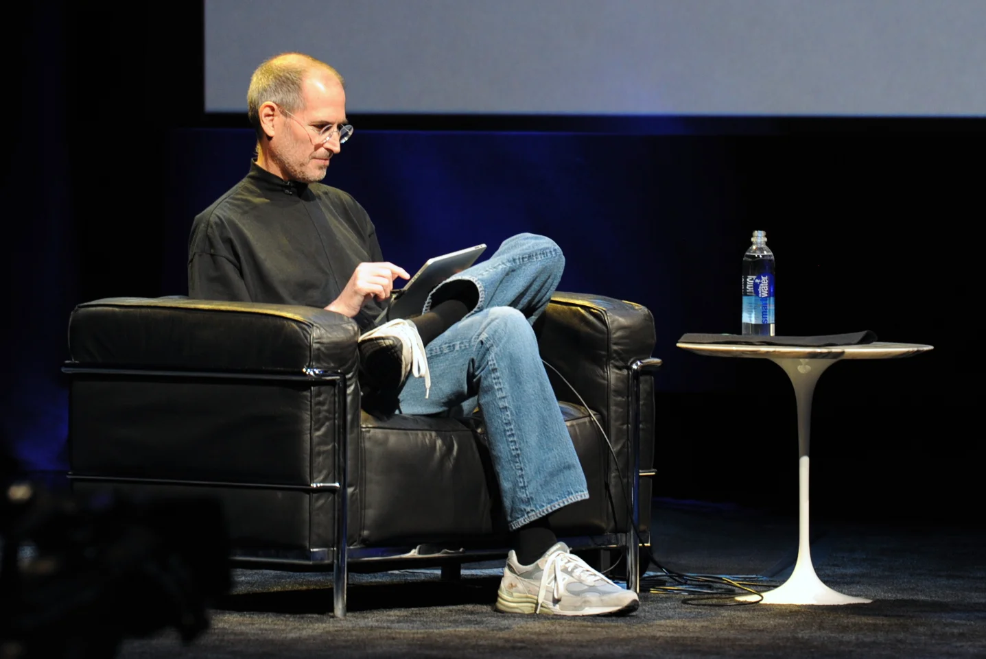
Five years after the iPad launch let's take a step back and see what is actually happening in the world of presentation software and the use of mobile devices. My observations are based on the people I see around me everyday: startup employees (mostly mid 30s to 40s) and staff in big corporates (a bit older).
- Designing. Apple has made a big inroad in terms of hardware, but it is still PowerPoint that runs on a laptop machine that is the preferred set up to create slides. I have not encountered anyone who uses a mobile device to do this. Apple Keynote is pretty much still a niche application.
- Frankensteining / finding stuff. Cloud-based file systems can be confusing to use. I still do not understand exactly what happens when Keynote on iPad tells me it is converting a regular Keynote file. In practice, the file system that everyone is using is.... the email inbox and sent box. People with gmail can find stuff faster than Outlook users.
- Viewing. Yes, more and more, people use their mobile devices to view a presentation. And it is not the iPad, a tablet, it is the mobile phone, where people squint to see what is in the slides. These are investors looking at a pitch deck, these are managers/superiors proving input on a slide. Think about it, this might be a more important audience for your slides than the ones sitting in conference room.
- Emergency edits. Still laptop, although a tablet could work here, few people use it in a corporate setting.
- Coffee chat, 1 on 1. Mostly laptop, I see fewer iPad/tablets than I saw 1-2 years ago.
- Conference room. Laptop. The crappy VGA projector is being replaced by crappy LCD screens. Presentations that look beautiful on your retina display, look absolutely horrible on an LCD screen with poor resolution and overly bright settings. (Test, test, test). Advanced meeting rooms now allow you to airplay your presentations into the screen. People use their laptops to do this, not their mobile devices.
- Big keynote. Conference laptop with a memory stick plugged in.
So what is really changing? People are viewing decks on mobile phones, especially busy people that might not be overly motivated to see your pitch (investors in round 0 of the due diligence process for example).
Presentation gurus like me used to discourage dense bullet points because you can't (too small) and don't want (too boring) to read them in the back row. Now it is a bit more subtle. You can't read small text on a mobile screen. But, more and more desks are read without a presenter being present and you actually need some text to explain things properly.
In SlideMagic, I encourage big, bold, but extremely simple designs (that will come through nicely on a mobile device), plus I left space on the side for a regular explanation paragraph.
Image on WikiPedia

