I have been experimenting with OpenClaw, a 24/7 personal AI assistant. It is an open source project that was created over the past month, created almost by accident as a hobby project by a developer. Late last year, developers discovered that using an AI coding tool for non-coding applications really works, especially if you can give it access to local files (rather than chatting). Next step: keep the AI agent running 24/7. Next step, find a way to let the AI agent keep some context about you. (Context memory is a big issue in AI, it fills up at some time, so storing bits of context for future reference enables persistent awareness). Next step, implement recurring instructions. Next, make the AI assistant available from any channel, including Whatsapp. This, combined with full system access, creates an incredibly powerful AI assistant (that can also be incredibly destructive). “It’s 2AM, I have a 12 hour to do list and full shell access, lovin’ it”. What can possibly go wrong.
So it requires some technical knowledge to run this thing in a vaguely responsible way. I put it on AWS EC2 in a completely isolated virtual network, with an access tunnel that only I control, plus a number of prompt injection filters running on yet another server. (OpenClaw’s founder has joined OpenAI exactly for that reason, to get the financial resources to fix the complexity and security issues)
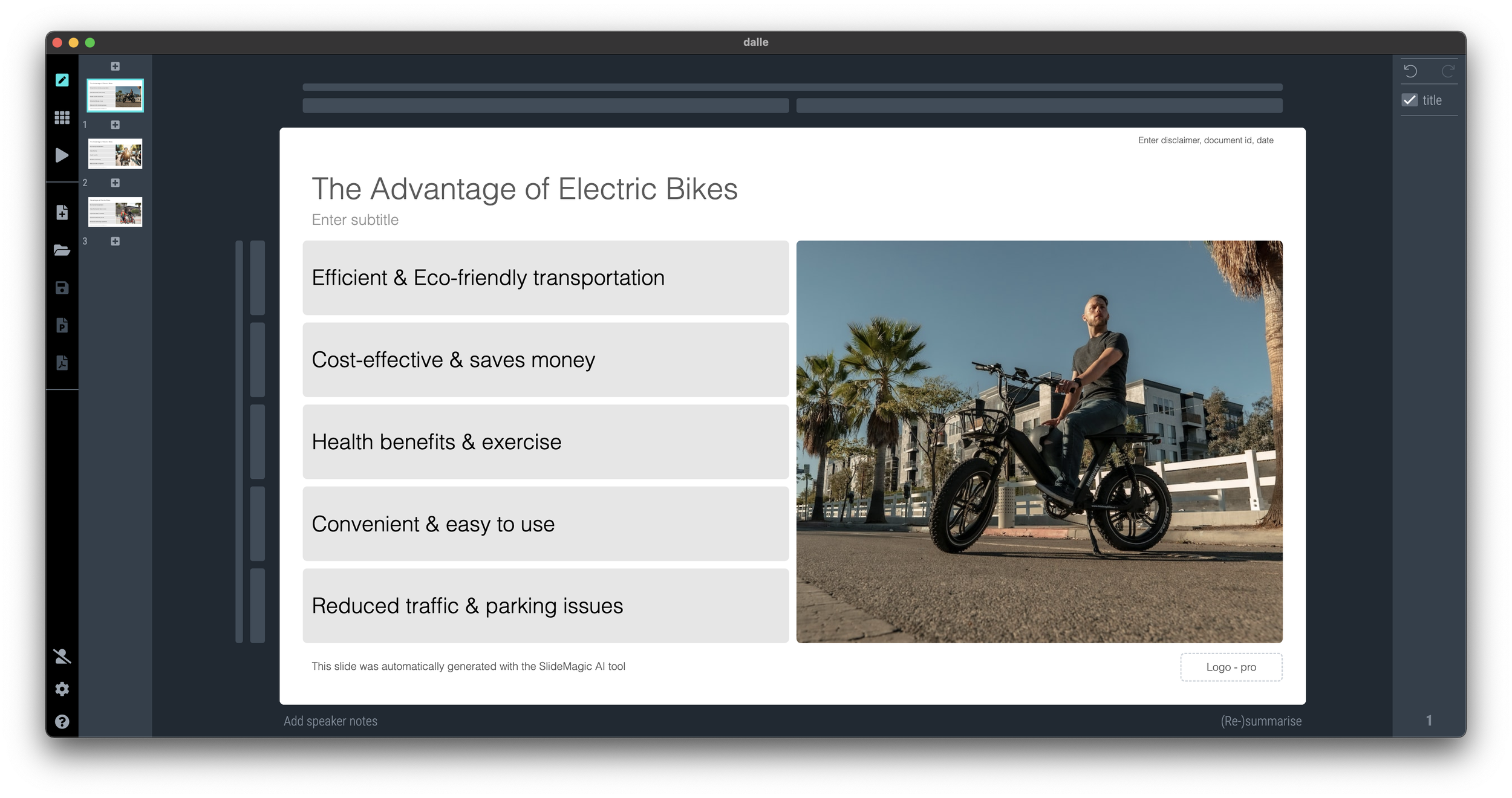
Working with it, enables me to get a feel for the future. Direct instructions to applications (code editors, presentation design software, spreadsheets, food takout apps) will become increasingly irrelevant.
We will move from well-designed, beautiful, easy to understand, visual user interfaces that humans can interact with directly to clear and transparent API endpoints that an agent can call on behalf of a human.
Interesting times.


