

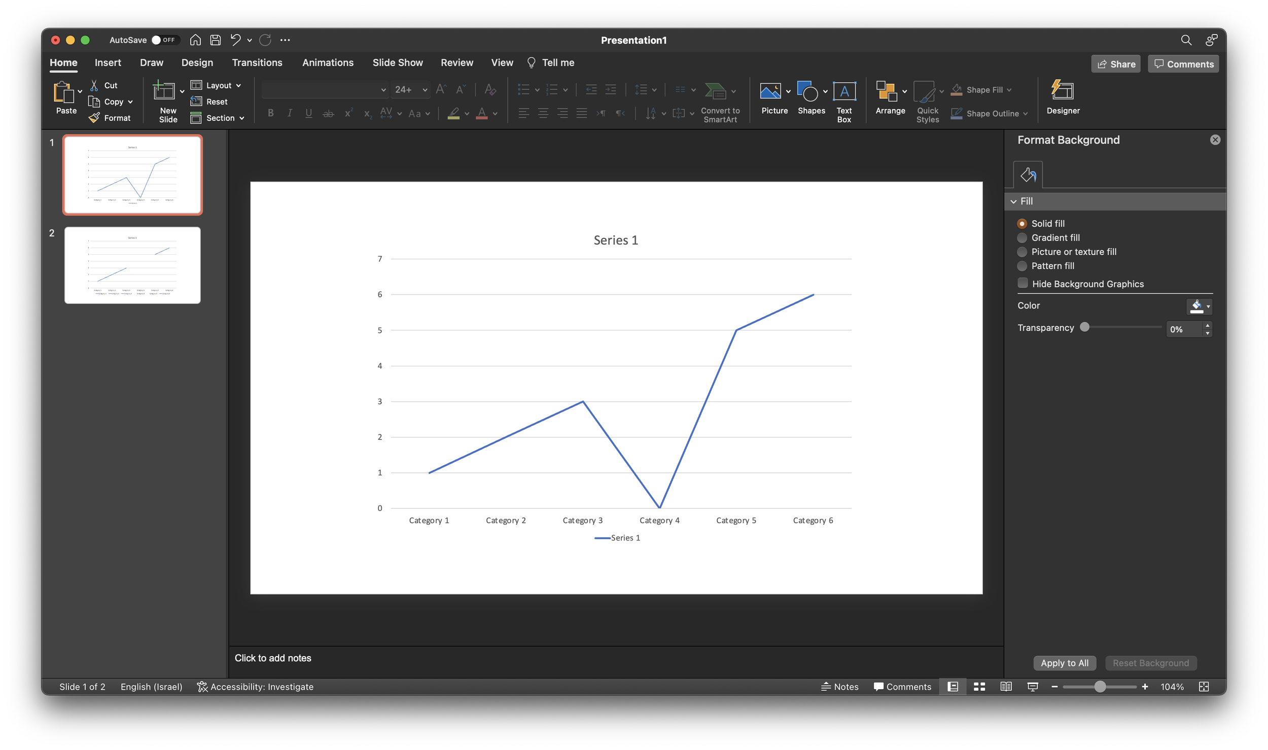
A PowerPoint post today, why not… Someone showed me a little trick to remove a point in a line graph. Useful when you have one year with missing data, and simply interpolating the value between the 2 neighbors would be bending the truth. Putting a zero leaves an odd line (see below).
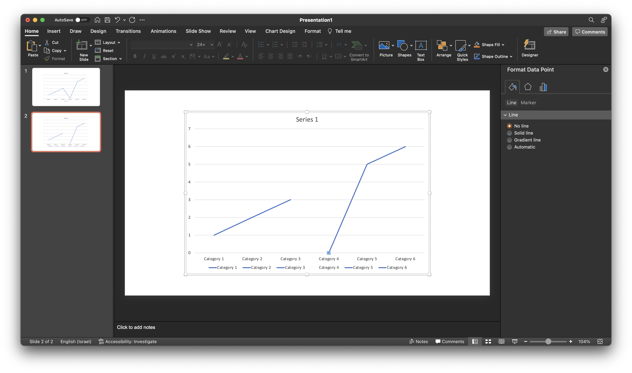
If you select the data point, (not the data series), and go into format data point and the paint bucket, you can set the line to “no line” (see below).
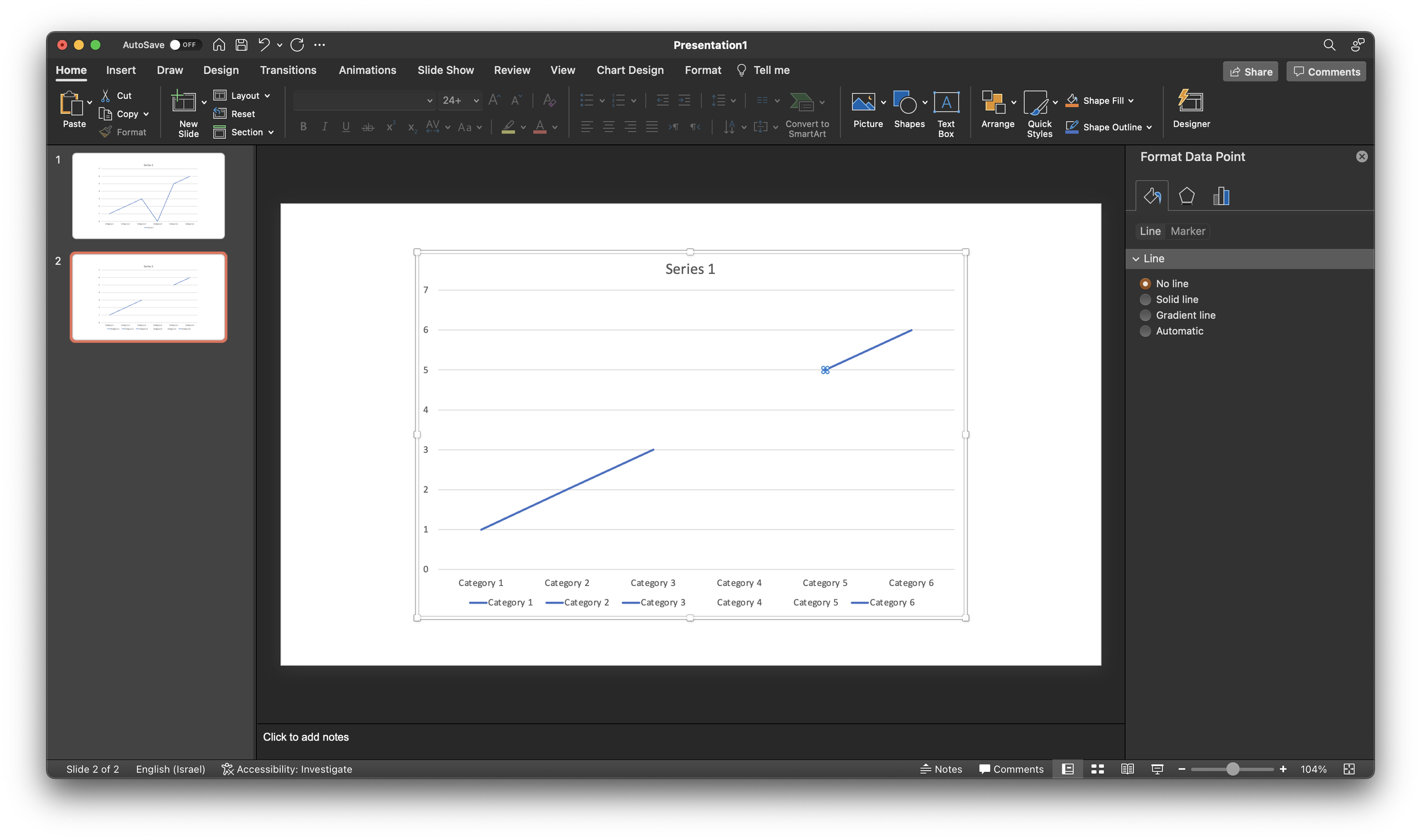
Repeat the process for the neighbor to the right (see below).
As a result, some weird things are happening to the data series labels though. Also, this standard PowerPont/Excel chart is far from presentable in your slide deck. An alternative approach in SlideMagic? Put in a column chart with a zero column value.