Viewing entries in
Images

Where visuals are crucial

Where visuals are crucial

If I sit down with a client, in almost all cases, the pitch of a company comes out fine verbally. People know how to tell their story. The order might not be perfect, there are some repetitions, here and there one of my questions needs to be clarified, but all in all, in 30 minutes we got a pretty good understanding of what is happening.

My work is to translate that story into visuals. And given the above, there are different types of slides.

Some slides are absolutely crucial to understanding the pitch. These are the ones that people are opening their laptops for, and pull up page 37:

  • Screen shots and images of applications/products, in many cases it is actually unclear what the product does. This is specifically the case in internet applications, or medical devices where a picture of the actual product explains a lot.
  • Data visualization that emphasizes how big something really is compared to something else, how fast things are growing or declining. Visuals do a much better job here than spoken word
  • Complicated relationships, competitive positionings, IT architectures. These cases require a map on which both brains can sync to disentangle these complex structures.

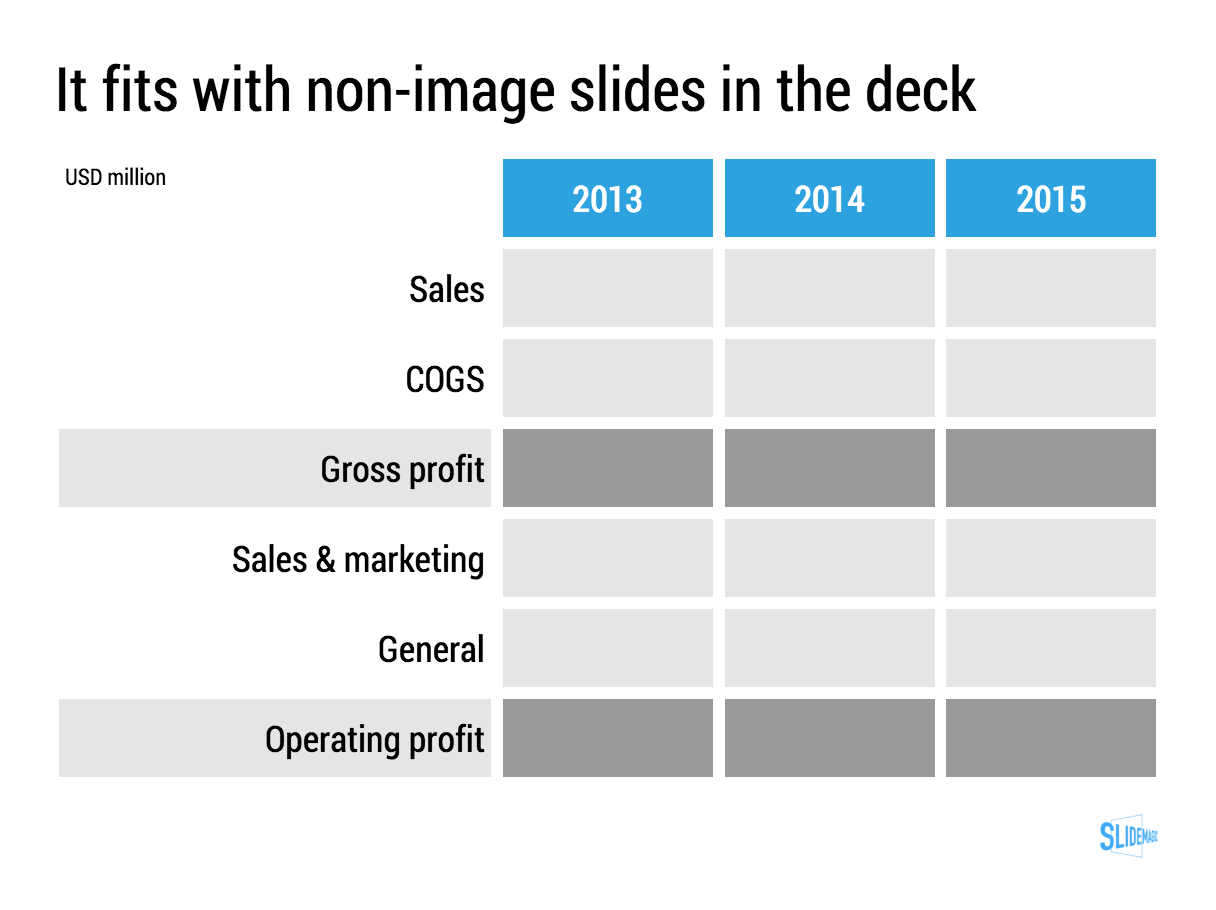
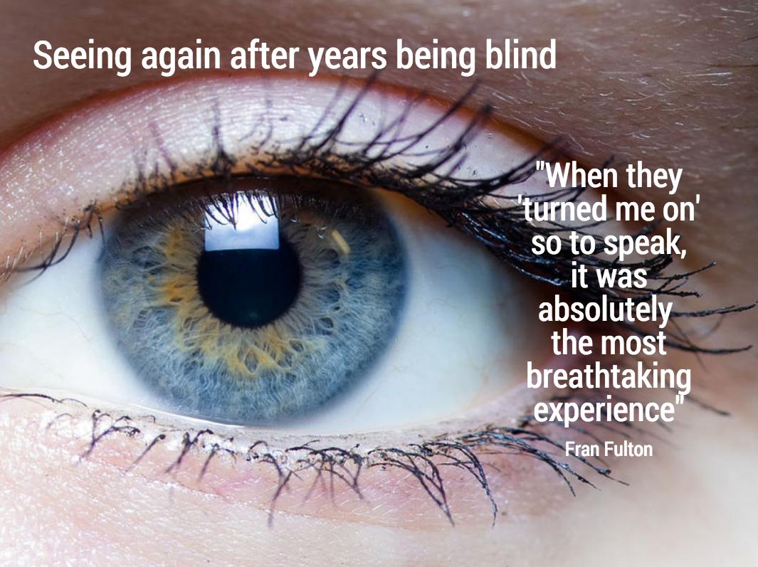
Other slides are mere backup for the spoken word. They help to make the story more powerful, but are not essential: large photographs of metaphors (endless road, squeezed orange, confused customer) or simple text charts that support the flow of the story.

The purpose of the last group of charts is 1) to give your company a professional look & feel, and 2) make it possible for people to read/digest the story without you being present.

SlideMagic: a platform for magical presentations. Free student plan available. LEARN MORE
2-step image search

2-step image search

When searching for an image, there are 2 steps:

  1. What sort of image works best?
  2. What actual image is the best (and can I use without copyright issues)?

Recently, I needed a panorama overview of a retail store. Most stores do not have 20 meter high ceilings (a waste of space, a waste of energy), and stock image sites only provide images of actual stores under an editorial license (news papers can use them, marketing presentations not).

A broad Google search brought me to the Galeries Lafayette in Paris (step 1), after which it was easy to find a nice, high-res, creative commons image (step 2).

SlideMagic: a platform for magical presentations. Free student plan available. LEARN MORE
"Flattening" a video

"Flattening" a video

Most of the corporate promotion videos I see are enhanced presentations: text movements with animations, still images with slow zoom added, piano background music and maybe some custom made illustrations. They look good, but have 2 problems when it comes to pitches to busy people:

  • They make files very heavy (email attachment bounce and/or consuming 500MB of mobile download data)
  • They take too much time: like a bullet point chart, you will have read that one sentence 10x by the time the pianist is finished with the 8 bar melody and ready to move on to the next shot.

That is the reason why I often "flatten" these videos, take the 5 best screen shots and paste them as images in a regular presentation deck. Looks great, quick to read, easy to download.

Anticipating this issue, when you brief a video production company ask them for 2 versions of the video, one with all the graphical elements, and one with less text, so you can use it as source material for still images over which you can place your own text in a presentation. Also handy when your messages change over time.

There are many other situations where you might actually need to keep the video in its full size: demonstrations of products, interviews of people, etc. If it is just about adding drama to a still visual, why not go with a well designed still visual though.


SlideMagic: a platform for magical presentations. Free student plan available. LEARN MORE
The over-ambitious cover image

The over-ambitious cover image

Often, my clients want a cover image on the presentation that says it all: the entire message of the presentation in just one smart visual. There are 2 problems with this approach:

  • A technical one. The ideal image will probably not exist in some stock photo site, so there is significant photoshopping and editing required to get that elephant to balance on a skateboard while enjoying the benefits of flexible ROI. This image is unlikely to look good from a technical point of view.
  • Even if you were to make this happen, it is highly unlikely that the audience who walks into the auditorium while sipping a coffee will actually understand what it means.

Lower the ambitions, and pick a professional looking cover image that is somewhat connected to what you are going to talk about and use your presentation to get the full message out.

SlideMagic: a platform for magical presentations. Free student plan available. LEARN MORE
Fewer and fewer stock images

Fewer and fewer stock images

I have noticed that my purchase of stock images has gone down dramatically:

  • I stopped forcing myself to find an image for every slide (what I tended to do 10 years ago)
  • Stock image sites are now overloaded with cheesy compositions
  • There are many excellent free image sites around

SlideMagic: a platform for magical presentations. Free student plan available. LEARN MORE
Natural stock photos

Natural stock photos

I stumbled across yet another stock photo site that tries to offer "real" rather than cheesy, stages stock photos: Twenty Twenty (www.twenty20.com)

What I like: good images, big library, useful "collections". Pricing is relatively steep for the casual user (starting at $20 per image, or a $225 monthly subscription for 25 images compared to some of the free stock image sites that are popping up everywhere. Still, only marginally more than the big brand stock photo sites.

My prediction: iStock and shutterstock will add a "non-cheesy" filter option to their image sites soon.

SlideMagic: a platform for magical presentations. Free student plan available. LEARN MORE
The eyes need to smile

The eyes need to smile

Selecting profile pictures for a presentation or web site is always tricky. My advise is to take a huge amount of photos to have as many options as possible to select the best one.

The first and most obvious selection layer are obvious mistakes. Closed eyes, the tie not sitting straight, basic face expressions.

The second layer is more tricky. If you look carefully at a portrait image, it is usually possible to guess the sort of mood the subject was in. The face can be smiling, the eyes not. The person can look embarrassed, amused, shy, uncomfortable, curious.. Pick the one that suits best.

Think about this when your picture is being taken. Look at the lens of the camera, the way you would want to look at a potential investor or client standing in front of you. Professional actors can do this for every possible mood they want to project. For you, it is enough to do what comes naturally to you.


SlideMagic: a platform for magical presentations. Free student plan available. LEARN MORE
Searching for images inside one specific site

Searching for images inside one specific site

In order to make a nice profile slide about a company, you need to find good images of their products, ads, head office building (no, not the reception desk). One good trick to mine one specific web site for images is to go to the main Google Image search page: https://images.google.com/, and enter a query that says "site:domain.com". Here are the images that are stored on slidemagic.com.

SlideMagic: a platform for magical presentations. Free student plan available. LEARN MORE
An alternative to a logo

An alternative to a logo

When you need to list a handful of companies on a presentation slide, the main visualisation people use is a logo. It always looks great. Make sure you have the latest one (they tend to change rapidly), and pick one in a nice high resolution. If the colours clash too much, consider toning them down by making them black and white.

But the alternative to the logo, is actually getting an image of the company in action. An ad on the street, the neon on the corporate headquarters (no, not the HQ reception desk), a store front, etc. Make sure you don't have any copy right issues. I usually search for photographs on Google Image search that are "labelled for reuse" Below an example for Vodafone:

Image by Moyan Brenn on Flickr: https://www.flickr.com/photos/aigle_dore/15754634911

Image by Moyan Brenn on Flickr: https://www.flickr.com/photos/aigle_dore/15754634911

If you need to deal with a lot of company names, there is no escaping to the logo page. My presentation app SlideMagic makes lining up lots of logos very easy. Use the black and white toggle to mute logos if the colours get too busy.


SlideMagic: a platform for magical presentations. Free student plan available. LEARN MORE
Pushing the analogy too far

Pushing the analogy too far

Analogies are great. You take a concept that anyone can relate to, and use it to explain something unfamiliar. But you can push it too far.

  • An analogy that is complex in its own right defeats the purpose
  • An analogy that only partly fits
  • An analogy for which you cannot find the appropriate professional visuals easily without an advance degree in Photoshop
  • An analogy that is number 12 in a series of completely unrelated analogies for every single concept in your presentation
  • An analogy that is not "serious", it undermines the professionalism of your presentation, a bit of humour is OK, college humour is not.
  • An analogy that is a cliche

Or, like in the Accenture ad below, you are actually insulting your target group.


Good analogies are pretty much the opposite of the above. They are simple, fit the subject, are easy to visualise, and ideally, can cover all aspects of your story.

SlideMagic: a platform for magical presentations. Free student plan available. LEARN MORE
The mood of images

The mood of images

The first layer of the image in an image is what it is about, a tree, a house, a car. The second layer though is what general mood it evokes. Even if your images depict the right thing, somehow they do not feel right, and it is hard to pin down why. Here is a check list, I am exaggerating on purpose. 

  • Cheesy, tacky, not real, fake people
  • Something aggressive, violent, scary
  • Things are gross, ugly, not pretty, repulsive
  • A bit too racy
  • Girly, cutesy, childish
  • Dark, somber (including colours)
  • A closed, trapped setting
  • College humour that is actually not really funny
  • Cliche: ice bergs, dominos, 

I am exaggerating on purpose. That image of the apple pie is probably not "gross", but subconsciously, there is something not tasty about it. The image of the solider is not violent, but somehow a military association sets the wrong tone of the presentation.

The opposite is also true. The best images can uplift your mood and somehow makes your feel right. Images can set your mood pretty much like a painting / piece of art can.

If your image does not feel right, it probably is not right.

SlideMagic: a platform for magical presentations. Free student plan available. LEARN MORE
Selfies are not professional head shots

Selfies are not professional head shots

Images are a great way to liven up an "about" page on a web site or a team page in a presentation. The best images are the one where all team members are present in one image. You can overlay name tags and get a great composition. No issues with images in a different style, images that are outdated. And it shows how well the team works together.

Second best alternative is individual images. But please avoid selfies. Most people assume that where-is-the-button-I-need-to-press look when taking a selfie. It does not come across very professional. The least you can do is ask a colleague to take a quick picture with your phone if you are in a hurry.

SlideMagic: a platform for magical presentations. Free student plan available. LEARN MORE
I like to frame images

I like to frame images

Big, confident images look better on a presentation slide. The maximum size of your image is achieved when you let it "bleed" of the page (the term comes from the age of print, where the ink would drip of the corner).

These full size images look great if your presentation is just images. In most cases, my client work is not. Hence, I prefer to frame my images within a box of white (or black). Some people say it is bad practice, I disagree:

  • You do not have to worry about legibility of slide titles
  • Photo slides look consistent with other slides in the presentation
  • I think, it actually looks very distinguised

My presentation app SlideMagic caters for both formats, so don't worry if you disagree with me. You can clone the slides below (and all other slides I have used on the blog) into your own SlideMagic presentation via this link.


The image was found on unsplash, free images under a do-whatever-you-want license

SlideMagic: a platform for magical presentations. Free student plan available. LEARN MORE
NASA Apollo photo archive

NASA Apollo photo archive

NASA has uploaded a ton of public domain images of its Apollo missions online. Free to use in presentations. You can find them here. You can find more sources of free images here.


SlideMagic: a platform for magical presentations. Free student plan available. LEARN MORE
Stock image sites come second

Stock image sites come second

My use of images has changed a lot over the past year. I have now reached a point where stock image sites come in as a last resort. And when I do, clients often push back and ask me to look for something different than that cheesy, cliche, polished stock image.

So, most of my image search starts with Google Images, with the option "labelled for re-use". or I browse through some of these excellent sources of free presentation images. (Although I must say that the latter now become so popular that you start recognising images instantly because of over-use).

SlideMagic: a platform for magical presentations. Free student plan available. LEARN MORE
Google uses "glow" to put its logo over images

Google uses "glow" to put its logo over images

I don't think it looks very good. Adding a glow around an object always makes it look "dirty". The better solution in my eyes is to create an all-white version of the logo and put that over the image.

SlideMagic: a platform for magical presentations. Free student plan available. LEARN MORE
Images from museum collections

Images from museum collections

Step by step, museums are putting their entire collection of paintings online. These archives make for a great source of images: consistent in style, without copyright issues (if you go back sufficiently far in time). You won't find stock images of smartphones though, but maybe that makes your presentation actually look better.

Here are some examples of well developed web sites:

There are still big differences in how advanced museum web sites are, but ultimately every museum will come to realise that access to their collections should not be restricted to the people who happen to be in town.


Art: View from a balcony, Gustave Caillebotte, 1880

SlideMagic: a platform for magical presentations. Free student plan available. LEARN MORE
But that image does not exactly match?

But that image does not exactly match?

Not every image that is used in advertising has a functional objective. Take fashion ads, for example, sometimes the product is missing all together. 

  1. Images that show something highly specific: a product, a medical condition, a location
  2. Images that show a relevant scene or background: people tapping on their mobile phone, a driver in a traffic jam, calm bamboo forest, a sunset
  3. Images that make a visual metaphor: a prisoner in a cage, a cat chasing a mouse
  4. Images that just set the mood of the presentation

I use 1. and 4. more, and 2. and 3. less because they often lead to visual cliches. 


Art: "Self-Portrait, Yawning" by Joseph Ducreux, 1783

SlideMagic: a platform for magical presentations. Free student plan available. LEARN MORE
Putting text on images

Putting text on images

This image that I saw on Twitter has composition problems that you often see in presentation slides:

  • The text in the box does not have enough breathing space,
  • The quotation marks disturb the balance and alignment of the text box
  • The line breaks are not placed carefully enough, breaking apart words that belong together.

I tried to come up with an alternative design in SlideMagic (which does not support the giant quotation marks [yet]). You clone these two slides to your own SlideMagic account here and use them in your presentations if you want. Image taken from WikiPedia.


Art: detail of the Mona Lisa

SlideMagic: a platform for magical presentations. Free student plan available. LEARN MORE
Slide icons

Slide icons

Repeating the whole story of your presentation on the last slide is boring. You want to end with a "boom" and quickly remind people of the most important message in the presentation. I usually do that with repeating a key visual (just one). Using (the cliche) that a picture says more than a 1,000 words, the repeated image brings back the full richness of the discussion you had in one millisecond. Much more efficient than writing a bullet point.

If you have to repeat multiple messages, here is another trick: use small screen shots of slides. At the end, the audience does not need to be able to read the entire slide anymore. The thumbnail is a quick visual reminder of the content. Below an example that I created in SlideMagic.

I have added this slide design to the template file of all slides I created for the blog. You can open it in the SlideMagic app here and use it for your own designs. Just change the images.


Art: The Flute Concert of Sanssouci by Adolph Menzel, 1852, depicts Frederick playing the flute in his music room at SanssouciC. P. E. Bach accompanies him on the harpsichord.

SlideMagic: a platform for magical presentations. Free student plan available. LEARN MORE