Viewing entries in
Layout

Logo cropping

Logo cropping

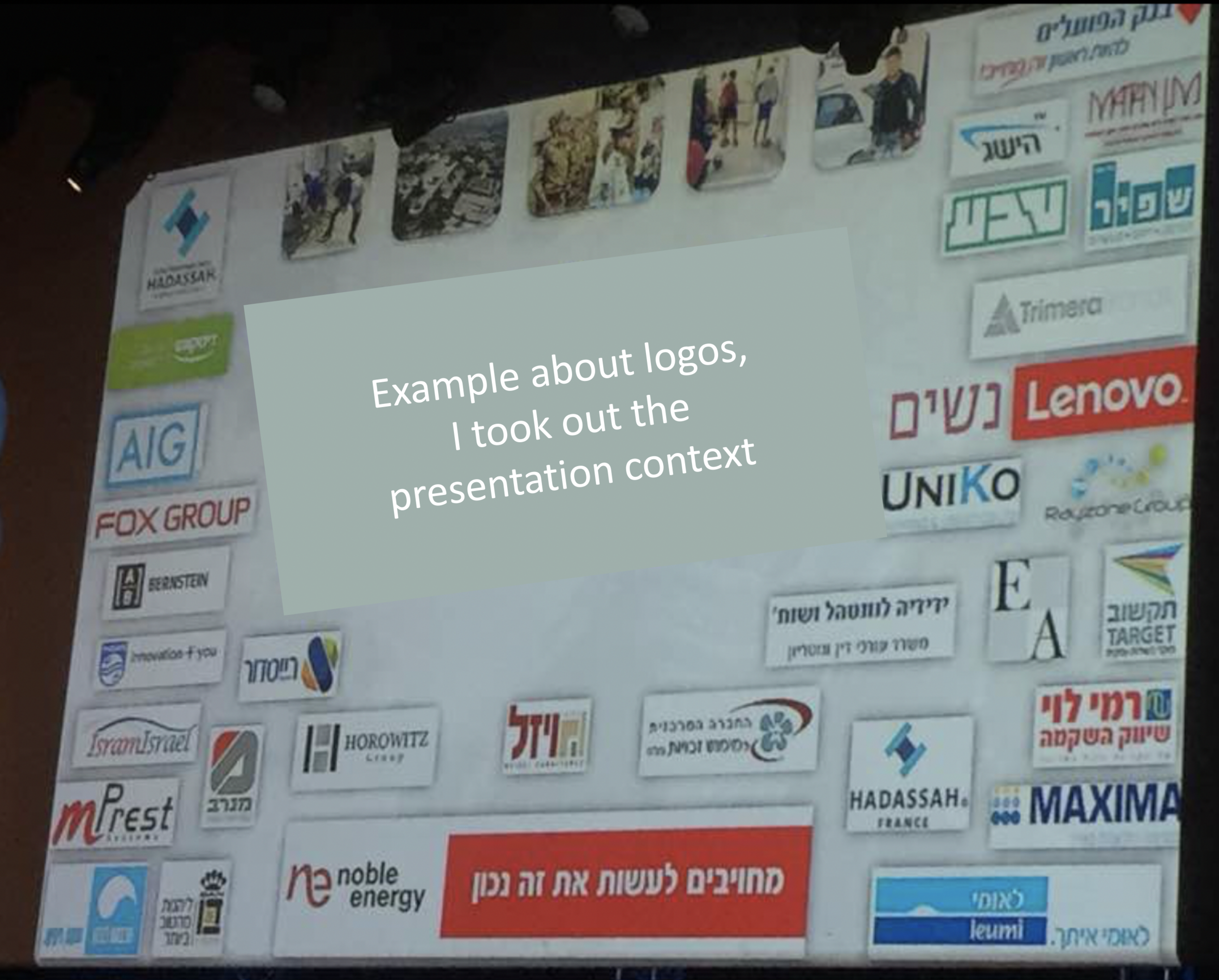
This screen shot is typical for many logo pages in presentations:

Images files are copied into the slide after which a background shading is added. The shadow creates an instant frame around the logo which is too tight, definitely not the framing the logo designer intended. Now that all logos have a box around them, the eye immediately wants everything to be distributed and aligned properly in a grid, which is impossible to do given the different sizes of the boxes. Finally, the drop shadows actually do not look good.

My approach to logo pages is to adhere to a strict grid and keep everything on a white background to give the logos space to breathe. In PowerPoint or Keynote it is a bit fiddly to line up all the logos, I usually put in a temporary table to make sure everything is lined up in rows and columns. When every logo is in its place, I delete the table.

My presentation app SlideMagic makes it easy, it is impossible not to align images in a proper grid.

SlideMagic: a platform for magical presentations. Free student plan available. LEARN MORE
Writing text on charts

Writing text on charts

Most charts consists of 2 - 4 "boxes" with some text inside them. Text in boxes is different from text in sentences and/or paragraphs. When writing an article, you don't have to worry about how long a line is, and/or whether it fits exactly in a certain amount of space.

Some guidelines about writing text in boxes:

  • Make sure the point in each of the boxes has more or less equal weight in terms of content. You don't want box 1 to cover the entire presentation message, and box 2 to be a footnote detail.
  • Think of text on slides as headlines. Strip out all unnecessary filler words (i.e., make it as short as possible), but add enough words to keep it specific (i.e., no generic buzzwords).
  • Make sure that each box has roughly the same amount of text, covers the same number of lines. Yes, that means being a bit more verbose if one box is particularly short.
  • Adjust line breaks to avoid orphan words on the next line, or line breaks that cut the words of a key concept in two (cognitive [break] dissonance).

When "writing" a chart: the content should be clear but the text should be balanced as well.


Image from WikiPedia

SlideMagic: a platform for magical presentations. Free student plan available. LEARN MORE
PowerPoint Designer - first impressions

PowerPoint Designer - first impressions

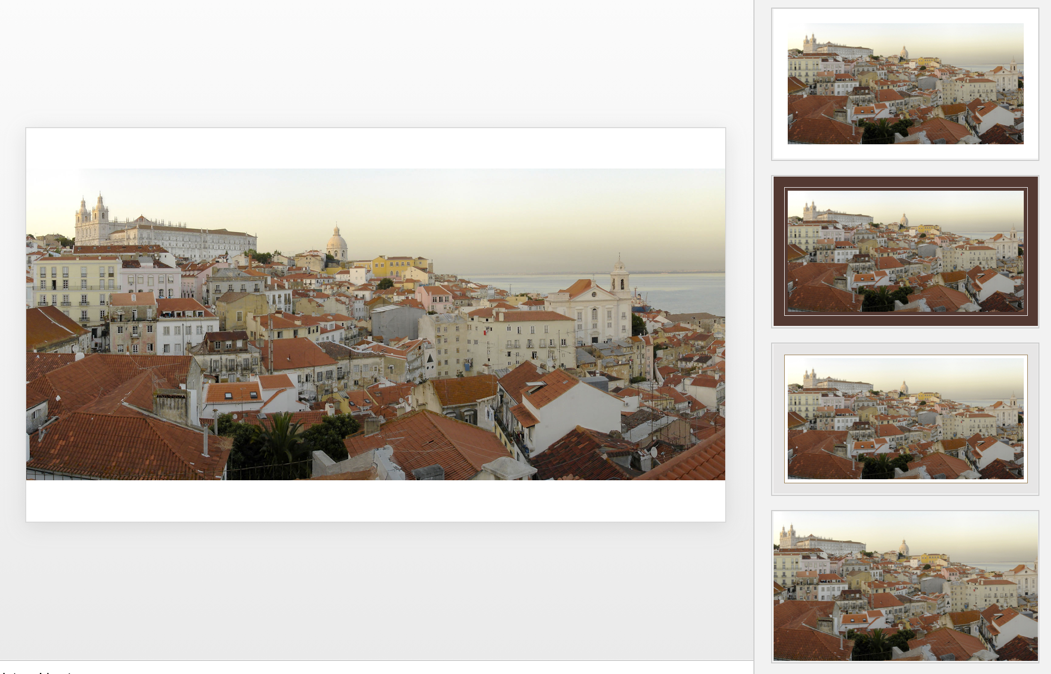
Microsoft has been adding a number of features to PowerPoint recently. One of them is Designer. In the Design tab of the ribbon, a new button appears on the right "Design Ideas". Clicking it generates alternative layouts of your slides on the right side of your screen.

The layouts are pretty nice. Microsoft has "automated" the design of 2 types of slides:

  • Image collages, multiple photos get put in different suggested grids, with place for a title
  • Process bullet points that can be translated to horizontally spaced out sequences of equally sized shapes.

Both are useful. Layman designers usually have no idea how to crop a nice photo collage, and translating that bullet list into a horizontal sequence looks nice, especially on wide 16:9 screen.

But here comes the but. 

  • The algorithm only works on these types of slides, so layman presentations will look inconsistent as same slides cannot be improved by the algorithm
  • And in case of the bullet transformation, PowerPoint needs to analyze the text with language processing, to decide that you are describing some kind of process. I had a hard time to trigger the algorithm, and in the end typed the exact same text as was used in Microsoft's explanation web post.

Microsoft is on the right path, these suggested layouts look a lot nicer than the SmartArt objects. And, getting layman designers to use some sort of grid is the biggest possible improvement you can create in slide design.

But I think it will take some time before language interpretation will be so sophisticated that PowerPoint understands the meaning of a slide and can pull a suggested layout from its library. That's one step above asking Siri to book a movie for you. 

Images get a nice suggested cropping

Images get a nice suggested cropping

Multiple images trigger multiple grid suggestions

Multiple images trigger multiple grid suggestions

No suggestion to clean up this grid

No suggestion to clean up this grid

No suggestions for these charts

No suggestions for these charts

Language interpretation concludes this is not a process

Language interpretation concludes this is not a process

This is a process, text taken from a Microsoft post

This is a process, text taken from a Microsoft post

(* Commercial start *)

This is why designed my presentation app SlideMagic with a forced grid structure, which is a fundamentally different interface approach from PowerPoint and Keynote, which are based on free placement and resizing of objects.

(* End of the commercial break *)

PowerPoint Designer is not 100% there yet, but from its look and feel and general creative direction you see that Microsoft is on the right path.


SlideMagic: a platform for magical presentations. Free student plan available. LEARN MORE
Backgrounds and introductions

Backgrounds and introductions

You got 30 minutes with a senior executive to present your case in a highly politically charged issue. Many people bring a very long deck that starts slowly, industry trends, backgrounds, history, until finally at 25 minutes we get to the real issue.

These type of presentations are not TED talks were we take the audience on an inspirational journey. Everyone in the room pretty much knows the background and history (if they did not, they could have read it the night before in your document), probably knows the arguments both sides are making.

Your 30 minutes is best spent showing why the combination of your arguments is the best one. You need to get the point early in your presentation, and have at least one slide that puts all the options, pros and cons on a page. Other slides in the presentation are backups for the points you are making.

Yes, that one slide can be busy, but it should not be unreadable. 

  • Keep sentences short, think of every word you are adding to the slide whether it is worth it or not
  • Group similar points into one overarching one
  • Spend very little slide real estate at no brainers to which both sides agree
  • Use colors, and layout to highlight the differences between the options
  • Project the slide over a white board if you can, so people can scribble and write on it

SlideMagic: a platform for magical presentations. Free student plan available. LEARN MORE
Editing Instagram photos

Editing Instagram photos

A quick post written on my iPad while enjoying my vacation here in beautiful Vietnam. I make a lot of Instagram snaps and here is the way I edit photos in the application. 

I do not use the pre-installed filters, they are random permutations of image adjustments that distort my photo too much. Instead I go in edit mode. 

The most important adjustment to any image is its composition: use zoom in/out, move left right, make sure the horizon is straight with the left most edit function. Then, on to brightness and contrast. Move the sliders and see whether your image improves or not. Next, highlights and shadows. That's it. 

You see the functions I don't touch: saturation, color overlays, structure, blur, etc. etc. 

SlideMagic: a platform for magical presentations. Free student plan available. LEARN MORE
Column titles

Column titles

I add them when they mean something. It is important to know whether the data is about 2015 or 2016 for example. On the other hand "description", "item", "option", "date", "comment", "scenario" etc. are not always necessary. See if you can do without them

SlideMagic: a platform for magical presentations. Free student plan available. LEARN MORE
Tone down the ambition

Tone down the ambition

Below is a professional print ad for Audi, trying to convince us that its heritage of cars is still present in today's models.

The concept is a very simple one. The way it is visualised is highly complex. To pull off something like the above requires a significant investment in a designer who knows what she is doing. Any attempt to DIY it will make your slide look amateurish.

But if you are not a global car brand with a million dollar advertising budget, you can still get that visual concept across.

  • A simple time line of cars
  • Overlapping circles with car images
  • Shapes around the current car with images of vintage cars

You can relax the ambition level of the type of visualisation you want to use. You cannot compromise on the professionalism of your slide.


Image from WikiPedia

SlideMagic: a platform for magical presentations. Free student plan available. LEARN MORE
Start with counting

Start with counting

The most fundamental feature of my presentation design app SlideMagic is the strict use of a grid to layout your slide. And there is a good reason for that.

Every slide I design start with counting. How many points. How many options. How many pro's and con's for each argument. How many years. How many competitors. How many types. How many team members. How many steps.

Even or odd number of items? If you end up with a nasty number (11, 13 for example), you find ways to combine 2 points, leave one of, split one up. 

Then think of shapes, which boxes are "long" (text), which boxes are square (images, icons), which boxes vary in text content, which are the same.

Then comes the thinking about layouts: 3x3 5x1, 1x4, 2x2?

Almost every slide has a table hiding in it.


Image from WikiPedia

SlideMagic: a platform for magical presentations. Free student plan available. LEARN MORE
More complicated slides

More complicated slides

For some reason, I find myself designing more complicated, busy slides recently. Busy does not mean more text and bullet points. Busy means showing complex arguments in diagrams: boxes that overlap, are interwoven, move from one into the next.

My guess there are a number of potential reasons:

  1. My presentations are mostly investor decks, and the most important use of my slides is actually the moment when the recipient opens and reads them on the computer. The standup presentation that follows (if the first screening was successful), is almost a formality in terms of slide content, it is more about having the opportunity to get the know the people behind the slides.
  2. Misuse of cliche stock images or forced visual analogies have started to make people tired of certain big picture slides. "Oh, it's going to be this type of presentation, let's page down to the meat quickly".
  3. Larger, and higher resolution screens create a temptation to design more complicated slides (thinner fonts, thinner lines, more subtle colour shadings). Today, these slides even look great on a retina iPad. (Old crappy VGA projects are a different story though).
  4. Big, page filling image slides, are actually not that hard to make and this might be a segment of work that gets done more and more in-house.

So, not a return to crammed bullet points, but diagrams lifted to a higher level.


SlideMagic: a platform for magical presentations. Free student plan available. LEARN MORE
How do you do it?

How do you do it?

A question I often get after a very simple make over of a slide. Answer:

  • Make boxes the same size
  • Line everything up in a grid
  • Cut excess filler words and passive verbs
  • Us one accent colour
  • Harmonize fonts
  • Reset image aspect ratios
  • Fit everything inside a frame with white space around it

"You make it sound so simple, but it is not.". It actually is. If you struggle doing it in PowerPoint, use SlideMagic, my presentation app.

SlideMagic: a platform for magical presentations. Free student plan available. LEARN MORE
One visual concept

One visual concept

I like to use one single visual concept as much as I can in a presentation. Two by two matrices, graphs, frameworks, they all require time to absorb by an audience. If you have to through in a new one on every single page, things can get pretty tiring. Management consultants tend to do this, and forget that the audience did not spend 3 months on the project but is hearing the story for the first time.

Luckily common issues in a presentation are often related:

  • Why is something difficult to do  (problem)
  • What is your solution
  • Why is the competition different

If you can fit all of this in a variant of the same diagram, you will save the audience a lot of time.


Art: Robert Antoine Pichon, Le Pont Aux Anglais, 1905

SlideMagic: a platform for magical presentations. Free student plan available. LEARN MORE
Netflix on its movie icons

Netflix on its movie icons

Some interesting reading here by Netflix who analysed how effective icons/tiles of its movies and TV shows were. 

SlideMagic: a platform for magical presentations. Free student plan available. LEARN MORE
Layout puzzles

Layout puzzles

Not every presentation slide is about finding the right image. In my work, I encounter a lot of "layout puzzles": tables or diagrams of boxes that need to convey complex trade-offs and relationships. The challenge is to convey the message simply, without making things too simplistic.

Here are some of the steps I go through:

  • Group things together, split things up until I get to table rows/columns or boxes that are more or less on the same level of importance
  • Edit down text to get clear box/row/column labels that are as short as possible, or when short is not an option, each have about the same amount of words (the number of lines covered is very relevant in typography)
  • Enforce some sort of grid to the page. Each box/column/row should have the same size, or span a multiple of grid elements. (In my presentation app SlideMagic it is not possible to violate this principle)
  • Swap rows and columns so that similar items end up next to each other. Re-arrange boxes in the diagram so that connected boxes are close and connecting lines do not cross.
  • At the final stage, add colour to make visual groupings that you could not create with physical proximity or connecting lines.

This might sound like tedious work, but the end result is often a diagram that forms the backbone of your entire presentation.


Image from WikiPedia

SlideMagic: a platform for magical presentations. Free student plan available. LEARN MORE
Presentation design without the design

Presentation design without the design

Most business presentations can be done perfectly without sophisticated and complex visual concepts. That image of an elephant balancing on a ball, or a 3 dimensional constellation of rotating database cylinders might not be necessary to get your point across.

Instead focus on the non-design challenges:

  • Finding nice full page images that can introduce the problem you are trying to solve
  • Recutting, regrouping, re-wording the key problems and your solution in a very clear and crisp table
  • Deciding what are the key statistics and data you want to use to show that your solution works and that the company is having momentum
  • Organising the more "boring" facts about your product/company in some decent looking tables in the back of the deck (team, product offering, pipeline, terms, etc.)

Full page images, tables, and simple graphs, that's all  you need (and all you will find in my presentation app SlideMagic). Doing more complicated things is more risky:

  • A perfectly executed simple slide looks a lot better than an amateurish looking effort at something that is more than you can pull of.
  • You can hire an expensive graphics designer to do the concept for your, but her style will be dramatically different from the slides you want to add yourself to the deck last minute

Keep it simple, and do that really well.

SlideMagic: a platform for magical presentations. Free student plan available. LEARN MORE
But it looks so simple!

But it looks so simple!

Often when I produce a slide with simple rectangular boxes and just once accent colour plus a black and white image (hey that looks like a SlideMagic slide), I get the comment that "things look really simple, unsophisticated".

No icons, no shadings, Helvetica, no drop shadows, no rounded corners, no gradients, no nothing.

Here is the trick: it is the composition of the slide that makes things sophisticated. And that is the hard part to get right. Look at the work of the famous Swiss graphics designers of the 1960s. Most of them designed posters with the very same tools that you have in your hands when opening PowerPoint.

Look some of the simpler posters, look at your slide, look back at the poster, look at your slide. Spot the difference, and fix it!. It is layout, not fancy graphics.

And, my presentation app SlideMagic makes it a bit easier than PowerPoint or Keynote.

SlideMagic: a platform for magical presentations. Free student plan available. LEARN MORE
A business card web site

A business card web site

I made a brief side step into web design last week, when a VC fund for which I created the fund raising presentation needed a web presence as well.

This fund (like many other businesses), needed a simple "business card", a decent, professional-looking web presence that works on all types of browsing devices. It was not trying to sell a product to consumers, it was not giving access to a content library, it was not powering a market place. 

Many of these business card web sites look poor:

  • People pick the wrong platform. A template that offers too many features, that can only be maintained by a web developer.
  • People let the design be driven by the menu structure that the template offers, rather than the content
  • People enthusiastically create active content sections (blog, news, links to social media pages) that then are not maintained.

For business card web sites, keep things very simple, but over-invest in the design of the web site. And design does not mean spectacular effects, video, and clever popups. Does the page look balanced and good (on both large and small screens). Pretty much like you would design paper/print work.


SlideMagic: a platform for magical presentations. Free student plan available. LEARN MORE
Ponder charts

Ponder charts

Not every PowerPoint slide is meant for presentations to a big audience. Some charts are meant for pondering behind a big screen. The one below is an example (made by FirstMark Capital).

Venture capitalists love these industry overviews full of logos and sectors. You could make this chart cleaner:

  • Replace logos with small text boxes
  • Perfectly line up all these tiny text boxes in a grid
  • Replace the rounded-corner shapes with shaded rectangles without a framing line

But that chart would be less fund to ponder....

SlideMagic: a platform for magical presentations. Free student plan available. LEARN MORE
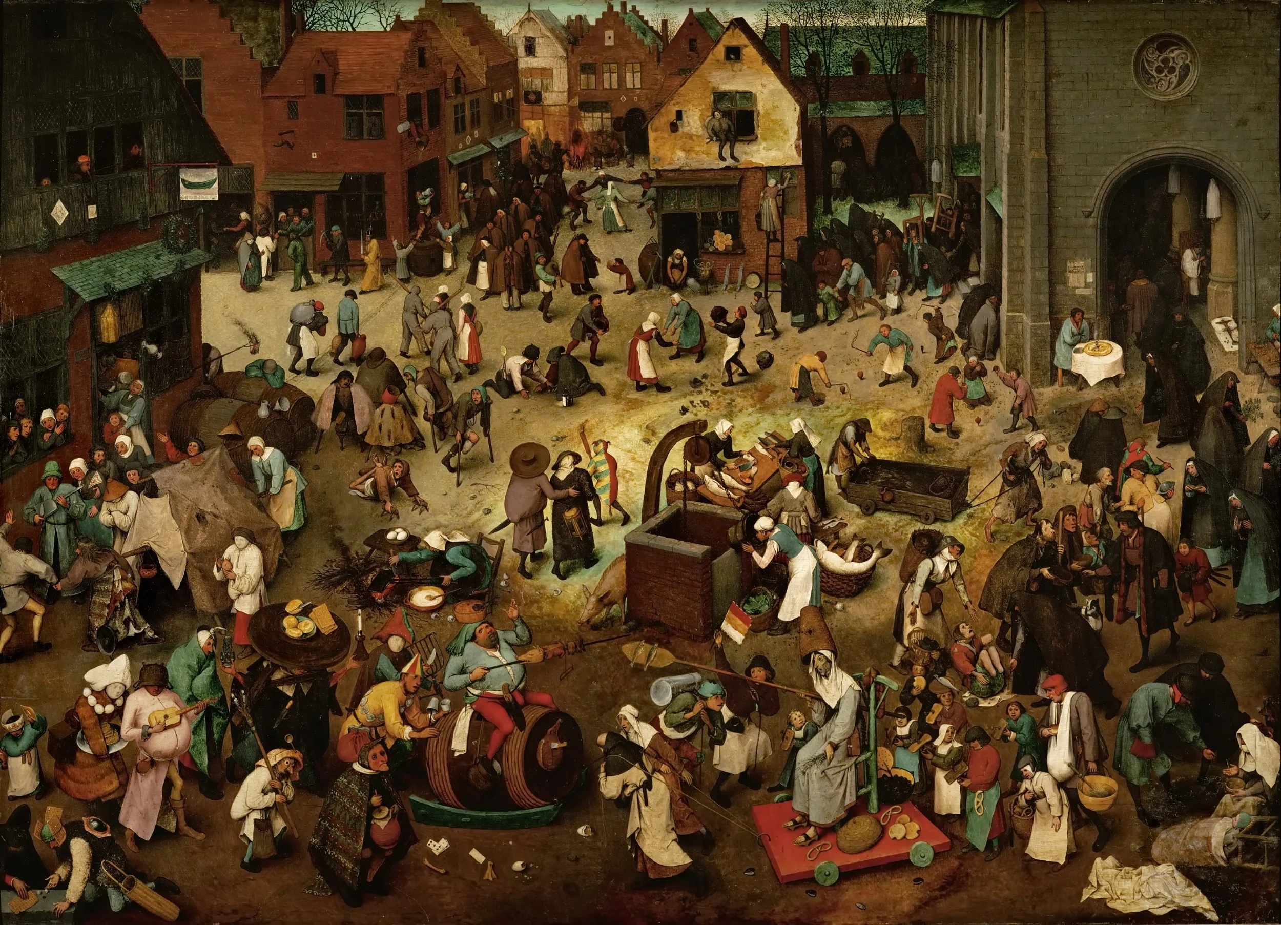
If things are busy, make a busy chart

If things are busy, make a busy chart

Chart loaded with detail are usually not the best way to convey a message. Except, when your message is that things are actually very busy, complex, interrelated. Then by all means make a busy chart. When presenting, don't feel tempted to go into the detail of its content though, the message stays "things are busy" and [click] you can go on to the next chart.


Art: The Fight Between Carnival and Lent, by Pieter Bruegel the Elder in 1559

SlideMagic: a platform for magical presentations. Free student plan available. LEARN MORE
We say, but we don't do

We say, but we don't do

Many people start of a presentation design project with "we want a presentation like Apple". A great intention. But after you come back with a first version (black background, a few words per slide, no bullets, no agenda pages, no summaries, no logo, no page numbers), people feel that it looks too dark, the flow is not clear, they want to summarise upfront what they are going to say, it is hard to refer to pages, it needs some branding, and to make sure that a certain point comes across, you better spell it out word for word on the slide.


Image by Danny Lion

SlideMagic: a platform for magical presentations. Free student plan available. LEARN MORE
A new way to organise my presentation templates

A new way to organise my presentation templates

I am experimenting with a new way to organise SlideMagic presentation templates and started adding them to www.slidemagic.com/templates. I will be adding more over the coming days. Please let me know if you have request for specific slide concepts I should add and I will see whether I can help you.


SlideMagic: a platform for magical presentations. Free student plan available. LEARN MORE