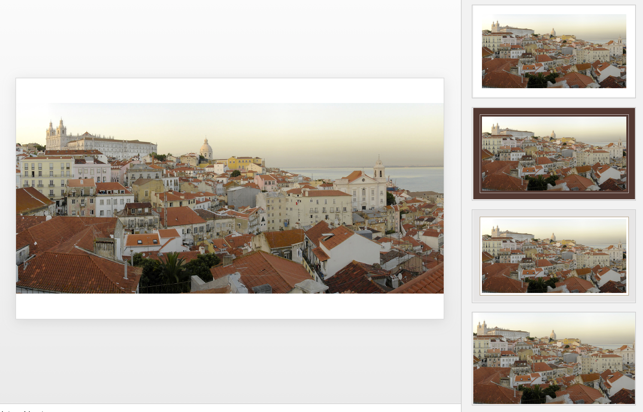
Microsoft has been adding a number of features to PowerPoint recently. One of them is Designer. In the Design tab of the ribbon, a new button appears on the right "Design Ideas". Clicking it generates alternative layouts of your slides on the right side of your screen.
The layouts are pretty nice. Microsoft has "automated" the design of 2 types of slides:
- Image collages, multiple photos get put in different suggested grids, with place for a title
- Process bullet points that can be translated to horizontally spaced out sequences of equally sized shapes.
Both are useful. Layman designers usually have no idea how to crop a nice photo collage, and translating that bullet list into a horizontal sequence looks nice, especially on wide 16:9 screen.
But here comes the but.
- The algorithm only works on these types of slides, so layman presentations will look inconsistent as same slides cannot be improved by the algorithm
- And in case of the bullet transformation, PowerPoint needs to analyze the text with language processing, to decide that you are describing some kind of process. I had a hard time to trigger the algorithm, and in the end typed the exact same text as was used in Microsoft's explanation web post.
Microsoft is on the right path, these suggested layouts look a lot nicer than the SmartArt objects. And, getting layman designers to use some sort of grid is the biggest possible improvement you can create in slide design.
But I think it will take some time before language interpretation will be so sophisticated that PowerPoint understands the meaning of a slide and can pull a suggested layout from its library. That's one step above asking Siri to book a movie for you.
Images get a nice suggested cropping
Multiple images trigger multiple grid suggestions
No suggestion to clean up this grid
No suggestions for these charts
Language interpretation concludes this is not a process
This is a process, text taken from a Microsoft post
(* Commercial start *)
This is why designed my presentation app SlideMagic with a forced grid structure, which is a fundamentally different interface approach from PowerPoint and Keynote, which are based on free placement and resizing of objects.
(* End of the commercial break *)
PowerPoint Designer is not 100% there yet, but from its look and feel and general creative direction you see that Microsoft is on the right path.


