Viewing entries in
SlideMagic

Presentations on mobile devices - taking stock

Presentations on mobile devices - taking stock

Five years after the iPad launch let's take a step back and see what is actually happening in the world of presentation software and the use of mobile devices. My observations are based on the people I see around me everyday: startup employees (mostly mid 30s to 40s) and staff in big corporates (a bit older).

  • Designing. Apple has made a big inroad in terms of hardware, but it is still PowerPoint that runs on a laptop machine that is the preferred set up to create slides. I have not encountered anyone who uses a mobile device to do this. Apple Keynote is pretty much still a niche application.
  • Frankensteining / finding stuff. Cloud-based file systems can be confusing to use. I still do not understand exactly what happens when Keynote on iPad tells me it is converting a regular Keynote file. In practice, the file system that everyone is using is.... the email inbox and sent box. People with gmail can find stuff faster than Outlook users.
  • Viewing. Yes, more and more, people use their mobile devices to view a presentation. And it is not the iPad, a tablet, it is the mobile phone, where people squint to see what is in the slides. These are investors looking at a pitch deck, these are managers/superiors proving input on a slide. Think about it, this might be a more important audience for your slides than the ones sitting in conference room.
  • Emergency edits. Still laptop, although a tablet could work here, few people use it in a corporate setting.
  • Coffee chat, 1 on 1. Mostly laptop, I see fewer iPad/tablets than I saw 1-2 years ago.
  • Conference room. Laptop. The crappy VGA projector is being replaced by crappy LCD screens. Presentations that look beautiful on your retina display, look absolutely horrible on an LCD screen with poor resolution and overly bright settings. (Test, test, test). Advanced meeting rooms now allow you to airplay your presentations into the screen. People use their laptops to do this, not their mobile devices.
  • Big keynote. Conference laptop with a memory stick plugged in.

So what is really changing? People are viewing decks on mobile phones, especially busy people that might not be overly motivated to see your pitch (investors in round 0 of the due diligence process for example).

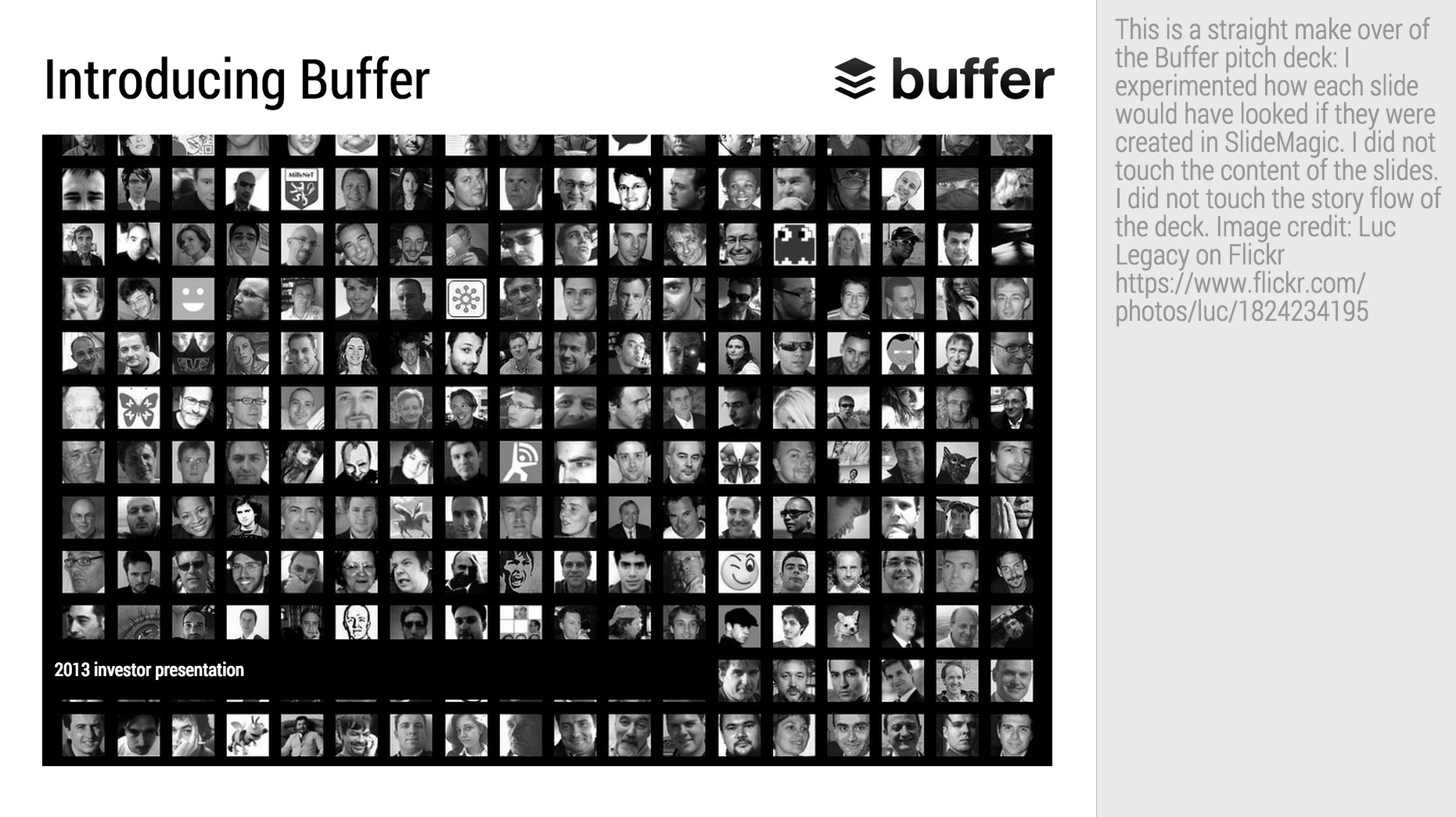
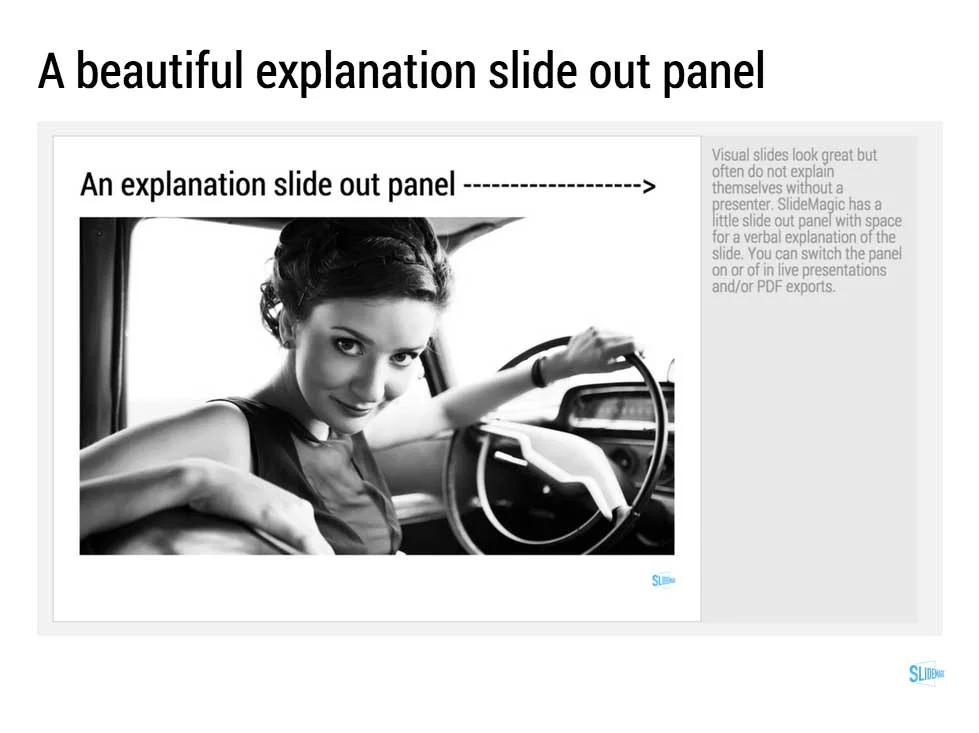
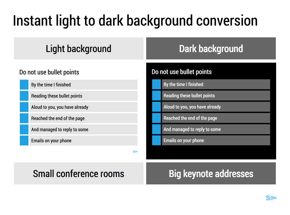
Presentation gurus like me used to discourage dense bullet points because you can't (too small) and don't want (too boring) to read them in the back row. Now it is a bit more subtle. You can't read small text on a mobile screen. But, more and more desks are read without a presenter being present and you actually need some text to explain things properly.

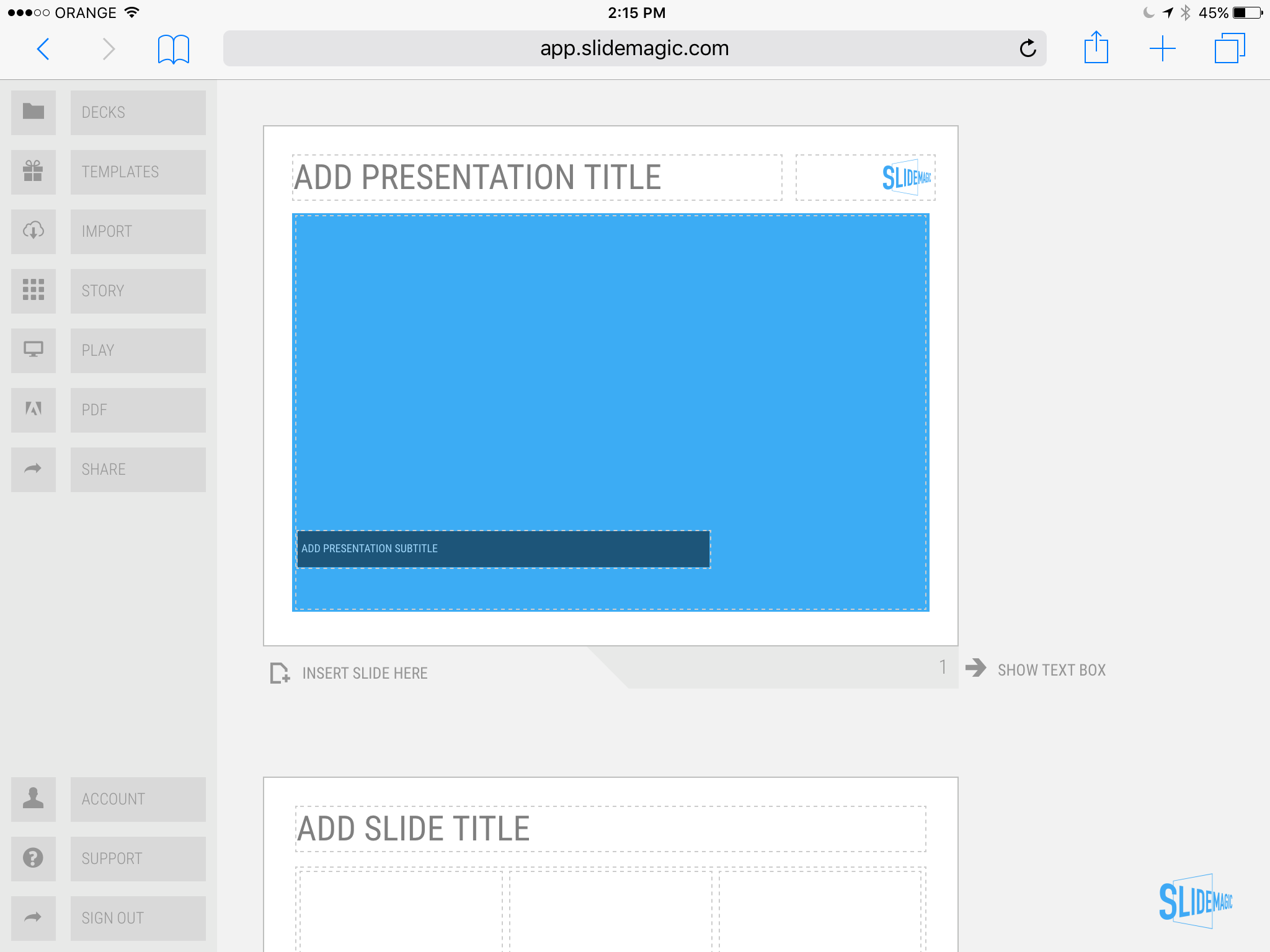
In SlideMagic, I encourage big, bold, but extremely simple designs (that will come through nicely on a mobile device), plus I left space on the side for a regular explanation paragraph.
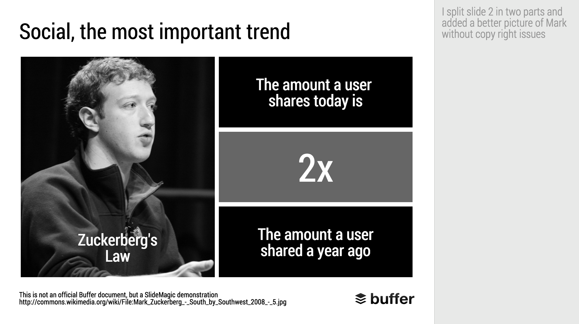

Image on WikiPedia


SlideMagic: a platform for magical presentations. Free student plan available. LEARN MORE
SlideMagic on iPad

SlideMagic on iPad

I have never been a big believer in focussed and productive presentation design on tablets, but presenting documents (mostly in 1-on-1 meetings) and making last minutes edits are important on mobile devices.

We are not making tablets a design priority, but have deployed some changes to the code that makes SlideMagic run pretty smoothly on an iPad (iPhone is still not optimal). Try it out and report back any bugs. Android tablet users, let me know what happens (I have not tried things out there yet).

With the large iPad Pro coming out later this year, there could be a brighter future for SlideMagic on iPad given the very simple menu structure we use.

Screen shot of SlideMagic on my iPad Mini 2

Screen shot of SlideMagic on my iPad Mini 2

SlideMagic: a platform for magical presentations. Free student plan available. LEARN MORE
Thoughts on user interfaces

Thoughts on user interfaces

As I am making progress with my presentation design app SlideMagic, I spend a lot of time thinking about user interfaces (UI) for office applications.

Part of the reason that it is so hard to wean people of Microsoft Office applications is that they have gotten used to the mouse/click/dropdown user interface. Spreadsheets, word processors (who uses them still?) and presentation design software all basically have that same UI.

The drop down UI started out pretty simple. File, edit, help menus. Over the years ribbons and tool bars have complicated things. Most people now use a fraction of the functionality that is available to them. As soon as a program does not have that familiar dropdown UI, people are in trouble. I had a hard time understanding the new Adobe Acrobat UI. It is beautifully simple, but it takes time to figure out how to do very basic operations (zooming in and out, combining multiple files into one, rotating mixed up pages of a scan).

Over the past years, user have gotten to know a second UI: the mobile device. The solution for office apps is super simple functionality that draws heavily on icons, UI elements that we have learned from mobile devices.

See how it can work in SlideMagic.

SlideMagic: a platform for magical presentations. Free student plan available. LEARN MORE
Facebook is a bad way to read this blog

Facebook is a bad way to read this blog

If you are following this blog through facebook, there is a big change that you will have missed many posts. Since I am investing my funds in SlideMagic features and not yet in marketing, I cannot afford to buy facebook ads. The best way to follow the blog is via a good old RSS or email subscription. You can add yourself to the list here: subscribe.

That email list is purely for blog updates, only people who opted in for SlideMagic product updates after registering for the app might get the occasional product update email.


Art: Vincent van Gogh, Postman Joseph Roulin, 1889

SlideMagic: a platform for magical presentations. Free student plan available. LEARN MORE
SlideMagic versus PowerPoint

SlideMagic versus PowerPoint

Some interesting feedback from SlideMagic beta testers:

  • I promised some SlideMagic beta testers to convert the presentation to PowerPoint in the end (there is not yet an automated feature that does that), and it is encouraging to see that these users are postponing that conversion again and again. 
  • For some clients I quickly re-do a short presentation in SlideMagic. Client response: the SlideMagic one looks better, why can't you do that in PowerPoint? Answer 1): SlideMagic uses a pretty font, not Arial, and 2) the corporate PowerPoint template has a slightly less elegant composition of the slide (position of titles, margins etc.)
  • Some clients want the templates that ship with SlideMagic in PowerPoint. After sending them, there are issues with modifying the template in PowerPoint, adjustments that take a second in SlideMagic
  • Some users ask where you can upload PowerPoint slides to convert them instantly to SlideMagic, that will not be possible I am afraid.

Most users are hesitant to switch because 1) it requires changing 20 years of presentation design habits, and 2) yes I admit, SlideMagic had a few bugs that need sorting out. As we make progress with the app, that second excuse becomes less relevant. SlideMagic is slowly reaching the production release.

If you have not tried SlideMagic, you should, Try it here.


SlideMagic: a platform for magical presentations. Free student plan available. LEARN MORE
Columns versus rows and other table design issues

Columns versus rows and other table design issues

When making a table, what to put in columns, what to put in rows? There is no absolute rule here, but this is what I consider when deciding (some of these can contradict each other).

  • It easier to fit lots of rows then lots of columns.
  • Long labels go in rows
  • Year on year trend: years go in columns
  • Feature/competitor comparison: features in the rows

The most important things is that you never should assume that the layout in which the source data was presented to you is the best way to put that table on a slide. Next to swapping rows and columns consider:

  • Shortening column labels
  • Re-sorting rows and columns so that check marks / similar table content is grouped together
  • Group together multiple rows, or multiple columns if their content is the same as the neighbour
  • Cut text as much as you can in table cells. Side comments and sentences can go in the footnote
  • Design a table at 2 levels: Level 1 (using colouring of cells) to communicate the pattern/conclusion, level 2 (using text) the explanation of the colouring for when people read the slides after the presentation
  • Harmonise column widths and row heights to get a grid pattern that is as calm as possible
  • Avoid boxes/outline lines, rather work with light grey boxes

Users of my presentation design app SlideMagic do not have to worry about a lot of these things, the app will do it form them. 


Art: Mondrian dresses by Yves Saint Laurent shown with a Mondrian painting in 1966.

SlideMagic: a platform for magical presentations. Free student plan available. LEARN MORE
New SlideMagic video tutorials

New SlideMagic video tutorials

I am in the process of creating a library of video tutorials for SlideMagic. Here are the first three, you can expand them to full screen size for more detail.


From the 3x3 grid to a basic slide composition


How to clone a template


How to import individual slides from another presentation/template


Art: William Merritt Chase, A Friendly Call, 1895.

SlideMagic: a platform for magical presentations. Free student plan available. LEARN MORE
Adding structure to text

Adding structure to text

Sentences or titles never have the same length, so putting them on a page without some form of framing makes the whole slide look unbalanced. My solution: a light grey background  creates a box that gives structure to the text. You can also use images to reinforce the slide's grid layout. Many people use an outline, a frame around text for the same purpose. I think a light box fill looks a lot better.  

The light grey box is one of the key structuring elements in my presentation design app SlideMagic. Traditional presentation design software is not very well set up to changing grids of text boxes and images. Try doing it in PowerPoint, then try to do the same thing in SlideMagic.


Art: Piet Mondriaan, Broadway Boogie Woogie, 1942

SlideMagic: a platform for magical presentations. Free student plan available. LEARN MORE
Makeover of the Buffer pitch deck that landed them $500k

Makeover of the Buffer pitch deck that landed them $500k

When Googling for examples of VC pitch decks, the on that Buffer used to raise $500k in 2013 ranks high. I decided to give it the SlideMagic treatment: how would the deck have looked when the slides would have been created in SlideMagic.

  • I changed the slide design to fit SlideMagic
  • I did not change the slide content
  • I did not change the story flow

I have a few comments on the slides that I have put in the SlideMagic explanation boxes.

Here is the original:

Here is the same deck in SlideMagic. You can clone this presentation to your own SlideMagic account by clicking this link and use some of the slide concepts in your own presentations. I have also added this presentation as a template in SlideMagic's template library.


Art: Johann Zoffany paints a group of Englishmen in Rome for the Grand Tour, united only by their wealth and love of art; unlike most conversation pieces, this was not a commissioned work


SlideMagic: a platform for magical presentations. Free student plan available. LEARN MORE
SlideMagic bugs fixed

SlideMagic bugs fixed

Presentation software needs to be absolutely bug free. Unlike a social media mobile app, where you can wait with grazing your news feed for a few hours, the presentation app needs to be ready for that critical 20 minute slot for the all-or-nothing presentation.

That is the reason I am keeping SlideMagic still in beta as I iron out all possible glitches. Here are some we fixed recently. If one of these caused you to stop using the app, give it another try.

  • Fixed: small (but annoying) differences in font size rendering between what you see in PDF and what you see on screen, causing words to drop to the next line when you don't want them to.
  • Fixed: erratic font size behaviour when rapidly increasing or decreasing font sizes
  • Fixed: enabling multi-edit of cells to manage colours, font sizes of more than one cell in one go.
  • Fixed: no need to leave and re-enter the shape format menu to work on another cell
  • Fixed: Windows/Firefox UI freezes
  • Fixed: story mode drag and drop issues

SlideMagic is moving closer to production stability.

B.t.w, I updated the SlideMagic marketing site yesterday, making the positioning plain and simple: it is easy to make business presentations. Easy, that's it. Also made the images a bit more daring.


Art: Scène d'été, or Summer Scene, is an oil on canvas painting by Frédéric Bazille, completed in 1869

SlideMagic: a platform for magical presentations. Free student plan available. LEARN MORE
SlideMagic example

SlideMagic example

Ramzi Mrad is entrepreneur in residence at INSEAD and used SlideMagic prepare his presentation of business case: how Roche Pharmaceuticals set the price for its Avastin cancer drug in Europe. This type of presentation is exactly how I envisioned SlideMagic being used. Without any professional support, a layman designer can come up with something pretty decent. You can see his presentation here.


Art: Pierre-Denis Martin (1663–1742), Vue du Château de Fontainebleau (1718-1723)


SlideMagic: a platform for magical presentations. Free student plan available. LEARN MORE
Dumbing down

Dumbing down

Seth Godin believes that:

I have been thinking about this a lot, since it applies to the core idea behind SlideMagic: making a simpler presentation design tool. Usually, Seth is right, and he urges people not to avoid the inevitable critical feedback.

So, I am a dumbing down PowerPoint? I do not think so. These are two different things:

  1. Get people to adopt a different approach to presentation design
  2. Get people to use a different tool, but continue to follow their current presentation design habits

I try to do 1, and the SlideMagic tool supports the approach.

  • SlideMagic is a new corporate visual presentation language
  • It always looks aesthetically pleasing
  • 90% of your time can be spend on your idea, 10% on jotting it down at a computer

So I think I am "smarting down" business presentation design. But hey, maybe I am biased and do not see things as they really are... 


Art: British war time propaganda poster

SlideMagic: a platform for magical presentations. Free student plan available. LEARN MORE
"All presentations will look the same"

"All presentations will look the same"

I get this feedback from early SlideMagic beta testers. SlideMagic supports one accent colour, one font, and encourages you to work in a strict slide layout grid. For certain presentations, this feedback is valid. I think we will not see any Apple product launch presentations designed in SlideMagic (yet).

For 99% of presentations though, it is actually precisely what I tried to achieve:

  • When the software tool you use for presentations is incredibly simple, you spend most of your time worrying about the content rather than searching support web sites how to align the second line of a bullet point paragraph. I want 90% of SlideMagic users to master 100% of its features.
  • If all presentations use more or less the same visual concepts to show trade offs, contrasts, sales over time, etc. then people will be able to read and understand them quicker

Today, I would argue that PowerPoint presentations look more similar to each other than the SlideMagic decks: lists of bullet points on a white background using the standard Microsoft Office (olive, blue, red, green) colour scheme.

Below are examples how the same SlideMagic chart would look when used in different companies. You see the impact of consistent use of colours. All SlideMagic charts will be updated instantly after a colour and logo change.

Screenshot 2015-04-30 11.25.00.png

If you want to try SlideMagic for yourself, you can sign up here as a beta user.


Art: Salomon de Bray, The Twins Clara and Aelbert de Bray, 1646

SlideMagic: a platform for magical presentations. Free student plan available. LEARN MORE
Send me your template requests

Send me your template requests

Presentation templates in SlideMagic have 3 big advantages:

  1. They are very easy to customise: adding rows, columns, boxes can be done without destroying the slide layout. Colours and fonts are adjusted instantly, so templates look never out of place with the rest of your slides
  2. You get them straight from a professional presentation designer
  3. New templates and updates get pushed instantly to all SlideMagic users

I want to add more templates.

Let me know what templates, concepts, you need. Put requests in the comments are send them to me at [email protected]. You can even send me PowerPoint slides if you want. If you have not done so, I will strip the slides of company specific information before publishing them in the SlideMagic template library.


Art: Henri Toulouse-Lautrec, Sescau photographe, 1896

SlideMagic: a platform for magical presentations. Free student plan available. LEARN MORE
Be less busy with presentations

Be less busy with presentations

This memo that was sent to the team behind Slack before its preview release resonated with me. 

We are unlikely to be able to sell “a group chat system” very well: there are just not enough people shopping for group chat system (and, as pointed out elsewhere, our current fax machine works fine).

I love the "be less busy" tag line of Slack. I love the stress relief that search provides in Slack (you can always find things if you have to). 

The more I think about it, SlideMagic might actually not an alternative to PowerPoint, it is a broader concept of change in how people in enterprises should communicate, and how they spend their time preparing for this communication. My tool enables this, but it is not the main thing of what it is all about.

SlideMagic enables you:

  • To be less busy with meetings: you can have short, to the point meetings where ideas can be communicated clearly, and decisions can be taken quickly. Documents are simple and clear, and more or less standardised. It becomes a very efficient corporate language.
  • To be less busy with preparing for meetings, Most of the time will go into forming your idea. Once you have your idea, it only should take an hour or so to jot it down in beautiful slides. And a powerful keyword search function across all your slides ensures that you will never have to do double work, rework slides.
  • To lift the spirits of a company by eliminating poor design. Employees work better in a beautiful office. Seeing depressing dense bullet point presentations on every screen, on every printer, on every fax machine, on every projector, in every email inbox, does not add to employee morale.

Now I need to rework somehow in the SlideMagic marketing web site. You do not have to wait for this, you can sign up for SlideMagic right now to be less busy with presentations.


Art: Portrait of an unknown woman, Ivan Kramskoi, 1883

SlideMagic: a platform for magical presentations. Free student plan available. LEARN MORE
Little productivity hacks in SlideMagic

Little productivity hacks in SlideMagic

Recently, I have focussed most of the development work for SlideMagic on improving the workflow. It is the small differences that can make a big difference. Here are two features that you might not have discovered yet:

You can select multiple boxes and edit their design (colours, font size, etc.) at the same time. Great for creating tables quickly or clean up inconsistent font sizes.

In the shape change menu you can tackle multiple shapes in one go. Click another shape and you can adjust its perimeter as well without leaving and re-entering the menu.

You can give SlideMagic a try yourself, the beta version is free to use. Sign up here.


Art: Rabbits by Johann Georg Seitz, subscribe to this blog, follow on Twitter

SlideMagic: a platform for magical presentations. Free student plan available. LEARN MORE
New PowerPoint 2016 for Mac can beat Keynote

New PowerPoint 2016 for Mac can beat Keynote

The preview of the new Microsoft Office 2016 is out (finally) and I have installed it on my production machine letting it do all my presentation design work for clients. (You can download the Office 2016 preview here)

  • It looks beautiful. PowerPoint 2016 for Mac looks exactly the same as PowerPoint 2013 for Windows. A calm flat user interface. Working in a beautiful software environment always encourages you to create beautiful presentations.
  • The whole interface feels faster, snappier, and smoother, somehow. This is especially true for Excel. The current version of Excel for Mac has a highly annoying latency when entering data in cells. 
  • Subtle changes to the default colours and fonts. Gone are the boring olive greens of the old PowerPoint colour scheme. Calibri light looks great on Retina displays. Gone are the default gradients and drop shadows. Gone are the tick marks in data charts.
  • The commenting infrastructure is nice for collaboration with other people
  • Full integration with OneDrive cloud storage (if Microsoft has guts they should add Dropbox as well, and maybe even Google Drive).
  • Now PowerPoint gives suggested snap lines to place objects, automatically distributing and aligning things on your screen. 
  • The grid behaves more normal with a centimeter ruler. If you accidentally move a grid line (yes, this still happens) it is easy to move it back to the right position. 
  • Now text and shape backgrounds have the exact same colour rendering, an annoying bug in PowerPoint 2011, where despite selecting the same RGB value, colours on text and shapes would render differently.

There are a few important things that are missing:

  • The ability to customise the toolbar at the top (here is where I put my align and distribute buttons for example) (this was possible in PowerPoint 2011)
  • It is still not possible to embed fonts with a presentation saved in PowerPoint for Mac (it works on the Windows version)

I think PowerPoint 2016 is so good that it has gained the edge over Apple Keynote. Recent user interface changes in Keynote have made the workflow a bit slower. You need to navigate around too many menus to do basic things such as colour changes. Keynote looks nice and clean, but this organised UI comes at the expense of usability.

But before PowerPoint can take the trophy, some bugs that are still in the preview need to be ironed out. I am confident that Microsoft will be able to do this over the next few months until the official release. Here wo go:

  • Font rendering: The software UI looks clean and crisp, but the presentation fonts look a bit fuzzy. In Excel, there is an inconsistency of fonts across the spreadsheet. It looks fine towards the top and bottom of the screen, but not in the middle. 
 
Fuzzy fonts on the slide (not in the software user interface)
 
Screenshot 2015-03-12 09.59.56.png
  • The colour picking is not completely fool proof, especially when you want to use it define new theme colours for your presentation
  • There are frequent crashes, save your work
  • Font variations to not come through as in PowerPoint 2011. For the Apple Helvetica font, the bold condensed variant does not pop up for example

But hey, you are developing a PowerPoint killer?

Correct (and therefore my review is biased), I think that PowerPoint and Keynote have too many features, and leave too much design freedom to a layman designer. The result: boring bullet point presentations. My presentation app SlideMagic is trying to address these issues. But that is a separate discussion.

UPDATE: This post was corrected, shape booleans are still present in PowerPoint 2016


Art: Claude Monet, Rouen Cathedral, Facade (sunset), harmonie in gold and blue 1892-1894 Musée Marmottan Monet Paris, France. Sign up for SlideMagic, subscribe to this blog, follow me on Twitter

SlideMagic: a platform for magical presentations. Free student plan available. LEARN MORE
SlideMagic is in public beta, anyone can sign up

SlideMagic is in public beta, anyone can sign up

Two years after having the first idea about creating a PowerPoint alternative from scratch, I now have taken the invite wall down on presentation software SlideMagic. Anyone can now sign up for the beta version.

Here is how to get hooked:

  1. Go to the "templates" tab and clone one of the template presentations to start
  2. Customise your own accent colour and logo
  3. Go all the way to the end (beyond playing around) and create one real presentation for your next meeting. It can be a short presentation. It can be low-risk presentation.

Step 3 is the important one. You will see how incredibly easy it is to create a presentation, especially when you think you should go back to PowerPoint for your next presentation.

Let me know your thoughts and share SlideMagic with like minded people who you think might enjoy it as well.


Art: Claude Monet, La rue Montorgueil à Paris. Fête du 30 juin 1878. Subscribe to this blog. Follow me on Twitter. Sign up for SlideMagic

SlideMagic: a platform for magical presentations. Free student plan available. LEARN MORE
Why SlideMagic is different

Why SlideMagic is different

I created a quick presentation (hey, in SlideMagic) that highlights some of the features I have put inside that you will not get in other presentation design apps. Some of them you will never find there (even if people try to copy them) because of the fundamentally different way SlideMagic works. Less designer freedom and more uniformity allows you to do great things!

  • Keyword search across all your slides, no more opening and closing files
  • Image-based search: "get me all the slides that contain this image"
  • Explanation slide-out drawer to turn an abstract visual presentation that needs verbal explanation into a document that you can email.
  • A strictly enforced grid that makes sure everything is always lined up and distributed properly. And the most tricky part: that includes the columns and bars of data charts as well.
  • Instant conversion from a light to a dark background and back (switch between a conference room and a keynote hall setting)
  • And, a template bank that is constantly updated by a McKinsey/Idea Transplant designer!

Give SlideMagic a try yourself, you can request an invite here.


Art: Albert Gleizes, 1912, Les Baigneuses, oil on canvas, 105 x 171 cm, Musée d'Art Moderne de la Ville de Paris. Published in Du "Cubisme"
Subscribe to this blog, follow me on Twitter

SlideMagic: a platform for magical presentations. Free student plan available. LEARN MORE
The final clean up

The final clean up

Some things to check once you think you have finished your presentation:

  • Are the fonts consistent throughout the presentation? Are have default Arials/Calibris managed to sneak in? 
  • Are font sizes in comparable boxes the same?
  • Are the headlines all in the same place on every slide?
  • Are objects in each slide aligned, and properly distributed?
  • Are the proper colours used on every slide, including data charts, or do you still see standard PowerPoint colours anywhere?
  • Are all images in the proper aspect ratio, without distortion?
  • Did you include an attribution to creative common images?
  • In case you will be displaying the presentation on another computer, have you checked Windows/Mac rendering issues? Sometimes fonts are rendered in slightly different sizes, causing words to drop to the second line.
  • Is data properly rounded up?

Now you see why SlideMagic has 1 font, 1 accent colour, and a strict grid that makes it impossible to misalign objects or put titles in the wrong places.


Art: Berthe Morisot, Hanging the Laundry out to Dry, 1875
Subscribe to this blog, follow me on Twitter

SlideMagic: a platform for magical presentations. Free student plan available. LEARN MORE