Viewing entries in
SlideMagic

Pondering SlideMagic 3.0

Pondering SlideMagic 3.0

Over the past month or so I have been slightly ‘distracted’. My wife (a life science investor) and I are working on an exciting new business that can change the way the pharma industry works (and cure a lot of patients in the process).

It is amazing to see how quickly I can now put things together compared to when I started the work on SlideMagic 2.0. Product development and prototyping is now really fun, as you can try out different things, make 180 degree design changes overnight without the need to re-brief large development teams.

This new confidence, combined with taking a step back from everyday development on SlideMagic is sparking some ideas that could ultimately turn into SlideMagic 3.0. Unlike 2.0, ideas are no longer held back with my ability to implement them, which is an interesting freedom to experience.

The gradual SlideMagic development process might not be a textbook startup case, but I believe this tinkering is the only way to get to a credible alternative presentation design tool. I am convinced that it will get there slowly, and then suddenly.

Photo by Allec Gomes on Unsplash

SlideMagic: a platform for magical presentations. Free student plan available. LEARN MORE
Limited time...

Limited time...

This chart lays out the philosophy behind SlideMagic: spend more time pitching, less time editing. There are only a limited number of productive hours in a day, it is a waste to spend them on slide design…

Screen Shot 2021-03-03 at 12.28.01.png
  • If you are preparing for an all-or-nothing pitch, you free up time to really, really rehearse your story.

  • If that quarterly report is sitting on the top of the to-do list and preventing your from doing other things, get it out of the way quickly.

P.S. I have add this slide to the database here, or search for ‘slidemagic’ in the desktop app to use it in your own presentation

SlideMagic: a platform for magical presentations. Free student plan available. LEARN MORE
Updates to the settings

Updates to the settings

As of version 2.6.27, the way settings are stored in SlideMagic. I rely on open source software and the previous engine I used to save settings on your machine was not maintained very well by its developer and started to cause more and more bugs over time.

If you are a pro subscriber, please log in again after you update. Also, you might have to re-enter your accent color to store it on your machine. Apologies for the inconvenience.

Photo by Rima Kruciene on Unsplash

SlideMagic: a platform for magical presentations. Free student plan available. LEARN MORE
Observations from a slide magician...

Observations from a slide magician...

“Slide magician”, that is what you become right after using SlideMagic for a while?

Recently, I had to go back to PowerPoint for wireframing some new app screens (it is this “free hand” doodling that is made impossible by design in SlideMagic). Here are some of my impressions.

  • PowerPoint has gotten much more polished. I do not use PowerPoint that often anymore, and you see improvement in the details of the UI elements (I have developed an eye for app design now).

  • Some elements are a bit intrusive. I had to work hard to save my work on a local drive rather than the Azure cloud folder, and the “AI-powered” design ideas with bold pictures and graphics took some time to switch off.

The biggest change was in my head though and has nothing to do with PowerPoint. I have become so accustomed to making slides in the SlideMagic-style (boxes and grids), that I started trying to make these slides in PowerPoint as well. And here I noticed how hard that was.

Something interesting is happening. I start to ‘forget’ certain workflows in PowerPoint, things are getting a bit rusty, compared to 3 years ago when I would fly across the user interface with the help of my custom toolbars. Maybe that is the same starting position as most PowerPoint users who are not professional designers.

Photo by Almos Bechtold on Unsplash

SlideMagic: a platform for magical presentations. Free student plan available. LEARN MORE
PowerPoint conversions back to Arial

PowerPoint conversions back to Arial

I changed the font that SlideMagic uses for PowerPoint conversions from Calibri to Arial as of version 2.6.22.

The thought behind Calibri was that when converting slides to PowerPoint, I wanted to stick as close as possible to the box-standard Microsoft format as possible, and Calibri is the standard font for Microsoft Office applications. SlideMagic users “complained” that the PowerPoint conversions did not look very similar to the beautiful originals. So I made the change.

Helvetica (especially thin variants) looks more elegant but gives compatibility issues on Windows machines. Hence Arial it is….

Obviously when you convert your SlideMagic .magic files to PDF, you get the exact same look & feel as in the SlideMagic app. This is the workflow we should aim for. SlideMagic .magic files are the source code of your documents, PDF is how you share the result with external audiences.

Photo by Natalia Y on Unsplash
SlideMagic: a platform for magical presentations. Free student plan available. LEARN MORE
Updates to the SlideMagic PowerPoint Add-in (alpha)

Updates to the SlideMagic PowerPoint Add-in (alpha)

Microsoft made some updates to its Office API (and SlideMagic made some changes to its server), and as a result, the SlideMagic PowerPoint add-in starts working a lot better.

The SlideMagic PowerPoint add-in is especially useful for users who download PowerPoint templates from the SlideMagic web site. Most of you are people who were subscribers to the legacy template store (RIP). Since PowerPoint conversions are a pro feature of SlideMagic, the add-in is only useful for pro subscribers.

What has changed?

  • The add-in now remembers your login details across PowerPoint files No need to constantly log in (again).

  • More importantly (thank you Microsoft), the SlideMagic add-in now adds slides straight into your existing PowerPoint presentation

The add-in is still an alpha phase, and things are tested for the moment in the online PowerPoint environment. I will submit it for another go for Microsoft approval to get it working with PowerPoint desktop versions as well.

Here is how to install the add-in:

  1. Download the file slidemagic.xml from this link

  2. Log in to your online Microsoft 365 account, click PowerPoint, and open a new presentation

  3. Select “insert”, then “add-ins”

  4. Select “my add-ins”, then “upload my add -in” in the top of the window (it is not available in the Microsoft store yet)

  5. Select the slidemagic.xml file you just download and upload it

  6. Go back to the '“home” ribbon

The add-in is installed. To use it:

  1. Click the SlideMagic button and the side panel loads

  2. Enter your log in details

  3. Search for a template, and click the design you like

  4. Click “insert” and the slide should appear in your PowerPoint presentation

While the slide is a perfect conversion from SlideMagic, you are obviously missing out on the customization features that make SlideMagic stand out from other presentation apps.

Below are the screenshots of the installation process

Screen Shot 2021-02-04 at 15.29.19.png
Screen Shot 2021-02-04 at 15.31.11.png
Screen Shot 2021-02-04 at 15.31.16.png
Screen Shot 2021-02-04 at 15.31.26.png
Screen Shot 2021-02-04 at 15.32.19.png
Screen Shot 2021-02-04 at 15.32.25.png

SlideMagic: a platform for magical presentations. Free student plan available. LEARN MORE
"10 happy users"

"10 happy users"

This tweet sums up SlideMagic’s strategy at the moment:

Ten happy users who use the product for hours every day and pay for it. Presentations is a very tricky segment, and existing solutions (including those with lots and lots of installs) suffer from one of these problems:

  • Users don’t think making presentations with it is fun

  • Users don’t use it as their go-to presentation platform

  • Users don’t see the value to pay for it

The strategy of buying millions of users and then waiting for 0.5% who might end up as a user is expensive, risky, and probably leads to the wrong product.

Photo by engin akyurt on Unsplash

SlideMagic: a platform for magical presentations. Free student plan available. LEARN MORE
In-app tutorials

In-app tutorials

Since v2.6.18, SlideMagic has in-app onboarding tutorials. Click the ‘?’ icon in the bottom left of the app, and you will be taken around the features of the screen that is currently active. The slide edit screen also covers the general navigation inside the app. Next to the edit screen, there are page walkthroughs for the story, settings, presenter, image/icon search, and template search screens.

There is still some formatting to do, and the tutorial needs a more prominent position when you start SlideMagic for the very first time, but all in all, very useful I think. The real-time examples work much better than static tutorial pages, and now, the tutorial will always be up to date with the user interface (which is still changing now and then).

Screen Shot 2021-02-02 at 15.52.15.png
Screen Shot 2021-02-02 at 15.56.30.png

SlideMagic: a platform for magical presentations. Free student plan available. LEARN MORE
SlideMagic analytics

SlideMagic analytics

Over the weekend I re-wrote the entire analytics engine of SlideMagic. (Apologies for the frequent app updates).

I had a whole bunch of tools installed, some of them dating bask a long time when I just started out with the blog. They were spitting out a lot of data that was never really used. Web analytics brings back memories of my time as a McKinsey consultant. The client having a massive and sophisticated business intelligence (“BI”) information system that could produce any breakdown of any segment at any time. Our work was to find what actually mattered, which often was a surprisingly simple chart.

If you are running a massive web site with billions of hits, then A/B testing the colour of buttons might make you money. You hire the web analytics consultant, let her do her work, and in the end your return on investment is a 0.005% uptake in conversion on a billion of clicks minus the cost of the data analysis project. The result is a massive amount of trackers that follow you across the internet.

SlideMagic no longer has them. I went back to basics, and put a very simple system in place, that gives me the information I need given the growth stage SlideMagic is in (making sure that the product works flawlessly). In the process I could also eliminate any possible information that could, if you really wanted to, identify a user. All is clean now, and I understand/control 100% what is actually going on with your data.

Photo by Nick Loggie on Unsplash

SlideMagic: a platform for magical presentations. Free student plan available. LEARN MORE
A better way to edit speaker notes

A better way to edit speaker notes

I made the user interface for speaker notes a bit clearer in version 2.6.12 of SlideMagic. The mysterious bullet point icon at the bottom of the slide has been replaced with a simple text link. Click and you will see a big and bold overlay over the slide where you can add your notes.

Screen Shot 2021-01-27 at 6.07.07.png
Screen Shot 2021-01-27 at 6.20.17.png

Speaker notes will show up in the presenter view window when you present the slides and are only visible to you the presenter, not to the audience. On a Zoom call, share the audience window to the video call participants, while you keep an eye on your private presenter view with important reminders of the points you want to make when presenting the slide.

Screen Shot 2021-01-27 at 6.10.39.png

In SlideMagic, you can edit your speaker notes also in this presenter view window. This is not only great for last minute fixes of your story, but also gives you a platform to edit the flow of your story slide by slide. Increase the size of your presenter view window, and click through your presentation. You see a small thumb of your slide, an even smaller one of the next slide up, and a big text box to write down your points.

Screen Shot 2021-01-27 at 6.25.13.png

When you return to the normal view of the slide, you will see that the speaker note edit link has changed colour, to remind you that there are speaker notes in this slide. This is important when you share .magic files with other users, because they will be able to read those speaker notes as well. (This prevents you from sending “Better not share our 50% churn with investors in the first presentation with investors if they do not ask for it….” to well, an investor attending your first presentation)

Screen Shot 2021-01-27 at 6.31.38.png

When convert a SlideMagic .magic file to PowerPoint .pptx (a ‘pro’ feature), the speaker notes will be transferred as well. (Of course, a PDF conversion will have no speaker notes.)

Screen Shot 2021-01-27 at 6.30.09.png

SlideMagic: a platform for magical presentations. Free student plan available. LEARN MORE
A faster way to edit slides

A faster way to edit slides

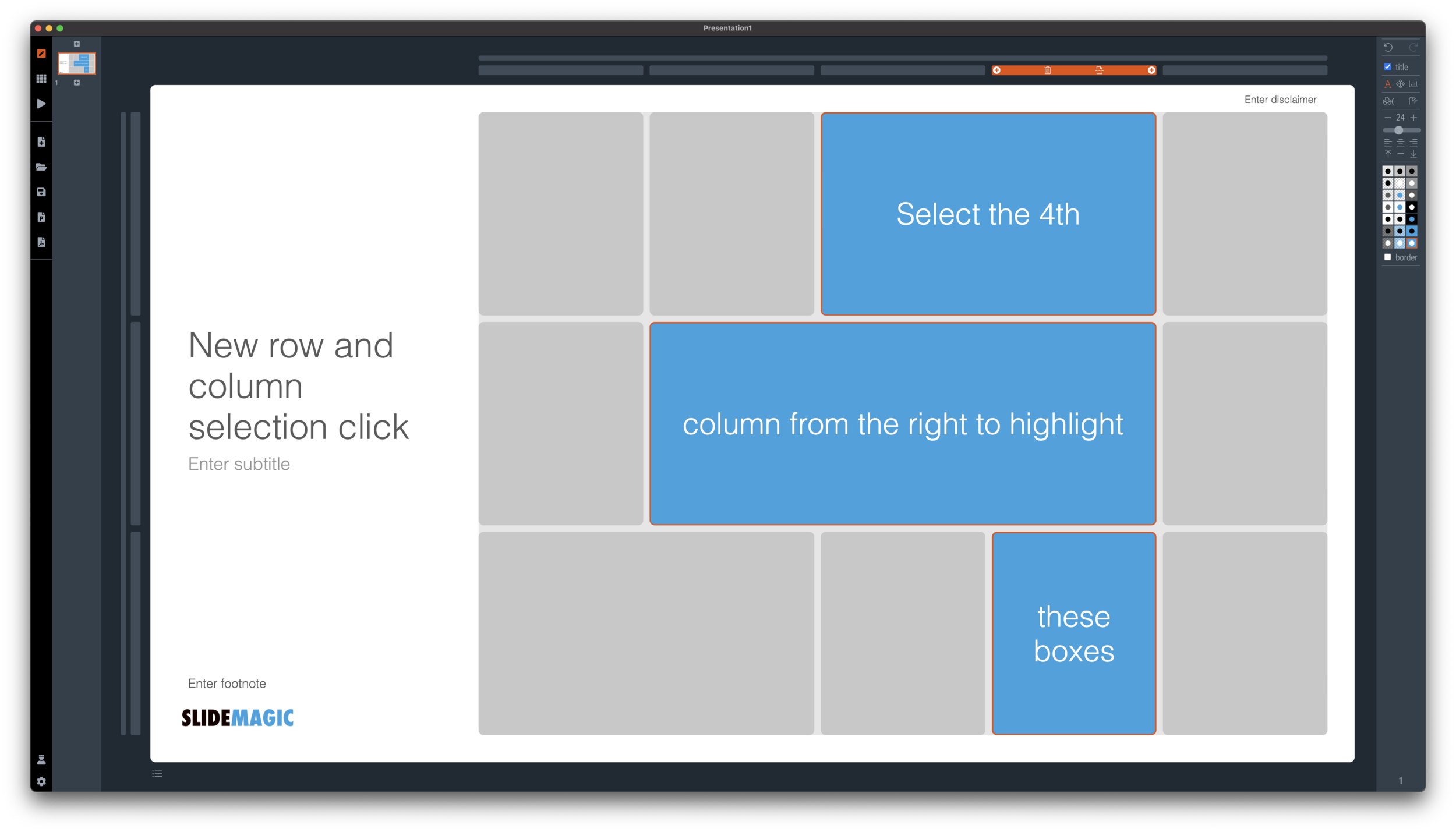
I have made more improvements to the SlideMagic user interface. Is is now easier to select multiple cells, especially in fine grids.

If you select a column marker at the top of the slide, all boxes in your slide that “touch|” the column will be become selected, and you can apply formatting to them in one go (for example, make them all blue).

Screen Shot 2021-01-18 at 17.36.19.png

The same applies for rows, click a row marker, and all relevant boxes in the row line up.

Screen Shot 2021-01-18 at 17.37.58.png

Finally, you can select whole areas of boxes by first clicking a top-left element, then clicking a bottom-right element, and SlideMagic will light up all the boxes that are in between. See the example below.

Screen Shot 2021-01-18 at 17.38.42.png
Screen Shot 2021-01-18 at 17.38.46.png

SlideMagic: a platform for magical presentations. Free student plan available. LEARN MORE
New 'no-title' layout

New 'no-title' layout

SlideMagic works with fixed positions for slide titles, subtitles, footnotes, and logos. Each slide looks organised, consistent, and the same.

Some slides call out for a slightly differently layout. Tracker pages for example. A simple text box that sites right in the middle of the screen. Up until now, SlideMagic would push these text boxes a bit down or to the right because of the required space for the slide title.

With a very simple check mark, I now created the option to remove titles from the slide on a slide-by-slide basis. It is a tiny adjustment to the user interface that can improve the look of layouts significantly. I am still putting a high hurdle when it comes to complicating SlideMagic. This is definitely not a complication!

While the user interface adjustment is easy, behind the scenes, there is a lot going on. Removing the the titles from a slide requires recropping of all the images on a slide. With SlideMagic’s new automatic cropping algorithm, this has now become possible. Imagine doing this for a slide with 40 client logos in a regular presentation design software, after which you come to the conclusion that the slide looked better with a title: re-cutting, re-cropping, re-distributing 40 images again. In SlideMagic, this is a button click.

You can check out the new features as of version 2.6.9

Screen Shot 2021-01-18 at 16.57.04.png
Screen Shot 2021-01-18 at 16.57.31.png
Screen Shot 2021-01-18 at 16.56.44.png
Screen Shot 2021-01-18 at 16.55.56.png

SlideMagic: a platform for magical presentations. Free student plan available. LEARN MORE
Should you put 'confidential' on every slide of your presentation?

Should you put 'confidential' on every slide of your presentation?

For years I tried to resist the pressure from lawyers to fill every slide with legal disclaimers. They do not look very pretty. But SlideMagic aims to be practical and as of version 2.6.8, you can do so, if you have to.

To make them still look OK:

  • I made the font really small, in all caps, so the disclaimer looks more like some sort of a document id

  • All disclaimers are exactly the same and at exactly the same place

  • The placement of the disclaimer changes based on what sort of aspect ratio / slide layout you are using

Screen Shot 2021-01-18 at 9.46.17.png

Should you put disclaimers? (Warning, I am not a lawyer). There are certain situations where you probably should. Certain confidentiality agreements state that information needs to be marked as being confidential to be covered by the agreement.

But, if there is no such agreement in place, I am not sure how much leverage you have if people are sharing pages despite all the scary warnings on the page. Also, if you are using slides with a big TED talk or product launch, the whole world can see them, making the disclaimers pretty useless.

Most investors do not sign NDAs, and you actually you want the junior VC to forward your pages to a partner in the firm. Assume that when you send your slides to investors, there can be leaks, so be careful what you put in there. In most cases the actual content of your super secret technology will not make the difference when it comes to evaluating your pitch deck in the early stages of the investment process.

So, consult your lawyer, push back if she insists, and give in if she has a reasonable argument.

Photo by Kristina Flour on Unsplash

SlideMagic: a platform for magical presentations. Free student plan available. LEARN MORE
Making SlideMagic more Zoom-friendly

Making SlideMagic more Zoom-friendly

Up until now, playing a SlideMagic presentation would trigger a full screen view of your slide, plus second full screen window on the presenter machine (if available). Switching back and forth to full screen, swapping monitors can be a bit disorienting, and in the area of Zoom, it does not work well when you want to share your audience window, but not your presenter view.

Screen Shot 2021-01-06 at 10.10.07.png

As of version 2.6.3, entering a presentation will now always trigger 2 windows (not in full screen): the slide and a smaller presenter view with timer, counter, and a thumb of the next slide coming up. You can re-rearrange them to monitors as you see fit, and go to full screen manually if needed.

This also ‘solves’ the issue of deciding which screen is the audience screen, and which one the presenter’s when many on screen projectors (not replaced very frequently) have lower screen resolutions than most computers.

SlideMagic: a platform for magical presentations. Free student plan available. LEARN MORE
How to crop headshots in your presentation

How to crop headshots in your presentation

The ideal design for a slide that shows your team is a group picture, all taken together. Unfortunately, these are almost impossible to produce. Teams change, and people are hardly ever in the same room (especially now with the virus).

The next best thing is a collage of headshots. Professional graphics designers have a specific approach to line these up properly:

  • Make sure that the eye line of all the head shots is more or less the same (at 25-33% of the image height

  • Make sure that the sizes of the heads are more or less the same

In PowerPoint and Keynote, this is an absolute pain to do. Getting different images to have the exact same size is tricky. Cropping images to position eye ines is tricky to do, and might undo part of the work that you did to get them to be all the same size.

In SlideMagic, things are easier, because it works with fixed shapes and smart cropping.

Below I plopped in 3 portrait images from the built-in image search engine of SlideMagic. In 2 of the 3 cases, the “AI” smart cropping algorithm did already a reasonable job, in the last case, totally not. But first things first, all images have the exact same size, and are spaced out absolutely perfect.

Screen Shot 2021-01-10 at 15.12.31.png

Next, we are going to drag the central dot at eye level for each of our team members and drag the images inside their boxes so the eye lines line up.

Screen Shot 2021-01-10 at 15.12.51.png

Now we can zoom the headshots to the right size by dragging the zoom slider at the bottom of the slide. SlideMagic keeps the eye line at exactly the level you set it to when zooming.

Screen Shot 2021-01-10 at 15.13.04.png

SlideMagic remembers the layout and crop of your image, for example if you change the aspect ratio of your slide to 4:3, the image still looks OK

Screen Shot 2021-01-10 at 15.13.11.png

SlideMagic: a platform for magical presentations. Free student plan available. LEARN MORE
New focal cropping now out of beta

New focal cropping now out of beta

I released version 2.6.1 as a regular SlideMagic app update, which includes the new focal cropping image rendering engine. I have been testing it extensively over the past few days and things are working smoothly.

If you are working on slide decks that you made a long time ago with SlideMagic, briefly check whether the image positioning is exactly as you intended it to be. (Including a possible logo image at the bottom right of the slide). An image that you thought was cropped “fill” or “fit” might just show a tiny gap around the borders. Hitting “fit” or “fill” again should solve the problem.

SlideMagic: a platform for magical presentations. Free student plan available. LEARN MORE
Weave effect in slides

Weave effect in slides

See the slide below. A weave effect shows how vertical and horizontal things are interconnected (in this case stuff I did back at McKinsey). It is impossible to weave shapes in programs such as PowerPoint or Keynote, they cannot be on top in one spot, and at the bottom in another,.

Screen Shot 2021-01-05 at 6.50.59.png

One way to get around this is the visual trick I applied here. Stick to a flat grid of boxes and colour/connect them to fake the visual effect. Super easy to make, super easy to change (adding, removing rows and columns). Below is the basic grid structure I used for this chart:

Screen Shot 2021-01-05 at 7.02.09.png

In PowerPoint and Keynote it can still be fiddly to line up all the boxes, especially when you want to make changes to a grid. You might have to resort to tables with very fat white margins between cells,. In SlideMagic it is super easy and even fun to create these charts. (Pro tip: SlideMagic converts to PowerPoint and can do the hard work for you).

I have added a variant of the slide to the SlideMagic template database (find it here, or simply search for “weave” in the desktop app)

SlideMagic: a platform for magical presentations. Free student plan available. LEARN MORE
Chart make-over: UK vaccine priorities

Chart make-over: UK vaccine priorities

I took on the challenge from this tweet:

The embedded tweet is obscuring the image, here is the original taken from the BBC:

_115770677_who_gets_covid_vaccines_first_640x2-nc-3.png

I think these icons are very cute, but are very hard to understand. I quickly put the following together in SlideMagic.

Screen Shot 2021-01-03 at 10.37.09.png

In the philosophy of SlideMagic, not the design of a pro, but very clear and very quick to put together. Notice how I kept things simple, by including the theoretical 0-16 years in nursing home residents, there won’t by any but the big horizontal bar shows the message “everyone” and maintains the visual harmony.

I have added this vaccin priority slide to the SlideMagic template database. You can access this slide for free by simply searching for “vaccine” from within the SlideMagic desktop app.

SlideMagic: a platform for magical presentations. Free student plan available. LEARN MORE
Focal point cropping!

Focal point cropping!

******* UPDATE: The new focal cropping is now out of beta and part of the regular SlideMagic release ********

Happy new year to you all, 2021 has already an important feature update.

I am testing an exciting new feature for SlideMagic: focal point cropping. (I first spoke about this back in August.) For each image in SlideMagic, you can set a focal point, a dot on the most important part of the photo. This can be a face, a feature of your product, a quote on a screen shot for example. If you subsequently change the size or shape or zoom level of the image, SlideMagic will re-crop the image so that your focal point appears in the right spot.

I have seen many examples of focal crops in other applications, but no one did get it completely right. That small house on the mountain you focused still disappears on certain screen sizes, or pictures get completely stretched and distorted when resizing screens or changing the composition of your slide. In SlideMagic, everything stays in place.

A particular design decision in web technology standards made it particularly hard to do (without having to divide by zero). Over the winter break, I rewrote the entire image rendering engine of SlideMagic, which was a bit like replacing the foundations of a house while people continue to live in it.

A lot is going on here, in terms of underlying math and how the user interface works. I won’t spell it out in detail here, the app should respond naturally without you having to think about it. The basics are in place now, but I still see a lot of improvement opportunities to the image cropping algorithm including automatic object detection.

I have released the feature only as a beta version at the moment, it will not update for non-beta users. Before the official release I want to make sure everything works for new presentations, maintain backward compatibility for older presentations, that there are no hiccups when downloading templates from the SlideMagic template database. If you want, you can install the latest beta version via Github here, the next time you start SlideMagic again, the latest current version will install back.

Below some screen shots where you see the feature in action:

Screen Shot 2020-12-30 at 12.51.23.png
Screen Shot 2020-12-30 at 12.51.29.png
Screen Shot 2020-12-30 at 12.51.35.png
Screen Shot 2020-12-30 at 12.51.41.png
Screen Shot 2020-12-30 at 12.51.46.png
Screen Shot 2020-12-30 at 12.51.58.png

This new cropping engine also enables me to take out this “hack” to deal with different image aspect ratios and images


SlideMagic: a platform for magical presentations. Free student plan available. LEARN MORE
Winter break 2020

Winter break 2020

More or less every year since 2008 when I started this blog, I posted around the winter break that I would pause writing to enjoy a holiday with my family. This year is a bit different. I am currently completely rewriting the image rendering engine for SlideMagic with a number of objectives:

  1. To finally enable proper smart cropping of images: if you scale an image, change its aspect ratio, crop, resize, whatever, SlideMagic will do the right thing and keep the item you want to be in focus, where it should be: in focus. The math for this is actually tricky, let’s hope I get it to work.

  2. Improve the performance of the application dramatically, especially when zooming/resizing and repositioning images. I should be able to match “video game”-type response rates

  3. (To remove a dependency on a very weird 1990s specification standard how images are rendered on web pages).

Non-beta SlideMagic users will not be guinea pigs for my plumbing changes, don’t worry.

Happy holidays everyone!

Photo by Mike Kotsch on Unsplash

SlideMagic: a platform for magical presentations. Free student plan available. LEARN MORE